前一章節介紹過混合模式,相信對濾鏡也不會很陌生。「濾鏡」是什麼呢?他可以做出與Photoshop相同的濾鏡,CSS提供了十種濾鏡,可以用在圖片、文字...等地方,還能夠搭配滑鼠移入做出不一樣的效果
濾鏡相關屬性:
支援瀏覽器,想看瀏覽器支援可以到 can i use 網站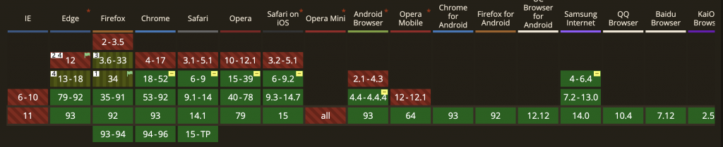
以%為單位,初始值0%,最大值100%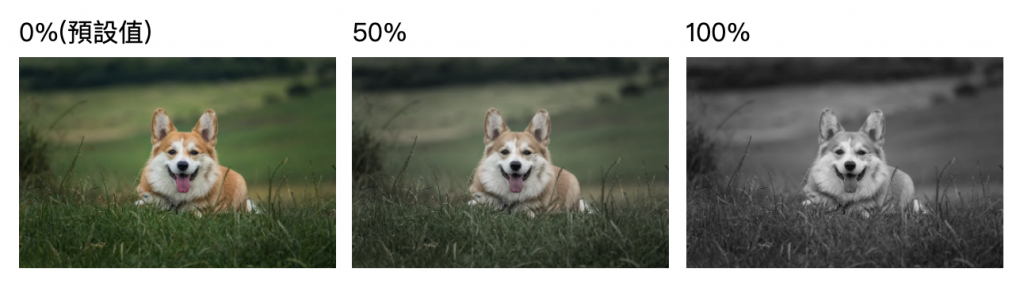
以%為單位,初始值0%,最大值100%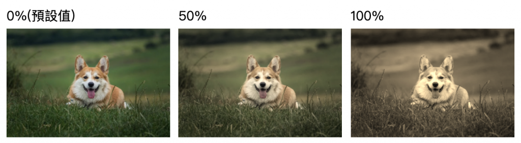
以%為單位,初始值100%,大於100%越鮮艷,小於100%彩度變低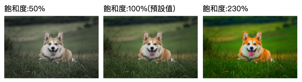
以deg為單位,初始值0deg,最大值360deg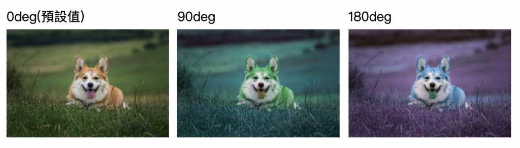
以%為單位,初始值0%,最大值100%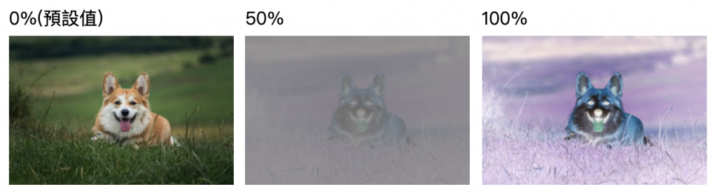
以%為單位,初始值100%,最小值0% ,值越小越透明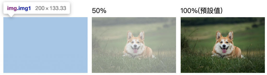
0%雖然看不見,但是他會存在在畫面上
以%為單位,初始值100%,大於100%越亮,小於100%越暗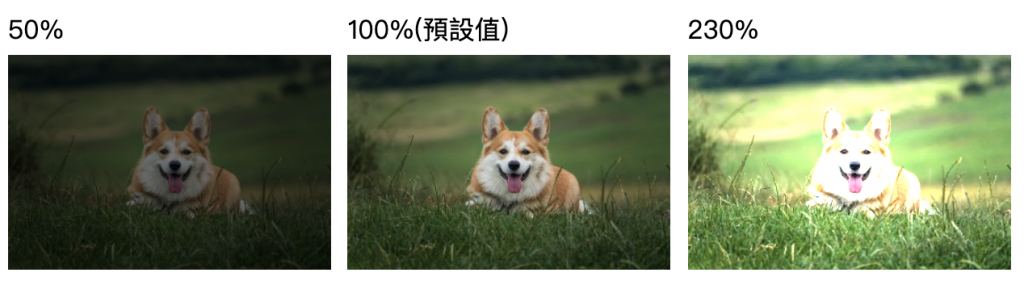
以%為單位,初始值100%,大於100%對比越大,小於100%對比越小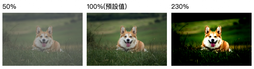
以px為單位,初始值0px,沒有最大值,數字越大越模糊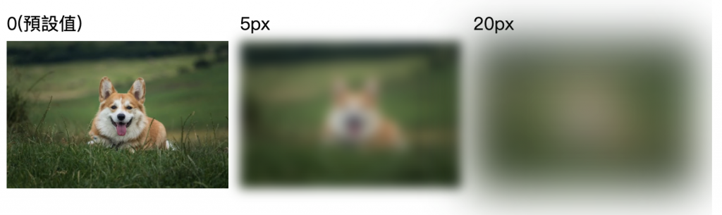
與box-shadow設定值相同,但呈現方式不同
drop-shadow會按照目標原始的內容去產生陰影,box-shadow會按照區塊
比較常遇到的是icon *.png圖片需要做陰影,下圖是box-shadow及drop-shadow設定所呈現的樣式差異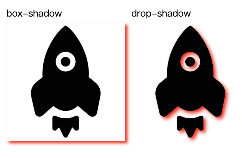
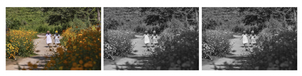
再也不需要兩張圖了~~只需要準備一張彩色的圖片,使用濾鏡控制滑入前後的樣子,範例是使用灰階濾鏡
<img src="img.jpg" width="200" >
<img src="img.jpg" width="200" >
<img src="img.jpg" width="200" >
img {
    -webkit-filter: grayscale(100%); /* Chrome, Safari, Opera */
    filter:  grayscale(100%);
}
img:hover {
    -webkit-filter: grayscale(0%); /* Chrome, Safari, Opera */
    filter:  grayscale(0%);
}
<div class="filter-box">
    <div class="txt">
      orem Ipsum is simply dummy text of the printing and typesetting industry. Lorem Ipsum has been the industry's standard dummy text ever since the 1500s, when an unknown printer took a galley of type and scrambled it to make a type specimen book.
    </div>
</div>
在filter-box區塊設定一個::after偽元素,裡面放置背景圖相關設定及模糊濾鏡樣式
.filter-box {
  position: relative;
  overflow: hidden;
  z-index: 1;
  width: 100%;
  height: 50vh;

}
.filter-box::after{
  content: "";
  background-position: center center;
  background-size: cover;
  position: absolute;
  /* 圖片需超過外層的區塊 */
  top: -30px;
  bottom: -30px;
  left: -30px;
  right: -30px;
  background-image: url("img.jpg");
  filter: blur(8px);
  z-index: -1;
}
.txt{
  background-color: rgba(0,0,0,.3);
  width: 100%;
  height: 100%;
  margin: 0 auto;
  padding: 30px;
  color: #fff;
  box-sizing: border-box;
  display: flex;
  align-items: center;
  justify-content: center;
}
在filter-box設置背景圖相關設定及模糊濾鏡樣式,然後在文字區塊設定backdrop-filter,就完成了
.filter-box {
  position: relative;
  overflow: hidden;
  /* 加入 z-index,區塊內的文字才能正確顯示 */
  z-index: 1;
  width: 100%;
  height: 50vh;
  background-image: url("https://cdn.pixabay.com/photo/2021/01/19/18/45/field-5932123_1280.jpg");
  background-position: center center;
  background-size: cover;

}
.txt{
  background-color: rgba(0,0,0,.3);
  width: 100%;
  height: 100%;
  margin: 0 auto;
  padding: 30px;
  color: #fff;
  box-sizing: border-box;
  display: flex;
  align-items: center;
  justify-content: center;
  backdrop-filter: blur(5px);
}
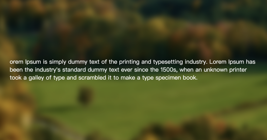
兩種方式都可以達到同樣效果,就CSS寫法不同而已
資料來源:
https://developer.mozilla.org/zh-CN/docs/Web/CSS/filter


 iThome鐵人賽
 看影片追技術