有時候在製作區塊時,會希望用不規則的形狀呈現,以前會將圖片製作成不規則形狀,在放到html裡面,或是用很多元素堆疊呈現,但每次要修改圖片就要再重新做一次,很麻煩。現在可以用clip-path屬性或mask屬性設定CSS,就可以輕鬆做出想要的形狀了。
遮罩和剪裁都是隱藏元素一部分,顯示可見區域,他們的區別是遮罩是使用圖像,剪裁是使用路徑
Clip-path 屬性能讓你裁剪一個元素中可顯示區域。
瀏覽器支援,更多資訊請看Can i use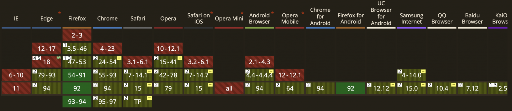
clip-path:inset(<length-percentage> round 圓角尺寸)
length-percentage是舉行的四個邊頂點到被裁切元素的距離,順序為上右下左,與margin類似
.shape-box{
  width:100px;
  height: 100px;
  background-color: #2196f3;
  clip-path: inset(10px 20px 30px 40px round 5px 20px);
}
clip-path:circle(圓形半徑 at 圓形位置(X Y座標))
範例:半徑50%
.shape-box{
  width:100px;
  height: 100px;
  background-color: #2196f3;
  clip-path: circle(50%)
}
範例:半徑50%,位置x座標:100px、y座標:100px
.shape-box{
  width:100px;
  height: 100px;
  background-color: #2196f3;
  clip-path: circle(100% at 100px 100px);
}
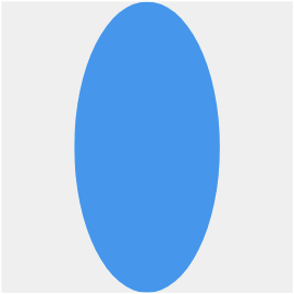
clip-path:ellipse(橢圓形半徑 at 橢圓形位置(X Y座標))
.shape-box{
  width:100px;
  height: 100px;
  background-color: #2196f3;
  clip-path: ellipse(25% 50% at 50% 50%);
}
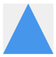
三角形:設定三個點
.shape-box{
  width:100px;
  height: 100px;
  background-color: #2196f3;
  clip-path: polygon(50% 0%, 0% 100%, 100% 100%);
}
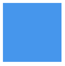
四角形:設定四個點,寬高分別為100px,因此設置舉行的數值順時針為(0 0, 0, 100% 100%, 0% 100%)
.shape-box{
  width:100px;
  height: 100px;
  background-color: #2196f3;
  clip-path: polygon(0 0, 100% 0, 100% 100%, 0% 100%);
}
設定多邊形的順序要同一個方向(順時針或逆時針)
<clipPath>來使用clip-path除了用clip-path屬性寫出基礎圖形外,還可以匯入自己找的svg圖
下圖是我要製作遮罩的圖形及圖片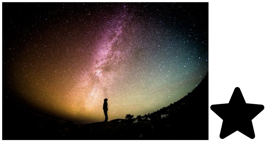
先將圖片匯入至編輯器,複製圖片的svg至你要製作的html檔案裡面,會出現以下的code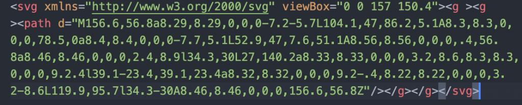
補上標籤,並給clipPath一個id名稱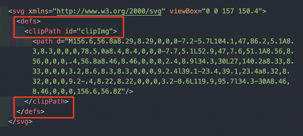
將你要裁切圖片放到html裡面,並給他class名稱,這邊是給clip-img
<div class="outer">
    <img src="img/img.jpg" alt="" class="clip-img">
    <svg xmlns="http://www.w3.org/2000/svg" viewBox="0 0 157 150.4">
      <defs>
        <clipPath id="clipImg">
          <path d="M333.6,237.4c-1-3.2-3.9-5.4-7.2-5.7l-45.3-4.1l-17.9-41.9c-1.3-3.1-4.3-5.1-7.7-5.1c-3.3,0-6.4,2-7.7,5.1l-17.9,41.9
	l-45.3,4.1c-3.3,0.3-6.1,2.6-7.2,5.7c-1,3.2-0.1,6.7,2.4,8.9l34.3,30L204,320.8c-0.7,3.3,0.5,6.7,3.2,8.6c1.5,1.1,3.2,1.6,4.9,1.6
	c1.5,0,3-0.4,4.3-1.2l39.1-23.4l39.1,23.4c2.9,1.7,6.5,1.6,9.2-0.4c2.7-2,4-5.3,3.2-8.6l-10.1-44.5l34.3-30
	C333.7,244.1,334.6,240.6,333.6,237.4z" />
        </clipPath>
      </defs>
    </svg>
  </div>
在css設置clip-path屬性,路徑為你剛剛在svg設定的id名稱
.clip-img{
  -webkit-clip-path: url(#clipImg);
  clip-path: url(#clipImg);
}
這樣就完成了
如果覺得太複雜,也可以使用製作clip-path的產生器CSS clip-path maker 網站,可以在選取他右邊的圖形,或是拉畫面上的貝茲曲線,完成後可以複製下方的code貼到你的css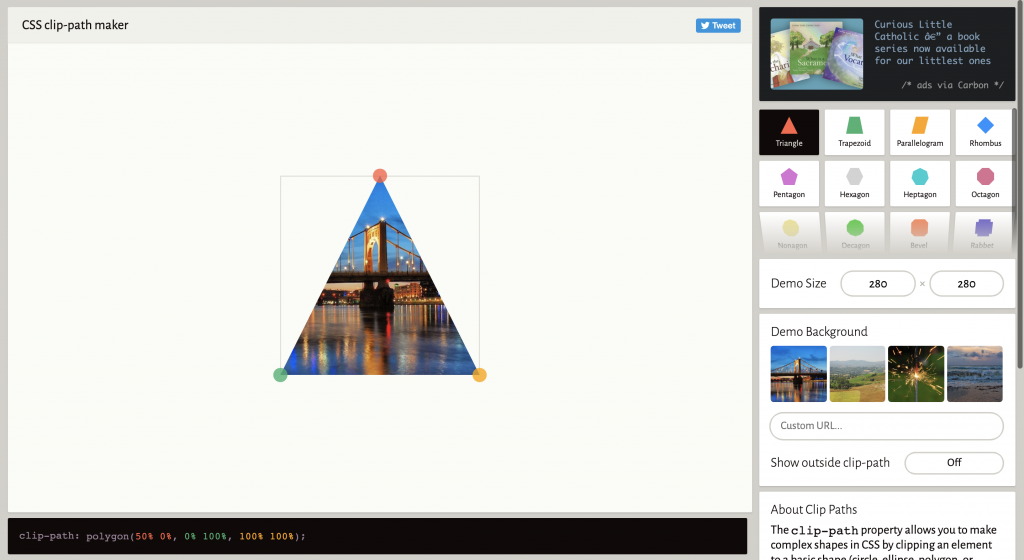
遮罩與裁剪類似,也是隱藏元素某部分顯示可見區域,但遮罩不同的地方是能依據透明度和灰階數值裁剪邊緣,也能設定其他的遮罩屬性,像是定位、尺寸等方式。
瀏覽器支援,更多資訊請看Can i use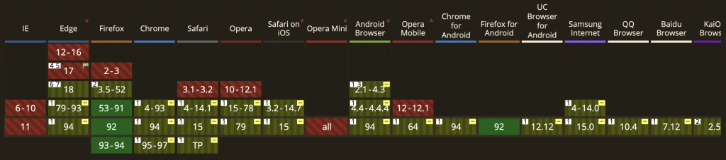
Chrome 與 Safari 目前僅支援部分的 mask 功能,須額外添加-webkit-前綴。
mask 與 background 的屬性很類似,相信大家很容易上手的
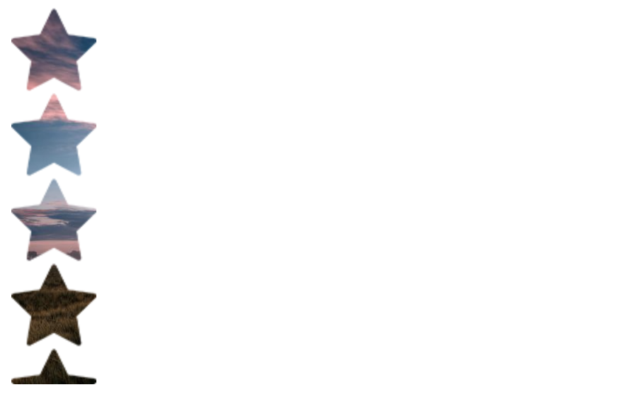
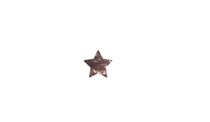
使用 url() 來設定遮罩圖片,遮罩必至少會有兩層,一張是要遮罩的形狀,一張是要被遮罩的圖
以下範例使用這兩張圖做遮罩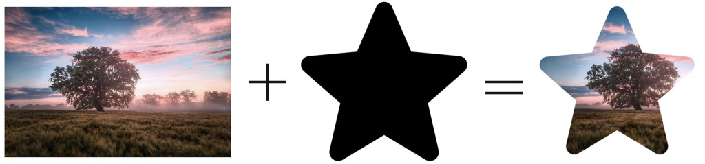
<img src="img/img.jpg" alt="" class="mask-img">
.mask-img{
  mask-image: url('../img/icon.png');
  -webkit-mask-image: url('../img/icon.png');
  width: 400px;
  mask-repeat: no-repeat;
  -webkit-mask-repeat: no-repeat;

}
除了使用圖片做遮罩外,也可以使用漸層色來做遮罩,就會依照圖片的透明度或是灰階的數值來做遮罩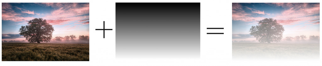
.mask-img{
  -webkit-mask: linear-gradient(#000, transparent);
  mask: linear-gradient(#000, transparent);
  width: 400px;
  mask-repeat: no-repeat;
  -webkit-mask-repeat: no-repeat;
  mask-size: contain;
}
類似background-repeat
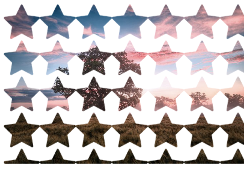
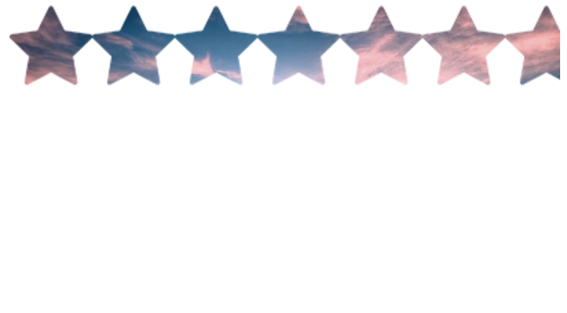
遮罩圖片會有間距,不會有裁切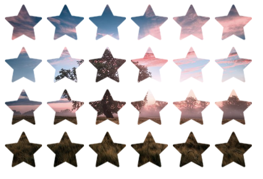
遮罩圖片緊靠一起不會有間距,遮罩會變形,不會有裁切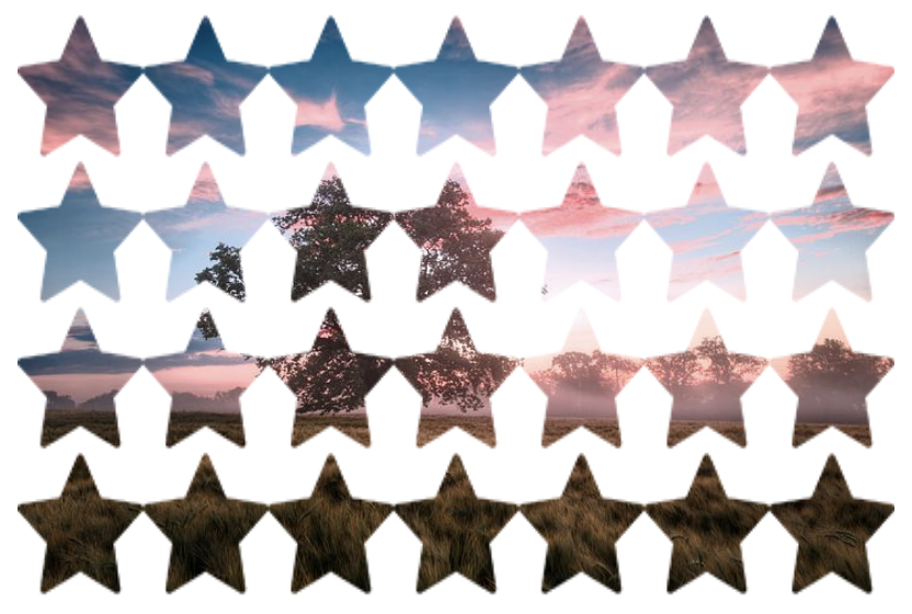
類似background-position
mask-position:水平設定 垂直設定
數值:px、rem、%
關鍵字:水平設定:left、center、right;垂直設定:top、center、bottom
範例為水平垂直置中
.mask-img{
  mask-image: url('../img/icon.png');
  -webkit-mask-image: url('../img/icon.png');
  width: 400px;
  mask-repeat: no-repeat;
  -webkit-mask-repeat: no-repeat;
  mask-position: center center;
  -webkit-mask-position: center center;
}
類似background-size
contain:圖片可以完整地被顯示
cover:圖片等比例放大,填滿區塊,但圖片會被裁切掉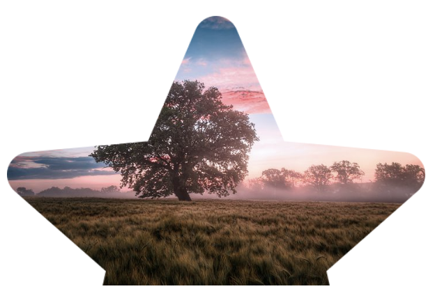
使用遮罩或剪裁,能夠有更多不一樣的變化呈現,clip-path屬性目前並非正規支援的效果,使用前還是要到Can i use確認一下瀏覽器支援程度,但在Chrome及Safari要記得加上-webkit-前綴。mask支援度比較好,只是在不同瀏覽器上會有些微的差異
參考資料:
https://www.w3cplus.com/css3/clipping-masking-css.html
https://orandigo.github.io/blog/2020/09/06/20200906-clip-path/
https://iter01.com/514881.html

 iThome鐵人賽
 看影片追技術