本篇大綱:基本散佈圖範例、進階散佈圖範例
今天的一天一圖表,我們要來畫 散點圖 / 散佈圖!散佈圖適合用在以下幾種情況:
除了呈現資料之外,也可以加上一些互動效果

今天我們就用這兩個範例來實際繪製散點圖吧!
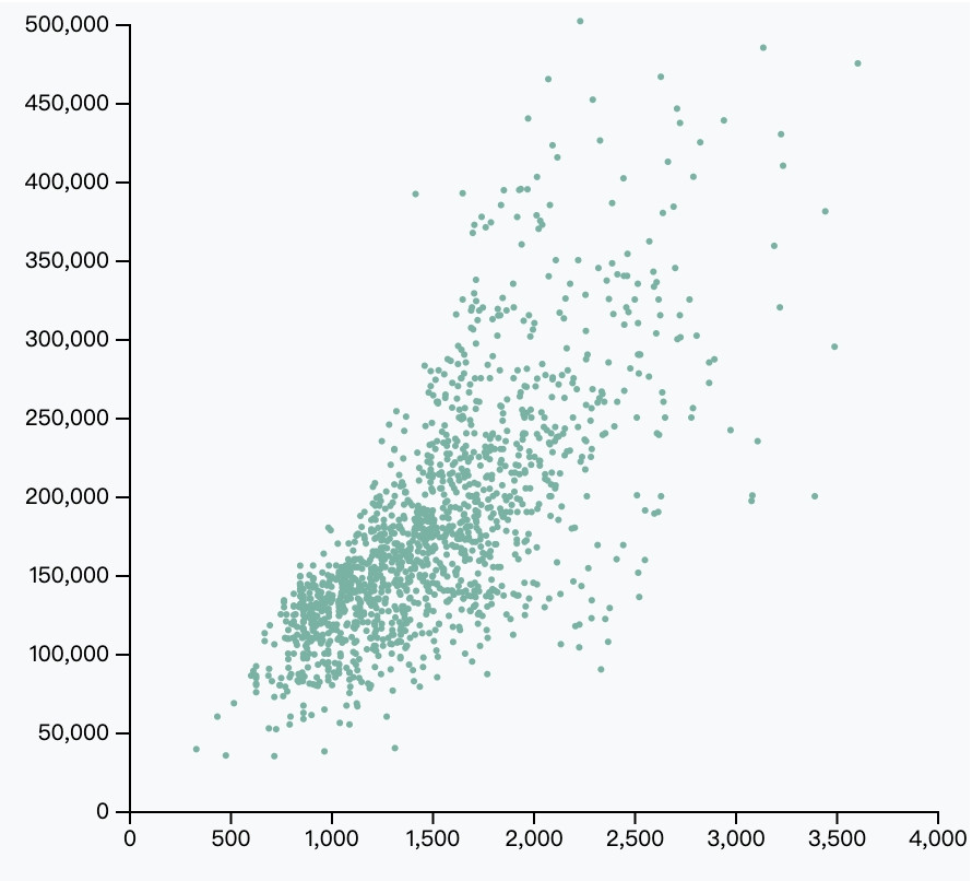
我們先來建立一個最基本的散佈圖。一般來說,這種散佈圖的資料都是 raw data,就是幾百幾單一、沒有經過統計的資料。這樣一來才能將所有的單筆資料變成一個點,並於散佈圖呈現所有點點的分佈情況。
我們今天使用的資料是 這個 ,確定資料後就可以開始畫圖啦!首先,我們先用async await 的方法串接API,拿到我們的資料;接著起手式一樣是建立RWD的svg圖表
// css
.scatter1 {
      margin: auto;
      width: 80%;
      min-width: 300px;
      margin: auto;
    }
// html
<div class="scatter1 m-auto"></div>
// 先取資料
async function getData(){
  let dataGet;

  const cors = "https://secret-ocean-49799.herokuapp.com/";
  const url = 'https://raw.githubusercontent.com/holtzy/data_to_viz/master/Example_dataset/2_TwoNum.csv'

  dataGet = await d3.csv(`${cors}${url}`);
  scatter1(dataGet)
}
getData()

// 建立圖表
function scatter1(data){
  // RWD 清除原本的圖型
  d3.select(".scatter1").select('svg').remove()

  // 建立 svg
  const svgWidth = parseInt(d3.select('.scatter1').style('width')),
        svgHeight = svgWidth
        margin = 50
  const svg = d3.select('.scatter1')
    .append('svg')
    .attr('width', svgWidth)
    .attr('height', svgHeight)

// 接下來的程式碼...
// 接下來的程式碼...
// 接下來的程式碼...
}

// RWD
d3.select(window).on("resize", scatter1());
建立好 svg 後,我們開始繪製比例尺跟XY座標軸
// 建立X軸線
const xScale = d3.scaleLinear()
       .domain([0,4000])
       .range([0, (svgWidth - margin*2)])

const xAxis = d3.axisBottom(xScale)


svg.append('g')
   .attr('transform', `translate(${margin}, ${svgHeight - margin/2})`)
   .call(xAxis)

// 建立Y軸線
console.log(data)
const yScale = d3.scaleLinear()
       .domain([0,500000])
       .range([(svgHeight - margin), 0])

const yAxis = d3.axisLeft(yScale)
                .tickFormat(d=>'$'+d)

svg.append('g')
   .attr('transform', `translate(${margin}, ${margin/2})`)
   .call(yAxis)
最後我們把資料綁定到 < circle >上
// 加上點點
svg.append('g')
   .selectAll('dot')
   .data(data)
   .enter()
     .append('circle')
     .attr('cx', d => xScale(d.GrLivArea))
     .attr('cy', d => yScale(d.SalePrice))
     .attr('r', 1.5)
     .style('fill', '#69b3a2')
這樣就完成啦!
如果我們想把特定範圍的資料設定成不同顏色,也可以這樣做
// 加上點點
svg.append('g')
   .selectAll('dot')
   .data(data)
   .enter()
     .append('circle')
     .attr('cx', d => xScale(d.GrLivArea))
     .attr('cy', d => yScale(d.SalePrice))
     .attr('r', 1.5)
   // 將大於129000的點點都變成粉紅色
     .style('fill', d => {
       return d.SalePrice > 129000? 'pink':'#69b3a2'
     })
圖表就變成這樣!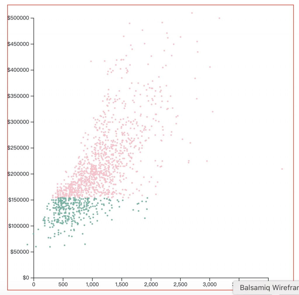
這樣就完成啦!散佈圖是不是很簡單呢~接著我們再看看範例二的圖表吧!
範例二畫面與互動效果有:
scaleLinear 或 scalePoint 製作我們就按照這些列出效果來繪製散點圖吧!首先,我們先建立 svg 跟座標軸
// css
.scatter1 {
      margin: auto;
      width: 80%;
      min-width: 300px;
      margin: auto;
    }
// html
<div class="scatter2 m-auto"></div>
function scatter2(){
// 建立svg
let w = parseInt(d3.select(".scatter2").style("width")),
    h = w*0.8,
    margin = {
        top: 40,
        right: 20,
        bottom: 20,
        left: 40
        },
    radius = 5;

let svg = d3.select(".scatter2").append("svg").attr('width', w).attr('height', h);
console.log(w, h)

let dataset = [
    { x: 100,
      y: 110 },
    { x: 83,
      y: 43 },
    { x: 92,
      y: 28 },
    { x: 49,
      y: 74 },
    { x: 51,
      y: 10 },
    { x: 25,
      y: 98 },
    { x: 77,
      y: 30},
    { x: 20,
      y: 83 },
    { x: 11,
      y: 63 },
    { x: 4,
      y: 55 },
    { x: 0,
      y: 0 },
    { x: 85,
      y: 100 },
    { x: 60,
      y: 40 },
    { x: 70,
      y: 80 },
    { x: 10,
      y: 20 },
    { x: 40,
      y: 50 },
    { x: 25,
      y: 31 }
];

// 接下來的程式碼寫在這邊...
// 接下來的程式碼寫在這邊...
// 接下來的程式碼寫在這邊...

}

// RWD
d3.select(window).on("resize", scatter2());
接著建立比例尺與座標軸
// 建立X比例尺與軸線
const xScale = d3.scaleLinear()
    .domain([0, d3.max(dataset, function (d) {
        return d.x + 10;
    })])
    .range([margin.left, w - margin.right]);

const xAxis = d3.axisTop()
    .scale(xScale)

const xAxisLine = svg.append('g')
    .attr('class', 'xAxis')
    .attr('transform', `translate(0, ${margin.top})`)
    .call(xAxis)

// 建立Y比例尺與軸線
const yScale = d3.scaleLinear()
.domain([0, d3.max(dataset, function (d) {
    return d.y + 10;
})])
.range([margin.top, h - margin.bottom])

const yAxis = d3.axisLeft()
    .scale(yScale)

const yAxisLine = svg.append('g')
    .attr('class', 'yAxis')
    .attr('transform', `translate(${margin.left}, 0)`)
    .call(yAxis)
建立好軸線跟比例尺後,開始把資料綁定到 < circle >上
// 資料綁定上circle
svg.selectAll("circle")
    .data(dataset)
    .enter()
    .append("circle")
    .attr('cx', function (d) {
        return xScale(d.x);
    })
    .attr('cy', function (d) {
        return yScale(d.y);
    })
    .attr('r', 5)
    .attr('fill', '#000')
    .on("mouseover", handleMouseOver)
    .on("mouseout", handleMouseOut);
這時我們就會得到初步的散點圖表了
再來,我們來進行滑鼠的互動設定吧~先來設定 mouseover 跟 mouseleave 的方法
//  mouseover 時點點變色+tooltip
function handleMouseOver(d, i) {
    // 選定this的元素,改變hover過去的顏色跟形狀
    d3.select(this)
        .attr('fill', 'orange')
        .attr('r', radius * 2);

    // 加上tooltips
    let pt = d3.pointer(event, this)
    svg.append("text")
        .attr('class', 'hoverTextInfo')
        .attr('x', pt[0] + 10)
        .attr('y', pt[1] - 10)
        .style('fill', 'red')
        .text([`x:${d.x}, y:${d.y}`])
}

// mouseleave 時變回原樣
function handleMouseOut(d, i) {
    d3.selectAll('.hoverTextInfo').remove()
    d3.select(this)
        .attr('fill', 'black')
        .attr('r', radius)
}
接著設定滑鼠點擊時,要紀錄點擊當下的座標,並將這個座標用 .invert 的方法換算成資料,再把這個新增的資料用push的方法推入原本的資料陣列
// 滑鼠click的時候增加一個點
svg.on("click", function () {
let coords = d3.pointer(event, this);

let newData = {
  // 把XY座標軸轉換成資料
    x: Math.round(xScale.invert(coords[0])),
    y: Math.round(yScale.invert(coords[1]))
};

// 將增加的資料座標推入原本的data
dataset.push(newData);
最後,我們要重新把更新過後的資料綁定到DOM上,同時把滑鼠over跟leave的方法也綁定上去
// 將新的資料綁定上circle、綁定 mouseover/mouseleave 方法
svg.selectAll("circle")
    .data(dataset)
    .enter()
    .append("circle")
    .attr('cx', function (d) {
        return xScale(d.x);
    })
    .attr('cy', function (d) {
        return yScale(d.y);
    })
    .attr('r', 5)
    .attr('fill', '#000')
    .on("mouseover", handleMouseOver)
    .on("mouseout", handleMouseOut);
})
完成!!
這邊附上本章的程式碼與圖表 Github 、 Github Page,需要的人請自行取用~