本篇大綱:d3.stack( ) 的用法、本次範例的畫面與互動效果、繪製堆積長條圖
今天的一天一圖表,來到長條圖三部曲的終章 — 堆積長條圖!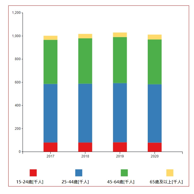
堆積長條圖的繪製相對困難一點,我們需要使用到 d3.scaleBand( ) 跟 d3.stack( ) 這兩個API。
這個方法主要是用來繪製堆積圖表,我們會使用 d3.stack( ) 的方法來換算每個數據的占比,接著再把這些數據呈現在長條圖上。如果不清楚它要怎麼使用、會生成哪些方法、提供什麼樣的數據的話,我在 Day9 的 Layouts 章節有詳細的解說。
這次我們要做的範例畫面與互動效果有:

我們這次沿用昨天的資料(臺南市勞動人口)來製作~首先,一樣先建立 svg 並把資料取回來
// css
.chart{
    width: 100%;
    min-width: 300px;
    margin: auto;
}
// html
<div class="chart"></div>
// js

let data = []
async function getData() {
  // 取資料
  dataGet = await d3.csv('./data/tainan_labor_force_population.csv')
  data = dataGet
  console.log(data)
  drawBarChart()
};
getData()

// RWD
function drawBarChart(){
  // 刪除原本的svg.charts,重新渲染改變寬度的svg
  d3.select('.chart svg').remove();

  // RWD 的svg 寬高
  const rwdSvgWidth = parseInt(d3.select('.chart').style('width')),
        rwdSvgHeight = rwdSvgWidth,
        margin = 20,
        marginBottom = 100

  const svg = d3.select('.chart')
                .append('svg')
                .attr('width', rwdSvgWidth)
                .attr('height', rwdSvgHeight);

  // 接下來的程式碼放這邊...
  // 接下來的程式碼放這邊...
  // 接下來的程式碼放這邊...
}

d3.select(window).on('resize', drawBarChart);
接下來,我們把 X軸跟 Y軸要用到的資料分別整理出來,並依此來建立 X軸跟 Y軸。
// map 資料集
const xData = data.map((i) => i['年度']);

// 設定要給 X 軸用的 scale 跟 axis
const xScale = d3.scaleBand()
                .domain(xData)
                .range([margin*2, rwdSvgWidth - margin]) // 寬度
                .padding(0.6)

const xAxis = d3.axisBottom(xScale)

// 呼叫繪製x軸、調整x軸位置
const xAxisGroup = svg.append("g")
                      .call(xAxis)
                      .attr("transform", `translate(0,${rwdSvgHeight - marginBottom})`)

// 設定要給 Y 軸用的 scale 跟 axis
const yScale = d3.scaleLinear()
                .domain([0, 1200])
                .range([rwdSvgHeight - marginBottom, margin])
                .nice() // 補上終點值

const yAxis = d3.axisLeft(yScale)
                .ticks(5)
                .tickSize(3)

// 呼叫繪製y軸、調整y軸位置
const yAxisGroup = svg.append("g")
                      .call(yAxis)
                      .attr("transform", `translate(${margin*2},0)`)
重點來了!除了本來的X軸分組之外,我們還需要整理一個 subgroups 資料集。這個資料集是把我們想要分組的資料拉出來,之後用來建立堆積圖的。以這邊的資料來說,我們希望能分成四組:
因此,我們用 Object.keys(data[0]).slice(1) 把這四個組別拉出來。分組的資料拉出來後,接著就是用 d3.stack( ) 的方法,把這些資料變成堆積圖可以使用的數據。
// 拉出要分組的資料
const subgroups =  Object.keys(data[0]).slice(1)

// 用 d3.stack() 把資料堆疊起來
const stackedData = d3.stack()
                      .keys(subgroups)(data)
接著,我們用 scaleOrdinal 的方法來設定 subgorup 資料的顏色
// 設定不同 subgorup bar的顏色
const color = d3.scaleOrdinal()
  .domain(subgroups)
  .range(['#e41a1c','#377eb8','#4daf4a', '#ffda6b'])
再來就是建立堆積圖表啦!我們把用 d3.stack 建立好的資料帶進去,並使用它提供的資料去建立 < rect >
const bar = svg.append('g')
                 .selectAll('g')
                 .data(stackedData)
                 .join('g')
                 .attr('fill',  d => color(d.key))
                 .selectAll('rect')
                 .data(d=>d)
                 .join('rect')
                 .attr("x", d => xScale(d.data['年度']))
                 .attr("y", d => yScale(d[1]))
                 .attr("height", d => yScale(d[0]) - yScale(d[1]))
                 .attr("width",xScale.bandwidth())
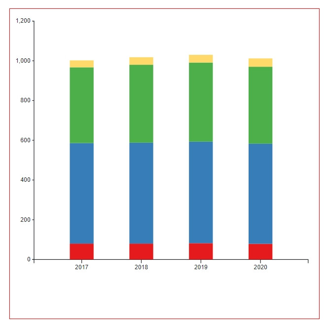
這樣基本的長條堆疊圖表就完成了
別走,還沒結束!我們還有動畫跟下方的標籤說明要做呢,先來加動畫吧
bar.on("mouseover", handleMouseOver)
   .on("mouseleave", handleMouseLeave)

// 設定文字標籤
const textTag = svg.append('text')
                  .attr('class', 'infoText')
                  .style('fill', '#000')
                  .style('font-size', '18px')
                  .style('font-weight', 'bold')
                  .style("text-anchor", 'middle')
                  .style('opacity', '0')

function handleMouseOver(d, i){
  const pt = d3.pointer(event, svg.node())

  d3.select(this)
    .style('opacity', '0.5')

  // 加上文字標籤
  textTag
     .style('opacity', '1')
     .attr("x",  pt[0])
     .attr('y', pt[1]-20)
     .text((d.target.__data__[1] - d.target.__data__[0]) + '千人')
}

function handleMouseLeave(){
  d3.select(this)
    .style('opacity', '1')

  textTag.style('opacity', '0')
}
最後再加上最下方的標籤就可以了~
// 加上辨識標籤
const tagsWrap =  svg.append('g')
     .selectAll('g')
     .attr('class', 'tags')
     .data(subgroups)
     .enter()
     .append('g')

if(window.innerWidth < 780){
  tagsWrap.attr('transform', "translate(-70,0)")
}

tagsWrap.append('rect')
     .attr('x', (d,i)=> (i+1)*marginBottom*1.3)
     .attr('y', rwdSvgHeight-marginBottom/2)
     .attr('width', 20)
     .attr('height', 20)
     .attr('fill', d => color(d))

tagsWrap.append('text')
        .attr('x', (d,i)=> (i+1)*marginBottom*1.3)
        .attr('y', rwdSvgHeight-10)
        .style('fill', '#000')
        .style('font-size', '12px')
        .style('font-weight', 'bold')
        .style("text-anchor", 'middle')
        .text(d=>d)
完成!一天又平安的結束惹 (下台一鞠躬)~
最後附上本章的程式碼:想看完整程式碼的請上 Github,想直接操作圖表的則去 Github Page 吧!請自行取用~
請問,如果想做radius(top-left, top-right)
怎麼做呢?
如果只要單邊有弧度,沒辦法單純用處理哦。可以參考這邊的作法 https://medium.com/@dennismphil/one-side-rounded-rectangle-using-svg-fb31cf318d90