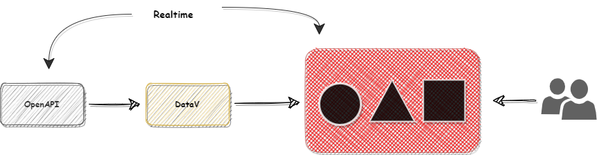
繼上一篇我們基礎認識了DataV的概念,接下來今天就要來實際產出一個圖表囉!
這裡筆者找到台北市的社會住宅公開資料API,並透過DataV設計一個可以即時更新的數據圖
點新建可視化進入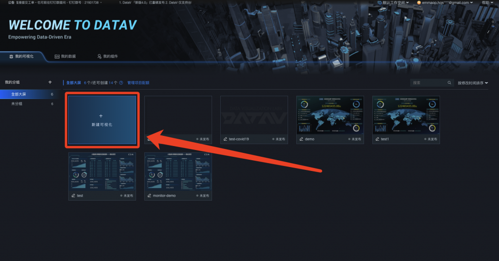
阿里雲有提供很多欲設模板可以套用,這裡選使用空白畫板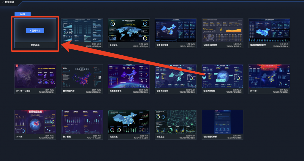
輸入任意名稱之後點選創建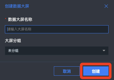
進到這個空白畫版之後,點左邊地圖,然後選擇基礎平面地圖讓他秀在上面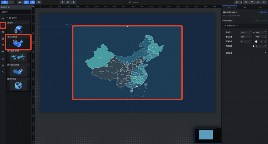
點擊那張圖,我們需要一張沒有附加特效的地圖,把右上角那些子組件刪除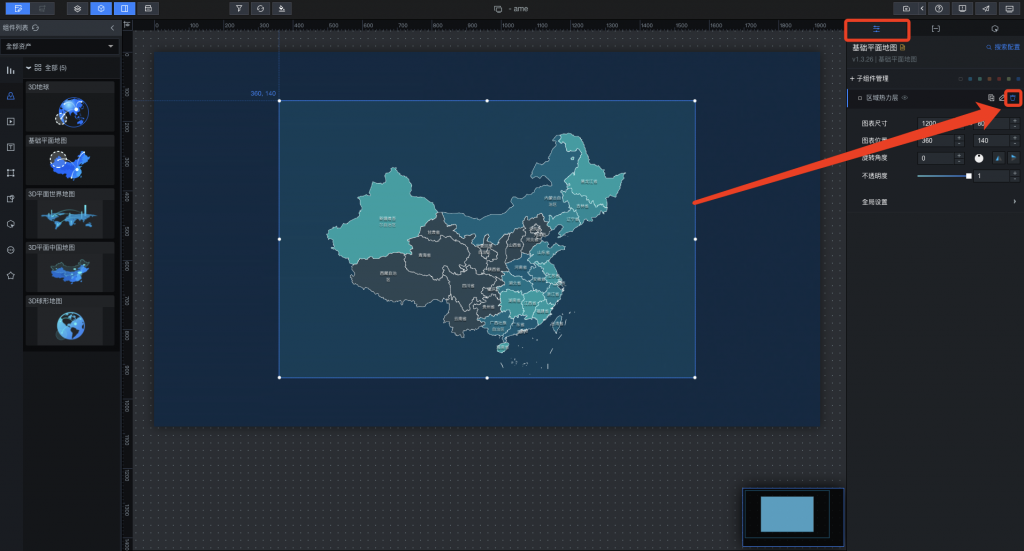
想要改變地圖的樣貌,再次點擊子組建管理,然後點擊底圖層,然後添加子組建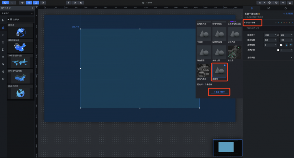
我們直接點進剛創建好的底圖層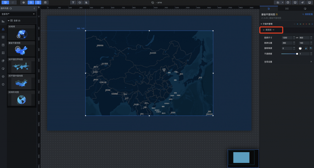
在瓦片中選擇Google地圖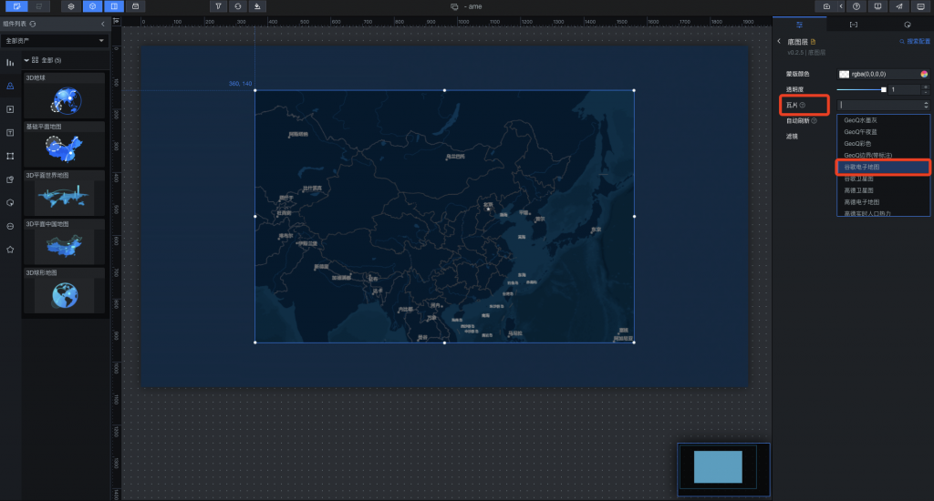
這樣就簡單把Google地圖匯入到DataV裡面了,現在我們要把這經緯度鎖定在台北,在點回那張圖,下面有全局設置,把地圖中心改成我們需要的(地圖縮放12.5、經度121.55、緯度25.05、台北市)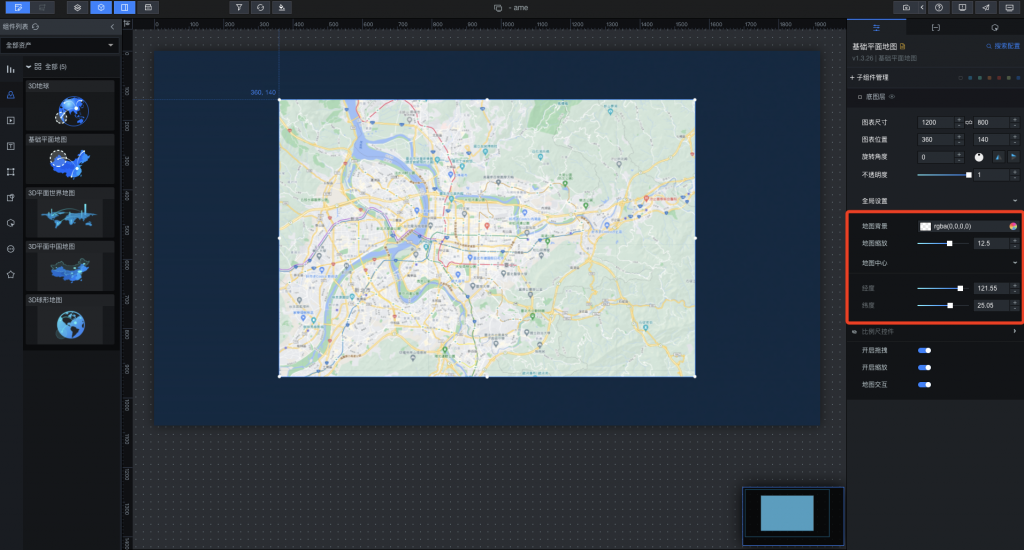
我們在子組建管理再添加一個流式氣泡層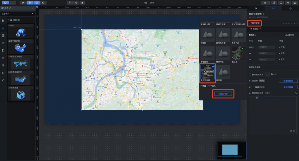
在數據裡面點選流式氣泡層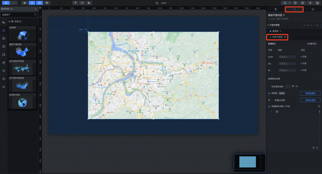
選擇需要配置的數據源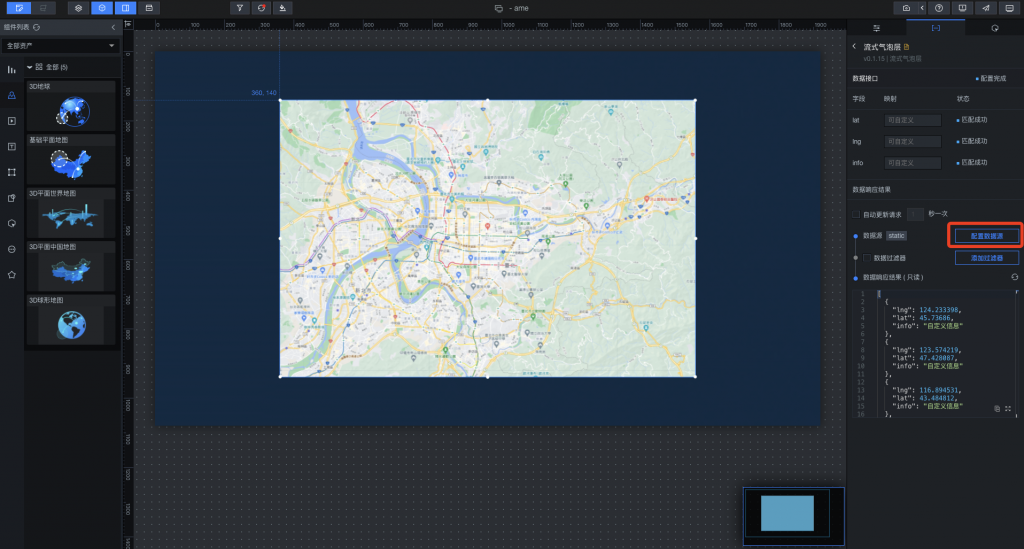
數據源類型選擇使用API然後在台北市政府的公開資料處拿API的URL,勾選服務器代理需求,就可以看到下面數據響應結果,因資料裡有座標數據字串"lat"、"lng",左側大圖中也開始顯示標記位置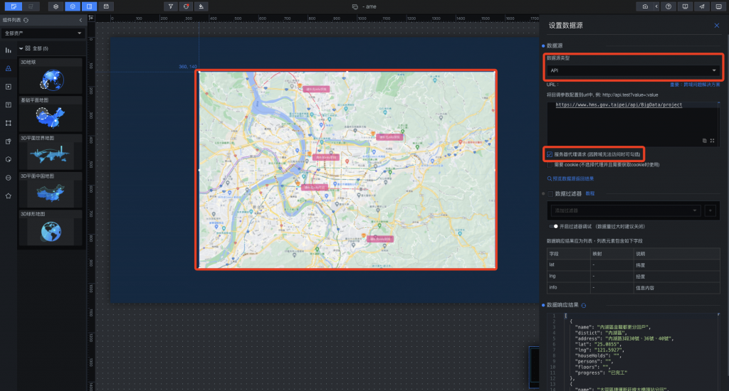
一樣回到數據,我們要讓流式氣泡圖層組件能顯示社會宅的名稱,把預設info字段填入name,他就會自動去映射取得API數據的name值並且顯示在上面,左圖也開始顯示位置跟該社會住宅的正確名稱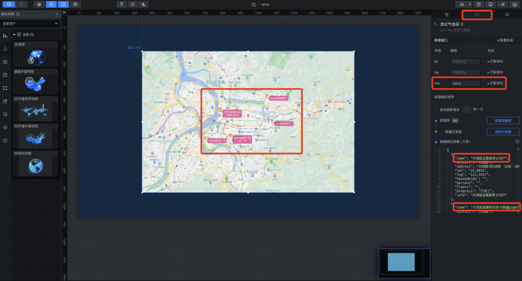
點選上方設置,調整一下尺寸跟圖表位置,讓他投射的時候是滿版且置中的(尺寸1920x1080、圖表位置0.0)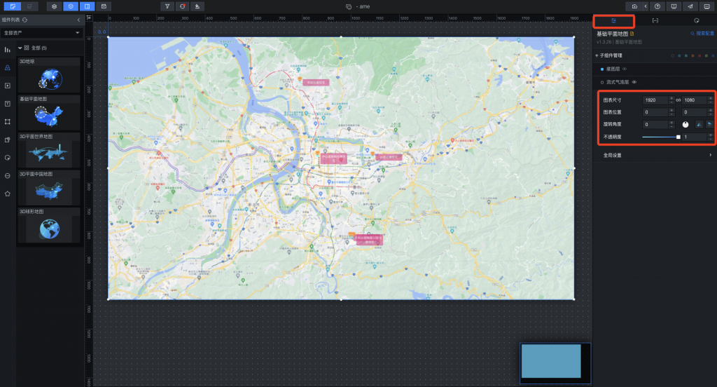
再來我們可以修改一下住宅的圖片還有字格的顏色,點選配置,然後流式氣泡層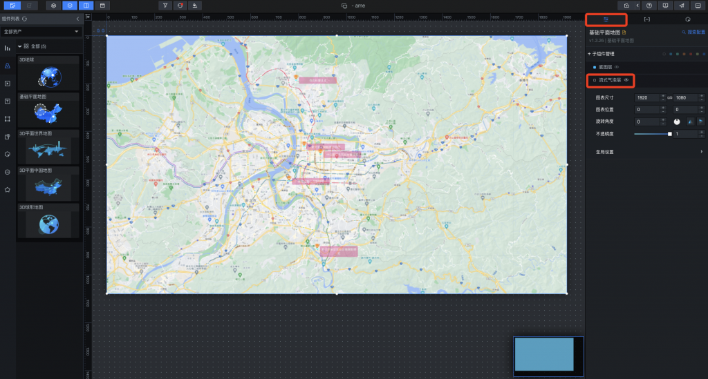
我們可以從網路上找尋一些房子的照片更換,更改一下背景顏色,也可以調整一下一次出現的住宅項目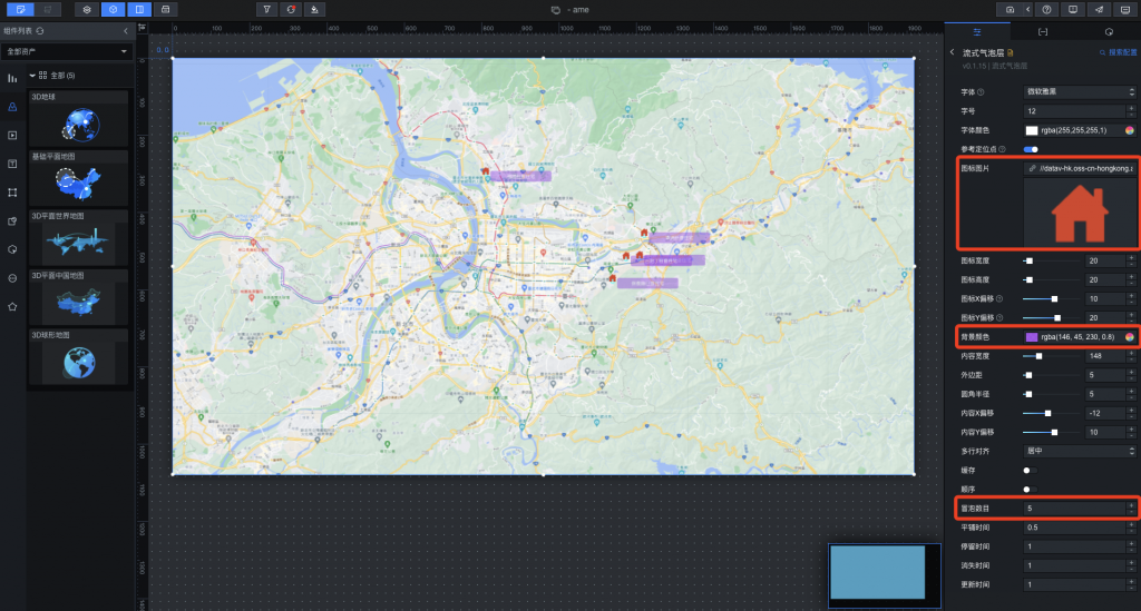
已經有了地圖座標位置,想在加上文字效果,點選表格下拉式選單,找到輪播列表後插入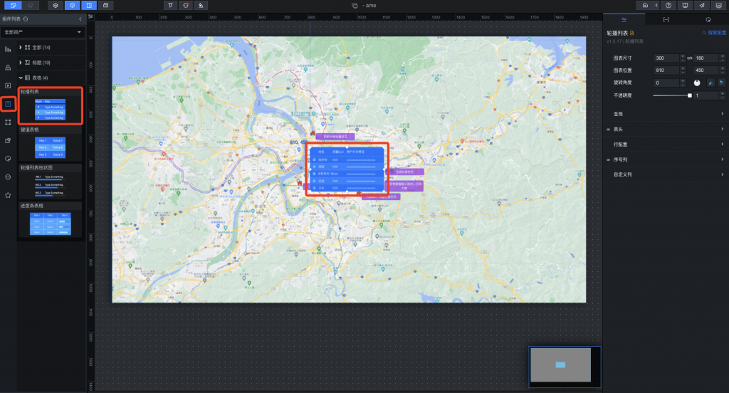
我們將它拉到左上角比較方便觀看,然後在右上配置中調整一下大小跟不透明度(尺寸600x300、不透明度0.75)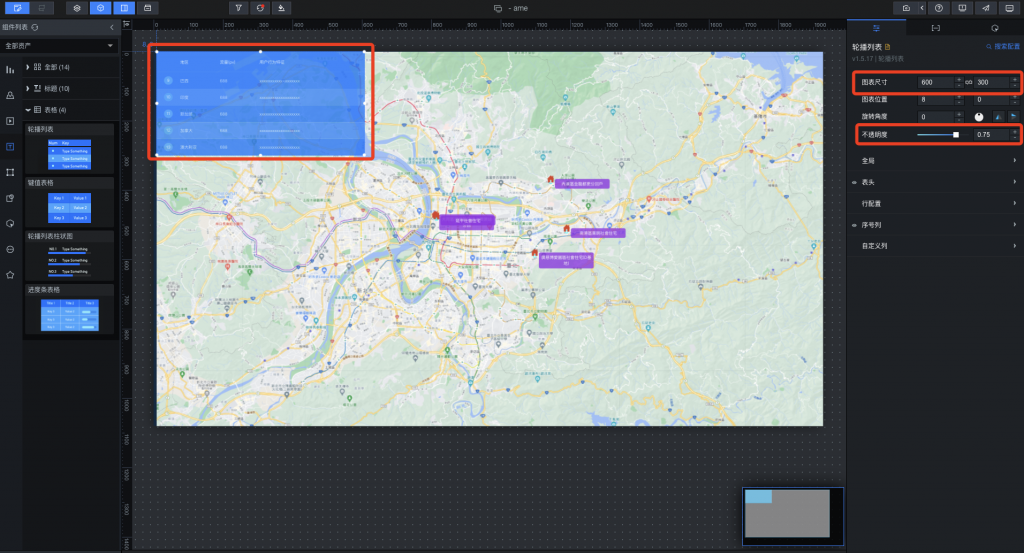
一樣點選數據,配置數據源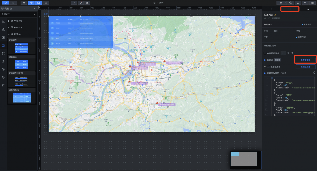
跟剛剛一樣數據源類型選API然後去台北市政府的資料處拿API的URL把他貼上,勾選服務器代理需求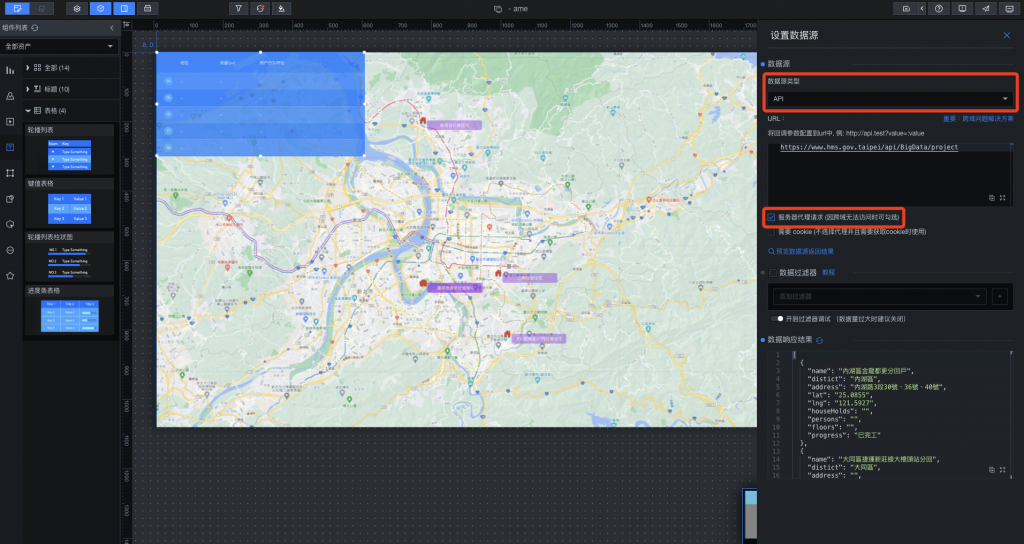
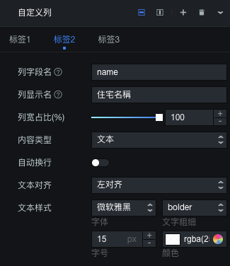
回到右上設置,開起自訂義列,將列字段明輸入匹配數據源的欄位,三塊顯示標籤我們顯示區域、住宅名稱、興建進度,因為住宅名稱較長,我們把他拉大一點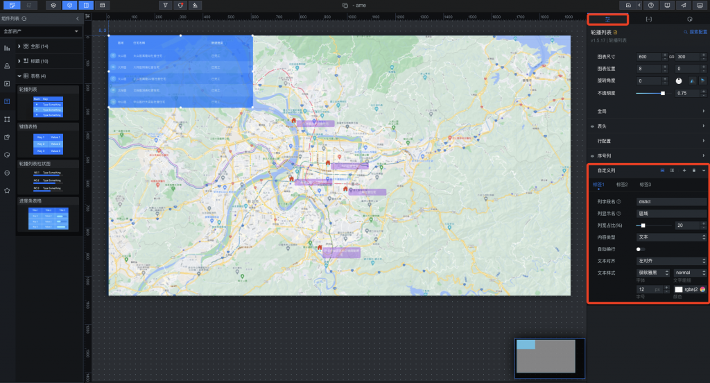
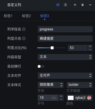
我們可以在這邊大概改一下表頭行高顏色,還有行配置的顏色等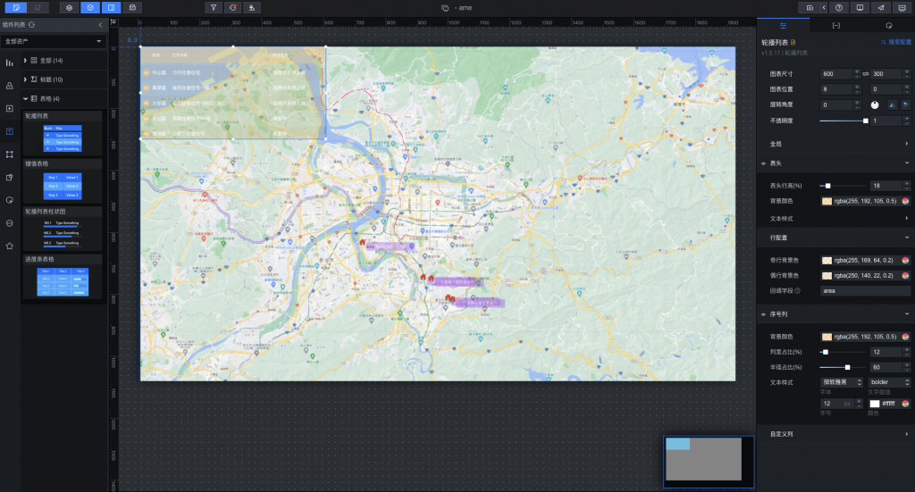
這樣子我們就完成一個地圖顯示各個社會住宅地點,以及左上角輪播各個區域、住宅名稱、興建進度的表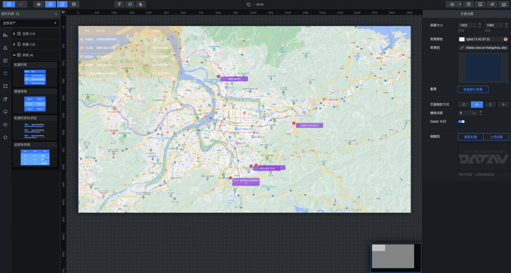
做完之後別忘記生成一下快照,直接點選右上角快照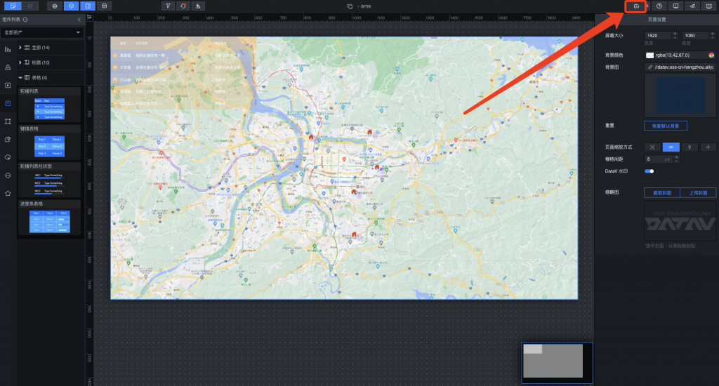
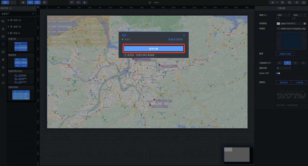
完成之後我們要來發布成給所有人觀看的一個大屏,點選右上角發布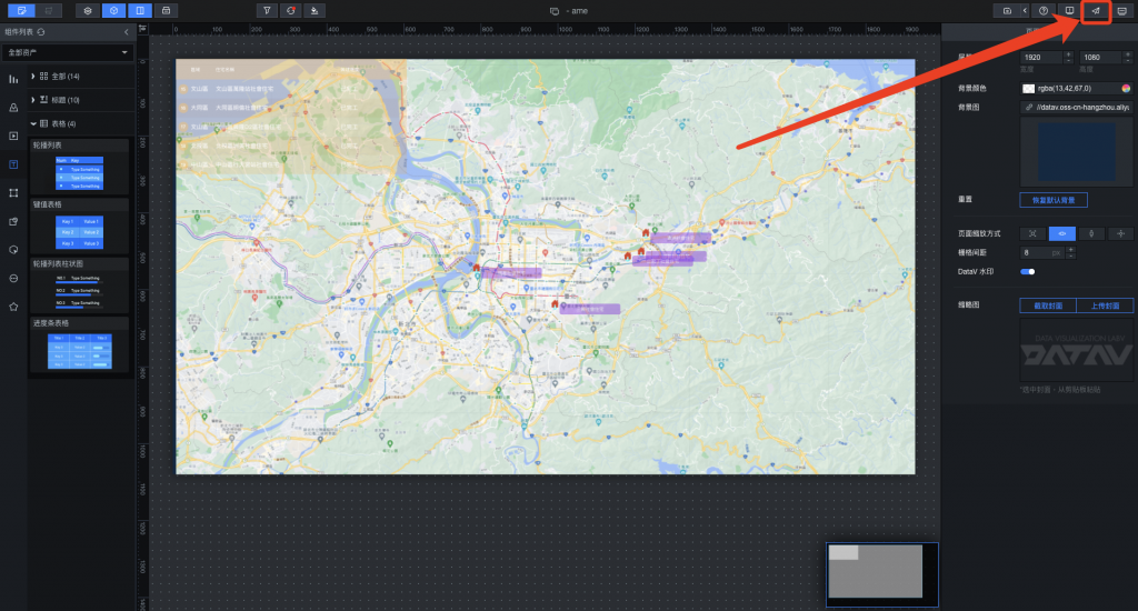
上面可以簡單設置一些訪問控制以及token,讓你的DataV連結是安全的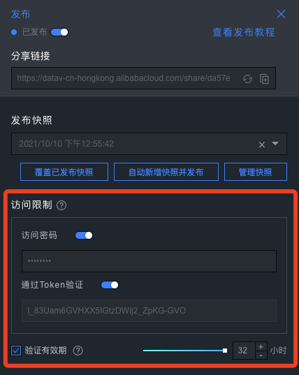
使用上面的分享連結,把我們剛剛設定的密碼給輸入進去
這樣就完成一個美觀的社會住宅地點及施工進度的即時同步數據可視化頁面囉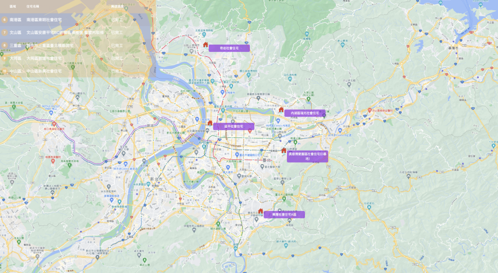
簡單的實作應用到這結束了,雖然看起來相比和原廠提供的範例圖還是相差勝遠,但只需短暫時間就能夠完成一個完整的可視圖,DataV所提供的工具及便利性還是挺不錯的,利用這套工具搭配各式數據來源相信可以產出更好的應用!