前面把java跟python部分完成後,
接下來要繼續寫js和html的步驟來完成1分k視覺化。
(1)引用的js套件
    <script type="text/javascript" th:src="@{/js/jquery-3.3.1.min.js}" ></script>
	<script src="https://code.highcharts.com/stock/highstock.js"></script>
	<script src="https://code.highcharts.com/stock/modules/data.js"></script>
	<script src="https://code.highcharts.com/stock/modules/drag-panes.js"></script>
	<script src="https://code.highcharts.com/stock/modules/exporting.js"></script>
(2)html的部分,
kbar_data為java傳過來的資料
<!DOCTYPE html>
<html xmlns:th="http://www.thymeleaf.org">
<body>
    <input type="hidden" id="kbar_data" th:value="${kbar_data}"/>
    <div id="container" style="height: 800px; min-width: 620px"></div>
</body>
</html>
(3)highcharts js撰寫,
將時間戳記、開、收、最低、最高價、量的資料取出,
並帶入套件中
<script type="text/javascript">
const kbar_data = $("#kbar_data").val();
const myArr = JSON.parse(kbar_data);

const ts = myArr.map.ts.myArrayList;
const Open = myArr.map.Open.myArrayList;
const High = myArr.map.High.myArrayList;
const Low = myArr.map.Low.myArrayList;
const Close = myArr.map.Close.myArrayList;
const Volume = myArr.map.Volume.myArrayList;

    // split the data set into ohlc and volume
    var ohlc = [],
        volume = [],
        dataLength = myArr.map.Volume.myArrayList.length,
        i = 0;

    for (i; i < dataLength; i += 1) {
        ohlc.push([
            parseInt(String(ts[i]).substring(0, 13)), // the date
            Open[i], // open
            High[i], // high
            Low[i], // low
            Close[i] // close
        ]);

        volume.push([
            parseInt(String(ts[i]).substring(0, 13)), // the date
            Volume[i] // the volume
        ]);
    }


    // create the chart
    Highcharts.stockChart('container', {

        rangeSelector: {
            selected: 1
        },

        title: {
            text: '2603長榮1分K'
        },

        yAxis: [{
            labels: {
                align: 'right',
                x: -3
            },
            title: {
                text: 'OHLC'
            },
            height: '60%',
            lineWidth: 2,
            resize: {
                enabled: true
            }
        }, {
            labels: {
                align: 'right',
                x: -3
            },
            title: {
                text: 'Volume'
            },
            top: '65%',
            height: '35%',
            offset: 0,
            lineWidth: 2
        }],

        tooltip: {
            split: true
        },

        series: [{
            type: 'candlestick',
            name: 'AAPL1',
            data: ohlc,
            dataGrouping: {
                enabled: false
            }
        }, {
            type: 'column',
            name: 'Volume',
            data: volume,
            yAxis: 1,
            dataGrouping: {
                enabled: false
            }
        }]
    });

</script>
(4)結果如圖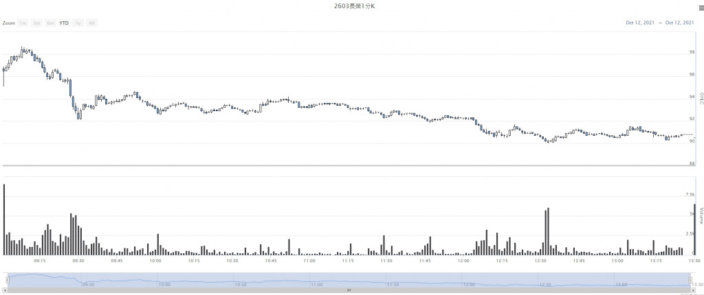
上方是k棒、而下方是量的柱狀圖,
這樣就完成第二個視覺化的功能。


 iThome鐵人賽