今天要延續昨天的 study 官方教學的 Lesson 3 與 Lesson 4。
Compose UI 是支援 Material Design 的,今天就來玩玩 Material Design吧。
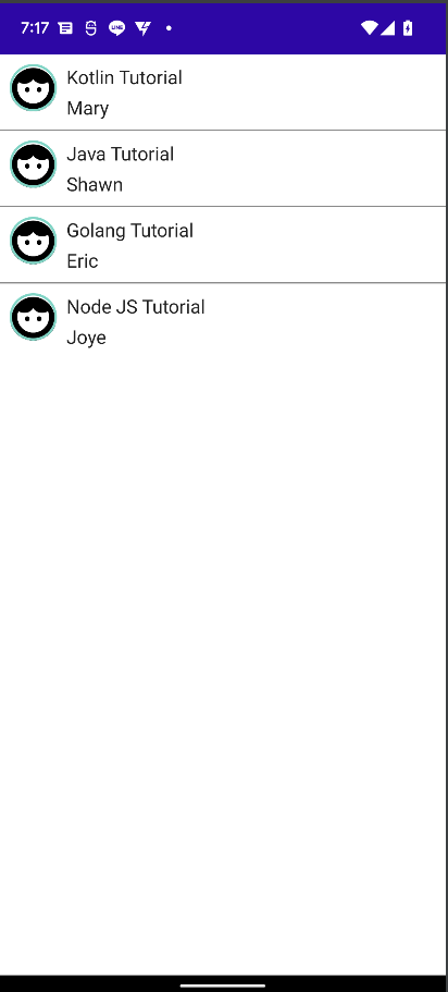
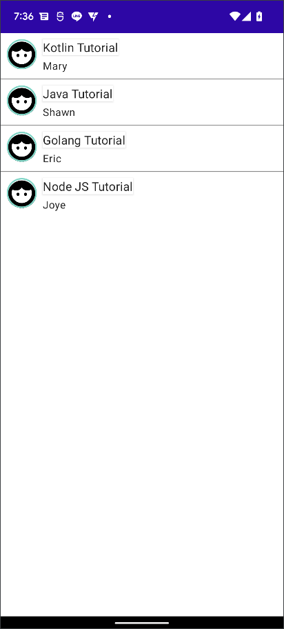
我們延續昨天的 Day 5 範例,來寫一個 Material Design 樣式來套用 NoteItem。Material Design 由Color、Typography、Shape 三個要素組成,接下來我們一個一個來實作一下。
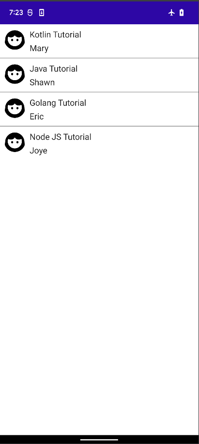
我們使用封裝在 MaterialTheme 主題的顏色 MaterialTheme.colors 來幫 Image 加個有顏色的邊框:
        Image(
            painter = painterResource(R.drawable.ic_profile_face1),
            contentDescription = "Contact profile picture",
            modifier = Modifier
                // Set image size to 40 dp
                .size(40.dp)
                // Clip image to be shaped as a circle
                .clip(CircleShape)
                .border(1.5.dp, MaterialTheme.colors.secondary, CircleShape)
        )
我們把 border 函數裡面的 shape 改為 RectangleShape,畫面的邊框就變成這樣了:
我們可以使用 MaterialTheme 提供的 Material Typography 樣式,設定 Text UI 的 style 參數,如下:
Note 的 title Text 的 style 指定為 subtitle1,Note 作者的 Text style 設定為 MaterialTheme.typography.body2。
        Column {
            Text(text = note.title, style= MaterialTheme.typography.subtitle1)
            // Add a vertical space between the author and message texts
            Spacer(modifier = Modifier.height(4.dp))
            Text(text = note.author, style = MaterialTheme.typography.body2)
        }
透過 Shape,可以做到畫龍點睛的效果。將 Title 的 Text UI 封裝在 Surface Compose 裡面,就可以自定義標題的形狀、以及高度了。
        Column {
            Surface(shape = MaterialTheme.shapes.large, elevation = 2.dp) {
                Text(text = note.title, style= MaterialTheme.typography.subtitle1)
            }

            // Add a vertical space between the author and message texts
            Spacer(modifier = Modifier.height(4.dp))
            Text(text = note.author, style = MaterialTheme.typography.body2)
        }
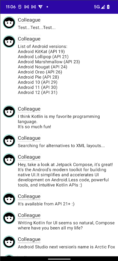
在 APP 開發中使用最多的就是 List 與 Animation 了。我們可以使用 LazyColumn 和 LazyRow,像 RecycleView 一樣只繪製顯示在螢幕上面的 Items。我們只需要改寫 NoteList 這個 Composable 函式:
@Composable
fun NoteList() {
    LazyColumn {
        items(SampleData.conversationSample) { note ->
            NoteItem(note)
        }
    }
}
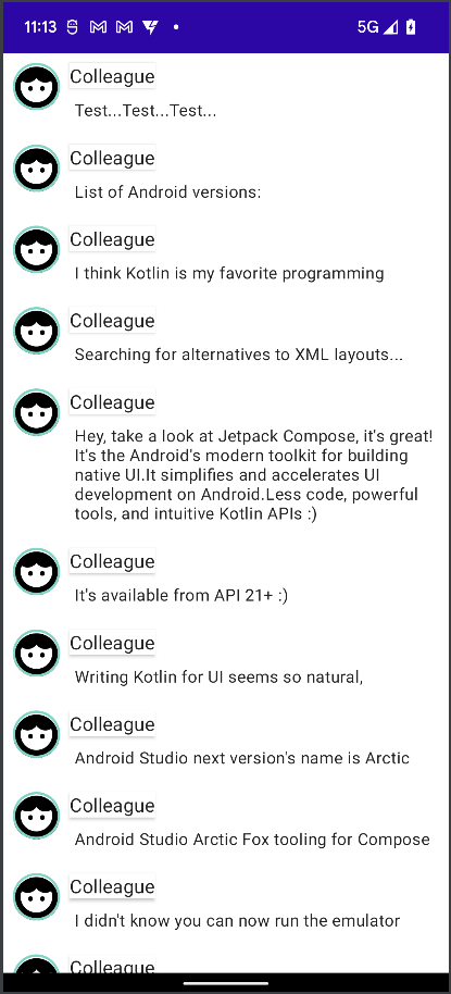
如果要平時每一個 item 只需要顯示一行,直到使用者點選 item 才會顯示完整 body 內容,為了存儲此 local 狀態,需要 trace item 是否已展開。為了 trace 這種狀態變化,須使用 remember 和 mutableStateOf 函數。 Composable 函數可以使用 remember 將 local 狀態存儲在 memory 中,並 pass 給 mutableStateOf 的值的變化。該值更新時,系統會自動重新繪製使用此狀態的 Composable item,這稱為 recomposition (重組)。
var isExpanded by remember { mutableStateOf(false) }
點選 note 時,note 的 isExpanded 狀態,更改 note 內容的背景顏色。將使用 modifier 的 clickable c參數來處理 composable item 上的點擊事件。背景顏色添加動畫效果,使其值逐步從 MaterialTheme.colors.surface 更改為 MaterialTheme.colors.primary(反之亦然),而不只是切換 Surface 的背景顏色。為此,您將使用 animateColorAsState 函數。最後會將使用 animateContentSize 修飾符順暢地為消息容器大小添加動畫效果
明天我們將了解 compose 的狀態以及生命週期。


 看影片追技術