今天我們來實作Day #5 搭配上筆者Thibe這一週的文章瀏覽和預期數據,看來這下滑趨勢達到顯著呢(p < 0.05)!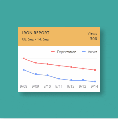
此次作品建議開啟CodePen觀看。
CodePen: https://codepen.io/stevetanus/pen/XWqjMbV
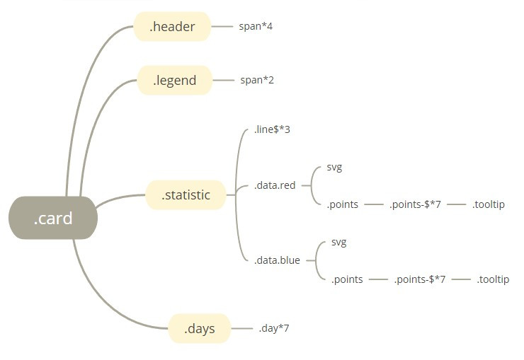
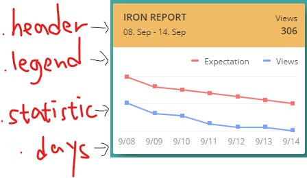
抱歉我寫字寫得很醜~.card之下,由上到下分成四個區塊,.header包含四個文字區塊,.legend包含兩個文字區塊,比較難的地方是.statistic,裡面用到了SVG畫線、pseudo-element偽元素(::before, ::after)、hover效果顯示數值,days包含了七個日期。
<div class="data red">
        <svg>
          <polyline points="9,1 50,16 90,20 130,25 171,30 211,35 251,40"></polyline>
        </svg>
        <div class="points">
          <div class="point-1">
            <div class="tooltip">200</div>
          </div>
          <div class="point-2">
            <div class="tooltip">160</div>
          </div>
          <div class="point-3">
            <div class="tooltip">150</div>
          </div>
          <div class="point-4">
            <div class="tooltip">145</div>
          </div>
          <div class="point-5">
            <div class="tooltip">130</div>
          </div>
          <div class="point-6">
            <div class="tooltip">115</div>
          </div>
          <div class="point-7">
            <div class="tooltip">100</div>
          </div>
        </div>
上面呈現在.statistic中的紅線,SVG的polyline屬性會將點用直線連起來,這邊定義了七個點,在points裡面,有著七點的tooltip數值,之後會透過CSS顯示在數據線上。
.header {
    position: relative;
    background: #f1ba64;
    width: 100%;
    height: 60px;
    padding: 2px;
    .big {
      position: absolute;
      font-weight: 600;
      font-size: 14px;
      text-transform: uppercase;
    }
    .small {
      position: absolute;
      font-weight: 400;
      font-size: 12px;
    }
    ...
}
在.header中,比較大的文字套用.big,比較小的文字套用.small,四個span都是用絕對定位。
.legend {
    text-align: right;
    padding: 10px 0 14px 0;
    span {
      position: relative;
      ...
      padding: 0 10px 0 25px;
    }
    span::before {
      position: absolute;
      left: 6px;
      top: 6px;
      display: block;
      content: "";
      width: 11px;
      height: 3px;
      border-radius: 3px;
    }
    .red::before {
      background: $red;
    }
    .blue::before {
      background: $blue;
    }
  }
.legend中使用了text-align: right;(tar)置右,兩個span都為相對定位點,有著右邊的padding: 10px,左邊的padding: 25px。在span::before(偽元素)為絕對定位,要注意的是在偽元素(::before,::after等等)內要寫入content屬性才會生效,.red跟.blue的::before偽元素分別為紅色與藍色的短直線。
https://www.oxxostudio.tw/articles/201706/pseudo-element-1.html
.statistic {
    ...
    .line1 {
      position: absolute;
      top: 0;
      left: 0;
      right: 0;
      height: 1px;
      background: #f2f2f2;
    }
    .line2 {
      @extend .line1;
      top: 40px;
    }
    .line3 {
      @extend .line1;
      top: inherit;
      bottom: 0;
    }
.line1、.line2、.line3,皆為1px的直線,其中@extend .line1讓後面兩條線繼承.line1的屬性。
polyline {
        fill: none;
        stroke-width: 2;
        stroke-linecap: round;
      }
      &.red polyline {
        stroke: $red;
      }
      &.blue polyline {
        stroke: $blue;
      }
polyline的fill要設為none,寬度為2px,邊框端點設為round,.red設為紅色,.blue設為藍色。
[class^="point-"] {
        position: absolute;
        width: 6px;
        height: 6px;
        // border-radius: 3px;
        cursor: pointer;
        z-index: 10;

        &:hover .tooltip {
          visibility: visible;
          opacity: 1;
          transform: translate3d(-50%, 0, 0);
        }
      }
這邊選擇包含"point-"的class,設定所有的點,在hover的時候會觸發.tooltip的動畫,讓他變成visible,透明度為1,並往上移動(原本.tooltip的設定為transform: translate3d(-50%, 10px, 0);在此的Y軸減少)。
30個你該記得的CSS選擇器: https://code.tutsplus.com/tutorials/the-30-css-selectors-you-must-memorize--net-16048
.point-1 {
left: 7px;
  top: 36px;
}
.point-2 {
  left: 48px;
  top: 51px;
}
...
每個點都用絕對位置去定位,left屬性差距在40~41之間,高度則是由觀看數據去判斷。
.tooltip {
        ...
        position: absolute;
        bottom: 13px;
        left: 50%;
        transform: translate3d(-50%, 10px, 0);
        padding: 8px 6px;
        visibility: hidden;
        opacity: 0;
        transition: transform 0.4s ease-out 0s, opacity 0.4s ease-out 0s;
        &::after {
          position: absolute;
          display: block;
          content: "";
          height: 6px;
          width: 6px;
          left: 50%;
          margin-left: -3px;
          bottom: -3px;
          transform: rotate(45deg);
        }
      }
.tooltip預設為透明看不見的,當點(class^="point-")被hover到時,.tooltip的屬性產生變化,transition設定讓transform跟opacity(transition-property)在0.4秒內(transition-duration)完成,有種浮上來的感覺。::after偽元素在這邊為旋轉45度的正方形,變成tooltip底下那個尖角,因為偽元素會繼承原本元素的屬性,所以transition也會跟著一起進行動畫。
https://developer.mozilla.org/en-US/docs/Web/CSS/CSS_Transitions/Using_CSS_transitions
 .days {
    width: 280px;
    margin: 0 auto;
    display: flex;
    .day {
      width: (100% / 7);
      text-align: center;
      ...
    }
.days設為display:flex(df),預設為橫向排列,寬度為280px,而在.day每一天的寬度設為100%/7,剛好七等分,並加上text-align:center(tac)使得日期置中排好。
HTML
| 目標 | 屬性 |
|---|---|
| 直線 | <polyline points=""/> |
| CSS | |
| 目標 | 屬性 |
| ------------- | ------------- |
| SVG polyline | fill: none, stroke, stroke-width, stroke-linecap |
| pseudo-element偽元素 | ::before, ::after |
| hover動畫 | &:hover設定變化,transition加入屬性、時間 |
不得不說,這個作品Statistic十分具有挑戰性,特別是在學習原作者對於相對絕對位置定位的功夫,並呈現了很漂亮的圖表。我將數據改成自己前七篇文章的瀏覽數、和自己預期的瀏覽數,(p.s.第七天的文章根本還沒出來)預期的其實也只是跟著往上估計看看。原本覺得從上一篇開始有寫得比較好了,這一篇又覺得內容太多,內容取捨整理得不是很好


 看影片追技術