我們在使用google map的時候,會將自己喜愛的地方標記起來,以備未來想要查看時,能夠更迅速的掌握資訊 ~
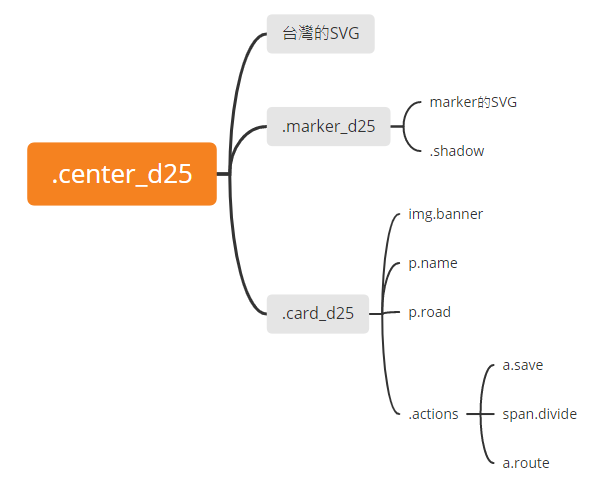
今天我們來實作Day #25,以下有些class命名會較長,但都和day25相關,為的是之後的整合。
CodePen: https://codepen.io/stevetanus/pen/gOzzqNM
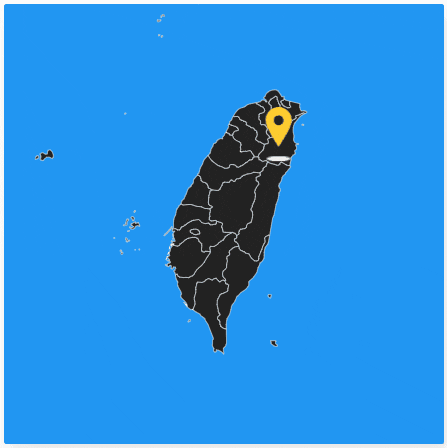
關於台灣的SVG,我是取用於這個網站simplemaps,marker的SVG和衝浪店圖片取自於原作者的code。
在這邊介紹HTML中title的屬性,被常常用在a tag和img上面,會使得滑鼠停留在上方時有提示文字(tooltip),舉個例,在景點卡片的.actions裡面的a連結:<a href="#" title="如何去" class="route">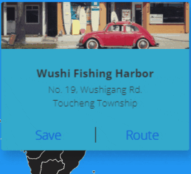
.marker_d25 {
    position: absolute;
    // 定位在宜蘭底部
    left: 210px;
    top: 100px;
    z-index: 5;
    cursor: pointer;
    transform: perspective(600px) rotateY(0deg);
    opacity: 1;
    transition: all 0.5s ease 0.4s;
    // 在加上.inactive時,會沿著Y軸逆時針旋轉90deg並消失
    &.inactive {
      transform: perspective(600px) rotateY(-90deg);
      opacity: 0;
      transition: all 0.5s ease;
    }
    ...
svg {
      fill: #ffcc30;
      animation: hovering_d25 1s ease-in-out infinite alternate;
    }
/* marker的SVG有著1s向上移動的動畫,上面animation的設定使得動畫會無限地雙向進行 */
@keyframes hovering_d25 {
  from {
    transform: translate3d(0, 0, 0);
  }
  to {
    transform: translate3d(0, -5px, 0);
  }
}
.shadow {
      background: #eee;
      width: 18px;
      height: 4px;
      border-radius: 50%;
      margin: 2px auto 0 auto;
      animation: shadow_d25 1s ease-in-out infinite alternate;
    }
/* 陰影有著1s放大的動畫,上面animation的設定使得動畫會無限地雙向進行 */
@keyframes shadow_d25 {
  from {
    transform: scale(1) translate3d(0, 0, 0);
  }
  to {
    transform: scale(1.25) translate3d(0, 0, 0);
  }
}
在marker的SVG跟.shadow的動畫合起來就很像是座標在呼吸的感覺,陰影會隨著座標上升而放大,隨著座標下降而縮小。
.card_d25 {
  position: absolute;
  // 定位在台灣的右上角
  z-index: 10;
  width: 240px;
  height: 190px;
  top: 50px;
  left: 95px;
  ...
  // 逆時針旋轉90deg,一開始為透明的,且移除點擊效果
  transform: perspective(600px) rotateY(-90deg);
  opacity: 0;
  pointer-events: none;
  transition: all 0.5s ease;
  // 加上.active時,回到0deg並顯現,以及可以點擊
  &.active {
    transform: perspective(600px) rotateY(0deg);
    opacity: 1;
    pointer-events: all;
    transition: all 0.5s ease 0.4s;
  }
.actions {
    position: absolute;
    bottom: 0;
    left: 0;
    width: 100%;
    height: 40px;
    display: flex;

    a {
      width: 50%;
      text-align: center;
      line-height: 40px;
      text-decoration: none;
      font-weight: 400;
      &:hover {
        color: #fff;
      }
      &:focus-within {
        color: #fff;
      }
    }
    // 中間線
    .divide {
      position: absolute;
      width: 1px;
      height: 20px;
      left: 50%;
      top: 10px;
      background: #222;
    }
  }
a tag可以設定:hover跟focus-within效果,使連結在滑過與點擊維持時都呈現白色。
const marker = document.querySelector(".marker_d25"); // 座標
const card = document.querySelector(".card_d25"); // 景點卡片
// 點擊座標時
marker.addEventListener("click", () => {
	card.classList.add("active"); // 卡片出現
	marker.classList.add("inactive"); // 座標消失
});
// 點擊景點卡片時
card.addEventListener("click", () => {
	card.classList.remove("active"); // 卡片消失
	marker.classList.remove("inactive"); // 座標出現
});
HTML
| 目標 | 屬性 |
|---|---|
| 提示字元 | title屬性 |
| CSS | |
| 目標 | 屬性 |
| ------------- | ------------- |
| a連結效果 | hover + focus-within |
| 旋轉字卡效果 | perspective + rotateY |
| 背面字卡 | opacity: 0 + pointer-events: none |
隨著季節入秋,海邊的浪也漸漸升高,雖然這幾週天氣都很穩定,但新手衝浪的時節差不多快結束了QQ

 看影片追技術