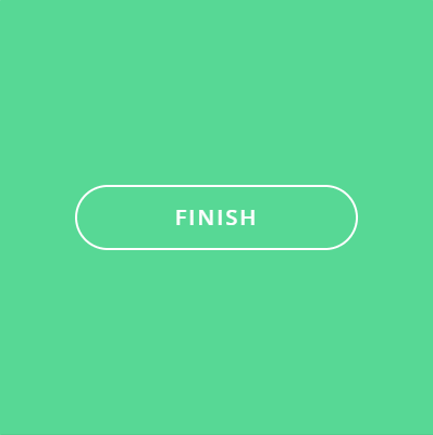
在寫鐵人賽文章時,我們常常會按下儲存草稿,這時候會有一個完成的動畫~一個圓圈轉動配上一個勾勾,簡單俐落!
今天我們來實作Day #24
CodePen: https://codepen.io/stevetanus/pen/OJZvzBJ
<div class="frame">
  <input type="checkbox" id="button" class="hidden" />
  <label for="button" class="button">Finish
      <img src="https://100dayscss.com/codepen/checkmark-green.svg" alt="green mark" /></label>
  <svg class="circle">
    <circle cx="30" cy="30" r="29" />
  </svg>
</div>
.frame有input:checkbox、label、img、SVG圓形,label寫入finish,img為綠色勾勾的圖片。
.hidden {
  display: none; // 移除它
}
.button {
  box-sizing: border-box;
  position: absolute;
  ... // 置中
  border: 2px solid #fff;
  border-radius: 30px; // 橢圓形按鈕
  text-transform: uppercase;
  font-weight: 600;
  letter-spacing: 2px;
  transition: all .3s ease-in-out;
  cursor: pointer;

  &:hover {
    background: #37BE77; // 較深的綠色
  }

  img {
    position: absolute;
    z-index: 2;
    top: 16px;
    left: 15px;
    opacity: 0;
  }
}
text-transform、font-weight、letter-spacing三者搭配使得文字更加雄偉。
裡面的img置於.button的中心,一開始為透明的。
因.button屬於label tag,所以我們加上cursor: pointer和hover效果,讓它變得像是按鈕。
<circle cx="30" cy="30" r="29" class="path"/>
.circle {
  position: absolute;
  width: 60px;
  height: 60px;
  ... // 置中
  fill: none;
  stroke: #fff;
  stroke-width: 2px;
  stroke-linecap: round;
  stroke-dasharray: 183;
  stroke-dashoffset: 183;
  pointer-events: none;
  rotate: -90deg; // 從圓形頂點開始動畫
}
.circle為半徑29px的圓形,帶有2px的邊框線,這邊我們試著用getTotalLength來抓stroke-dasharray動畫的長度:
const path = document.querySelector('.path');
console.log(path.getTotalLength())
// 181.91799926757812
我們設定stroke-dasharray: 182、stroke-dashoffset: 182發現圓形的上方多了一點點邊框線沒有被推移到,所以我們將數值設為183。 ------->
input:checked {

  & ~ .button {
    // 會在0.3s寬度變為60px,一樣維持在中心
    width: 60px;
    left: 170px;
    // 先跑button的動畫,延遲1.5s跑fill的動畫
    animation: button .5s ease both, fill .5s ease-out 1.5s forwards;

    img {
      animation: check .5s ease-out 1.5s both;
    }
  }

  & ~ .circle {
    // 延遲0.5s,動畫2s,最後跑完的光環動畫
    animation: circle 2s ease-out 0.5s both;
  }
}
@keyframes button {
  0% {
    border-color: #fff;
    color: #fff;
  }
  50% {
    color: transparent;
  }
  100% {
    border-color: #45B078;
    background: transparent;
    color: transparent;
  }
}
50%時文字透明,100%時背景跟邊框線變顏色。
/* animation-fill-mode: forwards; 使.button最後背景為白色 */
@keyframes fill {
  0% {
    background: transparent;
    border-color: #fff;
  }
  100% {
    background: #fff;
  }
}
@keyframes check {
	0% {
		opacity: 0;
	}
	100% {
		opacity: 1;
	}
}
@keyframes circle {
  0% {
    stroke-dashoffset: 183;
  }
  /* 圓環繞一圈 */
  50% {
    stroke-dashoffset: 0;
    stroke-dasharray: 183;
    rotate: -90deg;
    scale: 1;
    opacity: 1;
  }
  /* 圓環放大2倍並消失 */
   90%, 100% {
    stroke-dasharray: 500;
    rotate: -90deg;
    scale: 2;
    opacity: 0;
  }
}
值得注意的地方是,在圓環scale: 2的時候,stroke-dasharray的數值也要提高,才不會有缺口產生(500為大過於圓環的路徑長度,才會顯現完整的圓環)。
CSS
| 目標 | 屬性 |
|---|---|
| 字型變化 | text-transform、font-weight、letter-spacing |
| 光環放大 | scale與stroke-dasharray的提升 |
| 維持動畫結束屬性 | animation-fill-mode: forwards |
Today is my lucky day ~ thanks for your patience ~ we are about to finish!


 看影片追技術