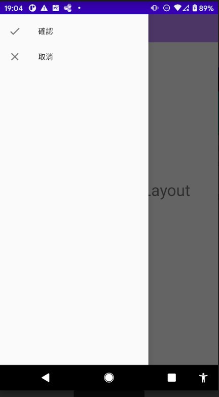
DrawerLayout 是一個隱藏式的側拉選單,效果確實如其名稱"抽屜"一樣,讓我們來看看他式怎麼使用的
放入想出現在側拉選單的內容。
<?xml version="1.0" encoding="utf-8"?>
<menu xmlns:android="http://schemas.android.com/apk/res/android"
    xmlns:app="http://schemas.android.com/apk/res-auto">
    <item
        android:id="@+id/menu_confirm"
        android:title="確認"
        android:icon="@drawable/ic_baseline_done_24" />

    <item
        android:id="@+id/menu_cancel"
        android:title="取消"
        android:icon="@drawable/ic_baseline_close_24" />
</menu>
<?xml version="1.0" encoding="utf-8"?>
<androidx.drawerlayout.widget.DrawerLayout
    xmlns:android="http://schemas.android.com/apk/res/android"
    xmlns:app="http://schemas.android.com/apk/res-auto"
    xmlns:tools="http://schemas.android.com/tools"
    android:id="@+id/drawer_layout"
    android:layout_width="match_parent"
    android:layout_height="match_parent">

    <!--內容ui-->

</androidx.drawerlayout.widget.DrawerLayout>
負責管理側拉選單內的功能,在此與第一步的menu綁定(app:menu="@menu/drawer_menu")
<?xml version="1.0" encoding="utf-8"?>
<androidx.drawerlayout.widget.DrawerLayout
    xmlns:android="http://schemas.android.com/apk/res/android"
    xmlns:app="http://schemas.android.com/apk/res-auto"
    xmlns:tools="http://schemas.android.com/tools"
    android:id="@+id/drawer_layout"
    android:layout_width="match_parent"
    android:layout_height="match_parent">

    <!--內容ui-->
    <com.google.android.material.navigation.NavigationView
        android:id="@+id/display_nvg"
        android:layout_width="wrap_content"
        android:layout_height="match_parent"
        android:layout_gravity="start"
        app:itemTextColor="@color/black"
        app:menu="@menu/drawer_menu" />

</androidx.drawerlayout.widget.DrawerLayout>
    private Toolbar toolbar;
    private DrawerLayout drawerLayout;
    private NavigationView display_nvg;
    private final Context mContext = this;
    @Override
    protected void onCreate(Bundle savedInstanceState) {
        super.onCreate(savedInstanceState);
        setContentView(R.layout.activity_main);
        toolbar = findViewById(R.id.toolbar);
        drawerLayout = findViewById(R.id.drawer_layout);
        display_nvg = findViewById(R.id.display_nvg);
        Log.e("TAG", "onCreate: "+drawerLayout);
        //設置toolbar、記得去theme改NoActionBar
        setSupportActionBar(toolbar);
        //設置切換按鈕(左上角三條線)
        ActionBarDrawerToggle toggle =
                new ActionBarDrawerToggle(this,drawerLayout,toolbar,
                        R.string.drawer_open,R.string.drawer_close);
        //與Drawer綁定
        drawerLayout.addDrawerListener(toggle);
        toggle.syncState();
        //NavigationView 內容點擊監聽
        display_nvg.setNavigationItemSelectedListener(
        new NavigationView.OnNavigationItemSelectedListener() {
            @Override
            public boolean onNavigationItemSelected(@NonNull MenuItem item) {
                //透過munu中的id尋找被點擊的項目
                switch (item.getItemId()){
                    case R.id.menu_confirm:
                        Toast.makeText(mContext,"確認",Toast.LENGTH_SHORT).show();
                        return true;
                    case R.id.menu_cancel:
                        Toast.makeText(mContext,"取消",Toast.LENGTH_SHORT).show();
                        return true;
                }
                return false;
            }
        });
    }
以上就是簡單的DrawerLayout與NavigationView的配合應用,可以發揮自己的想像力應用,增加自己UI的多樣性,我個人認為是個實用且好看的元件,推薦給大家拉~
<?xml version="1.0" encoding="utf-8"?>
<LinearLayout xmlns:android="http://schemas.android.com/apk/res/android"
    xmlns:app="http://schemas.android.com/apk/res-auto"
    android:layout_width="match_parent"
    android:layout_height="match_parent"
    android:orientation="vertical">

    <LinearLayout
        android:layout_width="match_parent"
        android:layout_height="250dp"
        android:gravity="center|center_vertical"
        android:padding="30dp"
        android:background="@color/purple_500"
        android:orientation="vertical">

        <ImageView
            android:id="@+id/imageView4"
            android:layout_width="150dp"
            android:layout_height="150dp"
            android:background="@drawable/profile_frame"
            app:srcCompat="@drawable/ic_baseline_person_24" />
        <TextView
            android:id="@+id/name_txt"
            android:layout_width="wrap_content"
            android:layout_height="wrap_content"
            android:layout_gravity="right"
            android:textSize="20sp"
            android:textColor="@color/black"
            android:text="" />
    </LinearLayout>
</LinearLayout>
<com.google.android.material.navigation.NavigationView
        android:id="@+id/display_nvg"
        android:layout_width="wrap_content"
        android:layout_height="match_parent"
        android:layout_gravity="start"
        app:itemTextColor="@color/black"
        app:headerLayout="@layout/navigation_header_layout"
        app:menu="@menu/drawer_menu" />
這可以讓NavigationView看起來更提升一個等級,我個人覺得一定要知道,而且只需要新增一個xml和短短增加一行就能達成,讓我們來看看效果:
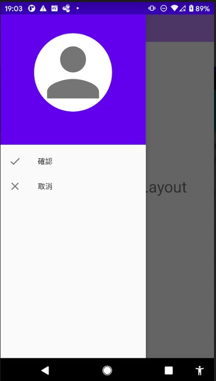
是不是看起來豐富好看多了呢!
以上就是今天的內容拉,希望對各位有幫助。


 iThome鐵人賽
 看影片追技術