觸控手機問世的那一刻,Button 就成了每個應用程式中不可或缺的元件。這也是我想把它擺到第一位來介紹的主因,作為 Mobile 移動端的開發工程師,都無法繞過它。今天我就來替各位整理一下在 Material Design 的架構下,如何去設計一個 Button,讓用戶透過 Motion Event 與應用程式互動與操作。若是對 Motion Event 有興趣的話,剛好我寫有過一篇文章淺淺的講過 ( 無情工商 )
Button Design 分為下面幾個段落來介紹
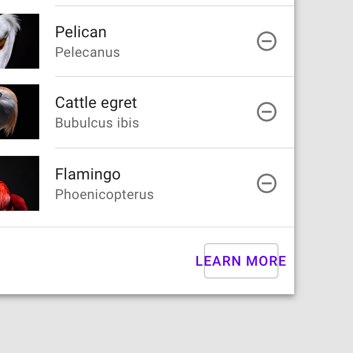
Button 告知用戶在此頁面可採取哪些行動,通常被放在各種 UI 裡面,例如 : Dialog、BottomSheet、Cards、Toolbar 等等
Button 的型態有四種,應用在不同的情境上,這邊簡單看過,後面會分別詳細介紹
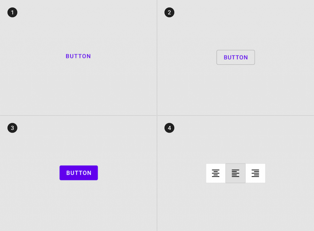
相對於其他種類不太顯眼。使用上,代表著較為不重要的 action
是比起 Text Button 再稍微更顯眼一點。使用上,代表的重要程度位於 Text 與 Contained
擁有最高的顯眼程度,使用上,作為畫面中最重要的 action,例如: 傳送資料、導航頁面
一群有關聯性的 Button 集合,通常應用在畫面排序與組合切換。使用頻率上會是最低的類型
在組成一個 Button 上,分別有標示 action 的 icon 與 Text label,還有它的容器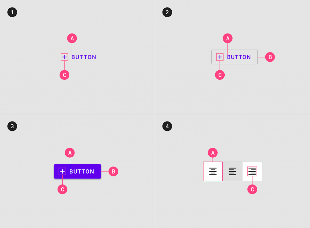
每個不同類型的 Button,在組成上都有些許的差異,像是 Text Button 就不需要 Container 來顯示顏色;icon 則是端看 Text label 在文字上表明的夠不夠清楚,在添加使用。若 icon 本身就可以簡潔表達,也可不使用 Text label。可以組合的方式非常多元,並適用在不同的場景之中
A . Text label
B . Container
C . Icon
是用來描述當前對應的 action 功能作用。如果 Button 沒有 Text label 的輔助下,那就只能透過 icon 來表達 Button 所代表的功能
在 Material Design 的默認情況下,Text 都會是大寫的形式,這設計是為了與其他 Text 元件做出區別
如果不想使用這種設計,那就要透過其他方式來區分,例如 : 顏色、大小、位置等等
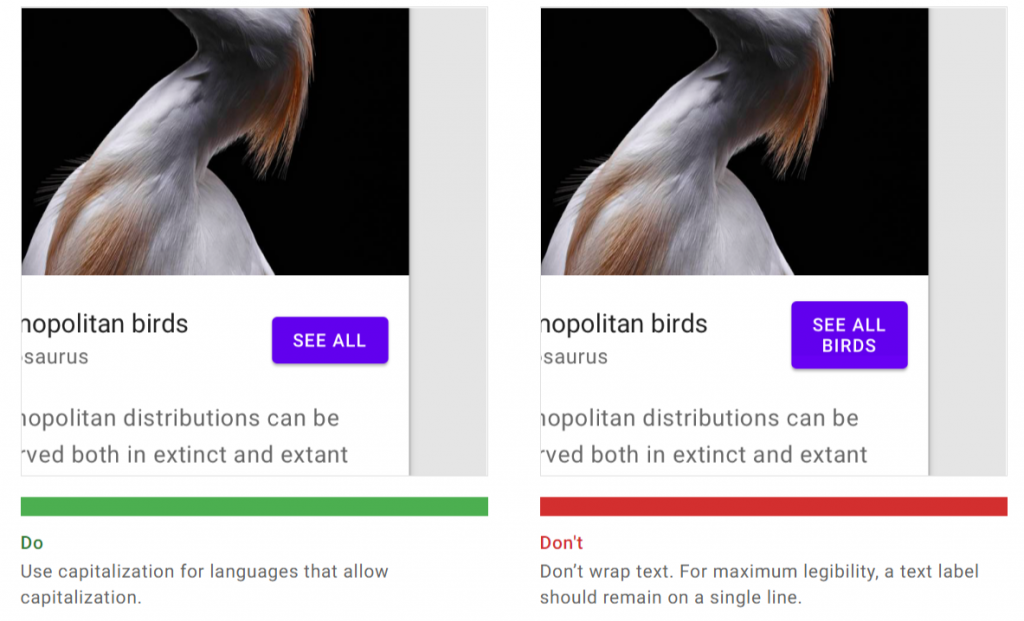
設計 Text label 時,記得不要有多行的文字排序,這會讓 Button 大小出現非預期的狀況
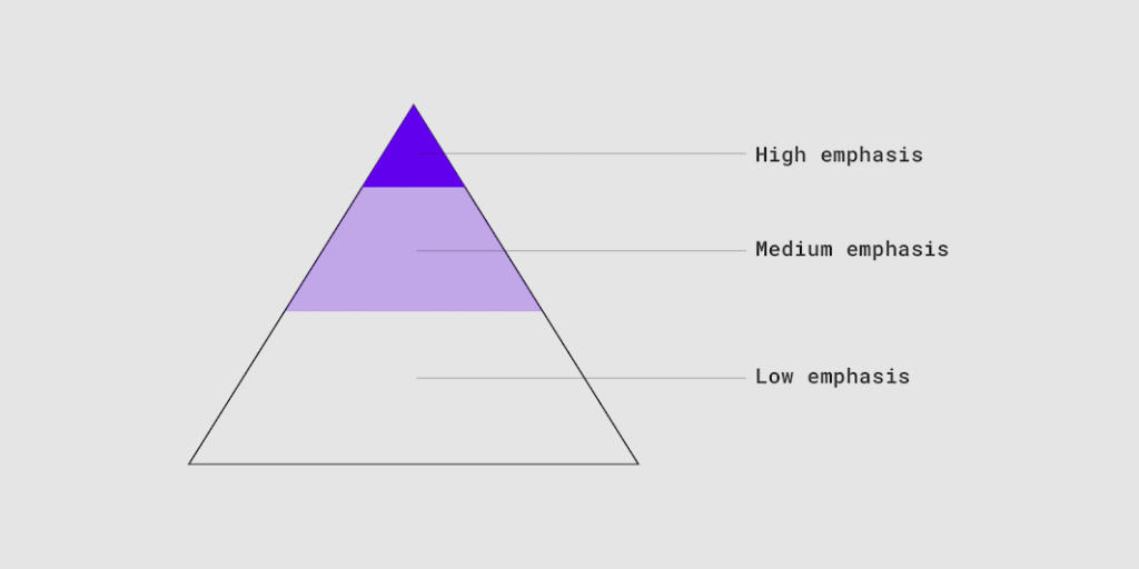
一個畫面應該會只有一個特別突出的 Button
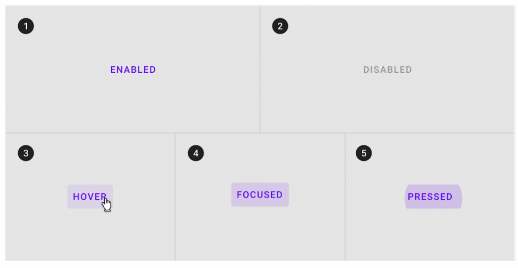
在佈局當中,我們可能會有多個 Button 來讓用戶使用,但若是沒有區分或層次差異,會讓用戶不知所措。所以這之間必須要有層次的關係。因為這樣的區分,才能讓用戶了解哪個 Button 是重要的。我們可以透過官方圖檔中的顏色,來分類之間的重要性
若畫面上,需要許多 Button 來對應不同 action,就能使用不同的 Button type 來表達其重要性級別
若是有相對應的操作,例如確認或取消,如果當前情境是希望使用者按下確認的,就會使用較為顯眼的 Contained Button,而與之對應的取消則使用 Text 或是 Outline Button。而 Button 裡面的 Text label 顏色要相互動應,使 Button 的顏色進行對比

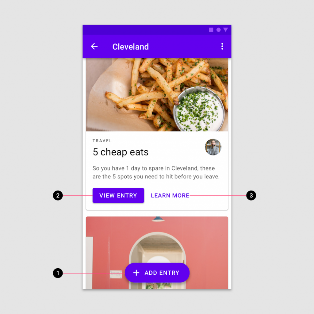
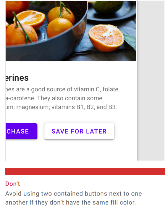
所以應該避免同時使用兩個 Contained Buttons 且沒有相同的填充顏色,不要將它們並排,這會讓用戶不知道兩種 Button 的功用與差異
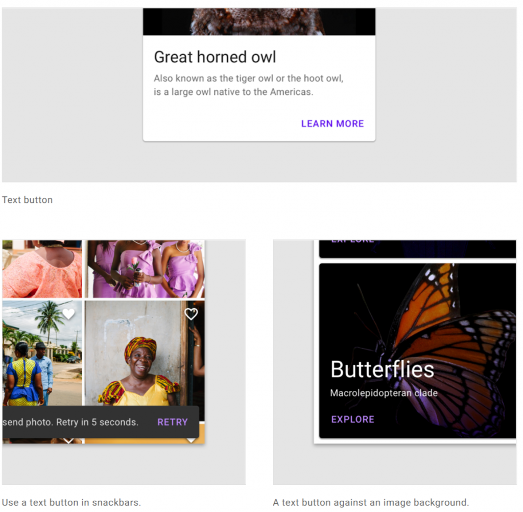
通常使用在 Dialog、Cards、SnackerBar,作為較不明顯並傳達低重要度的 action
作為Text Button的靈魂,直接告知了用戶當前這個 Button 的 action,而在呈現要與內容或是其他有 Text 的元件作區別,可以透過大小、顏色或字體來提升顯眼程度
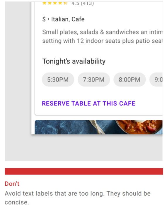
Text label 應該簡短有力,避免過長的 Text,這會讓用戶在閱讀與判斷上花費太多時間
TextButton 通常出現嵌入的元件之內,例如在 Dialog 或 Cards 上面,這樣能讓當中的內文與自己聯繫起來。而又因為 TextButton 沒有填色,所以不會搶占太多使用者的目光
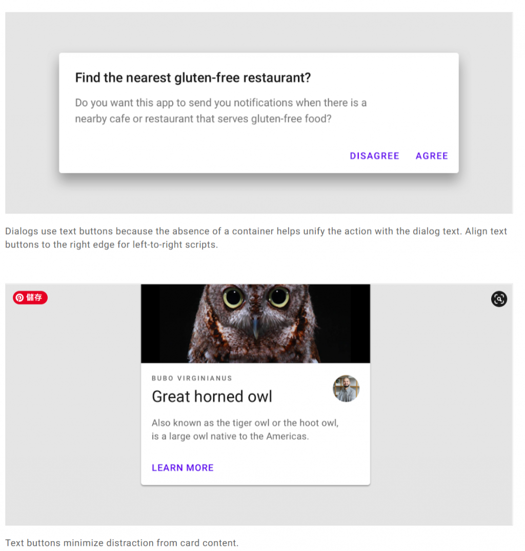
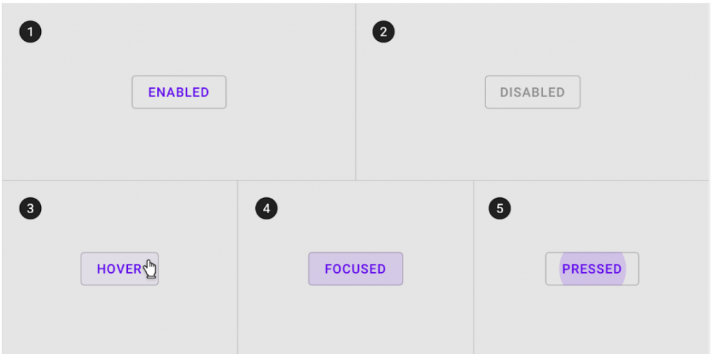
可放置在各種背景的前面。在用戶與 Button 交互之前,它的 Container 是不可見。為了保持可訪問性,Material Design 為區別各種 state 使用不同顏色透明度疊加。這種設計在 Text Button 設計上特別重要,否則用戶會無法區別它與一般的 TextView 有任何差異,也不會認為它是一種 Button 而去點擊操作
做為第二顯眼型態的 Button,所傳達的 action 也只是次等重要的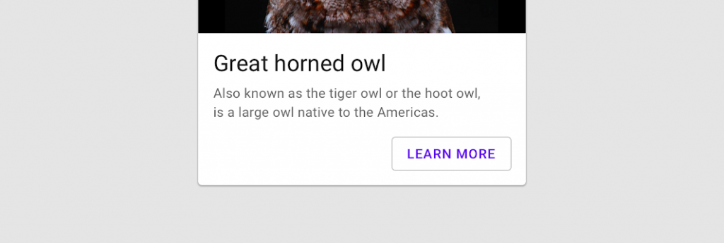
由外框限的 Stroke 與 Text label 組成,這與其他 Button 的特點在於 Stroke,所以也有不同的表現手法
而要注意在設置上,不要讓 Text label 超出框線
由於 Outline Button 沒有填色,與畫面背景色相容再一起,所以 Text label 的顏色應要避免相同
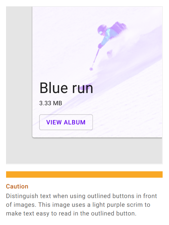
可以放置在各種背景之上,因為 Container 是透明的,在用戶與 Button 交互之前,顏色是不可見的。為了保持可訪問性,Material Design 為區別各種 state 使用不同不透明度疊加
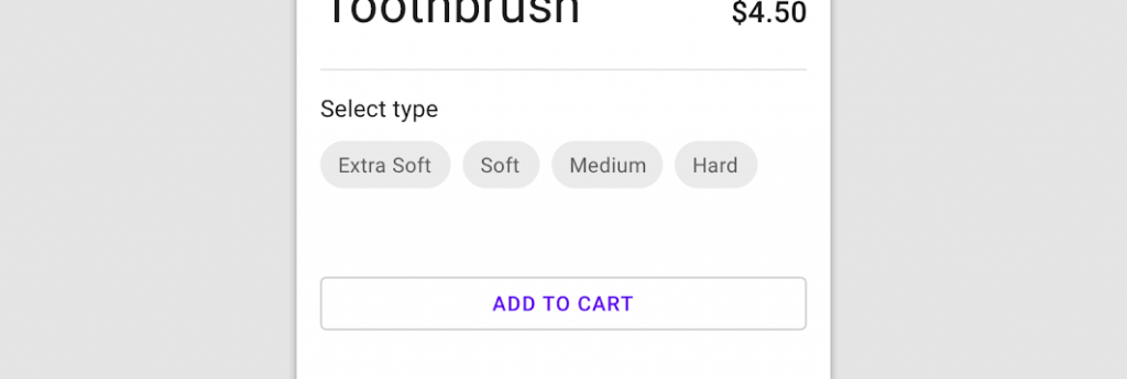
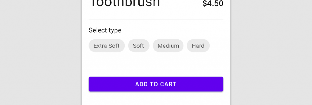
作為最高層級與顯眼的 Button,所對應的操作功能是最重要的
與其他 Button 差異最大的特點在於 Filled (填色) ,呈現出最顯眼的效果
設計上,要避免 Container 太小,導致 Text label 被截斷,無法傳達正確訊息給用戶
Contained 與其他 Button 不同之處其一,就是放置 icon 搭配 Text label,能更加顯眼與清楚的表達
避免 icon 與 Text label 是垂直的排列關係,這不易於閱讀與理解
也不要同時出現兩個 icon,這會讓用戶搞不清楚 Button 實際功能為何
陰影也是 Contained Button 的特色之一,較高的陰影設計會讓 Button 在呈現上感覺是浮上來的效果,像是一個真正實體的按鈕,讓 Button 與其他元件更有識別性
由於 Container 是填色的,所以比起 Text、Outlined Button 在主題色的不透明漸層程度上有所區別,會更加的透明甚至接近白色,避免與 Container 的填色重疊,讓用戶無法判斷
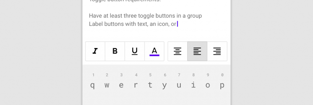
是一群相關性極高的 Button 放在一起的組合
在設計上,可以是單選的(切換排序),或是多選的 (設定字體的型態)
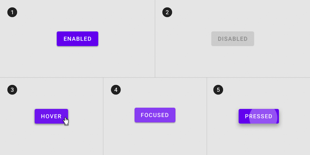
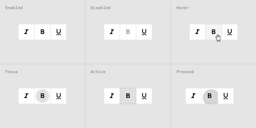
Toggle 與其他 Button 的 State 不大相同,因為要反饋選取狀態給用戶,而不只是點擊
選取當下,會改變 Text label、Icon 與 Container 的顏色,區別選取與未選取的狀態
Button 的篇幅有點長 (差點寫到吐) ,因為 Button 有四個種類,而每個種類又有不同的 Container、Placement、State 等等,但也代表 Material Design 在對 Button 的設計上,下了很多苦心。
相信看完之後大家對於 Button 有一定的概念,就可以依照不同的情境去使用不同樣式的 Button。還能透過顏色的深淺來影響用戶對 Button 重要性的認知,設計出符合使用者情境的畫面。
下一篇就會帶到 Button 實作的部分,此篇文章若有任何不解或誤導再請各位大神多多包容提醒 

 iThome鐵人賽
 看影片追技術