本系列文已改編成書「甚麼?網頁也可以做派對遊戲?使用 Vue 和 babylon.js 打造 3D 派對遊戲吧!」
書中不只重構了程式架構、改善了介面設計,還新增了 2 個新遊戲呦!ˋ( ° ▽、° )
新遊戲分別使用了陀螺儀與震動回饋,趕快買書來研究研究吧!ლ(╹∀╹ლ)
在此感謝深智數位的協助,歡迎大家前往購書,鱈魚感謝大家 (。・∀・)。
助教:「所以到底差在哪啊?沒圖沒真相,被你坑了都不知道。(´。_。`)」
鱈魚:「你對我是不是有甚麼很深的偏見啊 (っ °Д °;)っ,來人啊,上連結!」

有背景後,接著打造選單按鈕,建立 btn-base 檔案。
src\components\btn-base.vue
<template>
</template>

<script setup lang="ts">
import { ref } from 'vue';

interface Props {
  label?: string;
}
const props = withDefaults(defineProps<Props>(), {
  label: '',
});

const emit = defineEmits<{
  (e: 'update:modelValue', value: string): void;
}>();
</script>

<style scoped lang="sass">
</style>
接著分析一下期望的按鈕功能:
首先定義參數。
interface Props {
  label?: string;
  labelColor?: string;
  labelHoverColor?: string;
  strokeColor?: string;
  strokeHoverColor?: string;
  strokeSize?: string;
}
const props = withDefaults(defineProps<Props>(), {
  label: '',
  labelColor: 'white',
  labelHoverColor: undefined,
  strokeColor: '#888',
  strokeHoverColor: undefined,
  strokeSize: '2'
});
新增變數,用來表示狀態。
<script lang="ts">
export interface State {
  active: boolean,
  hover: boolean,
}
</script>

<script setup lang="ts">
...

const state = reactive<State>({
  active: false,
  hover: false,
});
</script>
這裡將 State 透過 export 匯出,讓其他地方使用此組件時使用
先讓我們把按鈕加到 the-home 中,讓我們一步一步地完成按鈕樣式。
src\views\the-home.vue
<template>
  <background-polygons-floating class="absolute inset-0">
    ...
  </background-polygons-floating>

  <div class="absolute inset-0 flex flex-col flex-center gap-20">
    <btn-base />
  </div>
</template>

<script setup lang="ts">
...
import BtnBase from '../components/btn-base.vue';
</script>
現在回到按鈕組件,首先是最外層的部分。
<template>
  <div
    class="btn flex flex-center text-3xl p-12 rounded-full"
    :class="btnClass"
  >
    <slot :state="state" />
  </div>
</template>

...

<script setup lang="ts">
...

...

const btnClass = computed(() => ({
  active: state.active,
}));
</script>

<style scoped lang="sass">
.btn
  backdrop-filter: blur(6px)
  background: rgba(white, 0.2)
  box-shadow: 2.8px 2.8px 2.2px rgba(0, 0, 0, 0.006), 6.7px 6.7px 5.3px rgba(0, 0, 0, 0.008), 12.5px 12.5px 10px rgba(0, 0, 0, 0.01), 22.3px 22.3px 17.9px rgba(0, 0, 0, 0.012), 41.8px 41.8px 33.4px rgba(0, 0, 0, 0.014), 100px 100px 80px rgba(0, 0, 0, 0.02)
  user-select: none
  overflow: hidden
  cursor: pointer
  transition-timing-function: cubic-bezier(0.000, 1.650, 1.000, 1.650)
  transition-duration: 0.2s
  &.active
    transform: scale(0.98) rotate(-1deg)
    transition-timing-function: cubic-bezier(0.34, 1.56, 0.64, 1)
</style>
接著加入 label 文字的部份。
<template>
  <div
    class="btn flex flex-center text-3xl p-12 rounded-full"
    :class="btnClass"
  >
    <slot :state="state" />

    <!-- label -->
    <div class="label relative font-black tracking-widest">
      {{ props.label }}
    </div>
  </div>
</template>
目前看起來應該長這樣。
看起來真不是普通的醜,別擔心,還沒結束 ( •̀ ω •́ )✧
把 Props 中的參數做成 label 樣式,新增 labelStyle。
const labelStyle = computed(() => {
  let color = props.labelColor;

  if (props.labelHoverColor) {
    color = state.hover ? props.labelHoverColor : props.labelColor;
  }

  return {
    color,
  }
});
綁定至對應的標籤並追加 CSS class。
<template>
  <div
    ...
  >
    <slot :state="state" />

    <!-- label -->
    <div
      class="label relative font-black tracking-widest"
      :style="labelStyle"
    >
      {{ props.label }}
    </div>
  </div>
</template>

...

<style scoped lang="sass">
...

.label
  transition-duration: 0.4s
</style>
接著實現文字外框的效果,使用 SVG 實現文字外框效果,若要將 SVG 效果綁定至 class 中,需要指定 id,為了避免 id 重複,這裡使用 nanoid 產生唯一 ID
<template>
  <div ... >
    ...
    <!-- label -->
    <div ... >
      ...
      <!-- stroke -->
      <div
        class="label-stroke absolute"
        :style="strokeStyle"
      >
        {{ props.label }}
      </div>
    </div>

    <svg
      version="1.1"
      style="display: none;"
    >
      <defs>
        <filter :id="svgFilterId">
          <feMorphology
            operator="dilate"
            :radius="props.strokeSize"
          />
          <feComposite
            operator="xor"
            in="SourceGraphic"
          />
        </filter>
      </defs>
    </svg>
  </div>
</template>

...

<script setup lang="ts">
...

const id = ref(nanoid());

const svgFilterId = computed(() => `svg-filter-${id.value}`);

const strokeStyle = computed(() => {
  let color = props.strokeColor;

  if (props.strokeHoverColor) {
    color = state.hover ? props.strokeHoverColor : props.strokeColor;
  }

  return {
    color,
    filter: `url(#${svgFilterId.value})`
  }
});

</script>

<style scoped lang="sass">
...

.label
  transition-duration: 0.4s

.label-stroke
  top: 0px
  transition-duration: 0.4s
</style>
外框出現了!
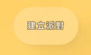
現在讓我們指定一下顏色。
src\views\the-home.vue
<template>
  ...

  <div class="absolute inset-0 flex flex-col flex-center gap-20">
    <btn-base
      label="建立派對"
      label-hover-color="#ff9a1f"
      stroke-color="#856639"
      stroke-hover-color="white"
    />
  </div>
</template>

...
看起來比較像樣一點了。( ̄︶ ̄)
最後綁定各類事件,讓按鈕產生互動效果吧。
<template>
  <div
    class="btn flex flex-center text-3xl p-12 rounded-full"
    :class="btnClass"
    @click="handleClick()"
    @mouseenter="handleMouseenter"
    @mouseleave="handleMouseleave"
    @mousedown="handleMousedown"
    @mouseup="handleMouseup"
  >
    ...
  </div>
</template>
...
<script setup lang="ts">
...
function handleClick() {
  emit('click');
}
function handleMouseenter() {
  state.hover = true;
}
function handleMouseleave() {
  state.hover = false;
}
function handleMousedown() {
  state.active = true;
}
function handleMouseup() {
  state.active = false;
}
</script>

<style scoped lang="sass">
...
</style>
現在看起來有模有樣了。(. ❛ ᴗ ❛.)
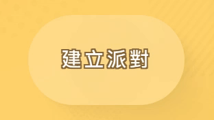
但是還是有點不太給力怎麼辦?沒問題,讓我們加點裝飾吧!首先把按鈕拉寬一點。
<template>
  ...

  <div class="absolute inset-0 flex flex-col flex-center gap-20">
    <btn-base
      class="menu-btn"
      ...
    />
  </div>
</template>

...

<style scoped lang="sass">
...

.menu-btn
  width: 30rem
</style>
接著使用 slot 插入裝飾用元素並加入 CSS 效果。
<template>
  ...

  <div class="absolute inset-0 flex flex-col flex-center gap-20">
    <btn-base
      ...
    >
      <template #default="{ state }">
        <div
          class="btn-content absolute inset-0"
          :class="{ 'hover': state.hover }"
        >
          <polygon-base
            class="absolute btn-polygon-lt"
            size="14rem"
            shape="round"
            fill="spot"
          />

          <q-icon
            name="sports_esports"
            color="white"
            size="8rem"
            class="absolute game-icon"
          />
        </div>
      </template>
    </btn-base>
  </div>
</template>
...
<style scoped lang="sass">
...

.btn-polygon-lt
  left: 0
  top: 0
  transform: translate(-50%, -60%)

.game-icon
  right: 0
  bottom: 0
  transform: translate(12%, 24%) rotate(-10deg)
  opacity: 0.6

.btn-content
  transform: scale(1)
  transition-duration: 0.4s
  transition-timing-function: cubic-bezier(0.545, 1.650, 0.520, 1.305)
  &.hover
    transform: scale(0.96) rotate(-2deg)
    transition-timing-function: cubic-bezier(0.34, 1.56, 0.64, 1)
</style>
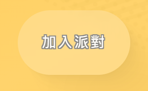
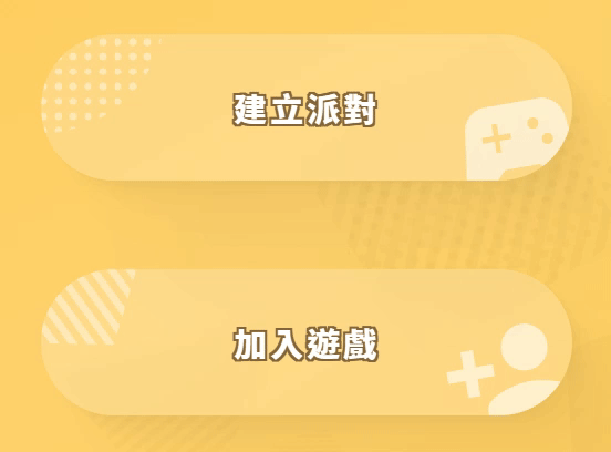
現在看起來不會那麼單調了!ヽ(✿゚▽゚)ノ

讀者們如果想要更複雜的效果,可以自行魔改喔!
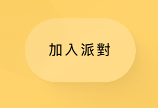
我們也把「加入遊戲」按鈕也加上去吧。
<template>
  ...

  <div class="absolute inset-0 flex flex-col flex-center gap-20">
    ...

    <btn-base
      class="menu-btn"
      label="加入遊戲"
      label-hover-color="#ff9a1f"
      stroke-color="#856639"
      stroke-hover-color="white"
    >
      <template #default="{ state }">
        <div
          class="btn-content absolute inset-0"
          :class="{ 'hover': state.hover }"
        >
          <polygon-base
            class="absolute btn-polygon-lt"
            size="14rem"
            rotate="144deg"
            shape="pentagon"
          />
          <q-icon
            name="person_add"
            color="white"
            size="7.8rem"
            class="absolute join-icon"
          />
        </div>
      </template>
    </btn-base>
  </div>
</template>

...

<style scoped lang="sass">
...

.join-icon
  right: 0
  bottom: 0
  transform: translate(6%, 20%) rotate(-10deg)
  opacity: 0.6

</style>
最後換個與畫面更協調的字體。
src\App.vue
...
<style lang="sass">
@import url('https://fonts.googleapis.com/css2?family=Noto+Sans+TC:wght@100;300;400;500;700;900&display=swap')

html, body, #app
  width: 100%
  height: 100%
  padding: 0
  margin: 0
  font-family: 'Noto Sans TC', sans-serif

...
</style>
主選單按鈕完成!(/≧▽≦)/
以上程式碼已同步至 GitLab,大家可以前往下載:

 看影片追技術