
延續上一篇 Floating Action Buttons (上)
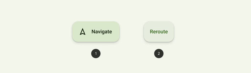
在上一篇FAB提到的icon必須清晰易懂,因為按鈕沒有文字描述,Extended FABs可以包括一個文字和icon。
但特別注意是ExtendedFloatingActionButton是屬於 MaterialButton的子類別,並非Floating Action Button的子類別,所以使用上會有些許不一樣。
例如在設定圖片時FloatingActionButton 使用app:srcCompat,然而ExtendedFloatingActionButton使用app:icon。
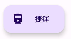
<androidx.coordinatorlayout.widget.CoordinatorLayout xmlns:android="http://schemas.android.com/apk/res/android"
    android:layout_width="match_parent"
    android:layout_height="match_parent"
    xmlns:app="http://schemas.android.com/apk/res-auto"
    android:orientation="vertical">

    <com.google.android.material.floatingactionbutton.ExtendedFloatingActionButton
        android:id="@+id/floating_action_button"
        android:layout_width="wrap_content"
        android:layout_height="wrap_content"
        android:layout_gravity="bottom|end"
        android:layout_margin="16dp"
        android:text="捷運"
        app:icon="@drawable/ic_railway_24"/>

</androidx.coordinatorlayout.widget.CoordinatorLayout>
res/values/theme.xml 新增指定style
在新增的ExtendedFloatingActionButton、FloatingActionButton,兩個分別的 parent 指定預設 style ,在透過 materialThemeOverlay取得新增指定style的內容,這樣ExtendedFAB、FAB的樣式主題就會相同
**指定style**
<style name="ThemeOverlay.App.FloatingActionButton" parent="">
        <item name="colorContainer">@color/purple_200</item>  --> 背景色
        <item name="colorOnContainer">@color/purple_700</item> --> 文字顏色
</style>

**ExtendedFloatingActionButton**
<style name="Widget.App.ExtendedFloatingActionButton" parent="Widget.Material3.ExtendedFloatingActionButton.Icon.Primary">
        <item name="materialThemeOverlay">@style/ThemeOverlay.App.FloatingActionButton</item>
</style>

**FloatingActionButton**
<style name="Widget.App.FloatingActionButton" parent="Widget.Material3.FloatingActionButton.Primary">
        <item name="materialThemeOverlay">@style/ThemeOverlay.App.FloatingActionButton</item>
</style>
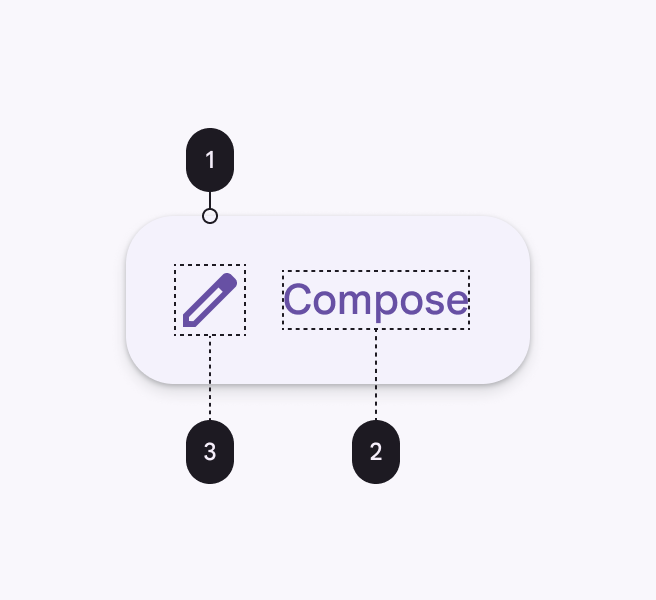
Container attributes、method、Default value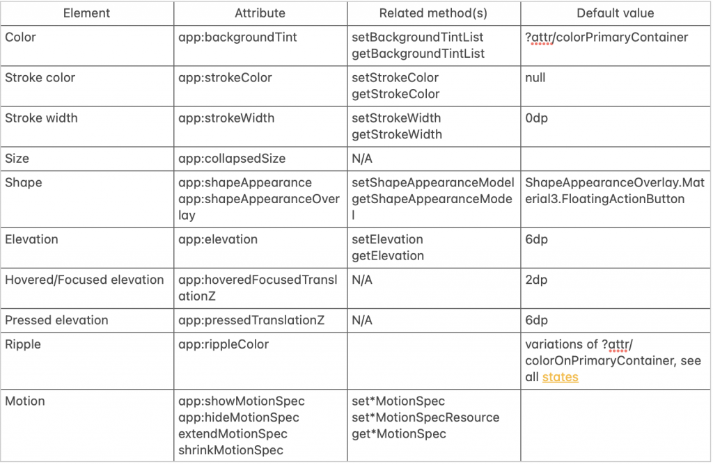
Icon attributes
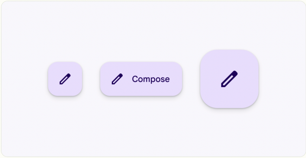
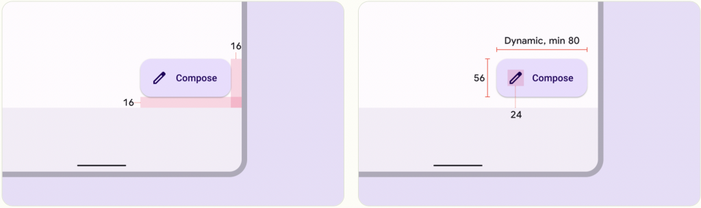
FloatingActionButton是不行調整icon大小,ExtendedFloatingActionButton得 icon 可以調整大小和padding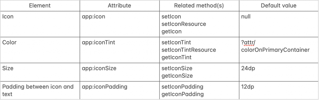
預設的Styles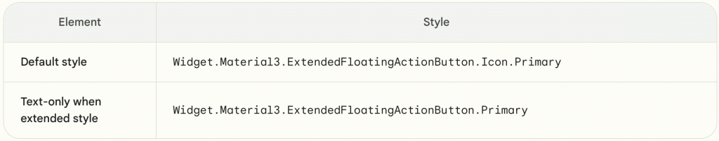
可以透過程式碼看到預設的參數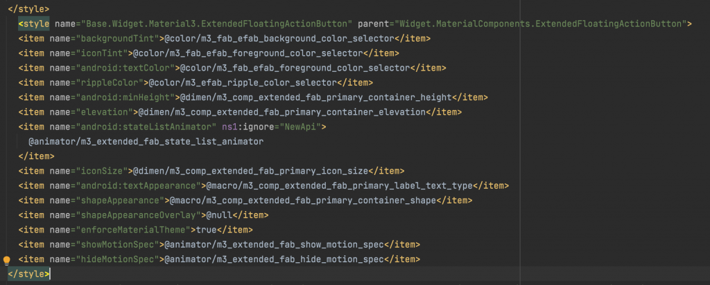
參考資料:Material Design Component Extended Floating Action Button

 看影片追技術