API and source code:
線性進度顯示,可以是確定性進度條,也可以是不確定性的連續動畫進度條
使用預設Style = Widget.MaterialComponents.LinearProgressIndicator
以下屬性可用於自定義元件的外觀:
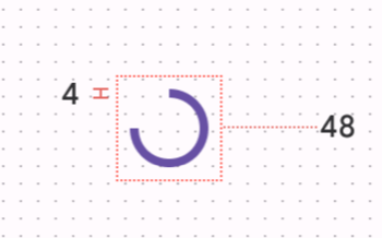
trackThickness:進度條和軌道的厚度。 (Default 4dp)indicatorColor:進度條的顏色。trackColor:線性進度軌道的顏色。trackCornerRadius:指示器和軌道圓角的半徑。indeterminateAnimationType:不確定的動畫的型別。indicatorDirectionLinear:進度條的掃蕩方向。確定性進度條
設定不確定性連續動畫android:indeterminate="true"
<com.google.android.material.progressindicator.LinearProgressIndicator
		android:layout_width="match_parent"
		android:layout_height="wrap_content" />
binding.progressLinear.setProgressCompat(10,false)
連續進度條動畫
<com.google.android.material.progressindicator.LinearProgressIndicator
		android:layout_width="match_parent"
		android:layout_height="wrap_content"
		android:indeterminate="true"/>
app:indicatorColor : 用來設置跑馬燈的顏色,要傳入一個 array color
<integer-array name="progress_colors">
			<item>@color/red</item>
			<item>@color/lightYellow</item>
			<item>@color/darkGreen</item>
</integer-array>
設置動畫類型 app:indeterminateAnimationType="disjoint"
每個顏色都會一段一段的出現
<com.google.android.material.progressindicator.LinearProgressIndicator
		...
		android:indeterminate="true"
		app:indeterminateAnimationType="disjoint"
		app:indicatorColor="@array/progress_colors"
		...
/>
設置動畫類型 app:indeterminateAnimationType="contiguous"
每個顏色都會接連出現,最少要求為3種顏色。 否則將丟擲IllegalArgumentException
<com.google.android.material.progressindicator.LinearProgressIndicator
        ...
        android:indeterminate="true"
        app:indeterminateAnimationType="contingous"
        app:indicatorColor="@array/progress_colors"
        ...
 />
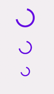
圓形進度顯示,透過沿無填充圓形軌道沿順時針方向動畫顯示進度。 可以使用在按鈕或卡片。
可以是確定性進度條,也可以是不確定性的連續動畫進度條

<com.google.android.material.progressindicator.CircularProgressIndicator
	android:layout_width="wrap_content"
	android:layout_height="wrap_content" />

設定不確定性連續動畫android:indeterminate="true"
<com.google.android.material.progressindicator.CircularProgressIndicator
	android:layout_width="wrap_content"
	android:layout_height="wrap_content"
	android:indeterminate="true" />
| Medium circularstyle | Widget.Material3.CircularProgressIndicator.Medium |
|---|---|
| Small circularstyle | Widget.Material3.CircularProgressIndicator.Small |
| Extra small circularstyle | Widget.Material3.CircularProgressIndicator.ExtraSmall |
默認情況下,indictor 在沒有動畫的情況下顯示或隱藏。
可以通過 app:showAnimationBehavior和 app:hideAnimationBehavior更改動畫行為
設定:
none (default) : 沒有使用動畫outward : 對於線性類型,從底邊折疊到頂邊,對於圓形類型,從內邊緣折疊到外邊緣。inward : 線性類型從上邊緣擴展到下邊緣,對於圓形類型,從外邊緣擴展到內邊緣。當動畫行為不是設定為 none 的時候,元件顯現會隨著動畫結束而改變,使用setVisibilityAfterHide 方法,去控制元件的可見狀態,就如同改變 Visibiltiy.INVISIBLE (default) or Visibility.GONE
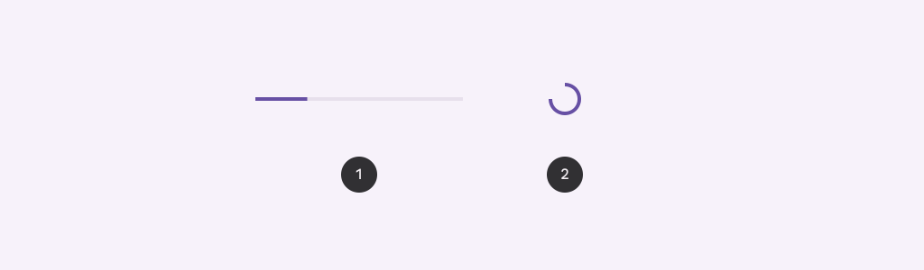
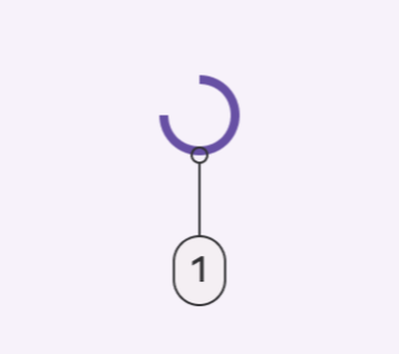
1.Active indicator
2.Track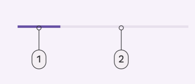
Layout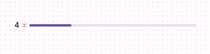
| Default linearstyle | Widget.Material3.LinearProgressIndicator |
|---|---|
| Default circularstyle | Widget.Material3.CircularProgressIndicator |
感謝您看到這邊 
參考資料:Material Design Progress indicator


 看影片追技術