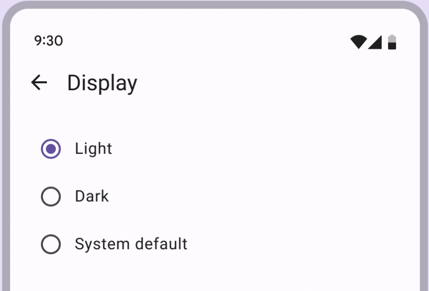
單選按鈕是一種選擇控制元件,當用戶需做出決定或從選項中選擇時使用,當列表中使用單選按鈕從選擇一個選項,如果選擇了單選按鈕,視覺上應該比未選定的專案更突出。
API and source code:
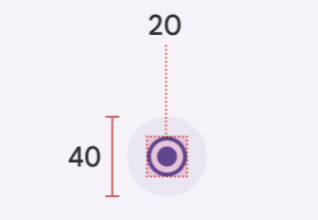
Radio button attributesapp:useMaterialThemeColors:使用主題顏色預設值:true,自定義設定"false"再透過 android:buttonTint 設定想要的顏色app:buttonTint:應用程式按鈕顏色android:minWidth:尺寸最小寬度android:minHeight:尺寸最小高度
Text label attributesandroid:text:設定文字android:textColor:顏色android:textAppearance:文字外觀
<com.google.android.material.radiobutton.MaterialRadioButton
            android:id="@+id/materialRadioButton"
            android:layout_width="wrap_content"
            android:layout_height="wrap_content"
            android:text="測試1" />
// 選取RadioButto按鈕
radioButton.isChecked = true

 // RadioButton檢查/取消檢查,設置監聽事件
radioButton.setOnCheckedChangeListener { buttonView, isChecked

}
使用Theme.Material3.主題時,RadioButton透過MaterialComponentsViewInflater自動為com.google.android.material.button.MaterialRadioButton

RadioGroup包裹所有的 RadioButtons,而 Group 本身是 Linearlayout 的子類,預設上是 vertical所以可以使用android:orientation="vertical"調整直的和橫的,Group 中的RadioGroup是只能選擇一個不能複選。
android:checkedButton" 屬性可以來預設初始狀態被選取的 RadioButton
<RadioGroup
    android:id="@+id/radioGroup"
    android:checkedButton="@+id/radio_button_1"
    android:layout_width="match_parent"
    android:layout_height="wrap_content">

		<RadioButton
        android:id="@+id/radio_button_1"
        android:layout_width="match_parent"
        android:layout_height="match_parent"
        android:text="@string/label_1"/>
    <RadioButton
        android:id="@+id/radio_button_2"
        android:layout_width="match_parent"
        android:layout_height="match_parent"
        android:text="@string/label_2"/>
    <RadioButton
        android:id="@+id/radio_button_3"
        android:layout_width="match_parent"
        android:layout_height="match_parent"
        android:text="@string/label_3"/>
    <RadioButton
        android:id="@+id/radio_button_4"
        android:layout_width="match_parent"
        android:layout_height="match_parent"
        android:text="@string/label_4"/>
    <RadioButton
        android:id="@+id/radio_button_5"
        android:layout_width="match_parent"
        android:layout_height="match_parent"
        android:enabled="false"
        android:text="@string/label_5"/>
</RadioGroup>
val checkedRadioButtonId = radioGroup.checkedRadioButtonId

 // radioGroup中的RadioButton已檢查/未檢查,設置監聽事件
radioGroup.setOnCheckedChangeListener { group, checkedId ->
   when(checkedId){
				R.id.radio_button_1 ->{}
				R.id.radio_button_2 ->{}
				R.id.radio_button_3 ->{}
				R.id.radio_button_4 ->{}
				R.id.radio_button_5 ->{}
		}
}
Default style Widget.Material3.CompoundButton.RadioButton

參考資料:Material Deaign RadioButton


 看影片追技術