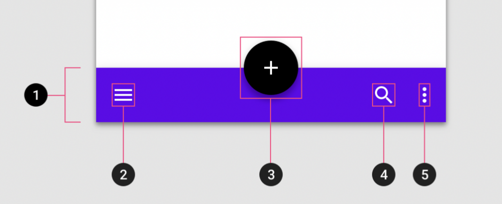
BottomAppBars 使用操作上是類似 NavigationBars,但NavigationBars使用在切換頁面,BottomAppBars使用上比較彈性可以是作為切換用,也可以是畫面上的特殊操作使用。
在使用BottomAppBar 元件API支援navigation icon、action items、overflow menu等新增操做案紐,雖然官方寫optional,但官方也強烈鼓勵使用。
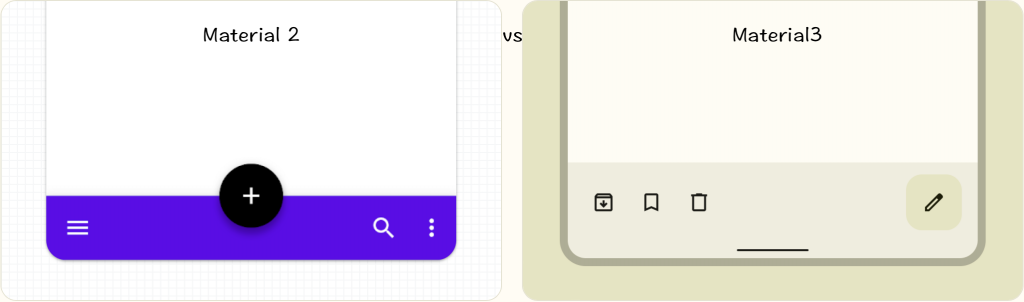
Material 2 : BottomAppBar的高度為8dp,不會包含FAB。
Material 3:BottomAppBar 高度變高,沒有陰影設定,可包含FAB。
API and source code:
BottomAppBar的Action item是讀取menu的item,需新增 menu.xml。
<androidx.coordinatorlayout.widget.CoordinatorLayout
		xmlns:android="http://schemas.android.com/apk/res/android"
    xmlns:app="http://schemas.android.com/apk/res-auto"
    android:layout_width="match_parent"
    android:layout_height="match_parent">

    <com.google.android.material.bottomappbar.BottomAppBar
        android:id="@+id/bottomAppBar"
        style="@style/Widget.Material3.BottomAppBar"
        android:layout_width="match_parent"
        android:layout_height="wrap_content"
        android:layout_gravity="bottom"
        app:menu="@menu/bottom_app_bar"/>

</androidx.coordinatorlayout.widget.CoordinatorLayout>
menu新增item時記得設ID,OnMenuItemClickListener取得itemId時會使用。
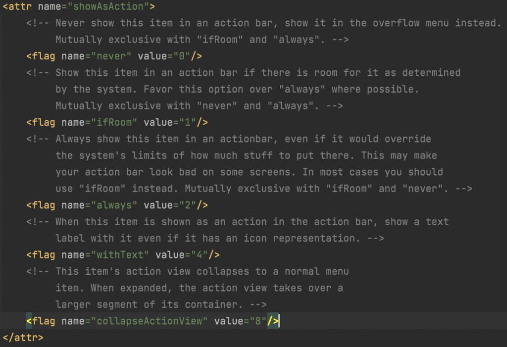
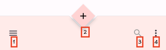
官方建議放在BottomAppBar時的item最多四個,通常menu的**attributes**可以設定是否根據操作欄位顯示空間 ****透過app:showAsAction設定。
根據需求調整app:showAsAction顯示設定,也是會影響到BottomAppBar的顯示方式
<menu xmlns:android="http://schemas.android.com/apk/res/android"
    xmlns:app="http://schemas.android.com/apk/res-auto">

    <item
        android:id="@+id/search"
        android:icon="@drawable/ic_search_24"
        android:title="搜尋"
        app:showAsAction="always" />

    <item
        android:id="@+id/delete"
        android:icon="@drawable/ic_delete_outline_24"
        android:title="垃圾桶"
        app:showAsAction="always" />

    <item
        android:id="@+id/archive"
        android:icon="@drawable/ic_archive_24"
        android:title="下載"
        app:showAsAction="always" />

    <item
        android:id="@+id/arrow_outward"
        android:icon="@drawable/ic_arrow_outward_24"
        android:title="點擊"
        app:showAsAction="always" />

</menu>
app:showAsAction 的相關設定
binding.bottomAppBar.setOnMenuItemClickListener{menuItemClick->
when (menuItemClick.itemId) {
        R.id.search-> true
        R.id.delete-> true
        R.id.archive-> true
        else -> true
    }
}
延續第一個的實作,再多新增FloatingActionButton

<androidx.coordinatorlayout.widget.CoordinatorLayout xmlns:android="http://schemas.android.com/apk/res/android"
    xmlns:app="http://schemas.android.com/apk/res-auto"
    android:layout_width="match_parent"
    android:layout_height="match_parent">

    <com.google.android.material.bottomappbar.BottomAppBar
        android:id="@+id/bottomAppBar"
        style="@style/Widget.Material3.BottomAppBar"
        android:layout_width="match_parent"
        android:layout_height="wrap_content"
        android:layout_gravity="bottom"
        app:menu="@menu/bottom_app_bar" />

    <com.google.android.material.floatingactionbutton.FloatingActionButton
        android:layout_width="wrap_content"
        android:layout_height="wrap_content"
        app:srcCompat="@drawable/ic_add_24"
        **app:layout_anchor="@id/bottomAppBar"** />

</androidx.coordinatorlayout.widget.CoordinatorLayout>

延續前面實作更改style="@style/Widget.Material3.BottomAppBar.Legacy" 即可呈現中間中間懸浮FAB
<?xml version="1.0" encoding="utf-8"?>
<androidx.coordinatorlayout.widget.CoordinatorLayout xmlns:android="http://schemas.android.com/apk/res/android"
    xmlns:app="http://schemas.android.com/apk/res-auto"
    android:layout_width="match_parent"
    android:layout_height="match_parent">

    <!-- Note: A RecyclerView can also be used -->
    <androidx.core.widget.NestedScrollView
        android:layout_width="match_parent"
        android:layout_height="match_parent"
        android:clipToPadding="false"
        android:paddingBottom="100dp">

        <!-- Scrollable content -->

    </androidx.core.widget.NestedScrollView>

    <com.google.android.material.bottomappbar.BottomAppBar
        android:id="@+id/bottomAppBar"
        style="@style/Widget.Material3.BottomAppBar.Legacy"
        android:layout_width="match_parent"
        android:layout_height="wrap_content"
        android:layout_gravity="bottom"
        app:menu="@menu/bottom_app_bar"
        app:navigationIcon="@drawable/ic_menu_24" />

    <com.google.android.material.floatingactionbutton.FloatingActionButton
        android:layout_width="wrap_content"
        android:layout_height="wrap_content"
        app:layout_anchor="@id/bottomAppBar"
        app:srcCompat="@drawable/ic_add_24" />

</androidx.coordinatorlayout.widget.CoordinatorLayout>
bottomAppBar.setNavigationOnClickListener {
    // Handle navigation icon press
}
顯示了當向下滾動可滾動內容時隱藏底部應用欄,並在向上滾動時出現。
https://firebasestorage.googleapis.com/v0/b/design-spec/o/projects%2Fm3%2Fimages%2Fl5vig8m9-scrolling_3P.mp4?alt=media&token=a652f69c-b761-43c2-bb25-796fb7fa8481
<androidx.coordinatorlayout.widget.CoordinatorLayout
    ...>

    ...

    <com.google.android.material.bottomappbar.BottomAppBar
        ...
        app:hideOnScroll="true"
        />

    ...

</androidx.coordinatorlayout.widget.CoordinatorLayout>
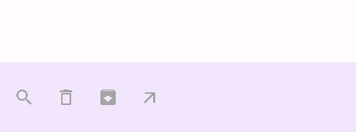
app:showAsAction="collapseActionView、never、withText" 都可以收納到Overflow menu顯示。
其他ifRoom、always兩個是互斥的,ifRoom會根據裝置寬度動態顯示,always是固定顯示比較會照成少部分跑版。
<menu xmlns:android="http://schemas.android.com/apk/res/android"
    xmlns:app="http://schemas.android.com/apk/res-auto">

    <item
        android:id="@+id/search"
        android:icon="@drawable/ic_search_24"
        android:title="搜尋"
        app:showAsAction="always" />

    <item
        android:id="@+id/delete"
        android:icon="@drawable/ic_delete_outline_24"
        android:title="垃圾桶"
        app:showAsAction="collapseActionView" />

    <item
        android:id="@+id/archive"
        android:icon="@drawable/ic_archive_24"
        android:title="下載"
        app:showAsAction="collapseActionView" />
    definition
    <item
        android:id="@+id/arrow_outward"
        android:icon="@drawable/ic_arrow_outward_24"
        android:title="點擊"
        app:showAsAction="collapseActionView" />

</menu>
建立新專案時通常會有Base application theme預設建立的主題色,可以再新增Customize your theme,這邊示範調整顏色
<!-- Base application theme. -->
    <style name="Theme.MCDProject" parent="Theme.Material3.Light">
        <!-- Primary brand color. -->
        <item name="colorPrimary">@color/purple_500</item>
        <item name="colorPrimaryVariant">@color/purple_700</item>
        <item name="colorOnPrimary">@color/white</item>
        <!-- Secondary brand color. -->
        <item name="colorSecondary">@color/teal_200</item>
        <item name="colorSecondaryVariant">@color/teal_700</item>
        <item name="colorOnSecondary">@color/black</item>
        <!-- Status bar color. -->
        <item name="android:statusBarColor" tools:targetApi="l">?attr/colorPrimaryVariant</item>
        **<!-- Customize your theme here. -->**
        <item name="shapeAppearanceSmallComponent">@style/cutFab</item>
        <item name="bottomAppBarStyle">@style/Widget.App.BottomAppBar</item>
        <item name="floatingActionButtonStyle">@style/Widget.App.FloatingActionButton</item>
    </style>

    **<!--Shape Appearance -->**
   <style name="cutFab"  parent="">
        <item name="cornerFamily">cut</item>
        <item name="cornerSize">@null</item>
    </style>

    **<!--BottomAppBar 繼承主題後使用新的主題-->**
    <style name="Widget.App.BottomAppBar" parent="Widget.Material3.BottomAppBar.Legacy">
        <item name="materialThemeOverlay">@style/ThemeOverlay.App.BottomAppBar</item>
    </style>

    **<!--FloatingActionButton 繼承主題後使用新的主題-->**
    <style name="Widget.App.FloatingActionButton" parent="Widget.Material3.FloatingActionButton.Primary">
        <item name="materialThemeOverlay">@style/ThemeOverlay.App.FloatingActionButton</item>
    </style>

    **<!--BottomAppBar 調整顏色-->**
    <style name="ThemeOverlay.App.BottomAppBar" parent="">
        <item name="colorContainer">@color/purple_200</item>
        <item name="colorOnContainer">@color/purple_700</item>
    </style>

    **<!--FloatingActionButton 調整顏色-->**
    <style name="ThemeOverlay.App.FloatingActionButton" parent="">
        <item name="colorContainer">@color/purple_200</item>
        <item name="colorOnContainer">@color/purple_700</item>
    </style>
FAB透過自訂義Style CutFab 設定cut 設定菱型
<androidx.coordinatorlayout.widget.CoordinatorLayout xmlns:android="http://schemas.android.com/apk/res/android"
    xmlns:app="http://schemas.android.com/apk/res-auto"
    android:layout_width="match_parent"
    android:layout_height="match_parent">

    <!-- Note: A RecyclerView can also be used -->
    <androidx.core.widget.NestedScrollView
        android:layout_width="match_parent"
        android:layout_height="match_parent"
        android:clipToPadding="false"
        android:paddingBottom="100dp">

        <!-- Scrollable content -->

    </androidx.core.widget.NestedScrollView>

    <com.google.android.material.bottomappbar.BottomAppBar
        android:id="@+id/bottomAppBar"
        style="@style/Widget.App.BottomAppBar" #自定義Style名稱
        android:layout_width="match_parent"
        android:layout_height="wrap_content"
        android:layout_gravity="bottom"
        app:menu="@menu/advanced_bottom_app_bar"
        app:navigationIcon="@drawable/ic_menu_24" />

    <com.google.android.material.floatingactionbutton.FloatingActionButton
        style="@style/Widget.App.FloatingActionButton"
        android:layout_width="wrap_content"
        android:layout_height="wrap_content"
        app:layout_anchor="@id/bottomAppBar"
        app:shapeAppearanceOverlay="@style/cutFab" #自定義菱形的形狀Style名稱
        app:srcCompat="@drawable/ic_add_24" />

</androidx.coordinatorlayout.widget.CoordinatorLayout>
BottomAppBarCutCornersTopEdge: Class source
FAB 自定義菱形的形狀Style 完成後,再來需要調整BottomAppBar 的形狀,才能吻合菱形

主要是繼承BottomAppBarTopEdgeTreatment然後在覆寫getEdgePath的方法,官方有提供Class source可以直接使用。
class **BottomAppBarCutCornersTopEdge** internal constructor(
    private val fabMargin: Float,
    roundedCornerRadius: Float,
    private val cradleVerticalOffset: Float
) :
    BottomAppBarTopEdgeTreatment(fabMargin, roundedCornerRadius, cradleVerticalOffset) {
    @SuppressLint("RestrictedApi")
    override fun getEdgePath(
        length: Float,
        center: Float,
        interpolation: Float,
        shapePath: ShapePath
    ) {
        val fabDiameter = fabDiameter
        if (fabDiameter == 0f) {
            shapePath.lineTo(length, 0f)
            return
        }
        val diamondSize = fabDiameter / 2f
        val middle = center + horizontalOffset
        val verticalOffsetRatio = cradleVerticalOffset / diamondSize
        if (verticalOffsetRatio >= 1.0f) {
            shapePath.lineTo(length, 0f)
            return
        }
        shapePath.lineTo(middle - (fabMargin + diamondSize - cradleVerticalOffset), 0f)
        shapePath.lineTo(middle, (diamondSize - cradleVerticalOffset + fabMargin) * interpolation)
        shapePath.lineTo(middle + (fabMargin + diamondSize - cradleVerticalOffset), 0f)
        shapePath.lineTo(length, 0f)
    }
}
activity將剛剛新增的自定義BottomAppBarCutCornersTopEdge透過bottomAppBar去設定background的MaterialShapeDrawable,setTopEdge(topEdge)。
val bottomAppBar = binding.bottomAppBar  // 這邊使用viewBinding取得bottomAppBar
val topEdge = BottomAppBarCutCornersTopEdge(
            bottomAppBar.fabCradleMargin,
            bottomAppBar.fabCradleRoundedCornerRadius,
            0.5f
)
val background = bottomAppBar.background as MaterialShapeDrawable
background.shapeAppearanceModel = background.shapeAppearanceModel
		.toBuilder()
	  .setTopEdge(topEdge)
    .build()
| Element | Attribute | Related method(s) | Default value |
|---|---|---|---|
| Color | app:backgroundTint | setBackgroundTintgetBackgroundTint | ?attr/colorSurface |
| Elevation | app:elevation | setElevation | 3dp |
| Height | android:minHeight | setMinimumHeightgetMinimumHeight | 56dp (default) and 64dp (w600dp) |
| Element | Attribute | Related method(s) | Default value |
|---|---|---|---|
| Icon | app:navigationIcon | setNavigationIcongetNavigationIcon | null |
| Color | app:navigationIconTint | setNavigationIconTint | ?attr/colorOnSurfaceVariant (as Drawable tint) |
| Element | Attribute | Related method(s) | Default value |
|---|---|---|---|
| Alignment mode | |||
| 對齊位置 | app:fabAlignmentMode | setFabAlignmentModegetFabAlignmentMode | end |
| Animation mode | app:fabAnimationMode | setFabAnimationModegetFabAnimationMode | slide |
| Anchor mode | app:fabAnchorMode | setFabAnchorModegetFabAnchorMode | embed |
| Cradle margin | app:fabCradleMargin | setFabCradleMargingetFabCradleMargin | 6dp |
| Cradle rounded corner radius 圓角半徑 | app:fabCradleRoundedCornerRadius | setFabCradleRoundedCornerRadiusgetFabCradleRoundedCornerRadius | 4dp |
| Cradle vertical offset 垂直偏移 | app:fabCradleVerticalOffset | setCradleVerticalOffsetgetCradleVerticalOffset | 12dp |
| End margin | app:fabAlignmentModeEndMargin | setFabAlignmentModeEndMargingetFabAlignmentModeEndMargin | N/A |
| Embedded elevation | app:removeEmbeddedFabElevation | N/A | true |
| Element | Attribute | Related method(s) | Default value |
|---|---|---|---|
| Menu | app:menu | replaceMenugetMenu | null |
| Icon color | N/A | N/A | ?attr/colorControlNormal (as Drawable tint) |
| Alignment mode 對齊位置 | app:menuAlignmentMode | setMenuAlignmentModegetMenuAlignmentMode | auto |
| Element | Attribute | Related method(s) | Default value |
|---|---|---|---|
| Icon | android:src and app:srcCompat in actionOverflowButtonStyle (in app theme) | setOverflowIcongetOverflowIcon | @drawable/abc_ic_menu_overflow_material (before API 23) or @drawable/ic_menu_moreoverflow_material (after API 23) |
| Theme | app:popupTheme | setPopupThemegetPopupTheme | @style/ThemeOverlay.Material3.* |
| Item typography | textAppearanceSmallPopupMenu and textAppearanceLargePopupMenu in app:popupTheme or app theme | N/A | ?attr/textAppearanceTitleMedium |
Default style theme attribute: bottomAppBarStyle
| Element | Style | |
|---|---|---|
| Default style | Widget.Material3.BottomAppBar | |
| Widget.Material3.BottomAppBar.Legacy |
"embed"會FAB放在BottomAppBar中。"end" 設定FAB放的位置在最後"start" menu設定開始對齊開頭
<style name="Widget.Material3.BottomAppBar" parent="Widget.MaterialComponents.BottomAppBar">
    <item name="android:minHeight">@dimen/m3_bottomappbar_height</item>
    <item name="maxButtonHeight">@dimen/m3_bottomappbar_height</item>
    <item name="fabAnimationMode">slide</item>
    <item name="fabAnchorMode">embed</item>
    <item name="removeEmbeddedFabElevation">true</item>
    <item name="fabAlignmentMode">end</item>
    <item name="menuAlignmentMode">start</item>
    <item name="fabAlignmentModeEndMargin">@dimen/m3_bottomappbar_fab_end_margin</item>
    <item name="fabCradleMargin">@dimen/m3_bottomappbar_fab_cradle_margin</item>
    <item name="fabCradleRoundedCornerRadius">
      @dimen/m3_bottomappbar_fab_cradle_rounded_corner_radius
    </item>
    <item name="fabCradleVerticalOffset">
      @dimen/m3_bottomappbar_fab_cradle_vertical_offset
    </item>
    <item name="elevation">@dimen/m3_comp_bottom_app_bar_container_elevation</item>

    <item name="backgroundTint">@macro/m3_comp_bottom_app_bar_container_color</item>
    <item name="navigationIconTint">?attr/colorOnSurfaceVariant</item>
    <item name="android:paddingLeft">@dimen/m3_bottomappbar_horizontal_padding</item>
    <item name="android:paddingStart">@dimen/m3_bottomappbar_horizontal_padding</item>
    <item name="android:paddingRight">@dimen/m3_bottomappbar_horizontal_padding</item>
    <item name="android:paddingEnd">@dimen/m3_bottomappbar_horizontal_padding</item>
    <item name="materialThemeOverlay">@style/ThemeOverlay.Material3.BottomAppBar</item>
  </style>
"cradle" FAB顯示方式cradle是頂部邊緣位置。"center" 設定FAB放的位置在中間"auto" FAB 居中對齊時,menu設定將在末尾對齊。
<style name="Widget.Material3.BottomAppBar.Legacy" parent="Widget.MaterialComponents.BottomAppBar">
    <item name="fabAnimationMode">slide</item>
    <item name="fabAnchorMode">cradle</item>
    <item name="removeEmbeddedFabElevation">false</item>
    <item name="fabAlignmentMode">center</item>
    <item name="menuAlignmentMode">auto</item>
    <item name="fabAlignmentModeEndMargin">@null</item>
    <item name="fabCradleMargin">@dimen/m3_bottomappbar_fab_cradle_margin</item>
    <item name="fabCradleRoundedCornerRadius">
      @dimen/m3_bottomappbar_fab_cradle_rounded_corner_radius
    </item>
    <item name="fabCradleVerticalOffset">
      @dimen/m3_bottomappbar_fab_cradle_vertical_offset
    </item>
    <item name="elevation">@dimen/m3_comp_bottom_app_bar_container_elevation</item>

    <item name="backgroundTint">@macro/m3_comp_bottom_app_bar_container_color</item>
    <item name="navigationIconTint">?attr/colorOnSurfaceVariant</item>
    <item name="materialThemeOverlay">@style/ThemeOverlay.Material3.BottomAppBar.Legacy</item>
  </style>
| Layout attribute | Value |
|---|---|
| Width | 根據裝置寬度 |
| Height | 80dp |
| Alignment | Vertically centered |
| Left/right padding | 16dp |
| Padding between elements | 8dp |
Responsive layout 寬度可以根據裝置
可以根據適合螢幕寬度改變顯示更多或更少的操作按鈕。
參考資料:Material Design Component Bottom App Bar


 看影片追技術