1.animation-name:動畫名稱。
2.animation-duration:動畫時間。
3.animation-timing-function:動畫效果。
4.animation-delay:延遲時間。
5.animation-iteration-count:循環次數,若填infinite為無限次數。
6.animation-direction :方向,若填reverse為反方向,alternate為來回一次。
7.animation-fill-mode :動畫結束時的模式,若填forwards為不回到第一幀。
在HTML創建div標籤做動畫練習
<!DOCTYPE html>
<html lang="zh">
  <head>
    <meta charset="UTF-8" />
    <meta name="viewport" content="width=device-width, initial-scale=1.0" />
    <meta name="robots" content="index, follow" />
    <title>Test</title>
    <link rel="stylesheet" href="./style.css" />
  </head>
  <body>
    <div class="box"></div>
  </body>
</html>
在CSS中做div的移動和變色
div.box {
  width: 200px;
  height: 200px;
  position: relative;
  background-color: red;
  animation-name: animation;
  animation-duration: 3s;
  animation-timing-function: ease-in;
  animation-fill-mode: forwards;
}

@keyframes animation {
  from {
    background-color: rgb(255, 21, 0);
    left: 0;
    top: 0;
  }
  to {
    background-color: rgb(68, 0, 255);
    left: 300px;
    top: 300px;
  }
}
執行div由紅變藍,如下圖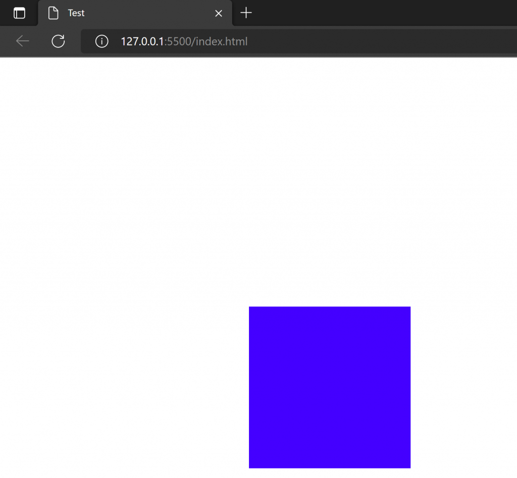
動畫也可直接縮寫如下
animation: animation 3s ease-in forwards;
【以上為我的學習心得,如有錯誤歡迎糾正】

 iThome鐵人賽
 看影片追技術