選單內容應適合使用者需求,同時易於開啟、關閉和互動。
當用戶與按鈕、操作或其他控制元件互動時,會出現選單。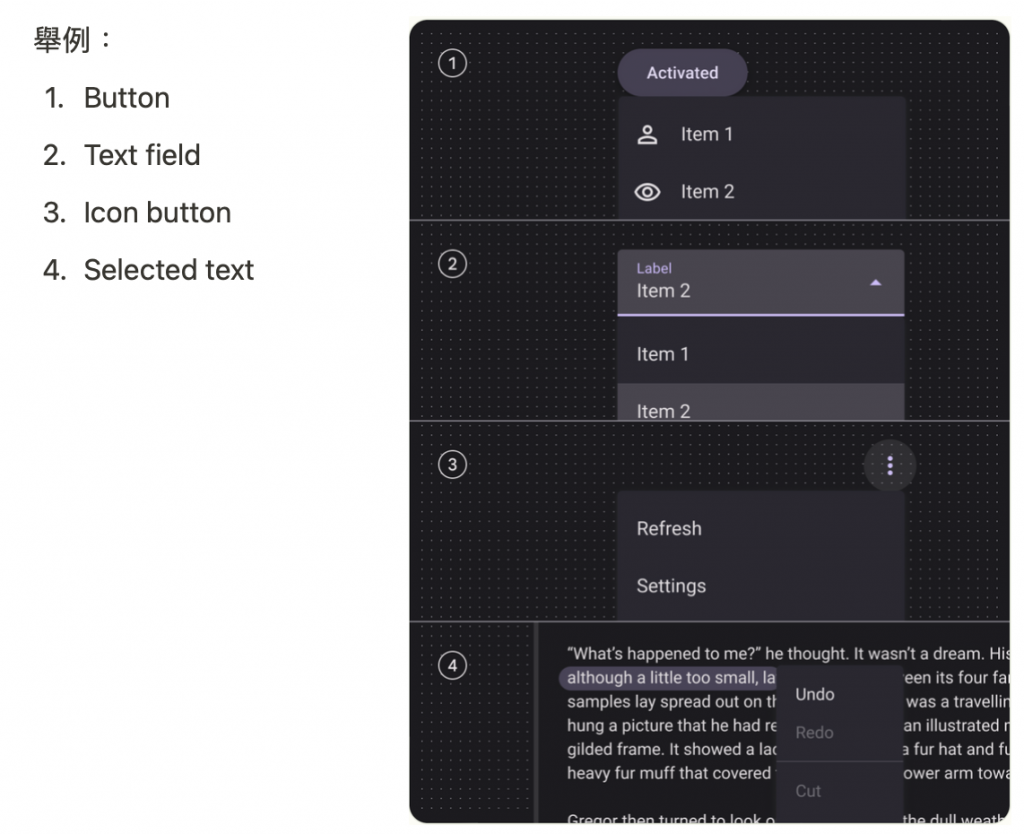
API and source code:
In res/menu/overflow_menu.xml:
<menu xmlns:android="http://schemas.android.com/apk/res/android">
    <item android:id="@+id/option_1"
          android:title="@string/option_1" />
    <item android:id="@+id/option_2"
          android:title="@string/option_2" />
    <item android:id="@+id/option_3"
          android:title="@string/option_3" />
</menu>
override fun onCreateOptionsMenu(menu: Menu): Boolean {
    val inflater: MenuInflater = menuInflater
    inflater.inflate(R.menu.overflow_menu, menu)
    return true
}
以下按下TextView時出現的上下文選單。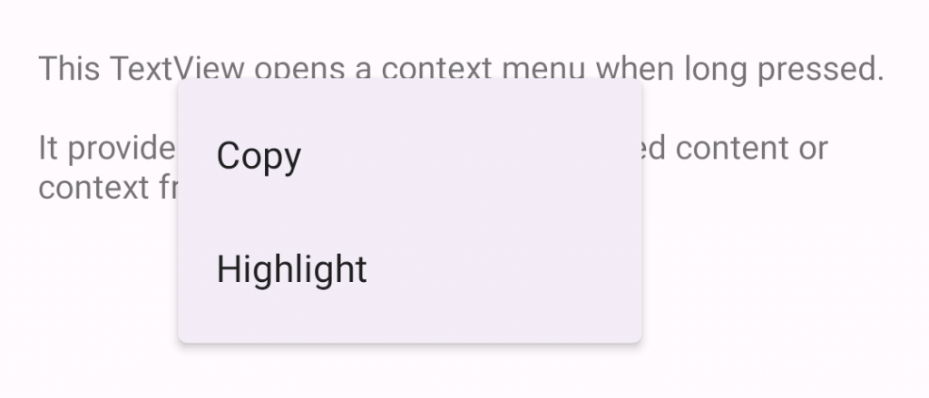
In the layout
<TextView
    android:id="@+id/context_menu_tv"
    android:layout_width="match_parent"
    android:layout_height="wrap_content"
    android:padding="16dp"
    android:text="@string/menu_context_menu_description"/>
override fun onCreate(savedInstanceState: Bundle?) {
    ...
    **val contextMenuTextView = view.findViewById<TextView>(R.id.context_menu_tv)**
    // 註冊 TextView context menu
    registerForContextMenu(contextMenuTextView)
}

override fun onCreateContextMenu(menu: ContextMenu, v: View, menuInfo: ContextMenu.ContextMenuInfo?) {
    val contextMenuTextView = v as TextView
    val context = context

    // 透過menu.add新增選單項
    menu.add(R.string.option_1)
        .setOnMenuItemClickListener { item: MenuItem? ->
            // Respond to item click.
      }
    menu.add(R.string.option_2)
        .setOnMenuItemClickListener { item: MenuItem? ->
            // Respond to item click.
      }
}

override fun onContextMenuClosed(menu: Menu) {
    // Respond to context menu being closed.
}
又或者可以在onCreateContextMenu中 inflate a context menu(與overflow_menu一樣)
res/menu/context_menu.xml
<menu xmlns:android="http://schemas.android.com/apk/res/android">
    <item android:id="@+id/option_1"
          android:title="@string/option_1" />
    <item android:id="@+id/option_2"
          android:title="@string/option_2" />
</menu>
override fun onCreateContextMenu(menu: ContextMenu, v: View, menuInfo: ContextMenu.ContextMenuInfo?) {
  super.onCreateContextMenu(menu, v, menuInfo)
  **val inflater: MenuInflater = menuInflater
  inflater.inflate(R.menu.context_menu, menu)**
}

// Then, to handle clicks:
override fun onContextItemSelected(item: MenuItem): Boolean {
  val info = item.menuInfo as AdapterView.AdapterContextMenuInfo
  return when (item.itemId) {
    R.id.option_1 -> {
      // Respond to context menu item 1 click.
      true
    }
    R.id.option_2 -> {
      // Respond to context menu item 2 click.
      true
    }
    else -> super.onContextItemSelected(item)
  }
}
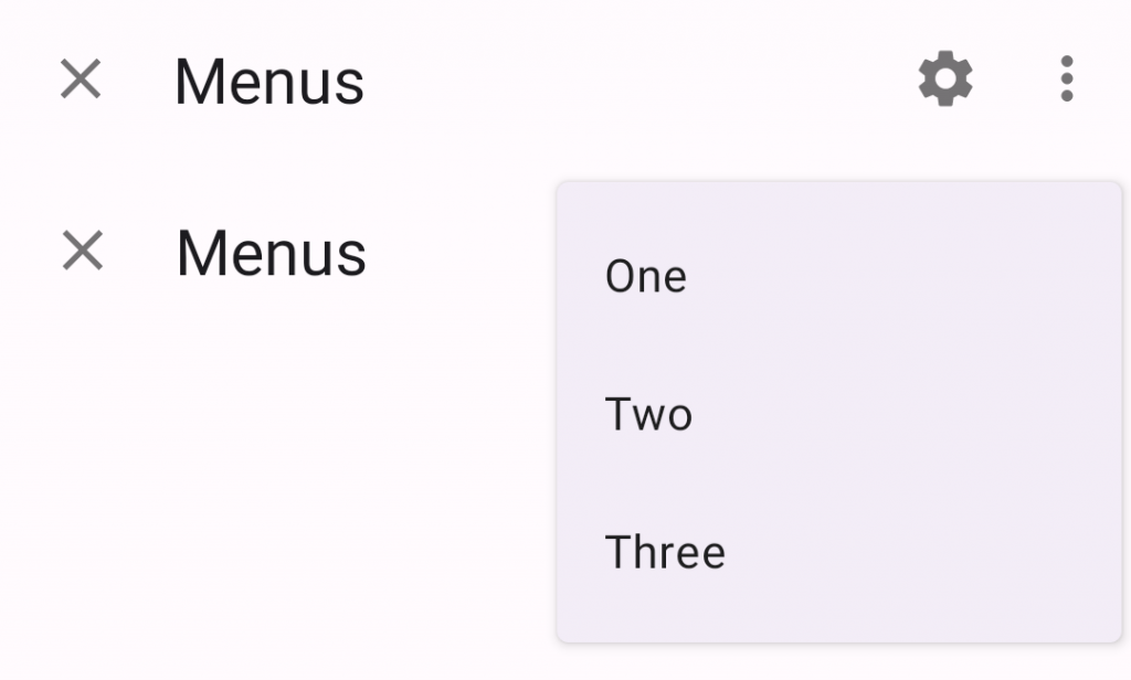
以下示例顯示了單擊按鈕時顯示的彈出式選單。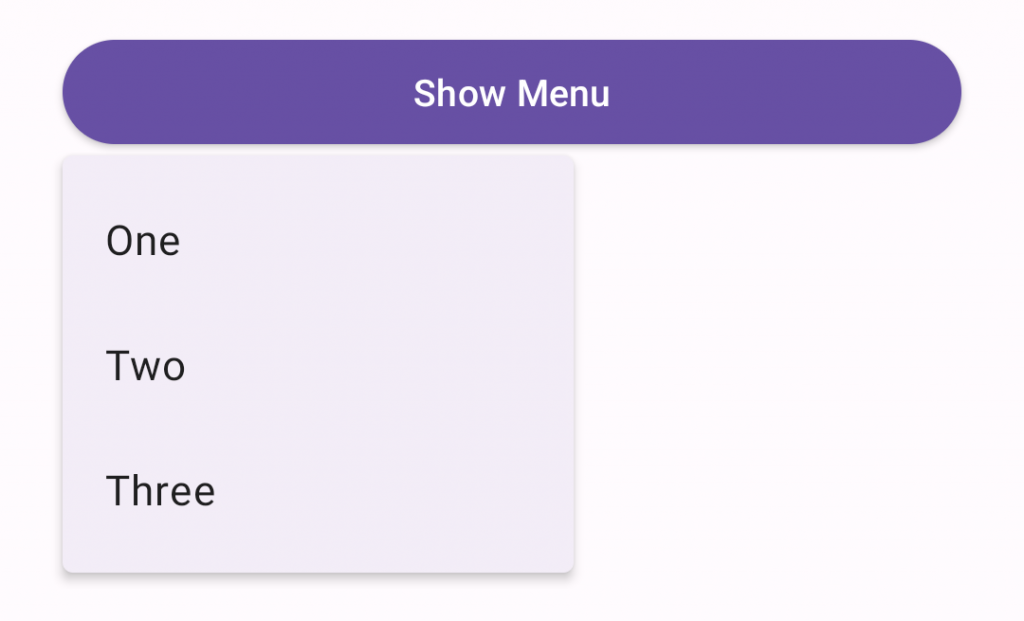
In the layout
<Button
    android:id="@+id/menu_button"
    android:layout_width="match_parent"
    android:layout_height="wrap_content"
    android:text="@string/show_menu"/>
In res/menu/popup_menu.xml
<menu xmlns:android="http://schemas.android.com/apk/res/android">
    <item android:id="@+id/option_1"
          android:title="@string/option_1" />
    <item android:id="@+id/option_2"
          android:title="@string/option_2" />
    <item android:id="@+id/option_3"
          android:title="@string/option_3" />
</menu>
In code
override fun onCreate(savedInstanceState: Bundle?) {
    ...
    val button = view.findViewById<Button>(R.id.menu_button)
    button.setOnClickListener { v: View ->
        showMenu(v, R.menu.popup_menu)
    }
}

private fun showMenu(v: View, @MenuRes menuRes: Int) {
    val popup = PopupMenu(context!!, v)
    popup.menuInflater.inflate(menuRes, popup.menu)

    popup.setOnMenuItemClickListener { menuItem: MenuItem ->
        // Respond to menu item click.
    }
    popup.setOnDismissListener {
        // Respond to popup being dismissed.
    }
    // Show the popup menu.
    popup.show()
}
Adding icons
目前沒有API向彈出式選單新增圖示, 以下變通辦法適用於API 21+,並使用僅限的library API,不能保證在未來版本中工作。以下示例顯示了一個帶有圖示的彈出式選單。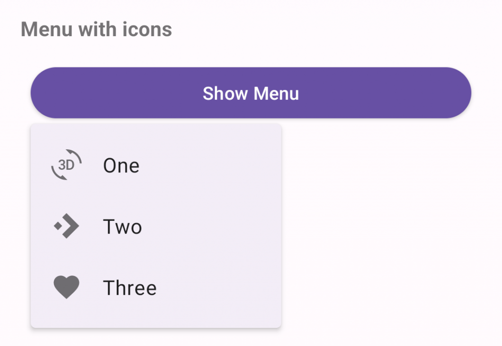
API and source code:
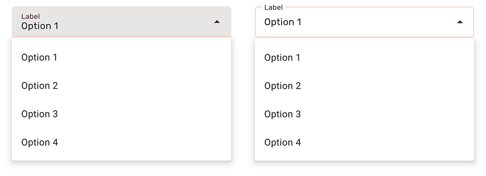
exposed dropdown menu是透過TextInputLayout實現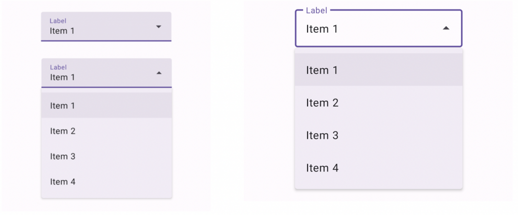
app:simpleItemsIn the layout時指定的字串陣列將自動完成的預設專案字串。android:inputType="none”不可編輯
<com.google.android.material.textfield.TextInputLayout
    android:id="@+id/menu"
    style="@style/Widget.Material3.TextInputLayout.FilledBox.ExposedDropdownMenu"
    android:layout_width="match_parent"
    android:layout_height="wrap_content"
    android:hint="@string/label">

    <AutoCompleteTextView
        android:layout_width="match_parent"
        android:layout_height="wrap_content"
        android:inputType="none"
        app:simpleItems="@array/simple_items"/>

</com.google.android.material.textfield.TextInputLayout>
app:simpleItems或者也可以以寫程式方式設定
val items = arrayOf("Item 1", "Item 2", "Item 3", "Item 4")
(textField.editText as? MaterialAutoCompleteTextView)?.setSimpleItems(items)
custom item adapter
val items = listOf("Item 1", "Item 2", "Item 3", "Item 4")
val adapter = ArrayAdapter(requireContext(), R.layout.list_item, items)
(textField.editText as? AutoCompleteTextView)?.setAdapter(adapter)
custom item layout (list_item.xml)
<TextView
    xmlns:android="http://schemas.android.com/apk/res/android"
    android:layout_width="match_parent"
    android:layout_height="wrap_content"
    android:padding="16dp"
    android:ellipsize="end"
    android:maxLines="1"
    android:textAppearance="?attr/textAppearanceBodyLarge"/>
Popup, overflow, and list popup window menus,支援可以自定義排版的主題。
在原本專案中Theme.App主題,新增選單的主題設定
<style name="Theme.App" parent="Theme.Material3.*">
    ...
    <item name="textAppearanceLargePopupMenu">@style/TextAppearance.App.BodyLarge</item>
    <item name="textAppearanceSmallPopupMenu">@style/TextAppearance.App.BodyLarge</item>
    <item name="popupMenuBackground">@drawable/custom_popup_background</item>
</style>

<style name="TextAppearance.App.BodyLarge" parent="TextAppearance.Material3.BodyLarge">
    <item name="fontFamily">@font/rubik</item>
    <item name="android:fontFamily">@font/rubik</item>
    <item name="android:textColor">@color/shrine_pink_900</item>
</style>
使用自定義選單背景樣式:res/drawable/custom_popup_background
<?xml version="1.0" encoding="UTF-8"?>
<shape xmlns:android="http://schemas.android.com/apk/res/android">
  <solid android:color="?attr/colorSurface"/>
  <corners
    android:radius="16dp"/>
  <padding
      android:bottom="8dp"
      android:top="8dp"/>
</shape>
<style name="Theme.App" parent="Theme.Material3.*">
    ...
    <item name="popupMenuStyle">@style/Widget.App.PopupMenu</item>
</style>

<style name="Widget.App.PopupMenu" parent="Widget.Material3.PopupMenu">
    <item name="android:popupBackground">@drawable/custom_popupmenu_background</item>
</style>
在原本專案中Theme.App主題,新增選單的主題設定
<style name="Theme.App" parent="Theme.Material3.*">
    ...
    <item name="textInputStyle">@style/Widget.App.ExposedDropdownMenu</item>
</style>

<!--TextInputLayout.*.ExposedDropdownMenu樣式設定materialThemeOverlay,
以使用所需的特定AutoCompleteTextView設定樣式覆蓋autoCompleteTextViewStyle。 因此,您無需在AutoCompleteTextView上指定樣式標籤。-->
<style name="Widget.App.ExposedDropdownMenu" parent="Widget.Material3.TextInputLayout.*.ExposedDropdownMenu">
    **<item name="materialThemeOverlay">@style/ThemeOverlay.App.ExposedDropdownMenu</item>**
    <item name="shapeAppearance">@style/ShapeAppearance.App.SmallComponent</item>
    <item name="hintTextColor">?attr/colorOnSurface</item>
    <item name="endIconTint">?attr/colorOnSurface</item>
</style>

<!--在自定義TextInputLayout樣式上設定materialThemeOverlay時,
將autoCompleteTextViewStyle設定為@style/Widget.Material3. AutoCompleteTextView.*
樣式或從中繼承的自定義樣式。-->
<style name="ThemeOverlay.App.ExposedDropdownMenu" parent="">
    <item name="colorPrimary">@color/shrine_pink_100</item>
    <item name="colorOnSurface">@color/shrine_pink_900</item>
    <item name="colorError">@color/shrine_red</item>
    <item name="textAppearanceBodyLarge">@style/TextAppearance.App.BodyLarge</item>
    <item name="textAppearanceBodySmall">@style/TextAppearance.App.BodySmall</item>
    <item name="**autoCompleteTextViewStyle**">@style/Widget.Material3.AutoCompleteTextView.*</item>
</style>

<style name="TextAppearance.App.BodyLarge" parent="TextAppearance.Material3.BodyLarge">
    <item name="fontFamily">@font/rubik</item>
    <item name="android:fontFamily">@font/rubik</item>
</style>

<style name="TextAppearance.App.BodySmall" parent="TextAppearance.Material3.BodySmall">
    <item name="fontFamily">@font/rubik</item>
    <item name="android:fontFamily">@font/rubik</item>
</style>

<style name="ShapeAppearance.App.SmallComponent" parent="ShapeAppearance.Material3.SmallComponent">
    <item name="cornerFamily">cut</item>
    <item name="cornerSize">4dp</item>
</style>
或者在layout中使用樣式
com.google.android.material.textfield.TextInputLayout
    ...
    **style="@style/Widget.App.ExposedDropdownMenu"**>

    ...

</com.google.android.material.textfield.TextInputLayout>
感謝看到這裡~~ 
參考資料:Material Design Component Menu


 看影片追技術