分隔線(MaterialDivider)是一個可用於佈局的檢視,將內容清晰的劃分。分隔線長度可伸縮性,例如用於分離列表項或定義長度。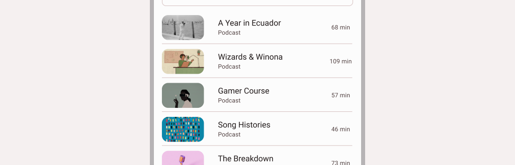
API and source code:
在MaterialDivider上設定android:layout_height="wrap_content",以確保為分隔符設定了正確的大小。
<com.google.android.material.divider.MaterialDivider
			android:layout_width="match_parent"
			android:layout_height="wrap_content"/>
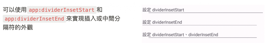
		<TextView
        android:layout_width="match_parent"
        android:layout_height="wrap_content"
        android:layout_marginTop="20dp"
        android:text="設定 dividerInsetStart"/>
    <com.google.android.material.divider.MaterialDivider
        android:layout_width="match_parent"
        android:layout_height="wrap_content"
        app:dividerInsetStart="20dp" />

    <TextView
        android:layout_width="match_parent"
        android:layout_height="wrap_content"
        android:layout_marginTop="20dp"
        android:text="設定 dividerInsetEnd"/>
    <com.google.android.material.divider.MaterialDivider
        android:layout_width="match_parent"
        android:layout_height="wrap_content"
        app:dividerInsetEnd="20dp" />

    <TextView
        android:layout_width="match_parent"
        android:layout_height="wrap_content"
        android:layout_marginTop="20dp"
        android:text="設定 dividerInsetStart、dividerInsetEnd"/>
    <com.google.android.material.divider.MaterialDivider
        android:layout_width="match_parent"
        android:layout_height="wrap_content"
        app:dividerInsetStart="20dp"
        app:dividerInsetEnd="20dp" />
divider.setDividerInsetStart(insetStart)
divider.setDividerInsetEnd(insetEnd)
MaterialDividerItemDecoration是一個RecyclerView.ItemDecoration,類似於DiparizerItemDecoration,可以用做LinearLayoutManager之間的水平和垂直方向分隔符。
// 水平和垂直設定
val divider = MaterialDividerItemDecoration(context!!, LinearLayoutManager.VERTICAL /*or LinearLayoutManager.HORIZONTAL*/)
recyclerView.addItemDecoration(divider)
| Element | Style |
|---|---|
| Default style | Widget.Material3.MaterialDivider |
| ?attr/materialDividerStyle |

在res/values/styles.xml 適用於所有分隔線並影響其他元件
<style name="Theme.App" parent="Theme.Material3.*">
    ...
    <item name="colorOutline">@color/shrine_pink_900</item>
</style>
使用default style theme attributes、styles 、 theme overlays,這些適用於所有分隔符,但不影響其他元件:
<style name="Theme.App" parent="Theme.Material3.*">
    ...
    <item name="materialDividerStyle">@style/Widget.App.MaterialDivider</item>
</style>

<style name="Widget.App.MaterialDivider" parent="Widget.Material3.MaterialDivider">
    <item name="materialThemeOverlay">@style/ThemeOverlay.App.MaterialDivider</item>
</style>

<style name="ThemeOverlay.App.MaterialDivider" parent="">
    <item name="colorOutline">@color/shrine_pink_900</item>
</style>
更改分隔線顏色 attr/dividerColor屬性:
<style name="Widget.App.MaterialDivider" parent="Widget.Material3.MaterialDivider">
   <item name="dividerColor">@color/shrine_divider_color</item>
</style>
layout 使用設定好的style
<com.google.android.material.divider.MaterialDivider
		style="@style/Widget.App.MaterialDivider"
		android:layout_width="match_parent"
		android:layout_height="wrap_content"/>
感謝看到這裡~~ 
參考資料:Material Design Component Divide


 看影片追技術