今天來介紹整個頁面的要角 Floating Action Button。
簡稱為 FAB ,常在 APP 右下角見到的懸浮按鈕,用來代表當前頁面最重要且最常用的功能。
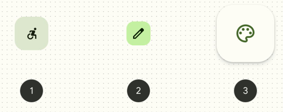
一共有 3 個大小,shape 、smallShape 、largeShape 。
M2 FAB 是圓形的,到了 M3 則是圓角箱型。
fun FloatingActionButton(
    onClick: () -> Unit,
    modifier: Modifier = Modifier,
    shape: Shape = FloatingActionButtonDefaults.shape,
    containerColor: Color = FloatingActionButtonDefaults.containerColor,
    contentColor: Color = contentColorFor(containerColor),
    elevation: FloatingActionButtonElevation = FloatingActionButtonDefaults.elevation(),
    interactionSource: MutableInteractionSource = remember { MutableInteractionSource() },
    content: @Composable () -> Unit,
) {

}
FloatingActionButtonDefaults 有 FloatingActionButton 需要的預設值。
onClick : 傳入function type 設置點擊按鈕時要做的動作。shape:分為 shape 、smallShape 、largeShape
containerColor:按鈕底色,預設為M3 Theme token 的 PrimaryContainer
elevation:懸浮的高度,根據按鈕的不同狀態(預設、按壓、懸停)高度從Level0 的0.dp 到Level5 的12.dp。interactionSource:和前幾天介紹的使用者互動一樣。content:按鈕上的內容很常和 Icon 一起使用另外還有一個和他很像的兄弟 ExtendedFloatingActionButton ,多了文字的空間說明按鈕功能。
@Composable
fun ExtendedFloatingActionButton(
    text: @Composable () -> Unit,
    icon: @Composable () -> Unit,
    onClick: () -> Unit,
    modifier: Modifier = Modifier,
    expanded: Boolean = true,
    shape: Shape = FloatingActionButtonDefaults.extendedFabShape,
    containerColor: Color = FloatingActionButtonDefaults.containerColor,
    contentColor: Color = contentColorFor(containerColor),
    elevation: FloatingActionButtonElevation = FloatingActionButtonDefaults.elevation(),
    interactionSource: MutableInteractionSource = remember { MutableInteractionSource() },
) {
		//....
}
text 和 icon 參數可以傳入 composable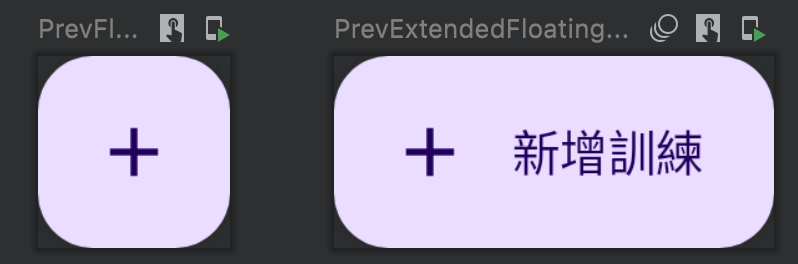
本專案會用到新增記事,就可以這樣表示:
import androidx.compose.material.FloatingActionButton
import androidx.compose.material.icons.Icons
import androidx.compose.material.icons.filled.Add

@Preview
@Composable
fun PrevFloatButton() {
    FloatingActionButton(onClick = { /*do something*/ }) {
        Icon(Icons.Filled.Add, contentDescription = “Add a training")
    }
}
@Preview
@Composable
fun PrevExtendedFloatingActionButton() {
    ExtendedFloatingActionButton(
        icon = { Icon(Icons.Filled.Add, contentDescription = null) },
        text = { Text("新增訓練") },
        onClick = { /*do something*/ }
    )
}
FAB 最常包在 Scaffold 裡面,Scaffold 在書上看過翻譯成手腳架,其實就是把常用的元件佈局做好配置,而且符合 M3 的設計規範,裡面可以配置bottomBar 、FAB 、topBar 、snackbarHost 等composable。
@OptIn(ExperimentalMaterial3Api::class)
@Composable
fun PrevFABinScreen() {
    Scaffold(
        floatingActionButton = {
            FloatingActionButton(onClick = { /*do something*/ }) {
                Icon(Icons.Filled.Add, contentDescription = "Add a training")
            }
        }
    ) { padding -> //1.
        Box(modifier = Modifier.padding(padding)) {

        }
    }
}
今日運動
休息


 看影片追技術