昨天架構完 HTML (附上連結 切版實作 HTML 篇),
今天要加上 CSS 樣式做排版~
會補充說明 偽類別 ,以及 CSS 變數 的使用方法。
首先建立一個 style.css 檔案,接下來都會在裡面新增內容。
先做個簡單的 Reset CSS
*{
    margin: 0;
    padding: 0;
    line-height: 1.5;
}
宣告 : --自訂義名稱: 值;
使用 : 屬性: var(--自訂義名稱);
設定變數的好處是當有變動時,只要去修改設定的值,
有套用此變數的都會一起被修改,
不用一個一個去找,一個一個去改。
:root 為網頁的 根元素 ,也可以設定在 body 或 html ,
在此區域設定的變數,內層都可以使用。
:root{
    --width: 1200px;
    --border-show: 1px solid gray;
    --border-hide: 1px solid transparent;
    --radius-large: 10px;
    --radius-small: 5px;
}
transparent 為 透明 色彩。
/* 共同 */
header, section, footer{
    max-width: var(--width);
}
img{
    width: 100%;
    display: block;
    border-radius: var(--radius-small);
}
/* header: Logo. 標題 */
header{
    margin: auto;
    display: flex;
}
header div{
    margin-left: 10px;
    width: 70px;
}
header h1{
    line-height: 70px;
}
為選擇器新增一些特殊的效果。
:link 在滑鼠點擊下去之前:hover 滑鼠 經過 時:active 滑鼠點下去尚未放開時:visited 滑鼠點下去,放開 以後
以 <a> 標籤舉例:
a:link {color:red;} /* 未訪問的連結,字體顏色為紅色 */
a:hover {color:orange;} /* 滑鼠劃過連結時,字體顏色為橘色 */
a:active {color:yellow;} /* 滑鼠點擊連結時,字體顏色為黃色 */
a:visited {color:green;} /* 已訪問的連結,字體顏色為綠色 */
還有其他的 偽類別 、 偽元素 ,有興趣再自行研究喔 (๑•̀ㅂ•́)و✧
附上介紹連結 W3School 、 MDN
/* nav: 導覽列 */
nav{
    margin: auto;
}
nav ul{
    display: flex;
}
nav ul li{
    width: 120px;
    text-align: center;
    font-size: 26px;
    list-style: none;
    border: var(--border-hide);
    border-radius: var(--radius-large);
    margin: 0 20px;
    padding: 10px;
}
nav ul li:hover{
    cursor: pointer;
    border: var(--border-show);
    background-color: gray;
    color: azure;
}
cursor: pointer; 游標 變成 手指 形狀,通常會搭配 :hover 效果一起使用。
形狀還有很多,附上可直接看效果的連結 W3School
/* header: 日夜標籤 */
span{
    display: inline-block;
    padding: 3px;
    border: var(--border-show);
    border-radius: var(--radius-small);
}
span:hover{
    cursor: pointer;
    background-color: gray;
    color: azure;
}
justify-content 排列對齊方式是 沿著主軸排列 ,
值有:flex-start (預設)、 flex-end 、 center 、space-between 、 space-around 、 space-evenly 。
附上實作影片 Day12【從麻瓜變成前端魔法師】CSS display: flex;
/* section */
section{
    margin: 20px auto;
}
.container{
    display: flex;
}
.item{
    border: var(--border-show);
    border-radius: var(--radius-large);
    padding: 30px;
    margin: 10px;
}
.item h2, .item p{
    padding: 10px;
}
.box{
    display: flex;
    align-items: center; /* 沿著交錯軸中間切齊排列,達到置中效果 */
    justify-content: space-evenly;
    border: var(--border-show);
    border-radius: var(--radius-large);
    padding: 30px;
    margin: 10px;
}
.box div{
    margin: 10px;
    padding: 10px;
}
.box div img{
    width: 400px;
}
.box h3, .box p{
    margin: 10px;
}
/* footer */
footer{
    margin: 10px auto;
    display: flex;
    justify-content: space-between;
}
footer div{
    width: 240px;
}
footer div p{
    margin-left: 10px;
}
footer ul{
    list-style: none;
    display: flex;
}
footer ul li{
    width: 100px;
    text-align: center;
    font-size: 22px;
    list-style: none;
    border: var(--border-hide);
    border-radius: var(--radius-large);
    margin: 10px;
    padding: 10px;
}
footer ul li:hover{
    cursor: pointer;
    border: var(--border-show);
    background-color: gray;
    color: azure;
}
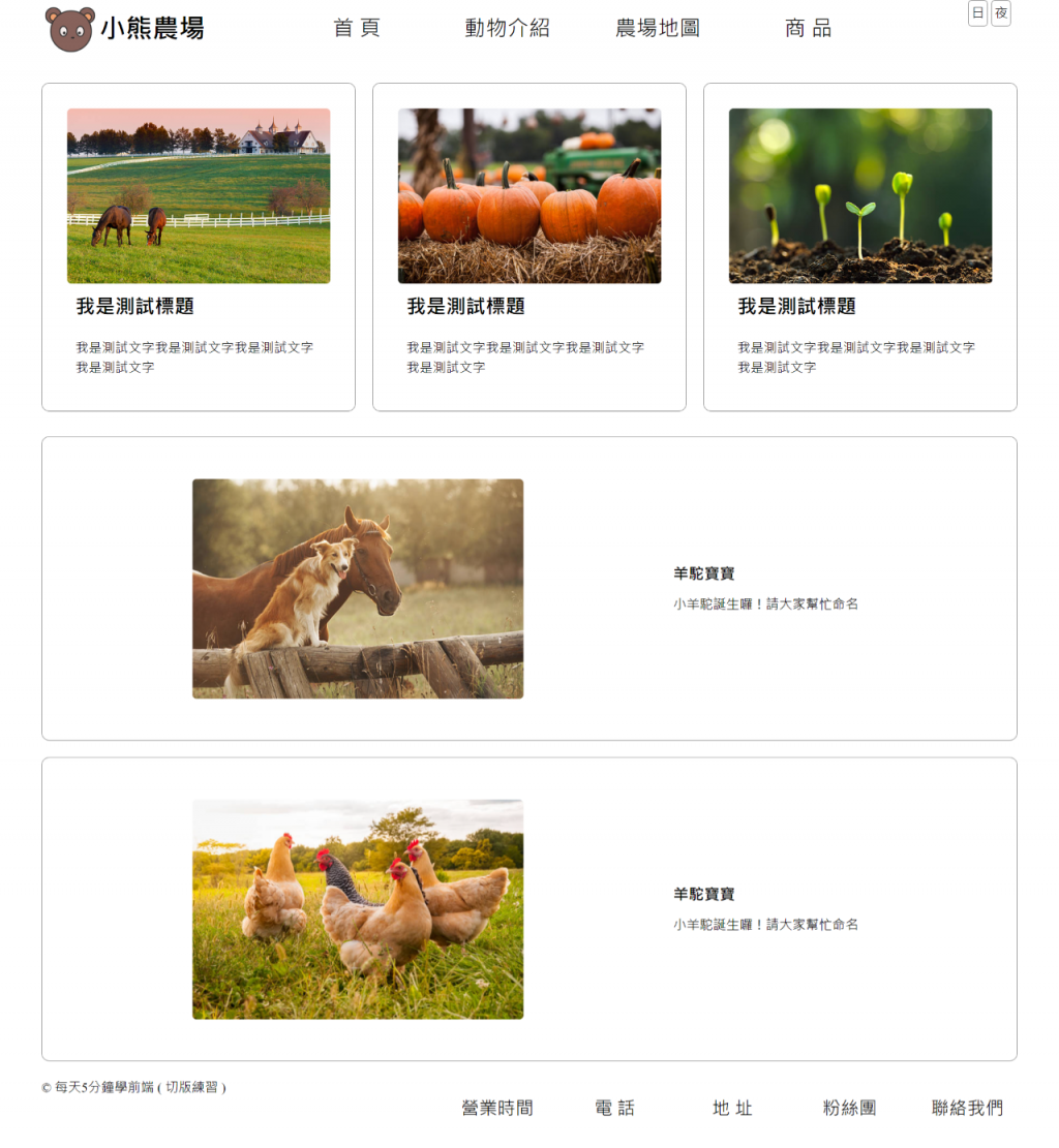
以上設定完畢,成果出爐~~

附上完整原始碼在 GitHub
另外,
我沒有做 RWD ,可再自行修改唷~
 自學指引:
自學指引:
感謝閱讀,我們明天見囉~~~ 


 看影片追技術