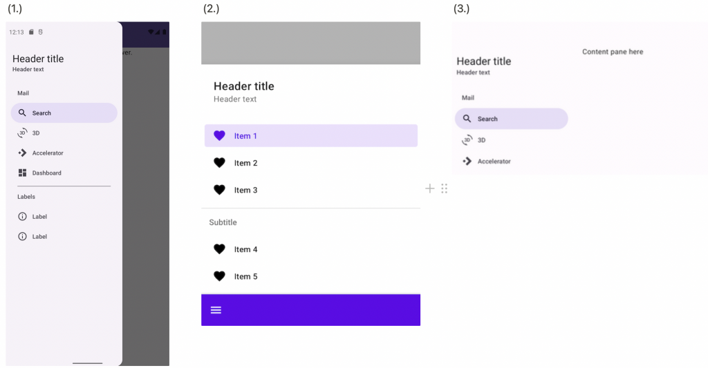
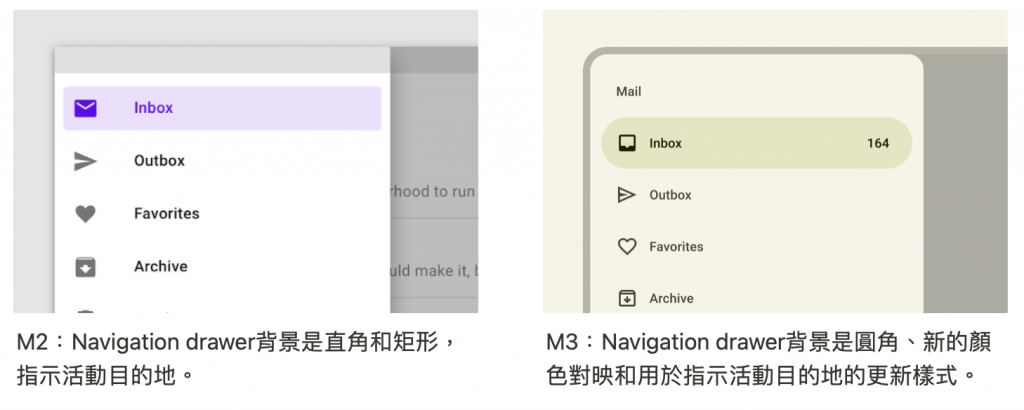
Navigation drawer 預設情況下可以開啟或關閉,以適應不同的應用程式佈局,有兩種型別的Standard、Modal。Standard標準非常適合頻繁切換到不同的目的地。 Modal適合不頻繁但更集中的切換。
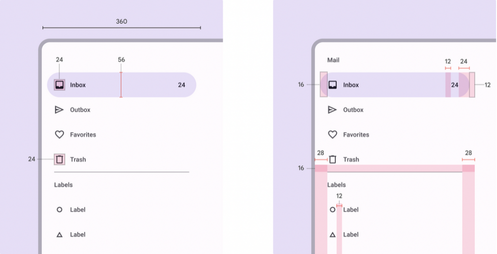
(3). Standard navigation drawer
API and source code:
因為Modal navigation drawer 需要DrawerLayout
在Module層的build.Gradle的dependencies中新增AndroidX DrawerLayout library.—> implementation("androidx.drawerlayout:drawerlayout:1.1.1")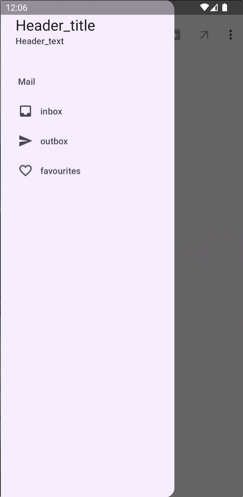
In the layout
<androidx.drawerlayout.widget.DrawerLayout xmlns:android="http://schemas.android.com/apk/res/android"
    android:layout_width="match_parent"
    android:layout_height="match_parent"
    xmlns:app="http://schemas.android.com/apk/res-auto">

    <androidx.coordinatorlayout.widget.CoordinatorLayout
        android:layout_width="match_parent"
        android:layout_height="match_parent"
        android:fitsSystemWindows="true">

        <com.google.android.material.appbar.AppBarLayout
            android:layout_width="match_parent"
            android:layout_height="wrap_content">

            <!-- Center-aligned、Small-->
            <com.google.android.material.appbar.MaterialToolbar
                android:id="@+id/topAppBar"
                android:layout_width="match_parent"
                android:layout_height="?attr/actionBarSize"
                app:layout_scrollFlags="scroll|enterAlways|snap"
                app:menu="@menu/top_app_bar"
                app:navigationIcon="@drawable/ic_menu_24"
                app:title="page_title" />

        </com.google.android.material.appbar.AppBarLayout>

    </androidx.coordinatorlayout.widget.CoordinatorLayout>

    <com.google.android.material.navigation.NavigationView
        android:layout_width="wrap_content"
        android:layout_height="match_parent"
        app:headerLayout="@layout/header_navigation_drawer"
        app:menu="@menu/navigation_drawer"
        android:layout_gravity="start" />

</androidx.drawerlayout.widget.DrawerLayout>
res/values/themes.xml
<style name="Theme.App" parent="Theme.Material3.Light.NoActionBar">
    <item name="android:windowTranslucentStatus">true</item>
</style>
res/layout/header_navigation_drawer.xml
android:fitsSystemWindows="true" 用於根據狀態欄等系統窗口調整視圖佈局<LinearLayout xmlns:android="http://schemas.android.com/apk/res/android"
android:layout_width="match_parent"
android:layout_height="match_parent"
android:fitsSystemWindows="true"
android:orientation="vertical">
<TextView
android:layout_width="wrap_content"
android:layout_height="wrap_content"
android:layout_marginTop="24dp"
android:layout_marginStart="24dp"
android:layout_marginEnd="24dp"
android:textAppearance="?attr/textAppearanceHeadlineSmall"
android:textColor="?attr/colorOnSurface"
android:text="Header_title" />
<TextView
android:layout_width="wrap_content"
android:layout_height="wrap_content"
android:layout_marginBottom="24dp"
android:layout_marginStart="24dp"
android:layout_marginEnd="24dp"
android:textAppearance="?attr/textAppearanceTitleSmall"
android:textColor="?attr/colorOnSurfaceVariant"
android:text="Header_text" />
</LinearLayout>
In code
drawerLayout.open()
drawerLayout.close()
class Navigation : AppCompatActivity() {

    private lateinit var binding: NavigationDrawerModelBinding

    override fun onCreate(savedInstanceState: Bundle?) {
        super.onCreate(savedInstanceState)
        binding = NavigationDrawerModelBinding.inflate(layoutInflater)
        setContentView(binding.root)

        binding.topAppBar.setNavigationOnClickListener {
            binding.drawerLayout.open()
        }

        binding.navigationView.setNavigationItemSelectedListener { menuItem ->
            menuItem.isChecked = true
            binding.drawerLayout.close()
            true
        }
    }
}
In the layout
<androidx.coordinatorlayout.widget.CoordinatorLayout xmlns:android="http://schemas.android.com/apk/res/android"
    xmlns:app="http://schemas.android.com/apk/res-auto"
    android:layout_width="match_parent"
    android:layout_height="match_parent">

    <androidx.coordinatorlayout.widget.CoordinatorLayout
        android:layout_width="match_parent"
        android:layout_height="match_parent"
        android:layout_marginBottom="?attr/actionBarSize">

        <!-- Screen content -->

        <FrameLayout
            android:id="@+id/scrim"
            android:layout_width="match_parent"
            android:layout_height="match_parent" />

        <com.google.android.material.navigation.NavigationView
            android:id="@+id/navigationView"
            android:layout_width="match_parent"
            android:layout_height="wrap_content"
            app:behavior_hideable="true"
            app:headerLayout="@layout/header_navigation_drawer"
            app:layout_behavior="@string/bottom_sheet_behavior"
            app:menu="@menu/navigation_drawer" />

    </androidx.coordinatorlayout.widget.CoordinatorLayout>

    <com.google.android.material.bottomappbar.BottomAppBar
        android:id="@+id/bottomAppBar"
        android:layout_width="match_parent"
        android:layout_height="wrap_content"
        android:layout_gravity="bottom"
        app:navigationIcon="@drawable/ic_menu_24" />

</androidx.coordinatorlayout.widget.CoordinatorLayout>
In code
class Navigation : AppCompatActivity() {

    private lateinit var binding: NavigationDrawerBottomBinding

    override fun onCreate(savedInstanceState: Bundle?) {
        super.onCreate(savedInstanceState)
        binding = NavigationDrawerBottomBinding.inflate(layoutInflater)
        setContentView(binding.root)

        val bottomSheetBehavior = BottomSheetBehavior.from(binding.navigationView)
        bottomSheetBehavior.state = BottomSheetBehavior.STATE_HIDDEN

        // bottomAppBar點擊icon開啟navigationView
        binding.bottomAppBar.setNavigationOnClickListener {
            bottomSheetBehavior.state = BottomSheetBehavior.STATE_EXPANDED
        }

        // navigationView的ItemSelected點擊事件
        binding.navigationView.setNavigationItemSelectedListener { menuItem ->
            menuItem.isChecked = true
            bottomSheetBehavior.state = BottomSheetBehavior.STATE_HIDDEN
            true
        }

        // navigationView以外的地方點擊關閉
        binding.scrim.setOnClickListener {
            bottomSheetBehavior.state = BottomSheetBehavior.STATE_HIDDEN
        }

        // Bottom navigation drawer 上滑時,navigationView以外的地方背景設改變
        bottomSheetBehavior.addBottomSheetCallback(object : BottomSheetBehavior.BottomSheetCallback() {
            override fun onSlide(bottomSheet: View, slideOffset: Float) {
                val baseColor = Color.BLACK
                //60% 不透明度
                val baseAlpha = ResourcesCompat.getFloat(resources, com.google.android.material.R.dimen.material_emphasis_medium)
                // Map slideOffset from [-1.0, 1.0] to [0.0, 1.0]
                val offset = (slideOffset - (-1f)) / (1f - (-1f)) * (1f - 0f) + 0f
                val alpha = MathUtils.lerp(0f, 255f, offset * baseAlpha).toInt()
                val color = Color.argb(alpha, baseColor.red, baseColor.green, baseColor.blue)
                binding.scrim.setBackgroundColor(color)
            }
            override fun onStateChanged(bottomSheet: View, newState: Int) {
            }
        })

    }
}
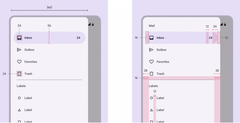
放置畫面上與螢幕內容互動,可用於平板電腦和桌上型電腦,因尺寸原因不適合手機裝置。
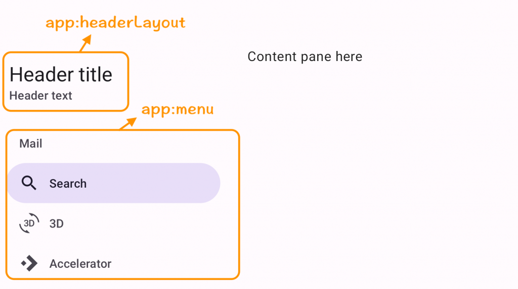
layout 中新增 NavigationView,設定headerLayout、menu的屬性
app:headerLayout="@layout/header_navigation_drawer"
app:menu="@menu/navigation_drawer”
<androidx.constraintlayout.widget.ConstraintLayout xmlns:android="http://schemas.android.com/apk/res/android"
    android:layout_width="match_parent"
    android:layout_height="match_parent"
    xmlns:app="http://schemas.android.com/apk/res-auto">

    <com.google.android.material.navigation.NavigationView
				android:id="@+id/navigationView"
        android:layout_width="wrap_content"
        android:layout_height="match_parent"
				app:headerLayout="@layout/header_navigation_drawer"
				app:menu="@menu/navigation_drawer”
        app:layout_constraintStart_toStartOf="parent"/>

		<TextView
            android:layout_width="0dp"
            android:layout_height="wrap_content"
            android:layout_marginTop="40dp"
            android:text="content pane here"
            android:textColor="?attr/colorOnSurface"
            app:layout_constraintEnd_toEndOf="parent"
            app:layout_constraintStart_toEndOf="@+id/navigationView"
            app:layout_constraintTop_toTopOf="parent" />

</androidx.constraintlayout.widget.ConstraintLayout>
主題—> res/values/themes.xml
<item name="android:windowTranslucentStatus">true</item> 設定透明status bar ****<style name="Theme.App" parent="Theme.Material3.Light.NoActionBar">
<item name="android:windowTranslucentStatus">true</item>
</style>
新增 headerLayout 標題和副標題 —> res/layout/header_navigation_drawer.xml
android:fitsSystemWindows="true" 用於根據狀態欄等系統窗口調整視圖佈局<LinearLayout xmlns:android="http://schemas.android.com/apk/res/android"
android:layout_width="match_parent"
android:layout_height="match_parent"
android:fitsSystemWindows="true"
android:orientation="vertical">
<TextView
android:layout_width="wrap_content"
android:layout_height="wrap_content"
android:layout_marginTop="24dp"
android:layout_marginStart="24dp"
android:layout_marginEnd="24dp"
android:textAppearance="?attr/textAppearanceHeadlineSmall"
android:textColor="?attr/colorOnSurface"
android:text="Header_title" />
<TextView
android:layout_width="wrap_content"
android:layout_height="wrap_content"
android:layout_marginBottom="24dp"
android:layout_marginStart="24dp"
android:layout_marginEnd="24dp"
android:textAppearance="?attr/textAppearanceTitleSmall"
android:textColor="?attr/colorOnSurfaceVariant"
android:text="Header_text" />
</LinearLayout>
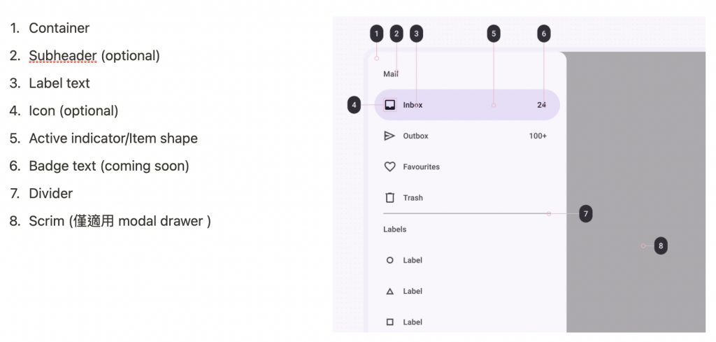
新增 menu item
<menu xmlns:android="http://schemas.android.com/apk/res/android">

    <item
        android:id="@+id/main_item"
        android:title="Mail">

        <menu>
            <item
                android:id="@+id/inbox_item"
                android:icon="@drawable/ic_inbox"
                android:title="inbox"
                android:checkable="true"/>
            <item
                android:id="@+id/outbox_item"
                android:icon="@drawable/ic_send"
                android:title="outbox"
                android:checkable="true"/>
            <item
                android:id="@+id/favourites_item"
                android:icon="@drawable/ic_favorite_border_24"
                android:title="favourites"
                android:checkable="true"/>
        </menu>

    </item>

</menu>
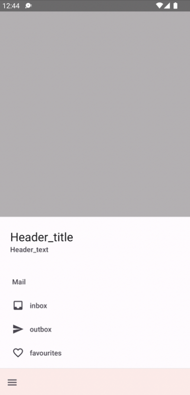
完成後在手機、折疊手機、平板的呈現樣子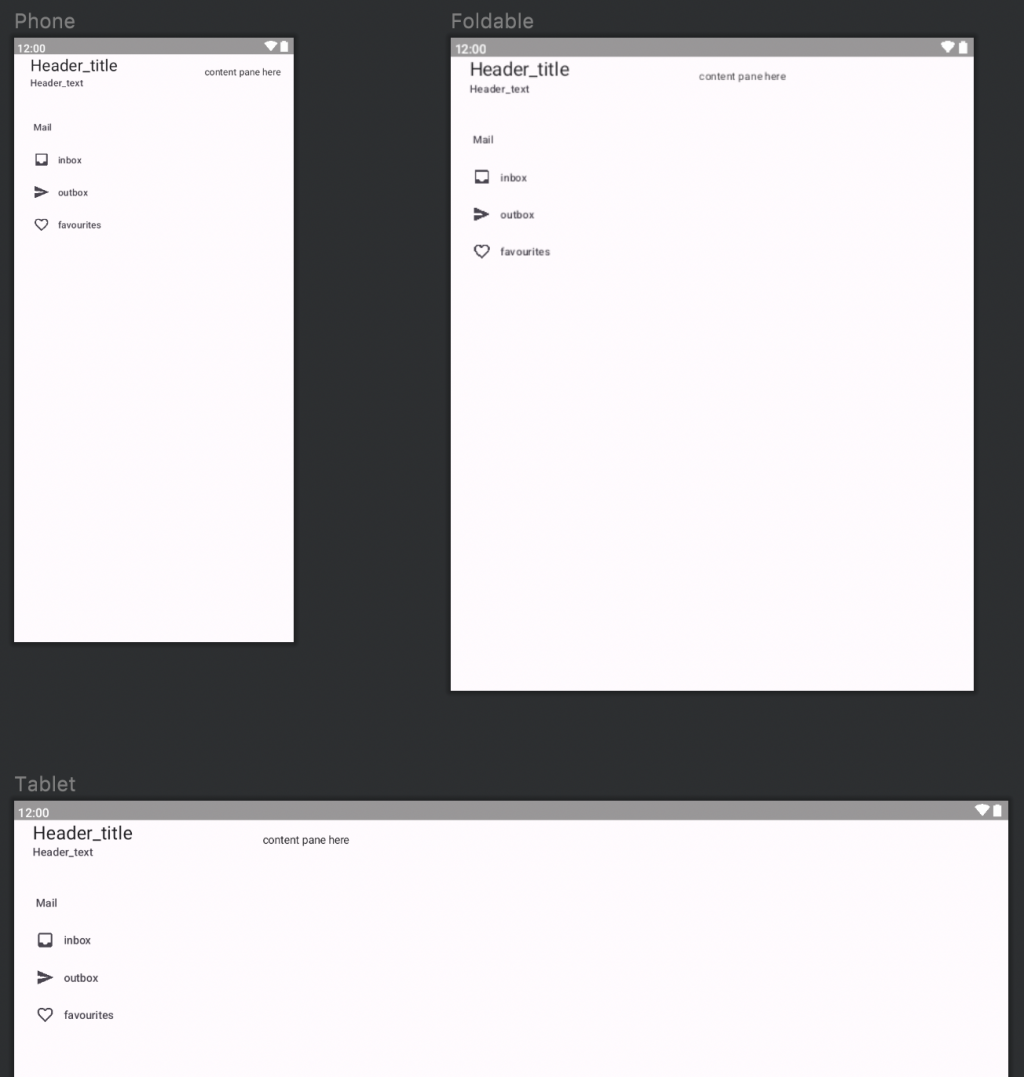
感謝您看到這邊 
參考資料:Material Deaign Navigation drawer


 看影片追技術