接續昨天(今天又因為分號弄成逗號,檢查好久)
https://www.youtube.com/watch?v=8ipFyy7HpqQ&list=PL5e68lK9hEzd-ZM4Km6xUia-mxQp52G6U&index=24
HTML
<!DOCTYPE html>
<html lang="en">
<head>
<meta charset="utf-8">
<title>測試</title>
<link href="C1.css" rel="stylesheet">
</head>
<body>
<section>
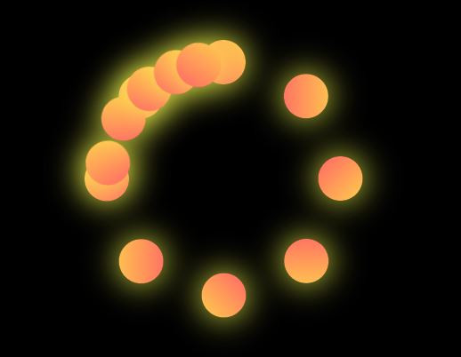
<div class="LOD">
<span style="--i:1;"></span>
<span style="--i:2;"></span>
<span style="--i:3;"></span>
<span style="--i:4;"></span>
<span style="--i:5;"></span>
<span style="--i:6;"></span>
<span style="--i:7;"></span>
<span style="--i:8;"></span>
<span class="ROT" style="--j:0;"></span>
<span class="ROT" style="--j:1;"></span>
<span class="ROT" style="--j:2;"></span>
<span class="ROT" style="--j:3;"></span>
<span class="ROT" style="--j:4;"></span>
</div>
</section>
</body>
</html>
CSS
body{
	margin: 0;
	padding: 0;
	box-sizing: border-box;
}

section{
	display: flex;
	justify-content: center;
	align-items: center;
	min-height: 100vh;
	background: #000000;
}

.LOD{
	position: relative;
	width: 250px;
	height: 250px;
}

.LOD span{
	position: absolute;
	top: 0;
	left: 0;
	width: 100%;
	height: 100%;
	display: block;
	transform: rotate(calc(45deg * var(--i)));
}

.LOD span::before{
	content: '';
	position: absolute;
	top: 0;
	left: calc(50% - 20px);
	width: 40px;
	height: 40px;
	background: linear-gradient(45deg,#FF6666,#FFCD4D);
	border-radius: 50%;
	box-shadow: 0 0 30px #F7FF4E;
}

.ROT{
	animation: AR 4s ease-in-out infinite;
	animation-delay: calc(-0.2s * var(--j));
}

@keyframes AR{
	0%{
		transform: rotate(0deg);
	}
	100%{
		transform: rotate(360deg);
	}
}
今天先這樣,明天繼續


 iThome鐵人賽
 看影片追技術