
昨天學習 Sass 的最主要目的,就是為了要看懂自己以前寫的東西,我把它統稱為小作品,當時的這些小作品我是照著 Hahow 課程教學,一步一步的跟著做,然後就做出來了。可惜的是並沒有製作時的寫筆記,又不太想回去重新看課程教學,趁著現在重學 Sass,而且又有寫筆記的狀態下,我認為拿以前的作品來研究,會是一個不錯的方法,那麼,我們就直接開始吧!
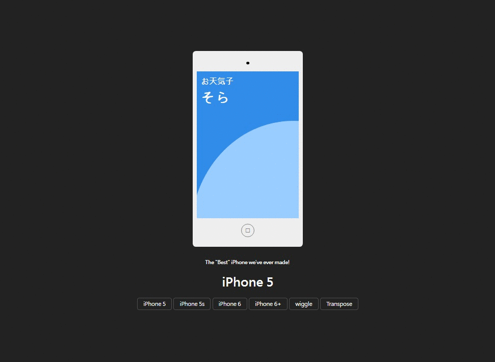
HTML:(Pug)
.phone
  .top
    .camera
  .screen
    .pages
      .page.page1
        h2 お天気子
        p そら
        .sky
      .page.page2
        h2 蔡依林Jolin Tsai - 天空
        p.
          聽著自己的心跳 沒有規則地跳躍   #[<br>]
          我安靜地在思考 並不想被誰打擾  #[<br>]
          我們曾緊緊擁抱 卻又輕易地放掉  #[<br>]
          那種感覺很微妙 該怎麼說才好  #[<br>]

          時間分割成對角 停止你對我的好 #[<br>]
          瓦解我們的依靠  #[<br>]

          在你離開之後的天空#[<br>]
          我像風箏尋一個夢  #[<br>]
          雨後的天空 是否有放晴後的面容  #[<br>]
          我靜靜的望著天空  #[<br>]
          試著尋找失落的感動  #[<br>]
          只能用笑容 期待著雨過天晴的彩虹  #[<br>]

          聽著自己的心跳 沒有規則地跳躍  #[<br>]
          我安靜地在思考 並不想被誰打擾  #[<br>]
          我們曾緊緊擁抱 卻又輕易地放掉  #[<br>]
          那種感覺很微妙 該怎麼說才好  #[<br>]

          時間分割成對角 停止你對我的好  #[<br>]
          瓦解我們的依靠  #[<br>]

      .page.page3
        h2 天空 wiki
        p.
          天空是大氣層或太空可被天體表面的觀測者看到的部分。在地球,晴朗的日間,天空看起來是藍色的。在日出和日落時,天空會偏紅色,但其實天空是無色的。對晴朗天空的能見度一般用視覺深度這個術語來描述。

          人可以在天空觀測氣象或天文現象,從而得知天氣變化、時間的流易或自己的方位。日出日落可知一日中的時間,晚上月亮的盈虧可以知道大概一個月的時間。北斗星可以指示北方。雲的厚度和形狀可以知道會否下雨。

          在天空可以欣賞到許多美麗的現象,如彩虹、極光和流星雨等。雀鳥會在天空飛翔。
  .bottom
    .button □
h3.status The "Best" iPhone we've ever made!
h2.phonename iPhone 5s
.buttons
  button.i5 iPhone 5
  button.i5s iPhone 5s
  button.i6 iPhone 6
  button.i6s iPhone 6+
  button.wiggle wiggle
  button.turn Transpose
CSS:(Sass)
$color_black: #222
$color_white: #eee

*
  position: relative
  user-select: none
  font-family: "微軟正黑體"
  vertical-align: top


body
 overflow-x: hidden  // x捲軸隱藏
 overflow-y: hidden  // y捲軸隱藏

html,body
  width: 100%
  height: 100%
  margin: 0
  padding: 0
  background-color: $color_black
  display: flex
  justify-content: center
  align-items: center
  // column變成水平排列
  flex-direction: column

.phone
  width: 250px
  padding: 10px
  border-radius: 8px
  background-color: $color_white
  transition-duration: 0.5s

  ///螢幕上方白邊(包含鏡頭)
  left: 0px
  .top
    height: 40px
    .camera
      position: absolute
      width: 7px
      height: 7px
      border-radius: 100%
      top: 50%
      left: 50%
      transform: translate(-50%,-50%)
      background-color: black

  .screen
    height: 360px
    transition-duration: 0.5s
    overflow: hidden
    cursor: pointer
    .pages
      width: 100%
      height: 100%
      // 強制不換行
      white-space: nowrap
      font-size: 0px
      transition: 0.5s
      // 若不設定left: 0px,第一張圖片動畫切換會有問題
      left: 0px

      .page
        font-size: initial
        display: inline-block
        background-color: #222
        width: 100%
        height: 100%
        padding: 10px
        box-sizing: border-box
        font-size: 11px
        position: relative
        white-space: normal
        text-align: justify
        h2
          color: white
          font-size: 20px
          margin: 0
        p
          color: white
          letter-spacing: 1px
          line-height: 25px

        &:before
          position: absolute
          left: 0
          top: 0
          content: ""
          display: block
          background-color: #308CE8
          height: 60px
          width: 100%
          margin: -20px 0px

      .page1
        color: white
        background-color: #308CE8
        p
          font-size: 35px
          margin-top: 15px
          font-weight: 800

        //白球
        .sky
          width: 500px
          height: 550px
          border: solid 1px #99CCFF
          border-radius: 100%
          background-color: #99CCFF
          bottom: -10px
          left: -25px

      .page2
          overflow-y: scroll  // y捲軸隱藏
      .page3

  // home鍵樣式設定
  .bottom
    height: 60px
    .button
      height: 30px
      width: 30px
      top: 50%
      left: 50%
      border-radius: 100%
      border: solid 1px gray
      transform: translate(-50%,-50%)
      text-align: center
      font-size: 20px
      line-height: 25px
      vertical-align: middle
      color: gray
      &:hover
        background-color: rgba(black,0.2)

.status,.phonename
  color : white
  margin: 0

.status
  font-size: 10px
  margin-top: 30px

.phonename
  font-size: 30px
  margin: 20px

.buttons
  min-width: 600px
  text-align: center
  button
    background-color: transparent
    border: solid 1px rgba(#fff,0.2)
    color: white
    padding: 5px 14px
    border-radius: 5px
    cursor: pointer

    &:hover
      background-color: #fff
      color:  #333
JavaScript:(jQuery)
// 空字串取得預設,改screen能改變螢幕高度(內部元件撐寬)
$(".i5").click(function () {
  $(".phone").css("width", "");
  $(".screen").css("height", "");
  $(".phonename").text($(this).text());
});

$(".i5s").click(function () {
  $(".phone").css("width", "250px");
  $(".screen").css("height", "400px");
  $(".phonename").text($(this).text());
});

$(".i6").click(function () {
  $(".phone").css("width", "270px");
  $(".screen").css("height", "440px");
  $(".phonename").text($(this).text());
});

$(".i6s").click(function () {
  $(".phone").css("width", "300px");
  $(".screen").css("height", "480px");
  $(".phonename").text($(this).text());
});

// 畫面滑動換頁效果
var page = 0;
$(".screen").click(function () {
  page += 1;
  if (page > 2) {
    page = 0;
  }
  $(".pages").css("left", "-" + page * 100 + "%");
});

// home鍵返回第一頁效果
$(".button").click(function () {
  page = 0;
  $(".pages").css("left", "");
});

//螢幕震動效果
var wiggletime = 21;
setInterval(function () {
  wiggletime += 1;
  if (wiggletime <= 20) {
    console.log(wiggletime);
    if (wiggletime % 2 == 0) {
      $(".phone").css("left", "-30px");
    } else {
      $(".phone").css("left", "30px");
      // if (wiggletime==21){
      //   $(".phone").css("left","60px");
      // }
    }
  }
}, 60);

$(".iggle").click();

//螢幕橫屏效果
var tag = 0;
$(".turn").click(function () {
  if (tag == 0) {
    $(".phone").css("transform", "rotate(90deg)");
    tag = 1;
  } else {
    $(".phone").css("transform", "");
    tag = 0;
  }
});
顯示結果:
本來想要詳細的講解的,發現講解這篇的篇幅會爆炸。
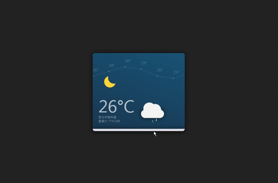
HTML:
<div class="daybox">
  <div class="top">
    <div class="moon"></div>
    <div class="cloud">
      <div class="rain"> </div>
      <div class="rain rain2"></div>
      <div class="rain rain3"></div>
    </div>
    <svg class="temsvg">
      <circle cx="0" cy="100" r="3"></circle>
      <text x="0" y="100">26°</text>
      <circle cx="70" cy="80" r="3"></circle>
      <text x="70" y="80">28°</text>
      <circle cx="140" cy="60" r="3"></circle>
      <text x="140" y="60">30°</text>
      <circle cx="210" cy="70" r="3"></circle>
      <text x="210" y="70">29°</text>
      <circle cx="280" cy="100" r="3"></circle>
      <text x="280" y="100">26°</text>
      <circle cx="350" cy="110" r="3"></circle>
      <text x="350" y="110">25°</text>
      <circle cx="420" cy="90" r="3"></circle>
      <text x="420" y="90">26°</text>
      <circle cx="490" cy="80" r="3"></circle>
      <text x="490" y="80">26°</text>
      <circle cx="560" cy="120" r="3"></circle>
      <text x="560" y="120">26°</text>
      <polyline points="0,100 70,80 140,60 ,210,70 280,100 350,110 420,90 480,80 560,120"></polyline>
    </svg>
    <div class="text_area">
      <div class="temperture">26°C</div>
      <div class="infos">
        <div class="address">新北市樹林區</div>
        <div class="time">星期六 下午2:00</div>
      </div>
    </div>
  </div>
  <div class="bottom">
    <!--day1-->
    <div class="dayweather">
      <h3>MON</h3>
      <svg viewbox="-50 -50 100 99">
        <circle class="sun" cx="0" cy="0" r="22"></circle>
      </svg>
    </div>
    <!--day2       -->
    <div class="dayweather">
      <h3>TUE</h3>
      <svg viewbox="-50 -50 100 100">
        <circle class="sun" cx="0" cy="0" r="22"> </circle>
      </svg>
    </div>
    <!--day3-->
    <div class="dayweather">
      <h3>WED</h3>
      <svg viewbox="-50 -50 100 100">
        <circle class="sun" cx="0" cy="0" r="22"> </circle>
      </svg>
    </div>
    <!--day4-->
    <div class="dayweather">
      <h3>THU</h3>
      <svg viewbox="-50 -50 100 100">
        <circle class="sun" cx="0" cy="0" r="22"> </circle>
        <circle class="cloud" cx="0" cy="30" r="20"> </circle>
        <circle class="cloud" cx="-15" cy="30" r="20"> </circle>
        <circle class="cloud" cx="-30" cy="30" r="20"> </circle>
        <circle class="cloud" cx="-25" cy="10" r="15"> </circle>
        <circle class="cloud" cx="-7" cy="15" r="15"> </circle>
      </svg>
    </div>
    <!--day5-->
    <div class="dayweather">
      <h3>FRI</h3>
      <svg viewbox="-50 -50 100 100">
        <circle class="sun" cx="0" cy="0" r="22"> </circle>
      </svg>
    </div>
    <!--day6-->
    <div class="dayweather">
      <h3>SAT</h3>
      <svg viewbox="-65 -25 100 100">
        <circle class="cloud" cx="0" cy="30" r="20"> </circle>
        <circle class="cloud" cx="-15" cy="30" r="20"> </circle>
        <circle class="cloud" cx="-30" cy="30" r="20"> </circle>
        <circle class="cloud" cx="-25" cy="10" r="15"> </circle>
        <circle class="cloud" cx="-7" cy="15" r="15"> </circle>
      </svg>
    </div>
    <!--day7-->
    <div class="dayweather">
      <h3>SUN</h3>
      <svg viewbox="-65 -25 100 100">
        <circle class="cloud" cx="0" cy="30" r="20"> </circle>
        <circle class="cloud" cx="-15" cy="30" r="20"> </circle>
        <circle class="cloud" cx="-30" cy="30" r="20"> </circle>
        <circle class="cloud" cx="-25" cy="10" r="15"> </circle>
        <circle class="cloud" cx="-7" cy="15" r="15"> </circle>
        <line class="rain" x1="-40" y1="15" x2="-40" y2="35"></line>
        <line class="rain rain3" x1="-20" y1="5" x2="-20" y2="25"></line>
        <line class="rain rain2" x1="-5" y1="20" x2="-5" y2="40"></line>
      </svg>
    </div>
  </div>
</div>
CSS:
@charset "UTF-8";
* {
  position: relative;
  font-family: 微軟正黑體;
  transition-duration: 0.4s;
}

html, body {
  width: 100%;
  height: 100%;
  margin: 0;
  padding: 0;
  display: flex;
  justify-content: center;
  align-items: center;
  background-color: #222;
}

.daybox {
  width: 50%;
  max-width: 400px;
  min-width: 320px;
  border-radius: 10px;
  border-color: transparent;
  box-shadow: 0px 0px 20px rgba(0, 0, 0, 0.7);
  cursor: pointer;
}

.daybox:hover .bottom {
  height: 100px;
}

.daybox:hover .dayweather {
  opacity: 1;
  top: -10px;
}

.daybox:hover .moon, .daybox:hover .cloud {
  opacity: 0.5;
}

.daybox:hover .temsvg circle, .daybox:hover .temsvg polyline, .daybox:hover .temsvg text {
  opacity: 1;
}

.rain {
  width: 2px;
  height: 10px;
  background-color: #F3F3F3;
  position: absolute;
  left: 40px;
  border-color: transparent;
  animation: raindrop 1s infinite linear;
  animation-delay: -0.1s;
}

.rain2 {
  position: absolute;
  top: 10px;
  left: 25px;
  animation: raindrop 1s infinite;
  animation-delay: -0.4s;
}

.rain3 {
  position: absolute;
  top: 15px;
  left: 55px;
  animation-delay: -0.7s;
}

@keyframes raindrop {
  0% {
    transform: translateX(10px) translateY(20px);
  }
  100% {
    transform: translateX(10px) translateY(70px);
    opacity: 0;
  }
}

.top {
  background: linear-gradient(20deg, #19283D, #17678F);
  height: 330px;
  background-size: 100% 300%;
  animation: daylight 5s infinite;
  border-radius: 10px 10px 0px 0px;
}

@keyframes daylight {
  0% {
    background-position: 100% 30%;
  }
  50% {
    background-position: 100% 100%;
  }
  100% {
    background-position: 100% 30%;
  }
}

.top .moon {
  width: 50px;
  height: 50px;
  border-radius: 100%;
  box-shadow: 15px -15px;
  position: absolute;
  animation: moonmove 20s infinite;
  left: 50px;
  top: 100px;
  border-color: transparent;
}

@keyframes moonmove {
  0% {
    box-shadow: 15px -15px #FFD633;
    transform: translateX(-15px) translateY(15px);
  }
  100% {
    box-shadow: -30px 30px #FFD633;
    transform: translateX(30px) translateY(-30px);
  }
}

.cloud {
  left: 210px;
  bottom: 50px;
  border-radius: 20px;
  width: 100px;
  height: 36px;
  position: absolute;
  background-color: #F3F3F3;
  border-color: transparent;
  animation: cloudmove 4s infinite;
  box-shadow: 0px 0px 20px rgba(0, 0, 0, 0.7);
}

.cloud:before, .cloud:after {
  content: "";
  border: solid 1px;
  display: block;
  width: 50px;
  height: 50px;
  border-radius: 100%;
  position: absolute;
  background-color: #F3F3F3;
  border-color: transparent;
}

.cloud:before {
  top: -32px;
  left: 10px;
}

.cloud:after {
  top: -25px;
  left: 35px;
}

@keyframes cloudmove {
  0% {
    transform: translateY(0px);
  }
  50% {
    transform: translateY(10px);
  }
  100% {
    transform: translateY(0px);
  }
}

.temsvg {
  width: 100%;
}

.temsvg polyline {
  stroke: #F3F3F3;
  fill: none;
  stroke-width: 1px;
  opacity: 0.2;
}

.temsvg text {
  transform: translateY(-20px);
  fill: #F3F3F3;
  opacity: 0.2;
}

.temsvg circle {
  fill: #F3F3F3;
  opacity: 0.2;
}

.text_area {
  position: absolute;
  display: inline-block;
  bottom: 25px;
  left: 25px;
  color: rgba(243, 243, 243, 0.7);
}

.text_area .temperture {
  font-size: 70px;
  line-height: 80px;
}

.text_area .infos {
  font-size: 13px;
  opacity: 0.5;
}

.moon, .cloud {
  transition: 0.5s 1s;
}

.temsvg circle {
  transition: 0.5s;
}

.temsvg polyline {
  transition: 0.5s 0.3s;
}

.temsvg text {
  transition: 0.5s 0.6s;
}

#switch_night:checked + .top .moon, #switch_night:checked + .top .cloud {
  opacity: 0.5;
}

#switch_night:checked + .top .temsvg circle, #switch_night:checked + .top .temsvg polyline, #switch_night:checked + .top .temsvg text {
  opacity: 1;
}

.bottom {
  background-color: #DBDBE5;
  height: 10px;
  display: flex;
  justify-content: center;
  box-shadow: 0px 0px 20px rgba(0, 0, 0, 0.7);
  border-radius: 0px 0px 10px 10px;
  overflow: hidden;
}

.bottom .dayweather {
  width: calc( 100% / 7 - 10px);
  text-align: center;
  opacity: 0;
  top: 10px;
}

.bottom .dayweather h3 {
  top: 20px;
  font-size: 8px;
  color: rgba(25, 40, 61, 0.7);
  font-weight: 500;
  letter-spacing: 2px;
}

.bottom .dayweather svg {
  top: 20px;
  width: 100%;
  max-width: 40px;
  height: 40px;
}
.bottom .dayweather svg .sun {
  fill: #FFD633;
  stroke: #FFD633;
  stroke-width: 30px;
  stroke-dasharray: 5px;
}

.bottom .dayweather svg .rain {
  stroke: #4DACFF;
  transform: translateY(50px);
  transform: translateY(-200px);
}

.bottom .dayweather svg .cloud {
  fill: #CCC;
}

.dayweather:nth-child(1) {
  transition-delay: 0.2s;
}

.dayweather:nth-child(2) {
  transition-delay: 0.3s;
}

.dayweather:nth-child(3) {
  transition-delay: 0.4s;
}

.dayweather:nth-child(4) {
  transition-delay: 0.5s;
}

.dayweather:nth-child(5) {
  transition-delay: 0.6s;
}

.dayweather:nth-child(6) {
  transition-delay: 0.7s;
}

.dayweather:nth-child(7) {
  transition-delay: 0.8s;
}
顯示結果:
寫到一半才發現「天氣盒子」不是 Sass...(暈)
分析了之前寫過的兩個小作品的製作流程,算是對昨天學到的 Sass,一個加強練習的機會。順帶一提,今天做了一些預定事項以外的事情,像是幫朋友配電腦生成估價單、調校 Ubuntu 和 Windows 10 系統設定,以及額外撰寫 WordPress Blog 的 CSS···這些瑣事對於寫鐵人賽文章來說,看起來其實不一定要做,但是在做了之後,神奇的事情發生了,這些事情在我沒有動力寫文章時,起到了助力(截稿壓力)。這裡我其實想表達的是:「有時候做一件事情進行的不順利時,可以去做一些不相關的事情來轉移注意力,這些事情會形成間接的推力」。今天一整天有點懶的打字,想說做做看其它的事,看看能不能提高一點寫作效率,而事實證明了這招是可行的辦法。
覺得煩躁、任務卡關時,不妨試著整理周邊環境,適度的打掃除了讓環境變得乾淨之外,透過整理會讓內心變得更加平靜,間接影響做事的效率。


 iThome鐵人賽
 看影片追技術