今天的參考
https://www.youtube.com/watch?v=LYgQXOV-x24
看了一下方法,是用一個旋轉的長方形,然後遮住一部分,看起來就會像2個光源在跑動
HTML
<!DOCTYPE html>
<html lang="en">
<head>
	<meta charset="utf-8">
	<title>測試</title>
	<link href="C1.css" rel="stylesheet">
</head>
<body>
	<div class="box">
		<h2>02</h2>
	</div>
</body>
</html>
CSS
@import url('https://fonts.googleapis.com/css?family=Roboto:300,400,500,700,900&display=swap');

*{
	margin: 0;
	padding: 0;
	box-sizing: border-box;
	font-family: 'Poppins', sans-serif;
}

body{
	display: flex;
	justify-content: center;
	align-items: center;
	min-height: 100vh;
	background: #000000;
}

.box{
	position: relative;
	width: 300px;
	height: 480px;
	display: flex;
	justify-content: center;
	align-items: center;
	background: rgba(0, 0, 0, 0.5);
	overflow: hidden;
	border-radius: 20px;
}

.box::before{
	content: '';
	position: absolute;
	width: 150px;
	height: 150%; /*太短 光線會斷掉*/
	background: linear-gradient(#FFF93F,#FF2929);
	animation: RN 4s linear infinite;
}

.box::after{
	content: '';
	position: absolute;
	inset: 4px;
	background: #14161B;
	border-radius: 16px;

}

@keyframes RN{
	0%{
		transform: rotate(0deg);
	}
	100%{
		transform: rotate(360deg);
	}
}

.box h2{
	color: #FFFFFF;
	font-size: 10em;
	position: relative;
	z-index: 10;
}
成果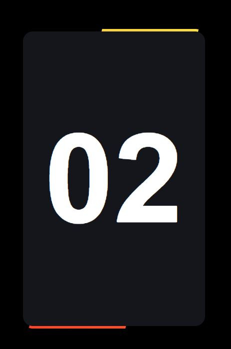
今天先這樣,明天找別的


 iThome鐵人賽
 看影片追技術