今天介紹另一種儲存雷達原始資料常用的格式-nexrad,但目前氣象局僅有五分山雷達使用此nexrad資料格式儲存原始資料。目前氣象局使用的是nexrad version2,那現在已經有nexrad version3,不清楚多久之後氣象局會跟進。
python的pyart套件可以讀取nexrad資料格式。
import pyart

nexrad = pyart.io.read_nexrad_archive("day26/20220526_0741_RCWF_VOL.157")
print(nexrad)
上述print(nexrad)會出現雷達相關資料(如下圖),基本是以屬性的概念取得第一層資料,取完之後會提供字典物件,可根據鍵值取數值。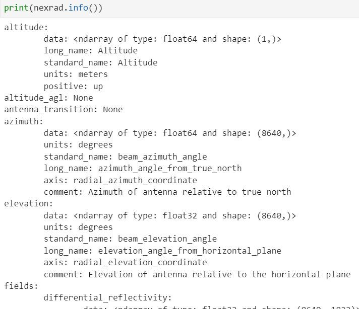
#取屬性latitude
lat_atri = nexrad.latitude
print(lat_atri)
'''
會得到字典物件如下
{'long_name': 'Latitude',
 'standard_name': 'Latitude',
 'units': 'degrees_north',
 'data': array([25.07305527])}
'''
#根據鍵值取數值
lat = lat_atri["data"]

'''
這樣就可以取得雷達位置緯度值
'''
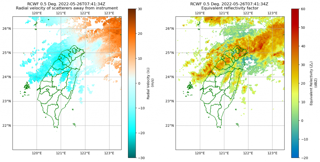
pyart有提供非常方便的視覺化方法,直接使用就可了。
fig = plt.figure(figsize=(16,8))
display = pyart.graph.RadarMapDisplay(nexrad) #先開一個要畫雷達地圖的物件
ax = plt.subplot(121,
                 projection=crs.PlateCarree())

display.plot_ppi_map('velocity',
                     sweep=1,
                     ax=ax,
                     projection=crs.PlateCarree(),
                     colorbar_label='Radial Velocity ($V_{r}$) \n (m/s)',
                     vmin=-30,
                     vmax=30,
                     shapefile="tw_shp/COUNTY_MOI_1090820.shp",
                     shapefile_kwargs={"facecolor":'none','edgecolor':'green'},
                     embellish=False, #取消內建的海岸線shapefile
                     cmap="pyart_BuDOr18")
ax.set_extent([119, 123.5, 21, 26.5])
gl=ax.gridlines(draw_labels=True)
gl.right_labels = False

ax = plt.subplot(122,
                 projection=crs.PlateCarree())
display.plot_ppi_map('reflectivity',
                     sweep=1,
                     ax=ax,
                     colorbar_label='Equivalent Relectivity ($Z_{e}$) \n (dBZ)',
                     vmin=-20,
                     vmax=60,
                     shapefile="tw_shp/COUNTY_MOI_1090820.shp",
                     shapefile_kwargs={"facecolor":'none','edgecolor':'green'},
                     embellish=False)

ax.set_extent([119, 123.5, 21, 26.5])
gl=ax.gridlines(draw_labels=True)
gl.right_labels = False
視覺化圖形如下