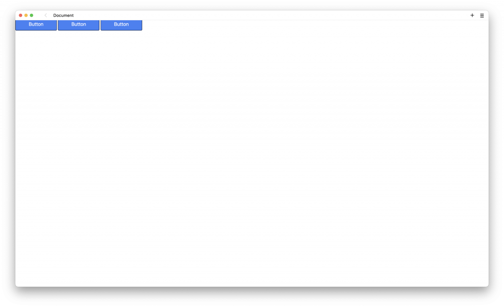
這個單元要來製作一個簡單的 header,使用上一個單元學習到的按鈕元件,這邊一口氣直接先放上三個按鈕:
<div>
  <a class="rounded border border-black bg-blue-500 px-12 py-3 text-lg text-white hover:bg-transparent hover:text-indigo-600" href="/">Button</a>
  <a class="rounded border border-black bg-blue-500 px-12 py-3 text-lg text-white hover:bg-transparent hover:text-indigo-600" href="/">Button</a>
  <a class="rounded border border-black bg-blue-500 px-12 py-3 text-lg text-white hover:bg-transparent hover:text-indigo-600" href="/">Button</a>
</div>
這個按鈕樣式的產生可以參考上一個單元,開啟瀏覽器的話,畫面會變成這個樣子:
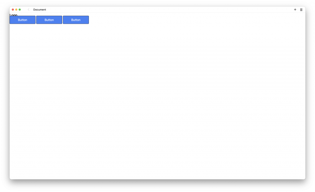
然後再加上一個 Logo 的文字,樣式是使用 text-xl 與 font-medium:
<div>
  <div>
    <a href="#" class="text-xl font-medium">Logo</a>
  </div>
  <div>
    <a class="rounded border border-black bg-blue-500 px-12 py-3 text-lg text-white hover:bg-transparent hover:text-indigo-600" href="/">Button</a>
    <a class="rounded border border-black bg-blue-500 px-12 py-3 text-lg text-white hover:bg-transparent hover:text-indigo-600" href="/">Button</a>
    <a class="rounded border border-black bg-blue-500 px-12 py-3 text-lg text-white hover:bg-transparent hover:text-indigo-600" href="/">Button</a>
  </div>
</div>
開啟瀏覽器的話,畫面會變成這個樣子:
加上水平與垂直的 padding,樣式是使用 px-6 與 py-3:
<div class="px-6 py-3">
  <div>
    <a href="#" class="text-xl font-medium">Logo</a>
  </div>
  <div>
    <a class="rounded border border-black bg-blue-500 px-12 py-3 text-lg text-white hover:bg-transparent hover:text-indigo-600" href="/">Button</a>
    <a class="rounded border border-black bg-blue-500 px-12 py-3 text-lg text-white hover:bg-transparent hover:text-indigo-600" href="/">Button</a>
    <a class="rounded border border-black bg-blue-500 px-12 py-3 text-lg text-white hover:bg-transparent hover:text-indigo-600" href="/">Button</a>
  </div>
</div>
開啟瀏覽器的話,畫面會變成這個樣子:

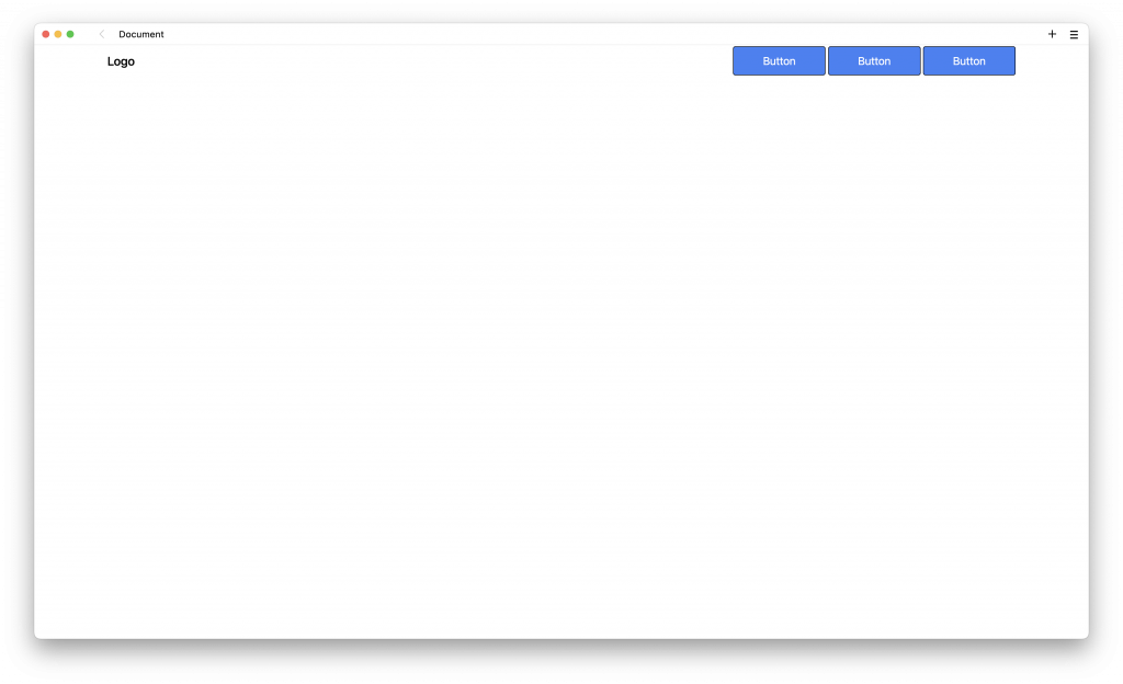
可以發現在第二層的兩個 div ,並沒有水平擺放,而是呈現垂直的擺放,要使用水平擺放的話,必須要新增 flex-row,而 flex-row 必須要與 flex 一起使用,加入樣式 flex 與 flex-row :
<div class="px-6 py-3 flex flex-row">
  <div>
    <a href="#" class="text-xl font-medium">Logo</a>
  </div>
  <div>
    <a class="rounded border border-black bg-blue-500 px-12 py-3 text-lg text-white hover:bg-transparent hover:text-indigo-600" href="/">Button</a>
    <a class="rounded border border-black bg-blue-500 px-12 py-3 text-lg text-white hover:bg-transparent hover:text-indigo-600" href="/">Button</a>
    <a class="rounded border border-black bg-blue-500 px-12 py-3 text-lg text-white hover:bg-transparent hover:text-indigo-600" href="/">Button</a>
  </div>
</div>
開啟瀏覽器的話,畫面會變成這個樣子:

更多相關的 flex 排版範例可以參考官方文件:https://tailwindcss.com/docs/flex-direction。
接下來希望在第二層的兩個 div 可以分別往左邊與右邊靠近,就必須要使用 justify-between,可以沿著容器的主軸來對齊,而且每個 div 之間有相等的空間,加入樣式 justify-between:
<div class="px-6 py-3 flex flex-row justify-between">
  <div>
    <a href="#" class="text-xl font-medium">Logo</a>
  </div>
  <div>
    <a class="rounded border border-black bg-blue-500 px-12 py-3 text-lg text-white hover:bg-transparent hover:text-indigo-600" href="/">Button</a>
    <a class="rounded border border-black bg-blue-500 px-12 py-3 text-lg text-white hover:bg-transparent hover:text-indigo-600" href="/">Button</a>
    <a class="rounded border border-black bg-blue-500 px-12 py-3 text-lg text-white hover:bg-transparent hover:text-indigo-600" href="/">Button</a>
  </div>
</div>
開啟瀏覽器的話,畫面會變成這個樣子:

更多相關的 justify-between 排版範例可以參考官方文件:https://tailwindcss.com/docs/justify-content。
由於現在的畫面是呈現滿版的方式,也就是螢幕多寬,兩個 div 元件就會更往左右兩邊貼齊,這邊可以使用 container 來呈現一個固定寬度,加入樣式 container:
<div class="px-6 py-3 flex flex-row justify-between container">
  <div>
    <a href="#" class="text-xl font-medium">Logo</a>
  </div>
  <div>
    <a class="rounded border border-black bg-blue-500 px-12 py-3 text-lg text-white hover:bg-transparent hover:text-indigo-600" href="/">Button</a>
    <a class="rounded border border-black bg-blue-500 px-12 py-3 text-lg text-white hover:bg-transparent hover:text-indigo-600" href="/">Button</a>
    <a class="rounded border border-black bg-blue-500 px-12 py-3 text-lg text-white hover:bg-transparent hover:text-indigo-600" href="/">Button</a>
  </div>
</div>
container 可以讓寬度在不同螢幕的大小內,呈現一個固定的寬度,例如當螢幕為 1024px ~ 1280px 之間的話,會永遠固定寬度 1024px。
但因為使用 container 會將寬度變小,所以會變成往左邊貼齊,要讓它呈現置中的效果,可以使用 mx-auto,是表示在 x 軸左右兩邊的留白一樣寬,所以就會有置中的效果,加入樣式 mx-auto:
<div class="px-6 py-3 flex flex-row justify-between container mx-auto">
  <div>
    <a href="#" class="text-xl font-medium">Logo</a>
  </div>
  <div>
    <a class="rounded border border-black bg-blue-500 px-12 py-3 text-lg text-white hover:bg-transparent hover:text-indigo-600" href="/">Button</a>
    <a class="rounded border border-black bg-blue-500 px-12 py-3 text-lg text-white hover:bg-transparent hover:text-indigo-600" href="/">Button</a>
    <a class="rounded border border-black bg-blue-500 px-12 py-3 text-lg text-white hover:bg-transparent hover:text-indigo-600" href="/">Button</a>
  </div>
</div>
開啟瀏覽器的話,畫面會變成這個樣子:
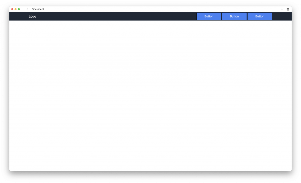
最上放上 header 標籤,設定背景設與文字的顏色,加入樣式 bg-gray-800 與 text-white:
<header class="bg-gray-800 text-white">
  <div class="px-6 py-3 flex flex-row justify-between container mx-auto">
    <div>
      <a href="#" class="text-xl font-medium">Logo</a>
    </div>
    <div>
      <a class="rounded border border-black bg-blue-500 px-12 py-3 text-lg text-white hover:bg-transparent hover:text-indigo-600" href="/">Button</a>
      <a class="rounded border border-black bg-blue-500 px-12 py-3 text-lg text-white hover:bg-transparent hover:text-indigo-600" href="/">Button</a>
      <a class="rounded border border-black bg-blue-500 px-12 py-3 text-lg text-white hover:bg-transparent hover:text-indigo-600" href="/">Button</a>
    </div>
  </div>
</header>
開啟瀏覽器的話,畫面會變成這個樣子:
tailwindcss - 從零開始學 - Day5 [完]


 iThome鐵人賽
 看影片追技術