哈囉 昨天分享了 youtube影片上的動畫~今天來把昨天學習到的做個整理~~
示範程式碼 : https://codepen.io/ywngjyyj-the-vuer/pen/PoXBeoa
參考影片 : https://www.youtube.com/watch?v=OqcgQnn3dBk
每天我都會將這篇文章裡的關鍵字、使用的語法、問題等做成清單,透過回想或許能幫助您加深記億喲
* display:flex
* justify-content: center
* align-items: center
* transform: translate(x,y)
* transform: scale()
* animation-delay
* animation-duration
* animation-iteration-count
* animaiton-name
* animation-timinf-funciton
* box-shadow
* :nth-child
* opacity
對一個元素display屬性設置為flex時,它就會變成Flexbox( 彈性盒子 ),顧名思義,它會使元素內的進行彈性布局。
Flexbox具有主軸起點及終點和尺寸、交錯軸起點及終點和尺寸的特性可以進行佈局規劃。
Flexbox可分為外容器與內元件。
Flex 外容器屬性:
- display
- flex-flow
- flex-direction
- flex-wrap
- justify-content
- align-items
Flex 內元件屬性:
- flex
- flex-grow
- flex-shrink
- flex-basis
- order
- align-self
與align-items相反,是以主軸來排版,是預設軸,故當flex-direction : row是不會有反應的,在這邊代表主軸是水平的、交叉軸是垂直的。
1.justify-content: flex-start 預設值,對齊主軸線最前端。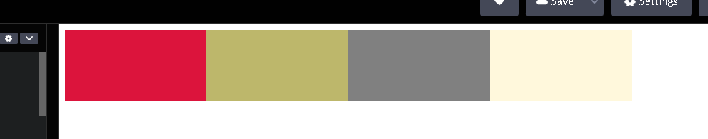
2.justify-content: flex-end 對齊主軸線最終端.
3.justify-content: center 對齊主軸線中央。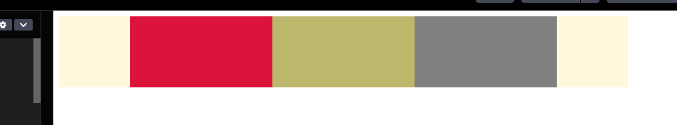
4.justify-content: space-around 平均分配寬度和間距。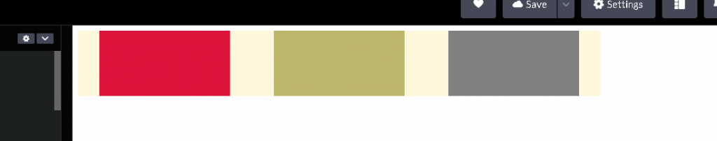
5.justify-content: space-between 平均分配寬度,第一項和最後一項貼齊邊緣。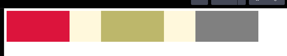
與justify-content相反,是以交錯軸來排版,要注意是交錯軸,故當flex-direction : column時,交錯軸由直轉橫。
以flex-direction : row為例,交錯軸是直的。
1.align-items : flex-start,對齊交錯軸線最前端。
2.align-items : flex-end ,對齊交錯軸線最後端。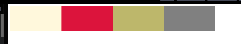
3.align-items : center ,對齊交錯軸線中央。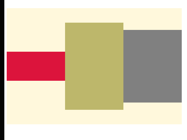
4.align-items : stretch,預設值,將內容元素撐開至 flexbox 大小。
5.align-items : baseline ,對齊內容物的基線。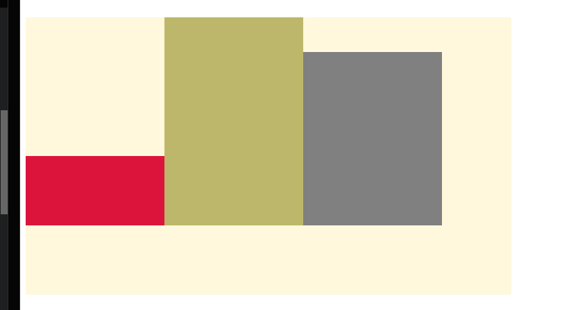
https://codepen.io/ywngjyyj-the-vuer/pen/xxmaGdz
transform屬性通常用於建立動畫效果,其中transform : translate(x,y)代表著可使元素相對於自身左上角進行平移的效果。
translateX( )表示水平方向上的位移。translateY( )表示垂直方向上的位移。transform屬性通常用於建立動畫效果,其中transform : scale( )代表著可使元素相對於自身放大( 正數 )或縮小( 小於1 )的效果。
https://codepen.io/ywngjyyj-the-vuer/pen/RwEybgo
這是一個動畫效果,設定每次的動畫延遲多久才開始動畫,可以設定秒數( s )或毫秒(ms)
動畫的持續時間,單位為秒( s )或毫秒( ms ),預設為0。
代表整個動畫的重複次數。
可輸入整數數值或無限次( infinite )。
在CSS中指定動畫的名稱,通過增加animation-name這個性可以使元素播放定義好的動畫效果,通常跟@keyframes搭配。
這是一個CSS動畫的屬性設定,代表著從動畫從開始到結束的時間曲線。animation-timing-funciton : linear ⇒ 等速animation-timing-funciton : ease ⇒ default,低速開始、逐漸加快、逐漸低速至結束。animation-timing-funciton : ease in ⇒ 以低速開始animation-timing-funciton : ease out ⇒ 以低速結束
https://codepen.io/ywngjyyj-the-vuer/pen/NWeBGBO
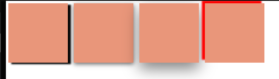
設定一個元素的陰影效果,可設定xy軸的偏移值、模糊半徑、擴張半徑、及顏色(可填入色碼或rgba( 顏色還可設定透明度 ))
box-shadow : ( x軸偏移值 , y軸偏移值 , 模糊半徑 , 擴張半徑) rgba( 0, 0, 0, 0.5 )
box-shadow: 10px 5px 5px black;
box-shadow: rgba(0, 0, 0, 0.35) 0px 5px 15px;
box-shadow: 0 20px 50px rgba(0, 0, 0, 0.5);
box-shadow: -10px -10px 5px red;
這是一個偽類選擇器,這可以讓元素處在特定條件時套用指定的 CSS 效果。比如最常用的:active或:hover。
用於選擇父元素下的不同子元素,這有助於創建複雜布局。
選擇.nth 裡面的div元素的奇數子元素。
.nth div:nth-child(odd) {
  background: pink;
}
parentElement : nth-child ( odd ) ⇒ 選擇父元素所有的奇數子元素。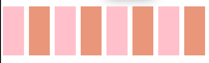
parentElement : nth-child ( even ) ⇒ 選擇父元素所有的偶數子元素。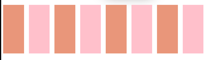
parentElement : nth-child ( 3 ) ⇒ 選擇父元素的第3個子元素。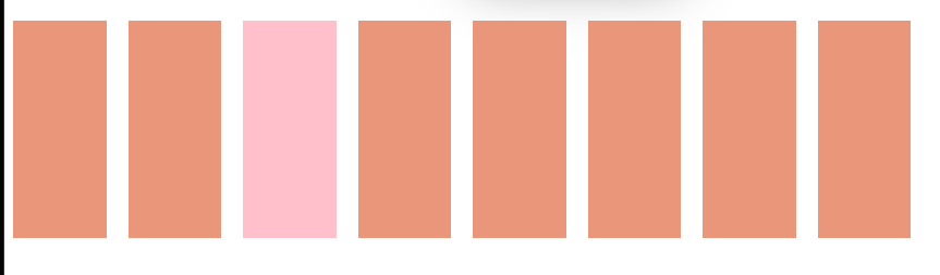
parentElement : nth-child ( 2n ) ⇒ 選擇父元素每兩格子元素的子元素。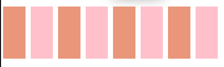
parentElement : nth-child ( 3n+1 ) ⇒ 從第1個子元素開始,選擇父元素每隔3個子元素的子元素。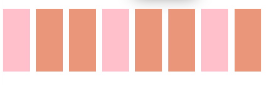
opacity : 1 ⇒ 元素完全不透明,元素後面背景不可見。opacity : 0 ⇒ 元素完全透明,元素不可見。opacity : 0.6 ⇒ 元素半透明,元素後面背景可見。
https://codepen.io/ywngjyyj-the-vuer/pen/GRPXprN
今天就到這邊結束啦~~
https://www.casper.tw/css/2017/07/21/css-flex/
https://w3c.hexschool.com/flexbox/4a029043
https://w3c.hexschool.com/flexbox/87d66dc4
https://developer.mozilla.org/zh-CN/docs/Web/CSS/transform-function/translate
https://eyesofkids.gitbooks.io/css3/content/contents/transform2d.html
https://developer.mozilla.org/zh-TW/docs/Web/CSS/CSS_animations/Using_CSS_animations
https://vocus.cc/article/623a76f2fd897800012afc4c


 看影片追技術