首先,我想將股票數據導入我的程序並分析其歷史趨勢。
import yfinance as yf
import datetime as dt
import numpy as np

Bit = yf.Ticker("BTC-USD")
Bit_hist = Bit.history(period="max")
我發現yfinance模塊非常容易使用和導入。由於python版本兼容性或棄用引起的奇怪錯誤都沒有出現。
我選用折線圖因為它是一個檢查整體趨勢的最佳可視化工具。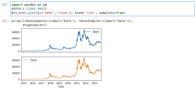
從上面的圖表中,我們可以看出BTC的收盤價和開盤價非常接近。價格在2011年到2022年之間有一次巨大的飆升,然後價格穩定下來。
使用相同的圖表,我們來看看交易量的變化。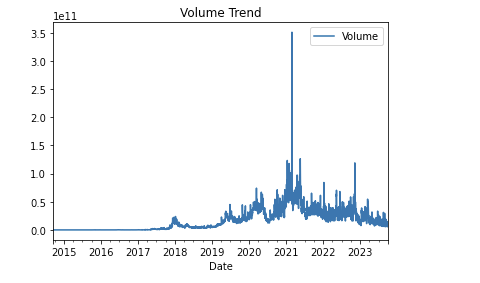
在2021年,交易量出現了巨大的增長,這與同一時期價格的大幅上升相對應。在2022年底價格下跌之後,也可以看到交易量出現了小幅增長。
由於BTC的波動過大,而且有太多的噪音(i.e. 小而頻繁的波動),讓我們試試通過對收盤價進行"rolling(window=100).mean()" 來計算每100天的移動平均(MAVG)來平滑趨勢線。
將MAVG與原始趨勢線進行比較,我們可以看到MAVG提供了比原始趨勢線更平滑的趨勢線。
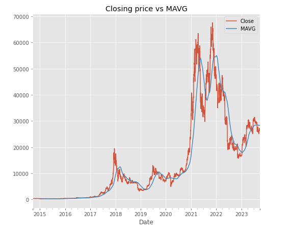
MAVG通過創建不斷更新的平均價格並消除價格的短期波動來平滑價格數據。
我們可以使用箱形圖來在每個類別(Open、Close、High、Low和Volume)中視覺上檢測任何價格的異常值。
features= ['Open', 'Close', 'High', 'Low', 'Volume']
plt.subplots(figsize=(20,10))
for i, col in enumerate(features):
    plt.subplot(2,3,i+1)
    sb.boxplot(Bit2[col])
plt.show()
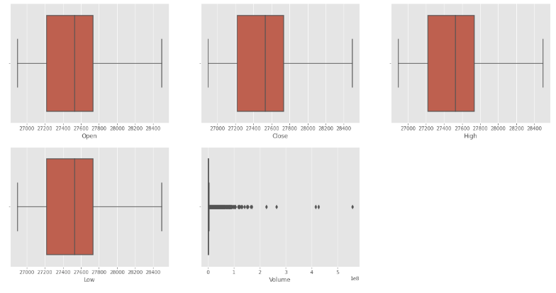
異常值會顯示為尾端的點點,上圖顯示似乎只有在交易量中發現了異常值。
以表格形式查看數據集也很有用:
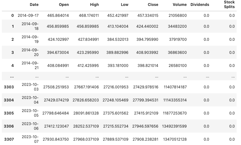
我們可以看到,BTC的價格從2014年的400多美元跳升到2023年的27,000多美元。
讓我們看看每年平均收盤價。
#split the year, month and day
splitted = Bit_hist2['Date'].astype('string').str.split('-', expand=True) # split Date COL w/ delimiter '-'
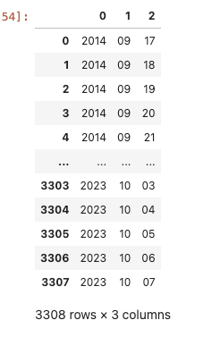
Bit_hist2['day'] = splitted[1].astype('int') # day = 1st col from "splitted"
Bit_hist2['month'] = splitted[0].astype('int') #month = 2nd col from "splitted"
Bit_hist2['year'] = splitted[2].astype('int') #year = 3rd col from "splitted"

# it_hist2 is the DataFrame
Bit_hist2['Date'] = pd.to_datetime(Bit_hist2['Date'])  # Convert 'Date' to datetime
Bit_hist2['year'] = Bit_hist2['Date'].dt.year  # Extract year from 'Datetime'

data_grouped = Bit_hist2.groupby('year').mean() # average the values by "year" COL
fig, axes = plt.subplots(nrows=2, ncols=2, figsize=(20, 10))

for i, col in enumerate(['Open', 'High', 'Low', 'Close']):
    row, col_num = divmod(i, 2)  # Calculate the row and column numbers
    data_grouped[col].plot.bar(ax=axes[row, col_num])
    axes[row, col_num].set_title(f'Mean {col} by Year')

plt.tight_layout()
plt.show()
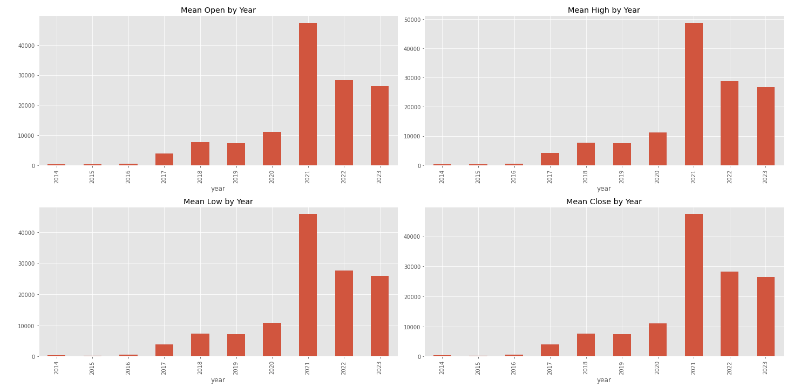
根據上面顯示的每年平均價格的長條圖,我們可以看出2021年的價格是所有年份中最高的。
從上面我們可以看出比起股票,BTC波動非常之大。我考慮因為要以較小的間隔和較短的時間框架對BTC進行抽樣,以便我想要使用的訓練模型實際上能夠產生更準確的結果。
我們將在下一部分繼續。
對 dbt 或 data 有興趣?歡迎加入 dbt community 到 #local-taipei 找我們,也有實體 Meetup 請到 dbt Taipei Meetup 報名參加
Ref:
https://levelup.gitconnected.com/20-pandas-functions-for-80-of-your-data-science-tasks-b610c8bfe63c