複習 🚀[Day18] 實作 - Firebase 創建專案 & 部署
在這篇文章有說到如何部署專案,完成後可以再輸入 npm run build 再查看專案是否部署完成~
為了讓視訊間更完成這篇就加上簡約的樣式,此處使用 styled-component 有興趣或想參考 UI 的人可以繼續看下去,也可以用這個 UI 進行優化~
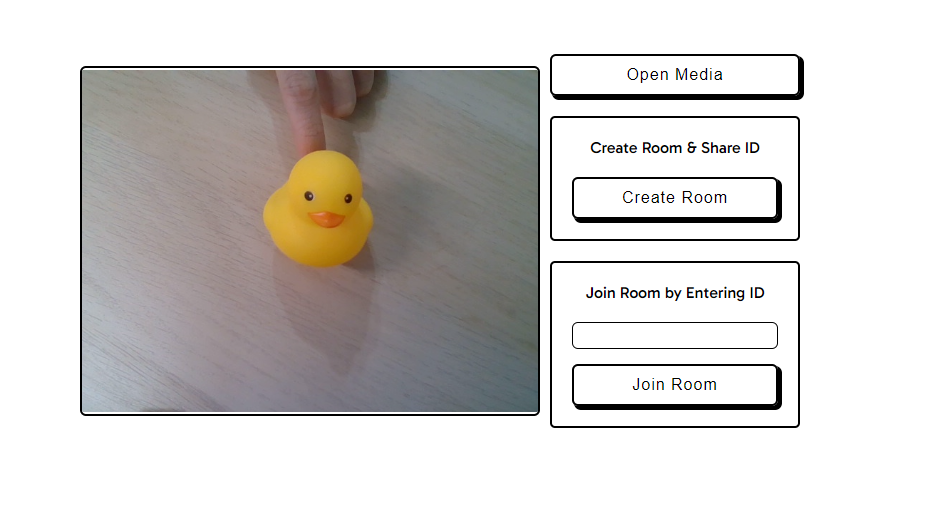
非常簡(偷)約(懶)的樣式🐥🐥🐥
styled-component 是一個 CSS-In-JS 的 libaray ,可以在 JSX 中撰寫 css ,且透過 JS 動態產生 unique 的 class name,不必擔心類名或全域樣式衝突的問題。
// style 用於創建 element 樣式,createGlobalStyle 用於創建全局樣式
import styled, { createGlobalStyle } from 'styled-components';

// 需注意名稱需大寫開頭
const Btn = styled.button`
  background-color: #007bff;
  color: #fff;
  padding: 10px 20px;
  border: none;
  cursor: pointer;
`;

return {
	<Btn />
}
react-icons 提供多種風格的 icon,可以直接在 react 中 import 使用。
import { BsCameraVideoFill } from 'react-icons/bs';

return {
	<BsCameraVideoFill/>
}
npm i styled-component
npm i react-icons
import {
  BsCameraVideoFill,
  BsCameraVideoOffFill,
} from 'react-icons/bs';
import { FaMicrophone, FaMicrophoneSlash, FaPhoneSlash } from 'react-icons/fa';
import styled, { createGlobalStyle } from 'styled-components';
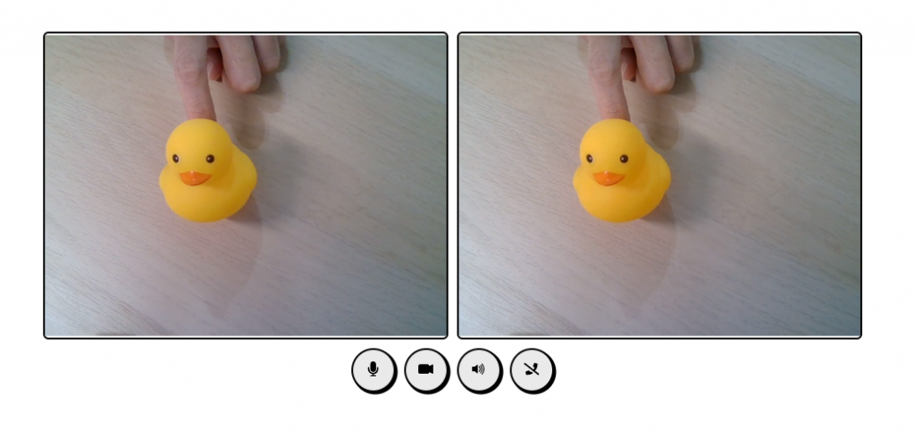
<GlobalStyle /> 在 component return 中isShow={isCall} 判斷 display 樣式videoState.isAudioMuted icon 顯示代替文字return (
<Container isColumn={peerConnection}>
<GlobalStyle />
<VideoContainer>
<LocalVideo ref={localVideoRef} autoPlay muted playsInline />
<RemoteVideo
ref={remoteVideoRef}
autoPlay
playsInline
isShow={isCall}
/>
</VideoContainer>
<ActionContainer isShow={!isCall}>
<OpenMediaBtn onClick={openMedia}>Open Media</OpenMediaBtn>
<RoomAction>
<ActionTitle>Create Room & Share ID</ActionTitle>
<ActionBtn onClick={createRoom}>Create Room</ActionBtn>
</RoomAction>
<RoomAction>
<ActionTitle>Join Room by Entering ID</ActionTitle>
<RoomIdInput
value={roomId}
onChange={(e) => setRoomId(e.target.value)}
/>
<ActionBtn onClick={() => joinRoom(roomId)}>Join Room</ActionBtn>
</RoomAction>
</ActionContainer>
<ToolBtnContainer isShown={peerConnection}>
<ToolBtn onClick={toggleMute}>
{videoState.isMuted ? <FaMicrophoneSlash /> : <FaMicrophone />}
</ToolBtn>
<ToolBtn onClick={toggleVideo}>
{videoState.isVideoDisabled ? (
<BsCameraVideoOffFill />
) : (
<BsCameraVideoFill />
)}
</ToolBtn>
<ToolBtn onClick={hangUp}>
<FaPhoneSlash />
</ToolBtn>
</ToolBtnContainer>
</Container>
);
const GlobalStyle = createGlobalStyle`
* {
    box-sizing: border-box;
}`;
const Container = styled.div`
  font-family: "Gabarito", cursive;
  margin: 0 auto;
  max-height: 100vh;
  display: flex;
  justify-content: center;
  align-items: center;
  flex-direction: ${({ isColumn }) => (isColumn ? 'column' : 'row')};
  gap: 10px;
  padding-top:25vh;
`;
const defaultBtn = styled.button`
  border: 2px solid black;
  border-radius: 6px;
  background: none;
  cursor: pointer;
  padding: 10px 18px;
  font-size: 16px;
  letter-spacing: 1px;
  box-shadow: 3px 3px 0px 1px rgba(0, 0, 0, 1);
  margin: 0 auto;
`;
const ActionContainer = styled.div`
  display: ${({ isShow }) => (isShow ? 'block' : 'none')};
  text-align: center;
`;
const OpenMediaBtn = styled(defaultBtn)`
  width: 250px;
  margin-bottom: 20px;
`;
const ActionBtn = styled(defaultBtn)`
  width: 100%;
`;
const RoomAction = styled.div`
  padding: 20px;
  border: 2px solid black;
  border-radius: 5px;
  max-width: 250px;
  max-height: 200px;
  margin: 0 auto;
  margin-bottom: 20px;
  &:last-child {
    margin-bottom: 0px;
  }
`;
const ActionTitle = styled.div`
  margin-bottom: 10px;
  padding-bottom: 10px;
`;
const RoomIdInput = styled.input`
  margin-bottom: 15px;
  width: 100%;
  border: 1.5px solid black;
  border-radius: 6px;
  padding: 5px 10px;
`;
const VideoContainer = styled.div`
  display: flex;
  gap: 10px;
`;
const VideoCall = styled.video`
  border: 2px solid black;
  border-radius: 6px;
  height: 350px;
  width: 460px;
`;
const LocalVideo = styled(VideoCall)``;
const RemoteVideo = styled(VideoCall)`
  display:${({ isShow }) => (isShow ? 'block' : 'none')}
`;
const ToolBtnContainer = styled.div`
  display: ${({ isShown }) => (isShown ? 'flex' : 'none')};
  gap: 10px;
`;
const ToolBtn = styled.button`
  border: 2px solid black;
  border-radius: 25px;
  background: #eaeaea;
  cursor: pointer;
  width: 50px;
  height: 50px;
  box-shadow: 2px 2px 0px 0.5px rgba(0, 0, 0, 1);
  svg {
    transform: scale(1.3);
  }
`;
這篇落落長,其實只是添加 style 樣式而已~ 可以依照自己的喜好完成樣式,接下來會有兩篇延伸討論。


 看影片追技術