終於來到了比較不一樣的主題CSS,這篇會較紹在React使用CSS的幾種方式
用法其實跟我們平常在寫CSS沒什麼兩樣
比如說我們有個css檔案main.css
將main.css改成main.module.css
在檔案import main.module.css
import styles from './main.module.css'
style.cssName
/* main.module.css */
.bg {
	background-color: red;
}
.content-title {
	font-size: 14px;
}
import 的變數使用物件提取資料的方式使用css class
import styles from './main.module.css'

export default function App() {
	return <div className={styles.bg}> // class為bg的樣式
		// 如果css是中間有連結號可以用這種方式
		<p className={styles['content-title']}>哈囉</p>
	</div>
}
vite和Next.js都內建CSS module,但是class呈現方式不太相同,但是都會給予一個根據元件或是css檔案的獨立名稱,避免css名稱的衝突。
vite
_class Name_hash的亂數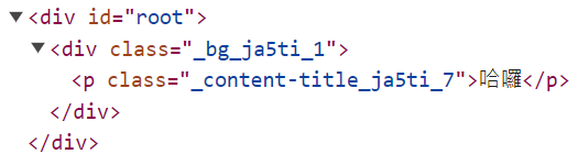
Next.js
module.css檔名_clas Name_hash的亂數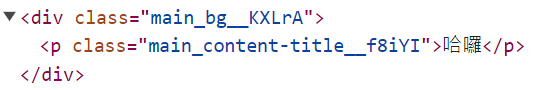
直接在進入點的檔案import css,class就不會經過編碼和一般class的用法相同
import './global.css'
另一種常見的React style使用方式,使用一套styled-components,它將css和js寫在一起,把css視為元件的方式來撰寫css,和傳統css總是分開寫的概念不太相同。
安裝
npm install styled-components
建立style元件
styled.HTML的Tag名稱,如果是就是styled.button,如果是h1就是styled.h1來開頭後面直接接著模板字串,來製作一個style元件。
import styled from 'styled-components';

const Button = styled.button`
  background-color: blue;
  color: white;
  font-size: 16px;
`;
使用
用法就如同一般的React元件一樣使用
import styled from 'styled-components';

const Button = styled.button`
  background-color: blue;
  color: white;
  font-size: 16px;
`;

function App() {
  return <Button>Button</Button>
}
可以帶入React元件的props使用,在styled component裡可以使用一個帶有props的function來根據props來對於style做動態的變換。
import styled from 'styled-components';

const Button = styled.button`
  background-color: ${props => props.$primary ? "red" : "green"};;
  color: white;
  font-size: 16px;
`;
function App() {
  return <Button $primary>Button</Button>
}
擴充建立的styled component,可以複寫原本建立的樣式或是新增沒有的樣式,使用styled(建立的styled component)
import styled from 'styled-components';

const Button = styled.button`
  background-color: ${props => props.$primary ? "red" : "green"};;
  color: white;
  font-size: 16px;
`;
const YellowButton = styled(Button)`
  border-color: blue;
  background-color: yellow;
`;
function App() {
  return <>
		<Button $primary>Button</Button>
	</>
}
也可以在React元件上擴充樣式styled(React元件)
// 要傳入一個className來讓原本的元件加上styled component的style
const Link = ({ className, children }) => (
  <a className={className}>
    {children}
  </a>
);
// 在styled傳入React元件
const StyledLink = styled(Link)`
  color: red;
`;

render(
  <div>
    <Link>原始的Link元件</Link>
    <StyledLink>經過styled comoponent加上新的樣式的元件</StyledLink>
  </div>
);
可以直接在樣式裡寫media query或其他selector
import styled from 'styled-components';

export const Button = styled.button`
  background-color: ${props => props.$primary ? "red" : "green"};
  color: white;
  font-size: 16px;
  @media(min-width: 768px) {
    background: blue;
    font-size: 24px;
  }
`;
const StyleUl = styled.ul`
  > li {
    color: red;
  }
`
function App() {
	return <StyleUl>
		<li>哈囉</li>
		<li>你好</li>
	</StyleUl>
}
和CSS Module一樣為了避免命名衝突,會在class加上編碼的形式呈現,所以我們寫css的時候也不用煩哪要取什麼class名稱,預設是全都是編碼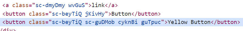
也可以在vite.config檔修改要呈現的class name樣子
export default defineConfig({
  plugins: [react({
      babel: {
        plugins: [
          [
            'babel-plugin-styled-components',
            {
              displayName: true, //styled component名稱
              fileName: true // styled component所在檔案名
            }
          ]
        ]
      }
    })],
})
以下的呈現是建立在App.jsx的Button styled component,這種方式會比全部都是編碼來的好在瀏覽器上找對對應在code裡的樣式位置。

目前也是蠻流行的Tailwind它可以讓我們直接在class上寫css
安裝
npm install -D tailwindcss postcss autoprefixer
產生confg
npx tailwindcss init -p
在config的content加入使用到路徑
export default {
  content: [
    "./index.html",
    "./src/**/*.{js,ts,jsx,tsx}",
  ],
  theme: {
    extend: {},
  },
  plugins: [],
}
在我們加入進入點的css檔案加上tailwind的樣式與功能
/* **./src/index.css */

@tailwind base;
@tailwind components;
@tailwind utilities;**
使用
直接在className加上樣式名稱,以下的class轉換成css就是font-size: 1.875rem;font-weight: 700;text-decoration-line: underline;,算是相當的語意化,其他更多的樣式可以到官網上查找
export default function App() {
  return (
    <h1 className="text-3xl font-bold underline">
      Hello world!
    </h1>
  )
}
可以直接使用偽類元素
<button class="bg-violet-500 hover:bg-violet-600 active:bg-violet-700 focus:outline-none focus:ring focus:ring-violet-300">
  Save changes
</button>
使用media query,在md(預設是768px)的寬度時字置中
export default function App() {
  return (
    <h1 className=" md:text-center">
    Hello world!
  </h1>
  )
}
可以在config上修改預設的寬度
module.exports = {
  theme: {
    screens: {
      'sm': '576px',
      // => @media (min-width: 576px) { ... }

      'md': '960px',
      // => @media (min-width: 960px) { ... }

      'lg': '1440px',
      // => @media (min-width: 1440px) { ... }
    },
  }
}
選取子層的tag
<ul className="[&>li]:bg-red-50">
  <li>哈囉</li>
  <li>你好</li>
</ul>
更多其他使用方式可以參考官網
https://styled-components.com/docs/tooling#babel-plugin
https://tailwindcss.com/docs/hover-focus-and-other-states#pseudo-classes
https://tailwindcss.com/docs/screens


 iThome鐵人賽
 看影片追技術