今天看到一個很有趣的新聞,是與夜生活相關的。在自由時報所發布的新聞〈台北夜生活魅力十足 全球排名第12、亞洲區第二〉內文指出,依照英國《Time Out》生活指南雜誌的最新調查,台北在全球最佳夜生活城市中排名第12位,榮登亞洲區第二。(文字引用出處: https://news.ltn.com.tw/news/world/breakingnews/4779424)因為我覺得這種夜生活排名的新聞很有意思,也可以看出現在人們對於一個好的夜生活需要具備的條件,因此我希望藉由這篇新聞內容,來製作資訊圖表。
在這篇新聞中,我認為可以製成資訊圖表的內容如下: (同樣擷取自自由時報新聞內文)
全球最佳夜生活城市排名依序分別為:1.巴西里約熱內盧,2.菲律賓馬尼拉,3.德國柏林,4.墨西哥瓜達拉哈拉(Guadalajara),5.美國奧斯汀(Austin),6.尼日拉各斯(Lagos),7.荷蘭鹿特丹,8.英國曼徹斯特,9.匈牙利布達佩斯,10.迦納阿克拉(Accra),11.阿根廷布宜諾斯艾利斯,12.台灣台北。
緊接著,我想分享我的資訊圖表製作方向。大致方式如下:
1.使用柱狀圖來顯示每個城市的排名。
2.使用Python來繪製標示各地區的圖表,並試著用不同的顏色來做出區別。
3.在顏色區別上,我想使用另一個Python套件Seabon來處理。(關於Seabon的介紹,我想留到下一篇;先放上我自己參考的圖卡跟色票介紹,內有豐富內容可以參考: https://seaborn.pydata.org/generated/seaborn.color_palette.html)
緊接著來寫程式,記得要套入Seabon套件:
import matplotlib.pyplot as plt
import seaborn as sns
# 設定城市和排名
cities = [
    "Rio de Janeiro", "Manila", "Berlin", "Guadalajara",
    "Austin", "Lagos", "Rotterdam", "Manchester",
    "Budapest", "Accra", "Buenos Aires", "Taipei"
]
ranks = list(range(1, 13))

# 設定不同洲的顏色
colors =sns.color_palette("flare")
continent_colors = {
    "South America": colors[1],
    "Asia": colors[2],
    "Europe": colors[3],
    "North America": colors[4],
    "Africa": colors[5],
}
city_colors = [
    continent_colors["South America"], # Rio de Janeiro
    continent_colors["Asia"], # Manila
    continent_colors["Europe"], # Berlin
    continent_colors["North America"], # Guadalajara
    continent_colors["North America"], # Austin
    continent_colors["Africa"], # Lagos
    continent_colors["Europe"], # Rotterdam
    continent_colors["Europe"], # Manchester
    continent_colors["Europe"], # Budapest
    continent_colors["Africa"], # Accra
    continent_colors["South America"], # Buenos Aires
    continent_colors["Asia"], # Taipei
]

# 繪製條狀圖
plt.figure(figsize=(11, 8))
sns.barplot(x=ranks, y=cities, palette=city_colors)

# 添加標題和標籤
plt.title("Top 12 Cities for Nightlife Worldwide")
plt.xlabel("Ranking")
plt.ylabel("Cities")

plt.show()
執行程式碼後,可以得到以下結果:
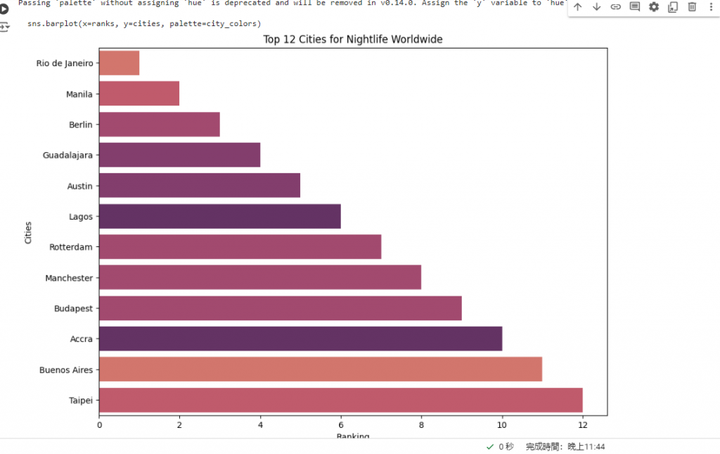
圖1:使用Seabon所繪製的圖表。
我目前是先把所有新聞中出現的中文地名改成英文,並把標題改成英文標題。但如果有人希望用程式碼,可以把標題和標籤更換,就能繪製出自己想要的圖表了。