Matplotlib是Python中一種用於的可視化工具,是開源的(可以免費使用),也有一些部分是用 C、Objective-C 和 JavaScript 編寫的(具有平台兼容性)。
安裝
pip install matplotlib
import
import matplotlib
import matplotlib.pyplot as plt
Check Matplotlib Version
print(matplotlib.__version__)
#輸出:3.8.4
資料視覺化
plt.plot([1, 2, 3, 4])
plt.show()
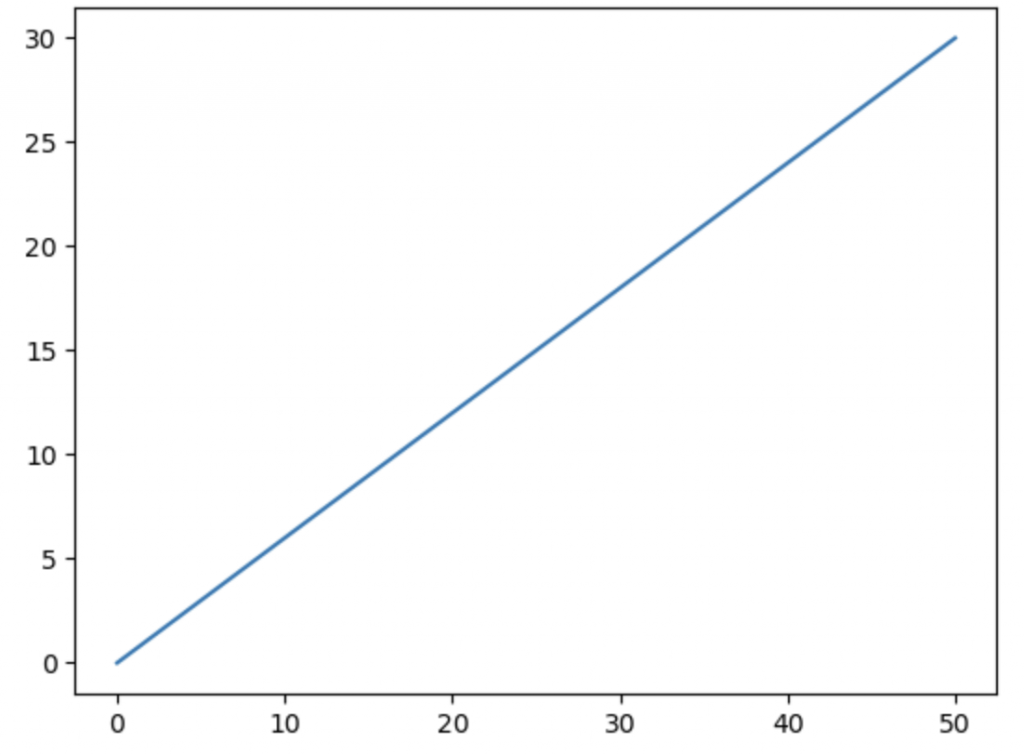
xpoint = np.array([0, 50])
ypoint = np.array([0, 30])

plt.plot(xpoint, ypoint)
plt.show()
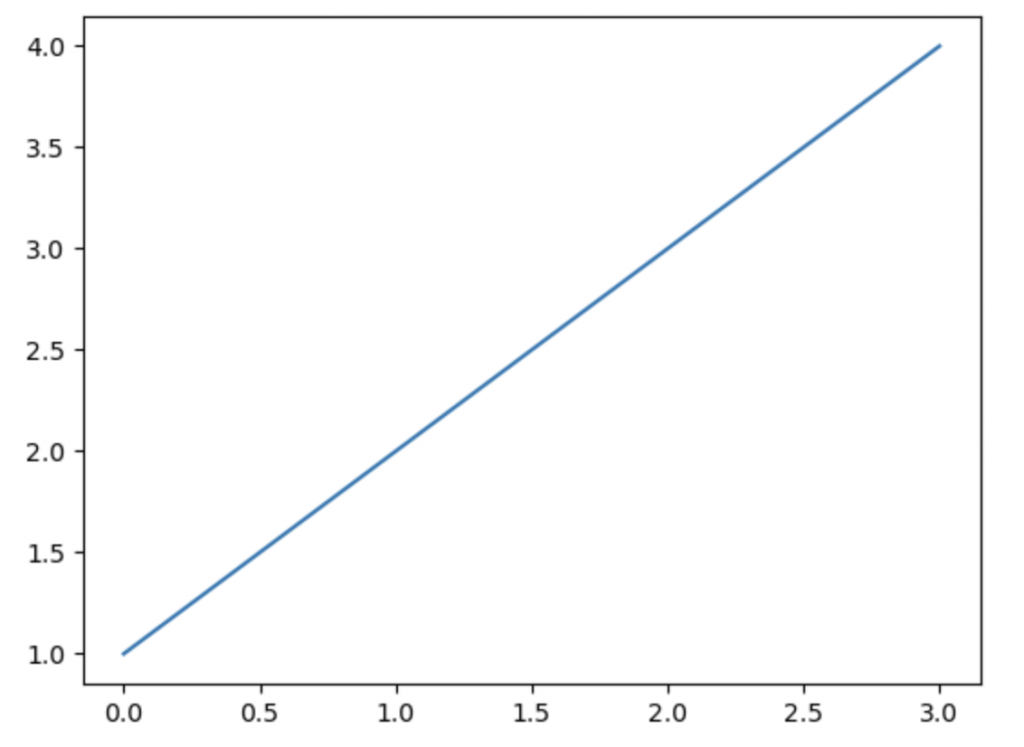
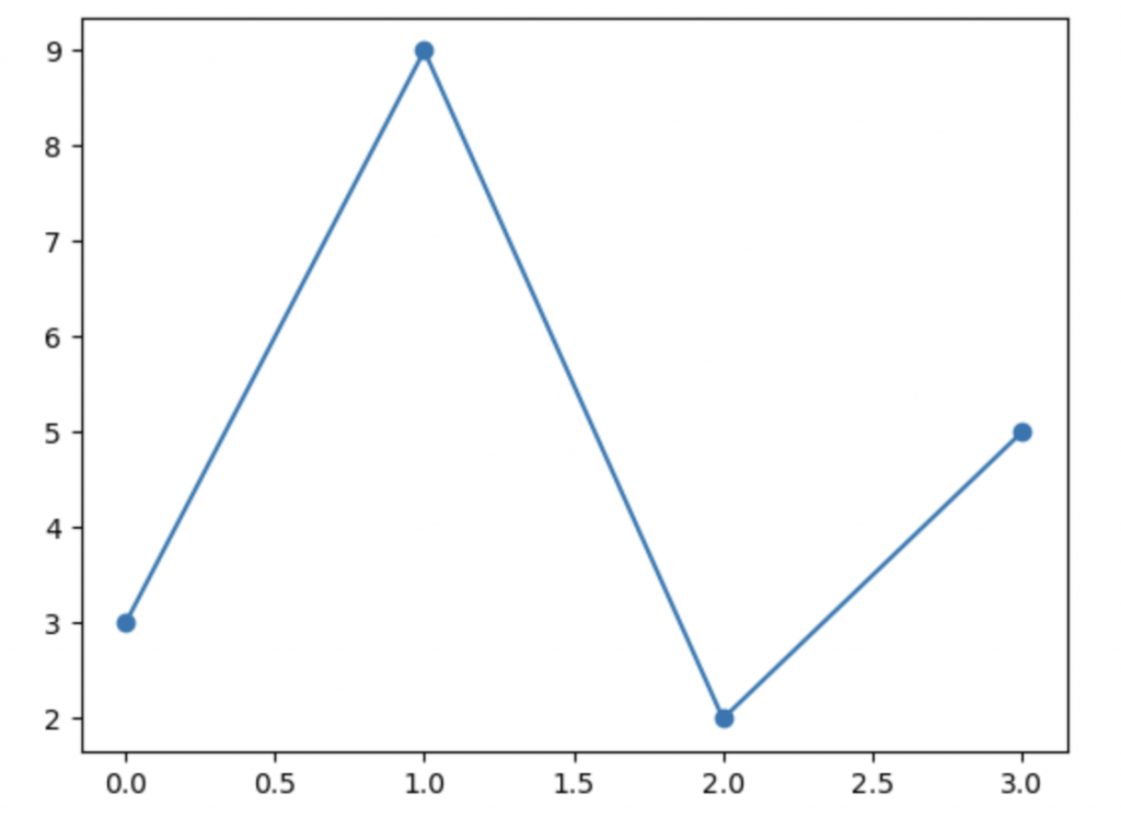
ypoint = np.array([3, 9, 2, 5])

plt.plot(ypoint, marker = "o")
plt.show()
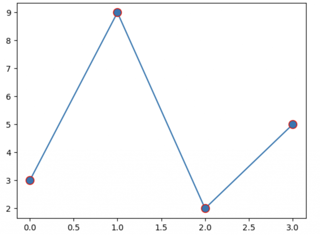
ypoint = np.array([3, 9, 2, 5])

plt.plot(ypoint, marker = "o", ms = 10, mec = "r")
plt.show()
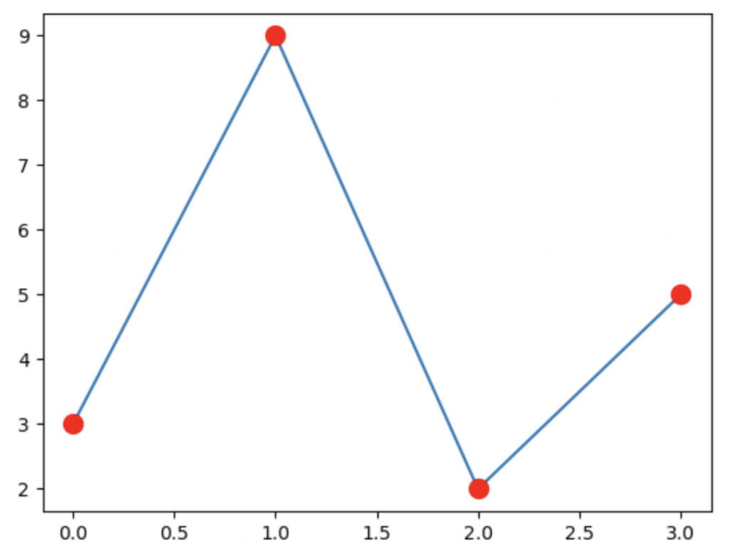
ypoint = np.array([3, 9, 2, 5])

plt.plot(ypoint, marker = "o", ms = 10, mec = "r", mfc = "r")
plt.show()
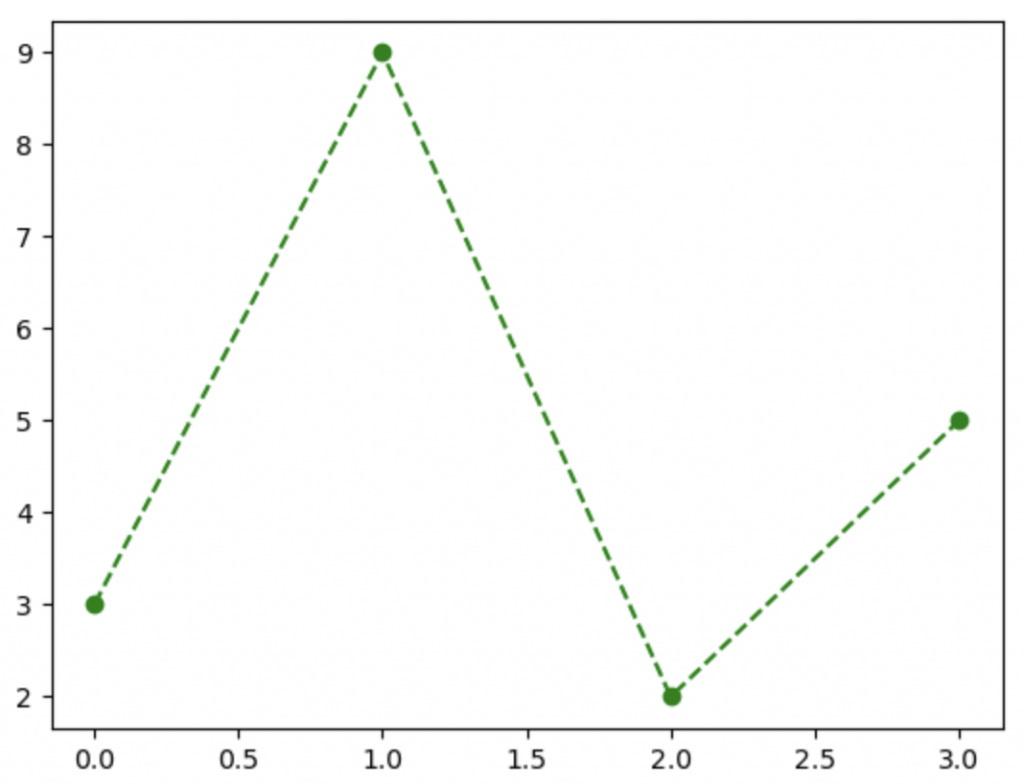
ypoint = np.array([3, 9, 2, 5])

plt.plot(ypoint, "o--g")
plt.show()
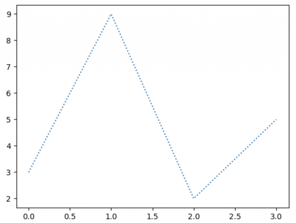
ypoint = np.array([3, 9, 2, 5])

plt.plot(ypoint, linestyle = "dotted")
plt.show()
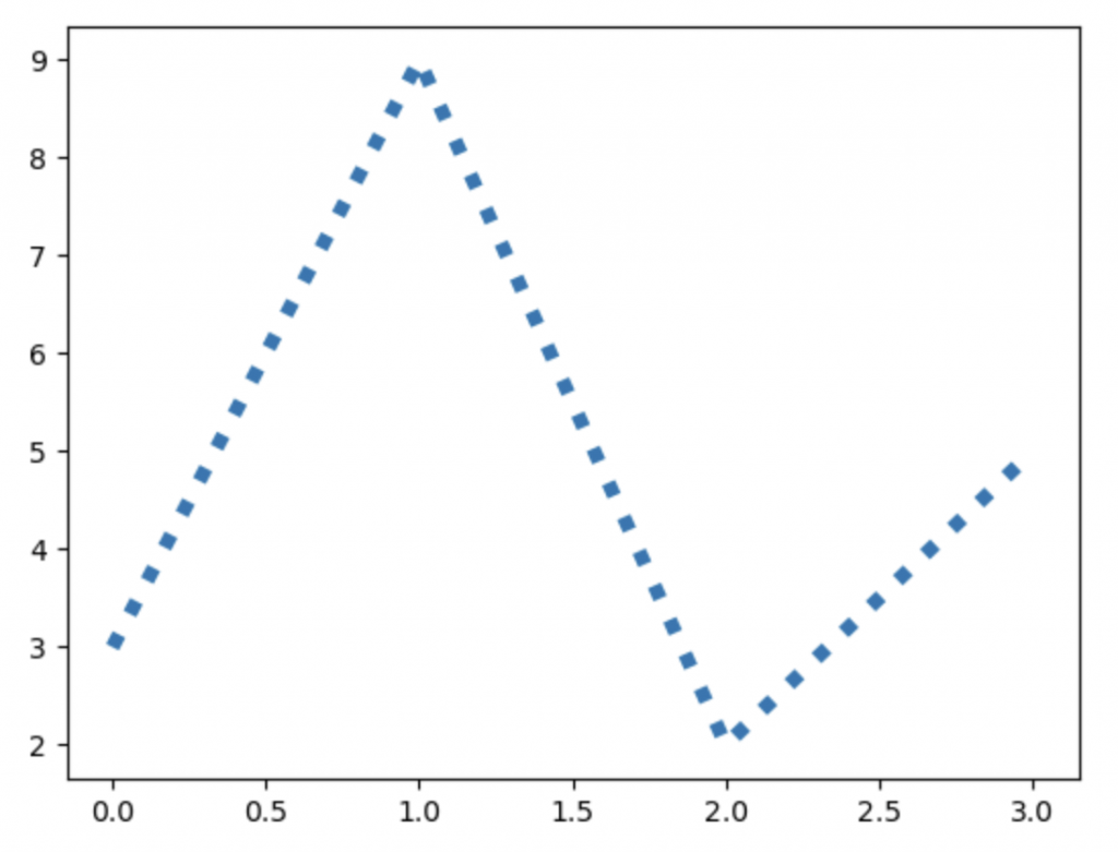
ypoint = np.array([3, 9, 2, 5])

plt.plot(ypoint, linestyle = "dotted", linewidth = 5)
plt.show()
Line style設定參考:Line style
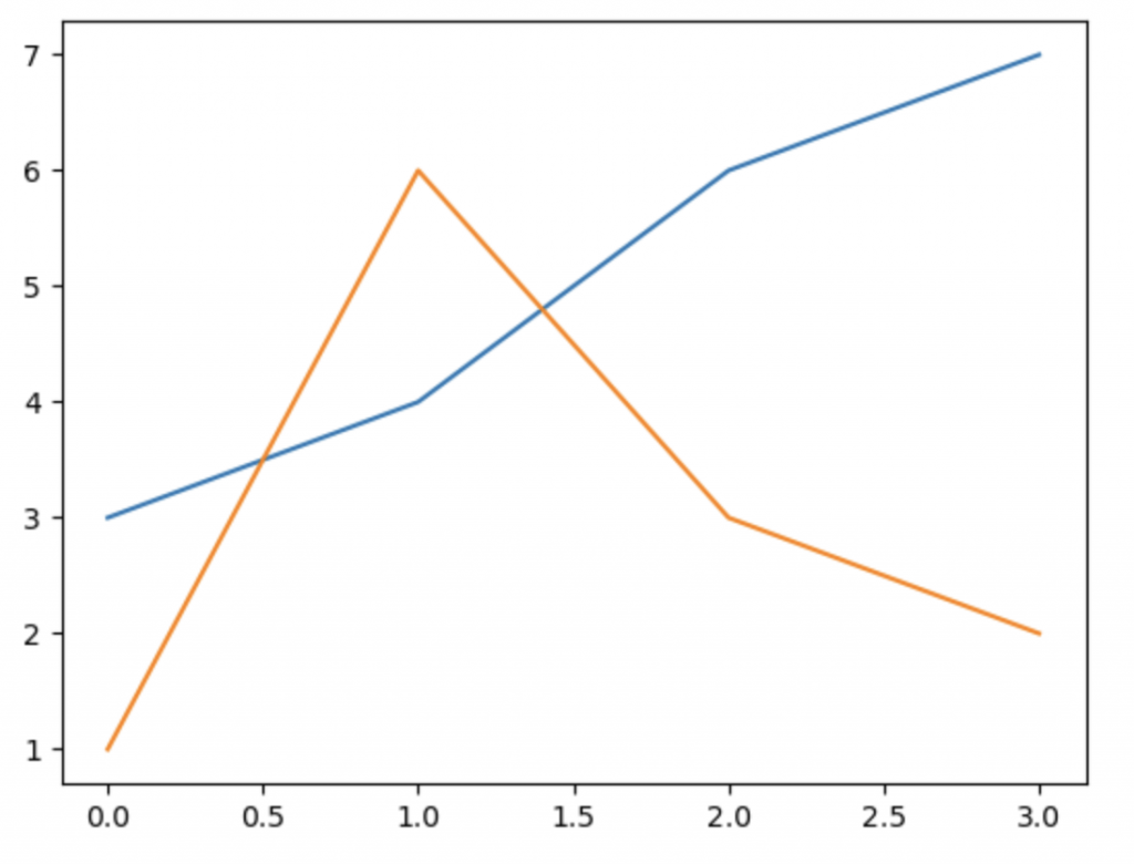
y1 = np.array([3, 4, 6, 7])
y2 = np.array([1, 6, 3, 2])

plt.plot(y1)
plt.plot(y2)

plt.show()
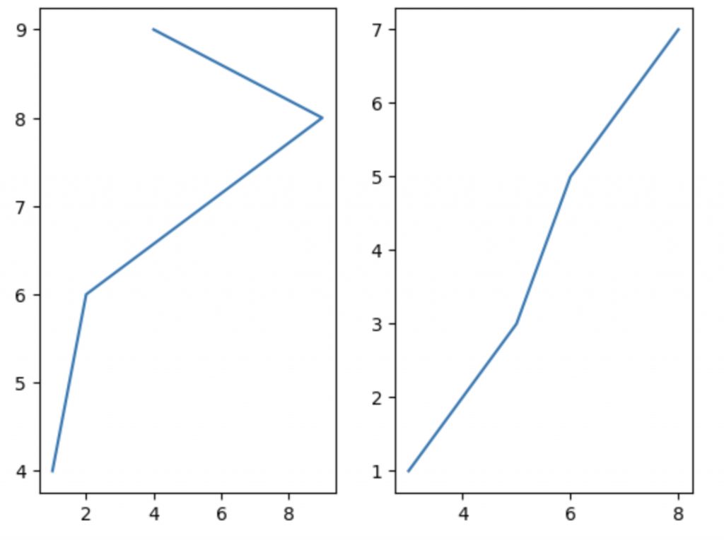
#plot1
x = np.array([1, 2, 9, 4])
y = np.array([4, 6, 8, 9])

plt.subplot(1, 2, 1)
plt.plot(x, y)

#plot2
x = np.array([3, 5, 6, 8])
y = np.array([1, 3, 5, 7])

plt.subplot(1, 2, 2)
plt.plot(x, y)
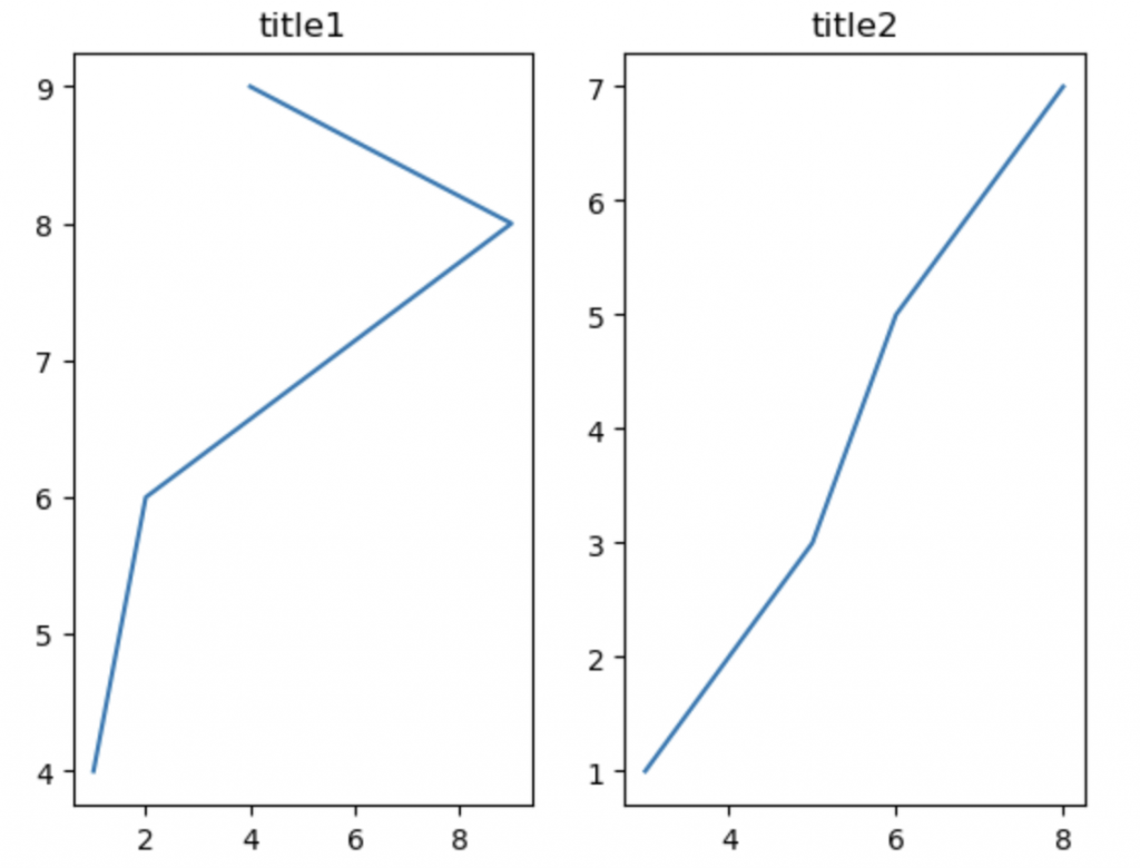
#plot1
x = np.array([1, 2, 9, 4])
y = np.array([4, 6, 8, 9])

plt.subplot(1, 2, 1)
plt.plot(x, y)
plt.title("title1")

#plot2
x = np.array([3, 5, 6, 8])
y = np.array([1, 3, 5, 7])

plt.subplot(1, 2, 2)
plt.plot(x, y)
plt.title("title2")
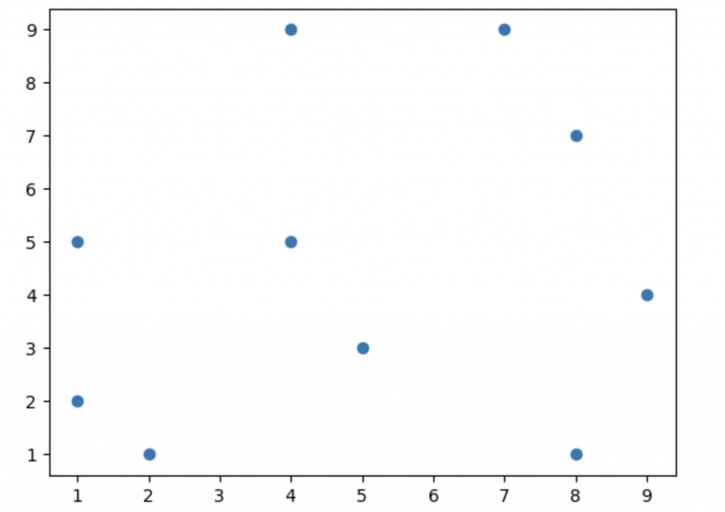
x = np.array([4, 2, 8, 1, 1, 5, 4, 7, 9, 8])
y = np.array([5, 1, 1, 2, 5, 3, 9, 9, 4, 7])

plt.scatter(x, y)
plt.show()
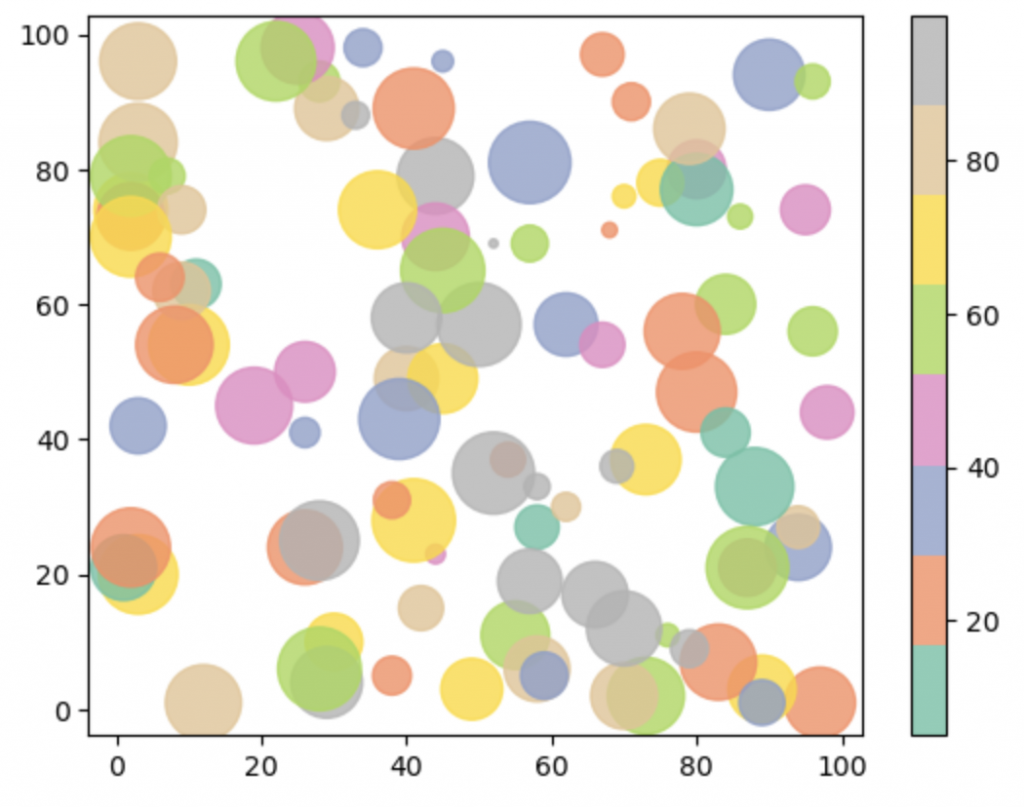
x = np.random.randint(100, size = 100) #生成一個 0 到 99 之間的100個隨機整數的一維數組
y = np.random.randint(100, size = 100)
colors = np.random.randint(100, size = 100)
size = 10 * np.random.randint(100, size = 100)

plt.scatter(x, y, c = colors, s = size, alpha = 0.8, cmap = "Set2")
plt.colorbar()
plt.show()
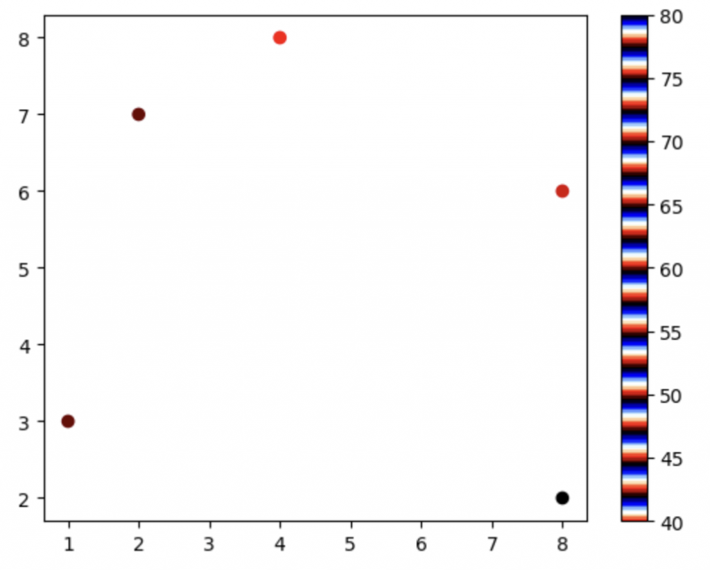
x = np.array([1, 8, 8, 2, 4])
y = np.array([3, 2, 6, 7, 8])
colors = np.array([70, 80, 50, 70, 40])

plt.scatter(x, y, c = colors, cmap = "flag")

plt.colorbar()
plt.show()
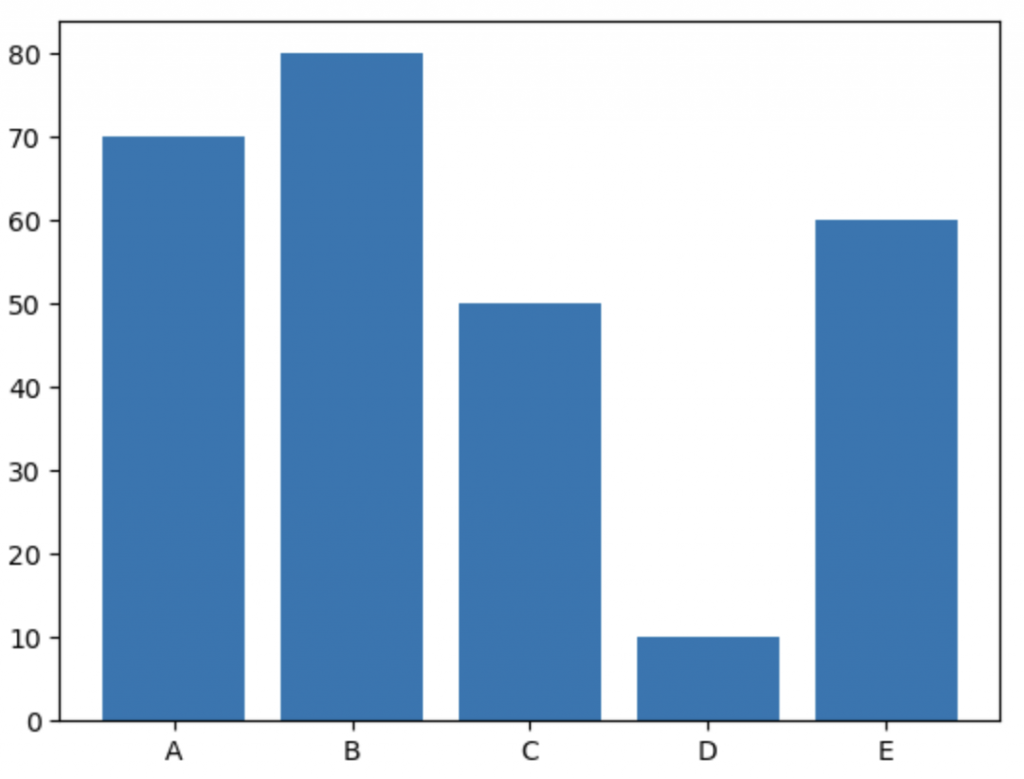
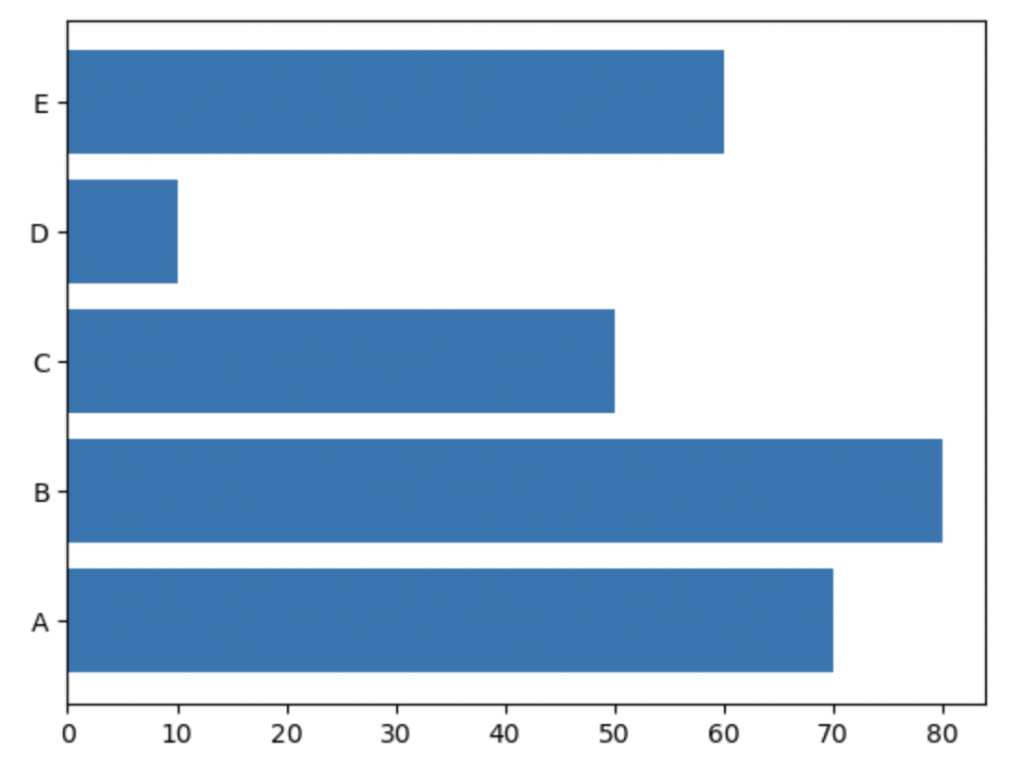
x = np.array(["A", "B", "C", "D", "E"])
y = np.array([70, 80, 50, 10, 60])

plt.bar(x, y)
plt.show()
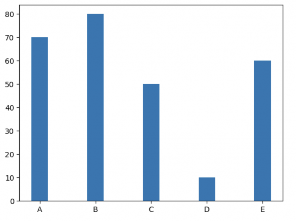
x = np.array(["A", "B", "C", "D", "E"])
y = np.array([70, 80, 50, 10, 60])

plt.barh(x, y)
plt.show()
x = np.array(["A", "B", "C", "D", "E"])
y = np.array([70, 80, 50, 10, 60])

plt.bar(x, y, width = 0.3)
plt.show()
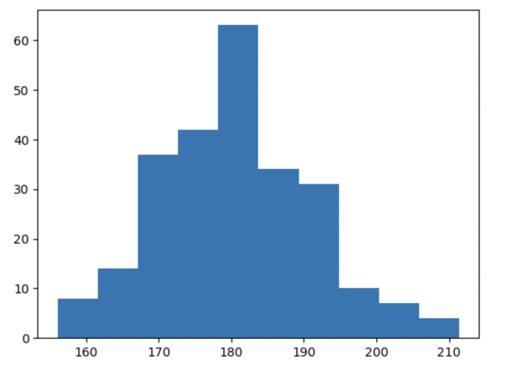
x = np.random.normal(180, 10, 250) #平均180, 標準差10, 250個數據, 生成高斯分佈隨機數據

plt.hist(x)
plt.show()
x = np.array([6, 7, 5, 2, 4])
mlabels = ["A", "B", "C", "D", "E"]

plt.pie(x, labels = mlabels, startangle = 90) #圓餅圖會以 90 度角開始繪製
plt.show()
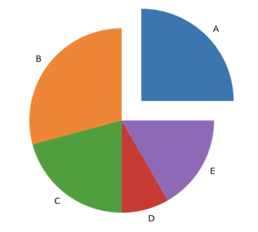
x = np.array([6, 7, 5, 2, 4])
mlabels = ["A", "B", "C", "D", "E"]
mexplode = [0.3, 0, 0, 0, 0]

plt.pie(x, labels = mlabels, explode = mexplode)
plt.show()

x = np.array([6, 7, 5, 2, 4])
mlabels = ["A", "B", "C", "D", "E"]
mexplode = [0.3, 0, 0, 0, 0]

plt.pie(x, labels = mlabels, explode = mexplode, shadow = True)
plt.show()
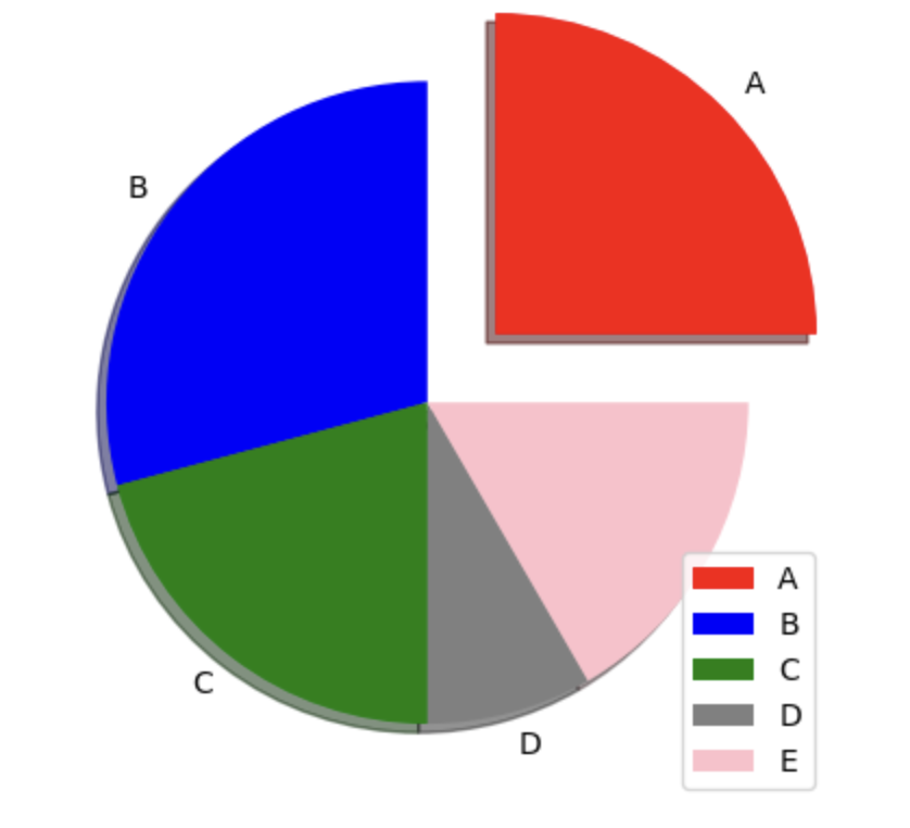
x = np.array([6, 7, 5, 2, 4])
mlabels = ["A", "B", "C", "D", "E"]
mexplode = [0.3, 0, 0, 0, 0]
mcolor = ["red", "blue", "green", "gray", "pink"]

plt.pie(x, labels = mlabels, explode = mexplode, shadow = True, colors = mcolor)
plt.legend()
plt.show()
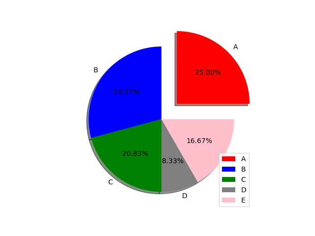
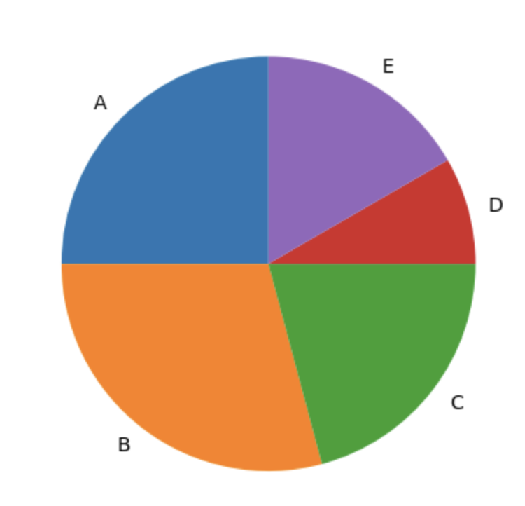
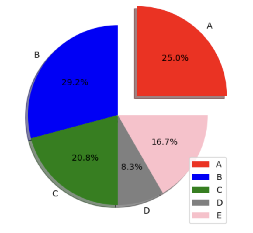
x = np.array([6, 7, 5, 2, 4])
mlabels = ["A", "B", "C", "D", "E"]
mexplode = [0.3, 0, 0, 0, 0]
mcolor = ["red", "blue", "green", "gray", "pink"]

plt.pie(x, labels = mlabels, explode = mexplode, shadow = True, colors = mcolor, autopct = "%1.1f%%") #指定了顯示百分比時保留一位小數。
plt.legend()
plt.show()
x = np.array([6, 7, 5, 2, 4])
mlabels = ["A", "B", "C", "D", "E"]
mexplode = [0.3, 0, 0, 0, 0]
mcolor = ["red", "blue", "green", "gray", "pink"]

plt.pie(x, labels = mlabels, explode = mexplode, shadow = True, colors = mcolor, autopct = "%1.2f%%")
plt.legend()

plt.savefig("piechart.png")

plt.show()