Seaborn 是屬於 Python 中一種資料視覺化的工具,底層工具基本上屬於 Matplotlib,但比起 Matplotlib ,可以更加美化圖表來提升視覺美感。
安裝
pip install seaborn
導入
import seaborn as sns
各種圖表語法
• scatterplot(): scatter plot
• distplot(): histogram
• countplot(): bar plot
• boxplot(): box plot
• violinplot(): violin plot
• swarmplot(): swarm plot
• factorplot(): factor plot
外框、背景樣式選擇
匯入資料
使用csv檔案匯入:
範例資料來源:pima-indians-diabetes
匯入資料前須簽確認檔案位置or匯入時設定好檔案從哪裡匯入:
import os
os.getcwd()
path = "檔案位置資料夾路徑"
os.chdir(path)
import pandas as pd
df = pd.read_csv("pima-indians-diabetes.csv")
分析數據及視覺化呈現
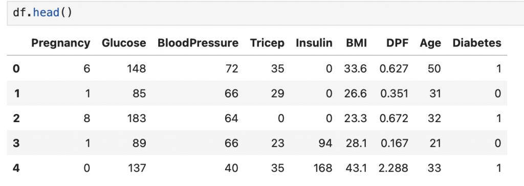
df.head()
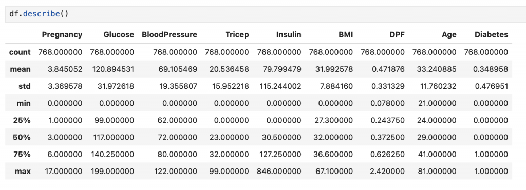
2. 查看基本統計結果:
df.describe()
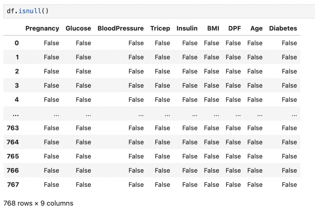
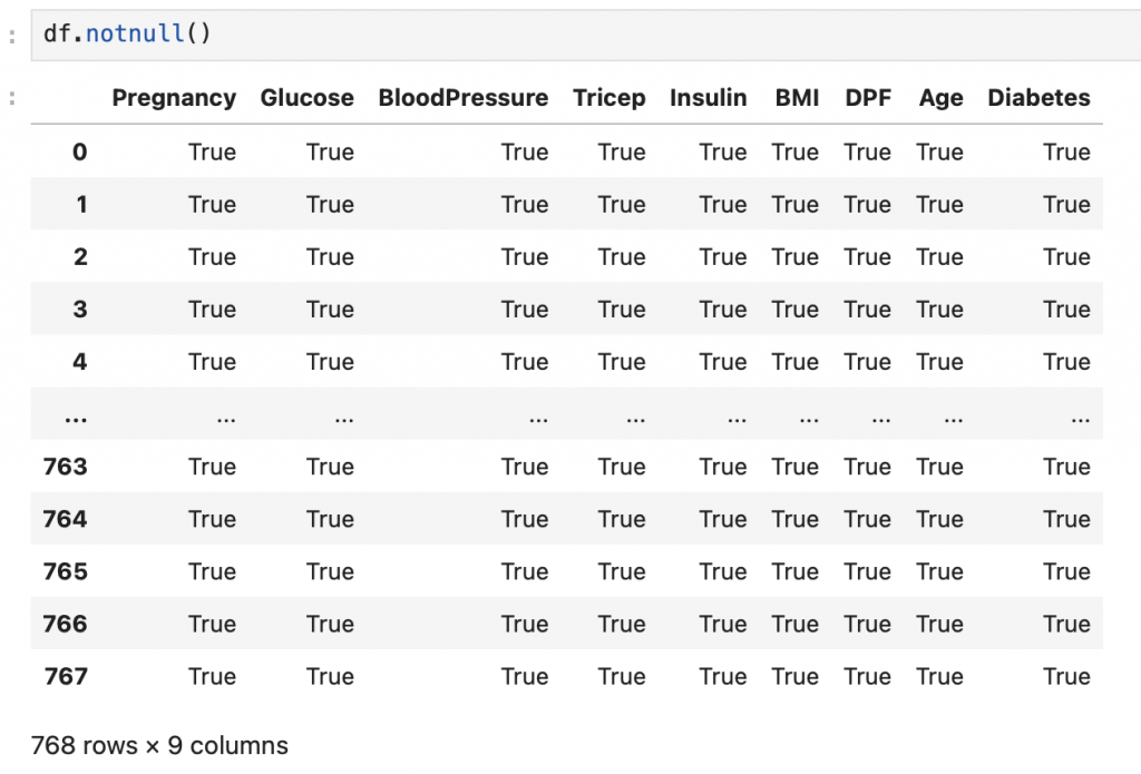
3. 查看是否有缺失資料:
df.isnull()
df.notnull()
df.fillna(0) #缺失值補0
df.dropna()
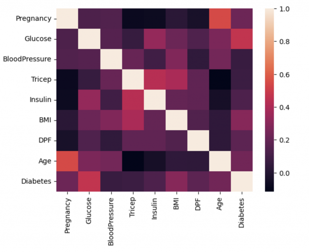
sns.heatmap(df.corrl())
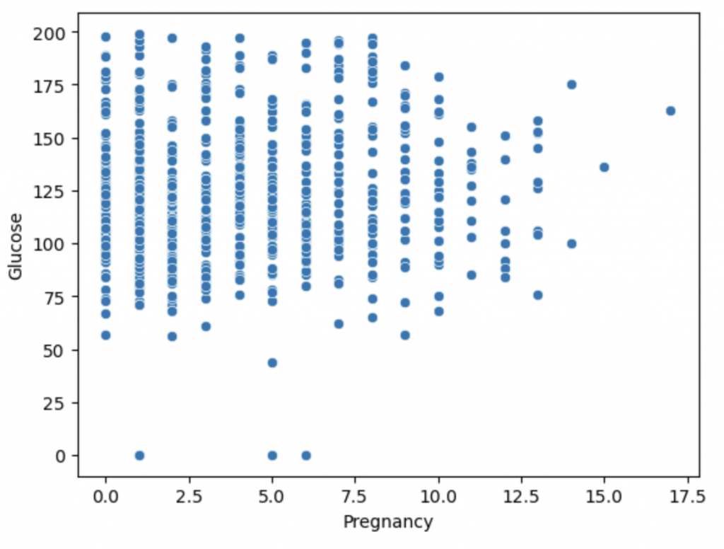
5. 數據散點圖:
sns.scatterplot(x = "Pregnancy", y = "Glucose", data = df)
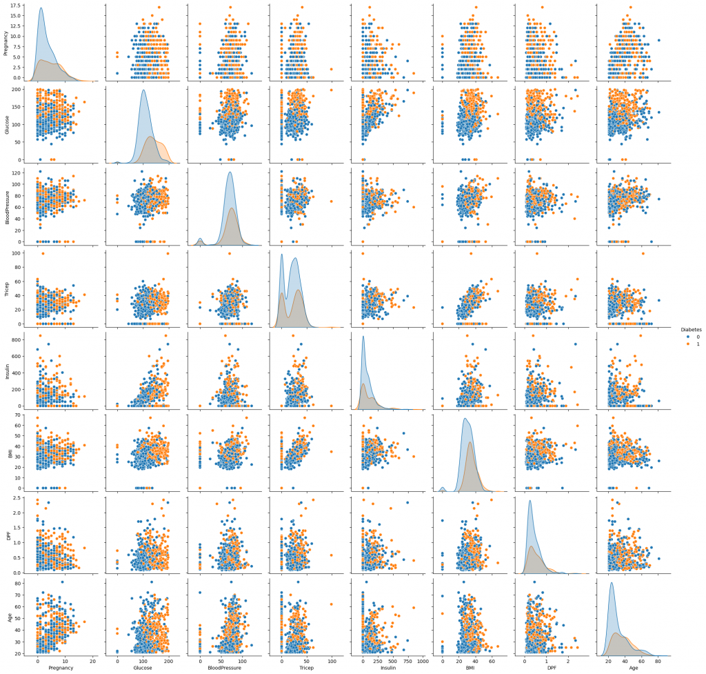
6. Pairplot繪製散佈圖矩陣:
sns.pairplot(df, hue = "Diabetes")