在上一篇文章中,我們逐步建立了 Hero Section,並結合 i18n 和 Framer Motion,來增強其動態效果與語言支持。
今天,我們將繼續加強 Hero Section,著重於如何透過數據展示動畫與滾動觸發效果,來進一步提升使用者的互動體驗。具體來說,我們將使用 react-countup 和 react-intersection-observer 來實現滾動觸發的數據動畫效果,並介紹兩種動態變更 SVG 顏色的方法。同時,我們還會實現 Tooltip 提示功能,讓用戶在懸停圖片或數據時能獲取更多信息。
接下來,請參照下圖中的紅色標註部分,我們今天的主要目標是:
react-countup 來實現數據的動態增長效果,並透過 react-intersection-observer,在使用者滾動到特定區域時觸發動畫。mask 技術,根據具體需求選擇最合適的方案。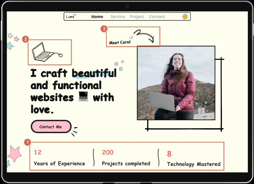
在設計過程中,我們採用了兩種方式來實現 SVG 顏色的動態變更。不同的方法適合不同場景,以下是兩者的比較:
| 方法 | 優點 | 缺點 | 使用情境 |
|---|---|---|---|
| 內嵌 SVG 並傳遞參數 | - 精細控制 SVG 的屬性(如 strokeColor、strokeWidth) |
較大的代碼量,複雜 SVG 可能影響頁面性能 | 適用於需要頻繁變更顏色和精細控制的情境,如圖標 |
CSS mask |
-簡單、快速改變顏色 | 僅適用於簡單圖案,無法處理複雜 SVG | 適合簡單的裝飾性圖形,如分隔線等 |
在本文的實作中,我們運用了這兩種技術:在需要靈活調整圖標顏色和樣式的情境下,使用了內嵌 SVG 並通過參數控制;而在簡單的裝飾性元素中則使用了 CSS mask 技術來進行色彩變更。
react-countup 和 react-intersection-observer我們將使用 react-countup 來實現數據的動態展示,並使用 react-intersection-observer 來偵測用戶滾動到數據展示區域的狀態。打開終端通過 npm 安裝這兩個庫:
npm install react-countup
npm install react-intersection-observer
StatsSection 元件接下來,我們創建一個 StatsSection 元件,用來展示統計數據。這個元件使用 CountUp 來展示數據增長效果,並通過 useInView 來監聽滾動事件,當使用者滾動到指定區域時觸發動畫效果。
import React from 'react'
import CountUp from "react-countup";
import * as styles from '@/components/Cards/StatsSection.module.scss'
import Separator from '@/assets/portfolio/separator.svg'; // 引入 SVG 文件
import { useInView } from 'react-intersection-observer';

const StatsSection = () => {
    const stats = [
        { num: 12, text: 'Years of Experience' },
        { num: 200, text: 'Projects Completed' },
        { num: 8, text: 'Technology Mastered' }
    ];
    const { ref, inView } = useInView({
        triggerOnce: true,
        threshold: 0.5, // 當用戶滾動到元素一半時觸發
    });

    return (
        <div className={styles.statsContainer} ref={ref}>
            {
                stats.map((item, index) => {
                    return <div className={styles.stats} key={index}>
                        <div className={styles.statsItem}>
                            <CountUp end={item.num}
                                duration={5}
                                delay={2}
                                className={styles.number} />
                            <p className={styles.label}>{item.text}</p>
                        </div>
                        {index < stats.length - 1 && (
                            <div className={styles.separator} />
                        )}
                    </div>

                })
            }
        </div>
    )
}

export default StatsSection
SVG 顏色我們在StatsSection.module.scss 運用 CSS mask 技術來動態更改 SVG 顏色。這裡將 SVG 分隔線設置為一個背景遮罩,並通過 background-color 動態調整其顏色。
.separator {
    mask: url('@/assets/portfolio/separator.svg') no-repeat center;
    background-color: var(--text-primary); // 用來改變 SVG 顏色
    width: 100px; // 根據需要調整
    height: 100px; // 根據需要調整
    margin: 0 20px;
}
ComputerIcon 元件我們將使用一個內嵌的 SVG 元件 ComputerIcon ,允許通過傳遞參數來動態調整顏色和線條寬度,這樣更適合需要精細控制的場景。
import React from 'react'

const ComputerIcon = ({ strokeColor = 'black', fillColor = 'none', strokeWidth = 0.5 }) => {
    return (
        <svg width="192" height="155" viewBox="0 0 192 155" fill="none" xmlns="http://www.w3.org/2000/svg">
             {/* 其他 SVG 路徑 */}
            <line y1="-0.25" x2="48.7919" y2="-0.25" transform="matrix(0.766664 -0.642049 0.583457 0.812144 73.3784 124.914)" stroke={strokeColor} strokeWidth={strokeWidth} />
        </svg>
    )
}

export default ComputerIcon
為了提供額外的數據說明,我們會設置一個 Tooltip 組件,當用戶懸停在圖片上時顯示額外的信息。這裡我們使用了 Framer Motion 來實現動畫效果。
import React, { useState } from 'react';
import { motion } from 'framer-motion';
import * as styles from '@/components/Tooltip/Tooltip.module.scss'

const Tooltip = ({ children, text }) => {
    const [isVisible, setIsVisible] = useState(false);

    const showTooltip = () => setIsVisible(true);
    const hideTooltip = () => setIsVisible(false);

    return (
        <div className={styles.tooltipContainer} onMouseEnter={showTooltip} onMouseLeave={hideTooltip}>
            {children}
            {isVisible && (
                <motion.div
                    className={styles.tooltipBox}
                    initial={{ opacity: 0, y: -10 }}
                    animate={{ opacity: 1, y: 0 }}
                    exit={{ opacity: 0, y: -10 }}
                    transition={{ duration: 0.2 }}
                >
                    {text}
                    <div className={styles.tooltipArrow} />
                </motion.div>
            )}
        </div>
    );
};

export default Tooltip;
Portfolio件元件接下來,我們將把 StatsSection、ComputerIcon 和 Tooltip 元件整合進 Portfolio 頁面,並展示統計數據和圖標。當用戶懸停在圖片時,會顯示 Tooltip。
import React from 'react';
import { Trans, useTranslation } from 'react-i18next';
import { log, logLevel } from '@/utils/log';
import Button from '@/components/buttons/Button';
import * as styles from '@/pages/Portfolio/Portfolio.module.scss'; // 使用模塊化的樣式
import { motion } from 'framer-motion'; // 引入 Framer Motion
import StatsSection from '@/components/Cards/StatsSection';
import ComputerIcon from '@/components/Icons/ComputerIcon';
import Tooltip from '@/components/Tooltip/Tooltip';

const Portfolio = () => {

    const { t, i18n } = useTranslation();

    log(logLevel.DEBUG, 'Portfolio rendered');

    // 定義一個簡單的淡入動畫
    const fadeIn = {
        hidden: { opacity: 0 },
        visible: { opacity: 1, transition: { duration: 1.5 } },
    };

    return (
        <>
            <div className={`${styles.heroContainer} ${i18n.language}`} data-lang={i18n.language}>
                <div className={styles.heroContent}>
                    <ComputerIcon strokeColor="var(--text-primary)" fillColor="var(--text-primary)" strokeWidth={0.5} />
                    <motion.h1
                        className={styles.heroTitle}
                        initial="hidden"
                        animate="visible"
                        variants={fadeIn}
                    >
                        <Trans i18nKey="portfolio.title">
                            I craft <span className={styles.highlight}>beautiful</span> websites 💻 with love.
                        </Trans>
                    </motion.h1>
                    <Button
                        type="primary"
                        afterContent={require('@/assets/buttons/dot.svg')}
                        size="large"
                    >
                        {t('portfolio.contact')}
                    </Button>
                </div >
                <div className={styles.imageContainer}>
                    <Tooltip text="Meet Carol </>">
                        <img className={styles.heroImage} src={require('@/assets/portfolio/heroimage.png')} alt="Meet Carol" />
                    </Tooltip>
                </div>
            </div>
            <StatsSection />
        </>

    )
}

export default Portfolio
在這段代碼中,我們將 Tooltip 元件應用於按鈕和圖片上,當用戶懸停時會顯示提示訊息,增加互動性。
運行後,數據區域在滾動時觸發動畫,SVG 圖標顏色隨參數變化,並且在懸停圖片時顯示 Tooltip,增強了互動性和視覺效果。

在今天的文章中,我們展示了如何在 Hero Section 中增強互動體驗,通過 react-countup 和 react-intersection-observer 實現滾動觸發的數據動畫效果,並介紹了兩種 SVG 顏色變更的方法。最後,我們還實作了 Tooltip 元件,進一步提升頁面的可用性和互動性。
此外,我們已將完整的代碼實作與更多練習題上傳至 GitHub,鼓勵大家前往查看,並回顧文章中的概念,挑戰更進階的優化練習。
👉 前往 GitHub 查看完整程式碼


 看影片追技術