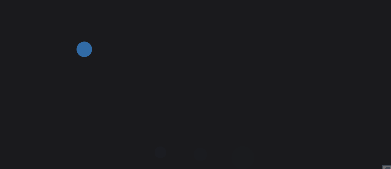
今天要介紹,如何使用 border-radius和 keyframes模擬氣泡從畫面頂部往下飄動並逐漸變大的效果
<div class="bubble-container">
    <div class="bubble"></div>
    <div class="bubble"></div>
    <div class="bubble"></div>
    <div class="bubble"></div>
    <div class="bubble"></div>
</div>
.bubble 氣泡元素。每個 .bubble 元素都是獨立的,會在畫面中以不同的大小和速度移動,模擬氣泡從底部往上漂浮的視覺效果body {
margin: 0;
display: flex;
justify-content: center;
align-items: center;
height: 100vh;
background-color: #1a1a1d;
overflow: hidden /*隱藏滾動條*/
}
.bubble-container {
    position: relative;
    width: 100vw;
    height: 100vh;
}

.bubble {
    position: absolute;
    top: -100px;
    width: 40px;
    height: 40px;
    background-color: #40A0FF;
    border-radius: 50%;
    animation: float 6s infinite ease-in-out;
}
.bubble:nth-child(1) {
    width: 50px;
    height: 50px;
    left: 20%;
    animation-duration: 8s;
}

.bubble:nth-child(2) {
    width: 30px;
    height: 30px;
    left: 40%;
    animation-duration: 6s;
}

.bubble:nth-child(3) {
    width: 60px;
    height: 60px;
    left: 60%;
    animation-duration: 10s;
}

.bubble:nth-child(4) {
    width: 40px;
    height: 40px;
    left: 80%;
    animation-duration: 7s;
}

.bubble:nth-child(5) {
    width: 35px;
    height: 35px;
    left: 50%;
    animation-duration: 9s;
}
@keyframes float {
    0% {
        transform: translateY(0) scale(1);
        opacity: 1;
    }
    100% {
        transform: translateY(100vh) scale(1.5); /* 氣泡上升並逐漸變大 */
        opacity: 0; /* 氣泡逐漸消失 */
    }
}

 iThome鐵人賽
 看影片追技術