有時候若是想要變換TextView或Button等元件的外觀時就會自定義來實現不同樣式
而自己完成一個元件的自定義也不難,只需要在drawable裡新增一個新的xml檔,就可以開始依照想要的樣子打程式了,定義好後只需要將其套用到UI元件上就好了
下面開始帶範例
首先,我們需要在drawable裡新增一個新的xml檔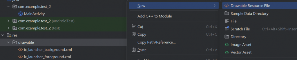
點擊Drawable Resource File新增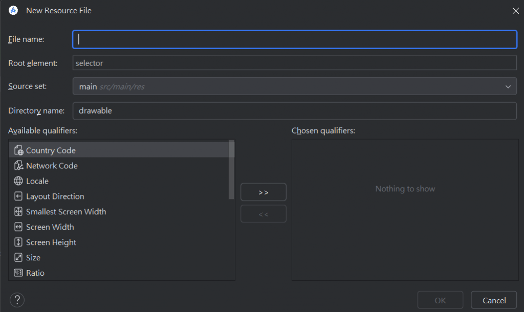
在File name裡輸入要取的檔案名點擊OK
檔案就建立好了
接下來是程式的部分
下面的程式碼是我隨便用的,接下來會開始解釋下面的程式碼
<?xml version="1.0" encoding="utf-8"?>
<shape xmlns:android="http://schemas.android.com/apk/res/android"
    android:shape="rectangle">
    <solid android:color="#2BC9CE" />
    <stroke
        android:width="5dp"
        android:color="#8BC34A" />
    <corners android:radius="8dp" />
    <padding
        android:left="10dp"
        android:top="10dp"
        android:right="10dp"
        android:bottom="10dp" />
</shape>
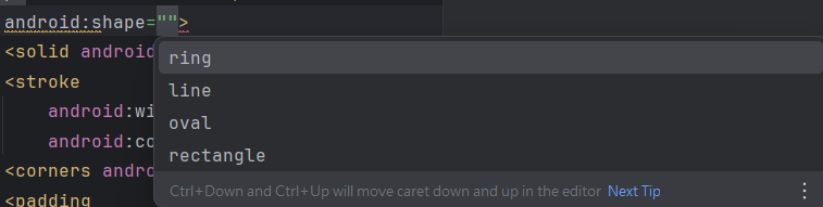
shape可以用來將要自定義的元件定義成矩形、圓形、橢圓形、環形等ring會定義成環形的line是線oval是橢圓形rectangle是矩形
這邊只簡單介紹一下而已有興趣可以再到這裡了解更多關於自定義的資訊
接下來要介紹的都是被包含在shape裡的屬性
<solid android:color="#2BC9CE" />
solid是定義背景的填充顏色的
這邊將背景設成了淺藍色
<stroke
        android:width="5dp"
        android:color="#3700B3" />
stroke是設定邊框樣式的,其中還包括邊框的寬度和顏色
這邊邊框設置成了淺綠色且寬度為5dp
<corners android:radius="8dp" />
corners是用來設置圓角的大小
這邊將圓角設置成了8dp
<padding
        android:left="10dp"
        android:top="10dp"
        android:right="10dp"
        android:bottom="10dp" />
padding是用來設置內邊距的,只要用了這個就可以確保文字不會太貼邊框
這邊設置了文字與邊框的內邊距都至少10dp
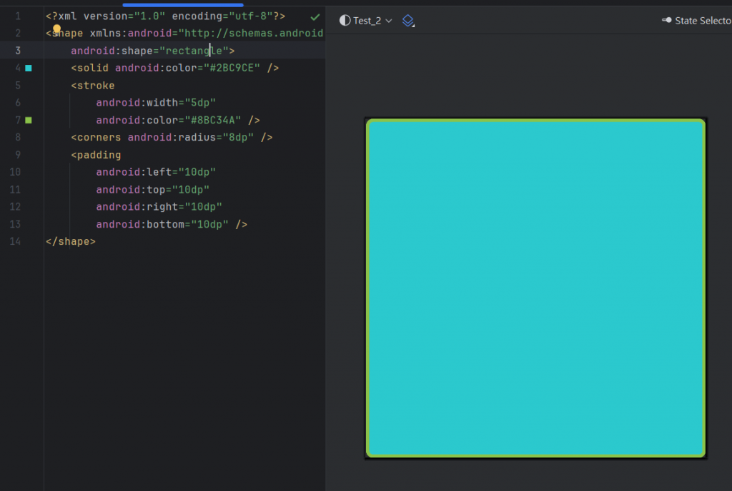
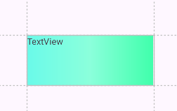
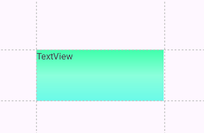
這是預覽的樣子
<TextView
        android:id="@+id/textView"
        android:layout_width="158dp"
        android:layout_height="42dp"
        android:background="@drawable/textview_bg"
        android:text="TextView"
        tools:layout_editor_absoluteX="126dp"
        tools:layout_editor_absoluteY="319dp" />
接著只需要向下面那樣到xml裡去新增一行background就好了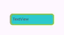
這樣就套用成功了
若是想要使用漸層的話也可以利用gradient來處理
<?xml version="1.0" encoding="utf-8"?>
<shape xmlns:android="http://schemas.android.com/apk/res/android"
    android:shape="rectangle" >
    <gradient
        android:angle="0"
        android:startColor="@color/black"
        android:centerColor="#8E8E8E"
        android:endColor="@color/white"/>
</shape>
angle是漸層的角度startColor是開始漸層的顏色centerColor是中間漸層的顏色endColor是結束漸層的顏色
angle是0度的樣子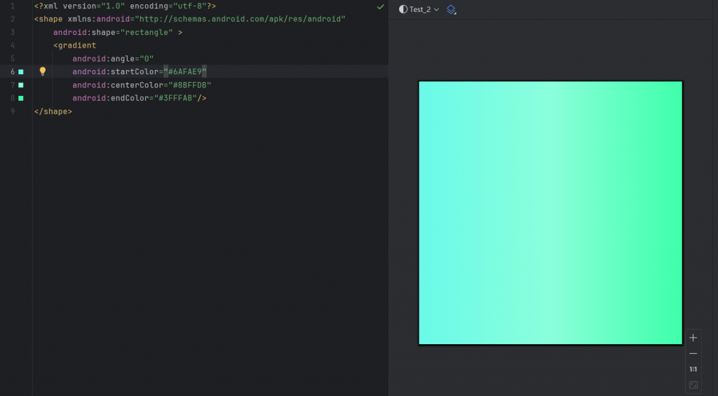
angle漸層的角度改成90度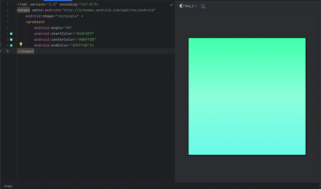
下篇會介紹如何實現框線虛線和實線

 iThome鐵人賽
 看影片追技術