在實作表單的手風琴之前,先利用 Button Toggle 來實作一般與收合兩種清單的切換,此元件是一種可單選或多選的選擇型按鈕。在引用 MatButtonToggleModule 模組後,就可以 <mat-button-toggle-group> 標籤,此標籤的 appearance 屬性用來設定所顯示的樣式;若要允許多選的話,則會設定 multiple 屬性。
<mat-button-toggle-group>
  <mat-button-toggle value="list">一般表格</mat-button-toggle>
  <mat-button-toggle value="expansion">收合表格</mat-button-toggle>
</mat-button-toggle-group>
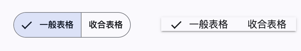
如上面所示,預設顯示所選擇的對象會有勾選符號,若不希望顯示則可以設定 hideSingleSelectionIndicator 或 hideMultipleSelectionIndicator 屬性來隱藏,前者針對的是單選,後者則為多選。
然而,若希望整個應用程式針對上面的 appearance、hideSingleSelectionIndicator 或 hideMultipleSelectionIndicator 等屬性都使用一樣的設定,我們可以實作 MatButtonToggleDefaultOptions 這個介面。
@Injectable()
export class CustomButtonToggleOptions
  implements MatButtonToggleDefaultOptions
{
  appearance: MatButtonToggleAppearance = 'standard';
  hideSingleSelectionIndicator = true;
  hideMultipleSelectionIndicator = true;
  disabledInteractive = true;
}
並且在 app.config 抽換掉 MAT_BUTTON_TOGGLE_DEFAULT_OPTIONS 令牌。
{
  provide: MAT_BUTTON_TOGGLE_DEFAULT_OPTIONS,
  useClass: CustomButtonToggleOptions,
},
當使用者選擇 Button Toggle 的狀態時,我們可以利用 change 或 valueChange 兩個事件來取得當前選擇狀態。
<mat-button-toggle-group (valueChange)="viewType.set($event)">
  <mat-button-toggle value="table" checked="true">一般表格</mat-button-toggle>
  <mat-button-toggle value="expansion">收合表格</mat-button-toggle>
</mat-button-toggle-group>
也可以與 Reactive Form 整合,設定繫結 FormControl 來記錄所選擇的狀態。
<mat-button-toggle-group [formControl]="viewControl">
  <mat-button-toggle value="list">一般清單</mat-button-toggle>
  <mat-button-toggle value="expansion">收合清單</mat-button-toggle>
</mat-button-toggle-group>
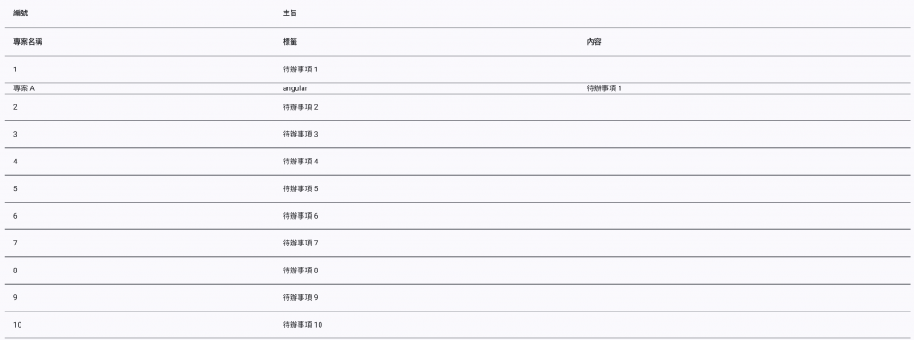
要在 Angular Material 的 Table 實作收合列的功能,需要先使用 multiTemplateDataRows 來允許顯示多資料列。接著,如之前資料表清單所描述,先定義收合列所需要的欄位內容。
<ng-container matColumnDef="id">
  <td mat-cell *matCellDef="let row">{{ row.id }}</td>
</ng-container>

<ng-container matColumnDef="subject">
  <td mat-cell *matCellDef="let row" colspan="3">{{ row.subject }}</td>
</ng-container>

<ng-container matColumnDef="project">
  <td mat-cell *matCellDef="let row">
    <div [@detailExpand]="row == expandedElement ? 'expanded' : 'collapsed'">
      {{ row.projectName }}
    </div>
  </td>
</ng-container>
在上面程式中,也定義了在開合過程中的動畫設定,此會對應到元件裝飾器中的 animations 設定。
@Component({
  ...
  animations: [
    trigger('detailExpand', [
      state('collapsed,void', style({ height: '0px', minHeight: '0' })),
      state('expanded', style({ height: '*' })),
      transition(
        'expanded <=> collapsed',
        animate('225ms cubic-bezier(0.4, 0.0, 0.2, 1)')
      ),
    ]),
  ],
})
最後,設定在點選資料列時記錄收合的對象,以及收合列的欄位設定,並將此列的高預設為 0。
<tr
  mat-row
  *matRowDef="let row; columns: ['id', 'subject']"
  (click)="expandedElement = expandedElement === row ? null : row"
></tr>
<tr
  mat-row
  *matRowDef="let row; columns: ['project', 'tags', 'content']"
  [style.height.px]="0"
></tr>
除了在 Table 中實作的收合的功能外,Angular Material 也有提供 Expansion Panel 實入手風琴。接下來,我們在今日工作的側邊欄使用 Expansion Panel 與 List 來顯示未完成與已完成事項。


 iThome鐵人賽
 看影片追技術