Hello, 各位 iT 邦幫忙 的粉絲們大家好~~~
在本系列文會展開使用 Avalonia UI 技術所建立的 TopAOAIConnector App 。由於使用 Avalonia UI 可以很快速的進行各平台的 桌面 應用程式開發,並且透過此 TopAOAIConnector App 來串接 Azure OpenAI Service 時所需的功能研究。
本篇是 就是要來點 A.I. 的 TopAOAIConnector App 系列文的 EP09。
話說 TopAOAIConnector App 的主要目標是要做到類似 Azure OpenAI Studio 的 Playground 去設定與使用的概念,所以 "Chat" 的畫面就至少要能像是 Playground 當中的 Chat 長相:
在 Azure OpenAI Studio 的服務中使用其 Playground,進到 "Chat" 的主要畫面長相大概如下: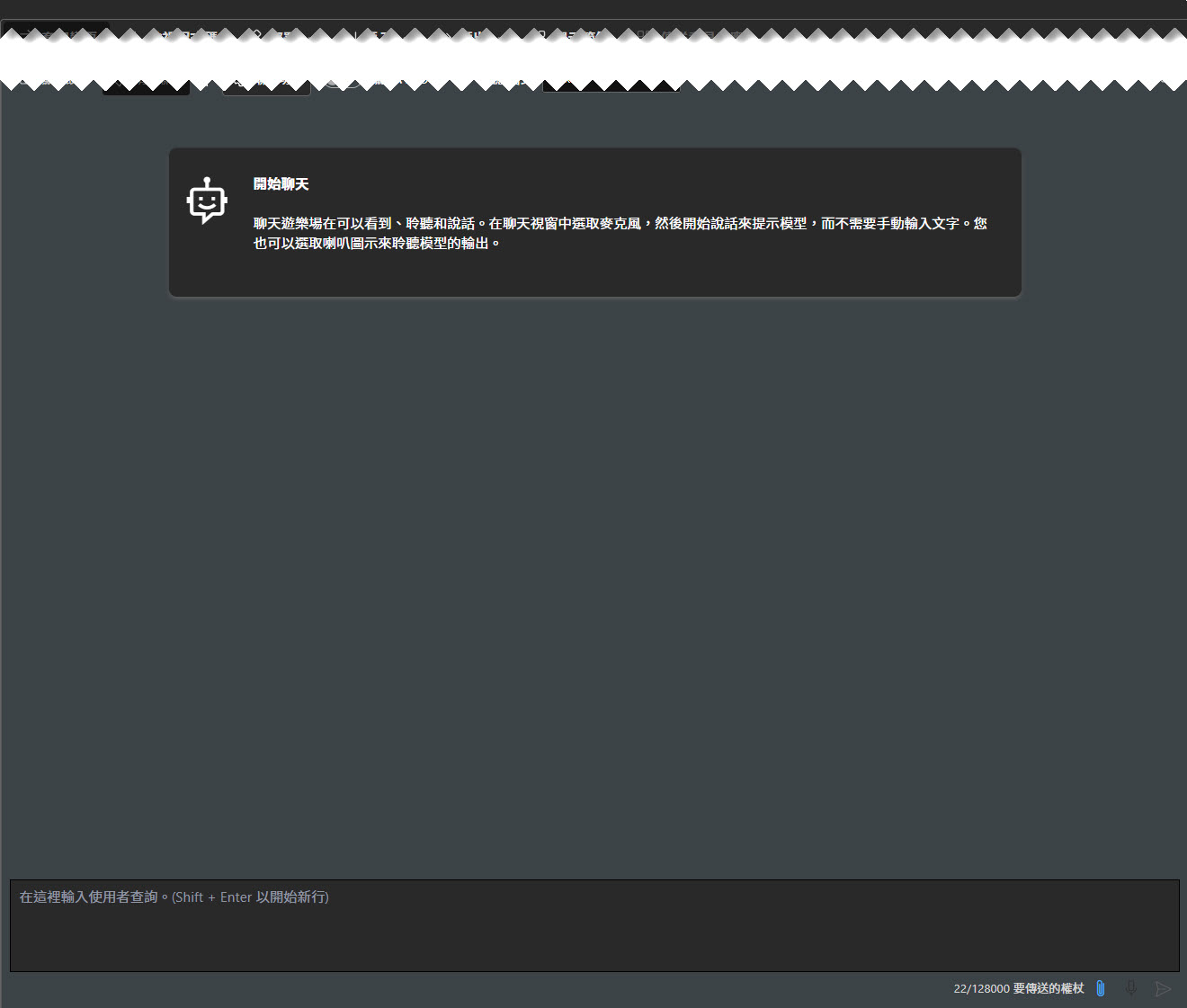
透過 Playground 簡單的對談時的長相: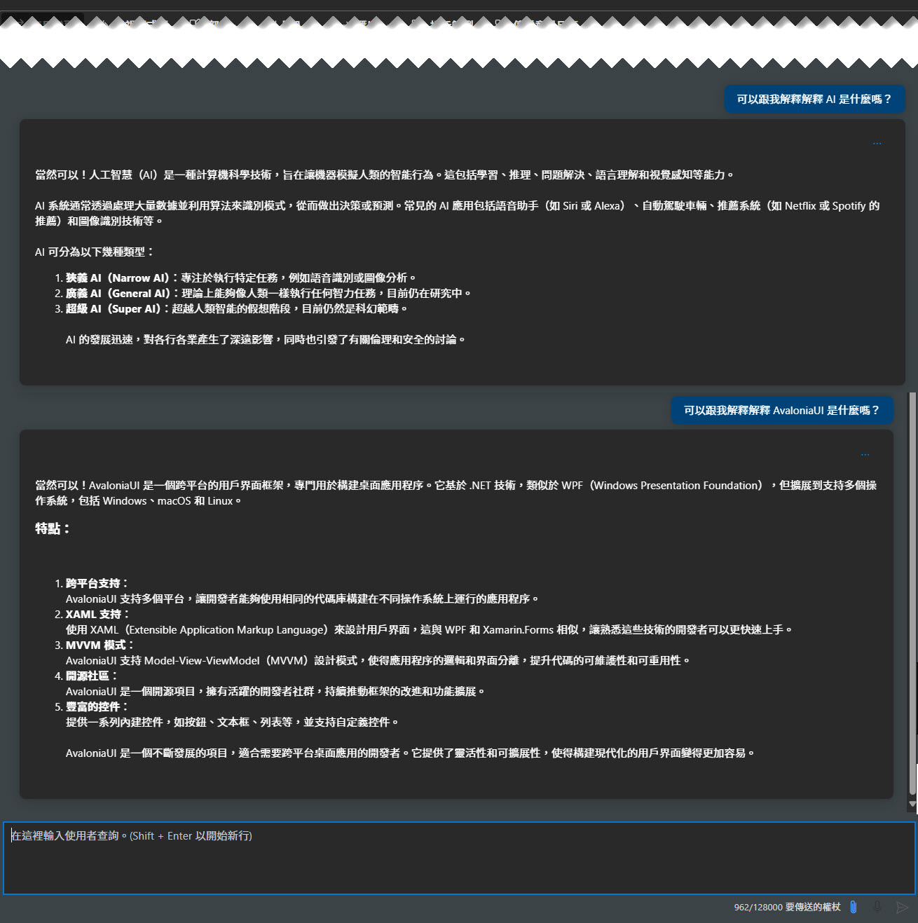
那就回到先前所建立 TopAOAIConnector App 的 Avalonia UI 專案囉!
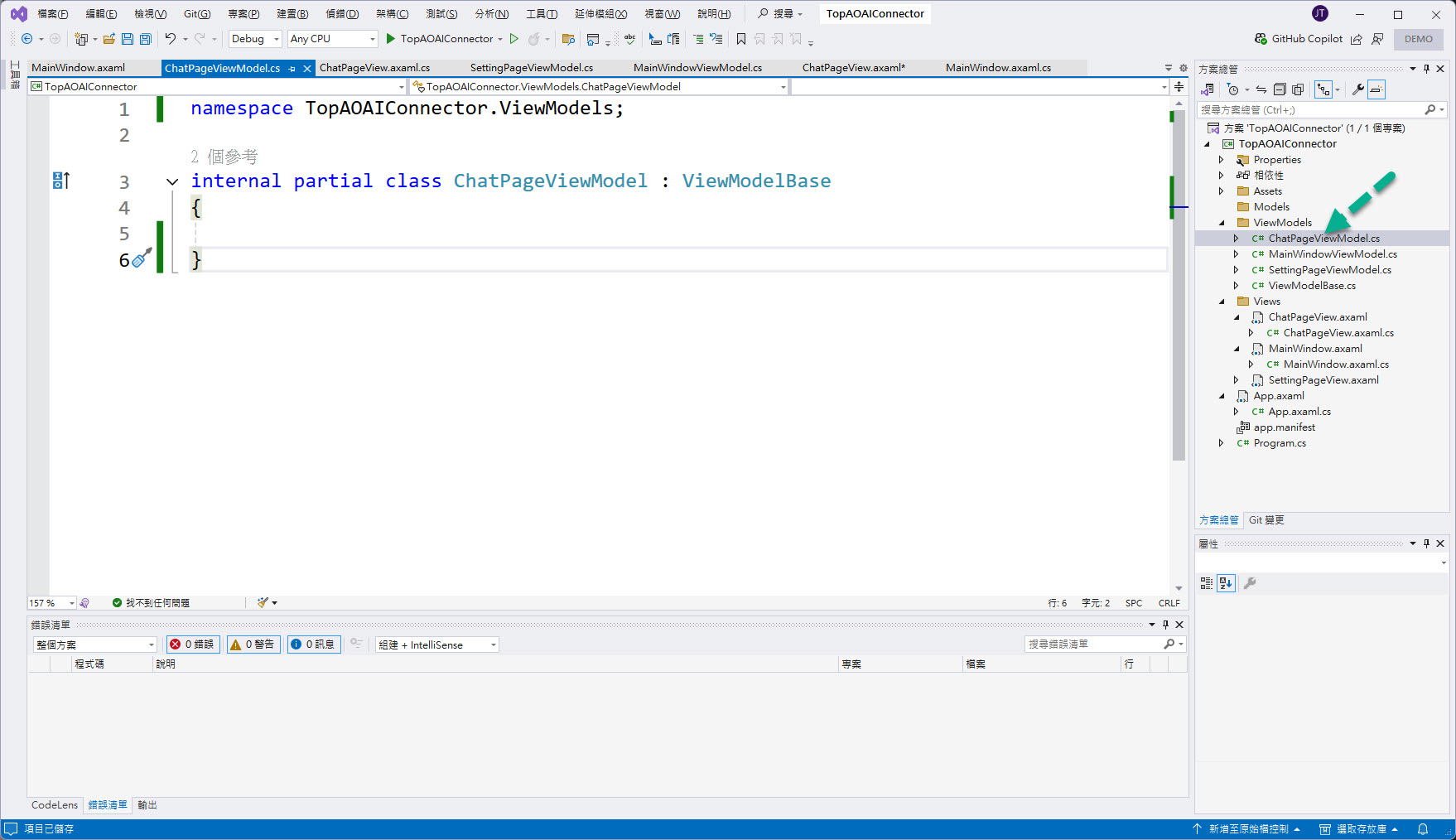
找到先前在 ViewModels/ChatPageViewModel.cs 大概會長這樣子:
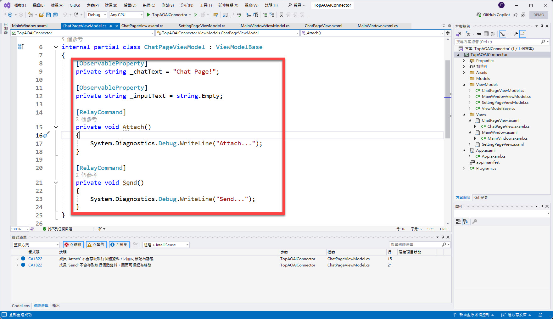
在該 ChatPageViewModel 當中加入以下程式碼:
[ObservableProperty]
private string _chatText = "Chat Page!";

[ObservableProperty]
private string _inputText = string.Empty;

[RelayCommand]
private void Attach()
{
    System.Diagnostics.Debug.WriteLine("Attach...");
}

[RelayCommand]
private void Send()
{
    System.Diagnostics.Debug.WriteLine("Send...");
}
改完後大概會如下圖 (紅框為所加入的 C# 程式碼):
接著切到 Views/ChatPageView.axaml 大概會長這樣子:
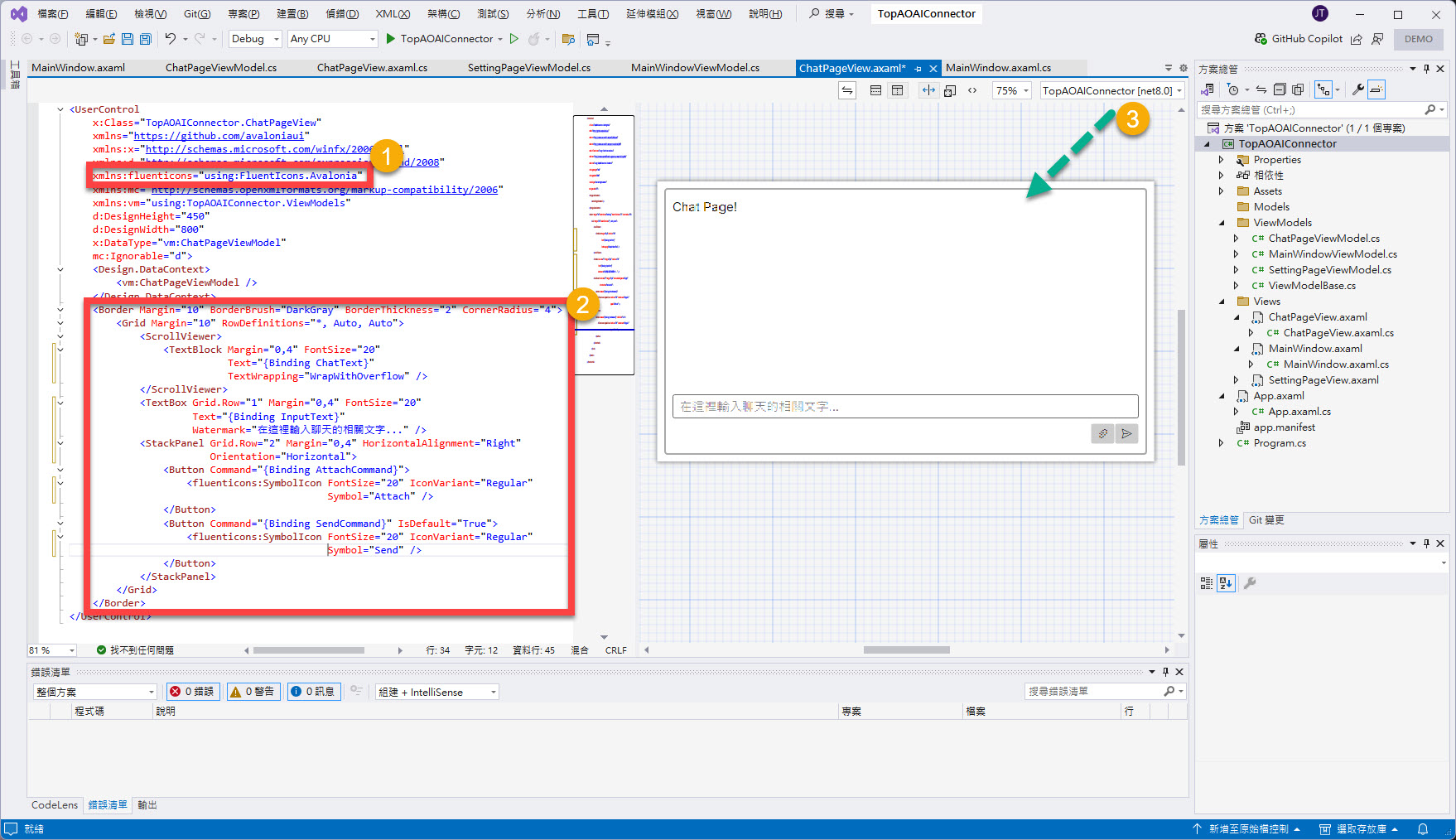
在該 ChatPageView 當中來編輯 XAML:
加入 "FluentIcons.Avalonia" 命名空間的使用(點 1)。
xmlns:fluenticons="using:FluentIcons.Avalonia"
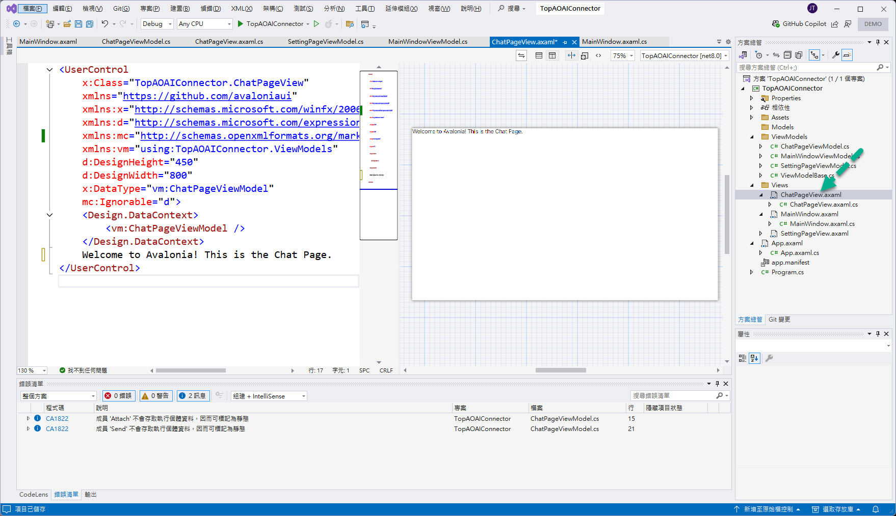
替換掉原本 UserControl 標記中單純文字顯示 "Welcome to Avalonia! This is the Chat Page.",為下列標記(點 2)。
<Border Margin="10" BorderBrush="DarkGray" BorderThickness="2" CornerRadius="4">
    <Grid Margin="10" RowDefinitions="*, Auto, Auto">
        <ScrollViewer>
            <TextBlock Margin="0,4" FontSize="20" Text="{Binding ChatText}" TextWrapping="WrapWithOverflow" />
        </ScrollViewer>
        <TextBox
            Grid.Row="1" Margin="0,4" FontSize="20"
            Text="{Binding InputText}"
            Watermark="在這裡輸入聊天的相關文字..." />
        <StackPanel Grid.Row="2" Margin="0,4" HorizontalAlignment="Right" Orientation="Horizontal">
            <Button Command="{Binding AttachCommand}">
                <fluenticons:SymbolIcon FontSize="20" IconVariant="Regular" Symbol="Attach" />
            </Button>
            <Button Command="{Binding SendCommand}" IsDefault="True">
                <fluenticons:SymbolIcon FontSize="20" IconVariant="Regular" Symbol="Send" />
            </Button>
        </StackPanel>
    </Grid>
</Border>
若 XAML 編輯正確,也應該能夠在 Visaul Studio 中正確地看到 preview 的結果(點 3)。
上述完成後會大概如下圖:
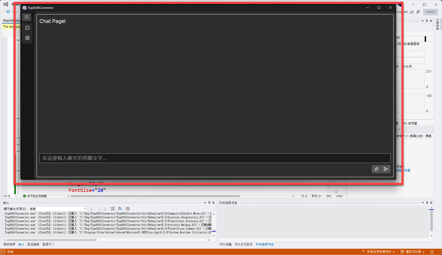
"執行並偵錯(F5)" 後出現的畫面應該會如下圖紅框中的畫面:
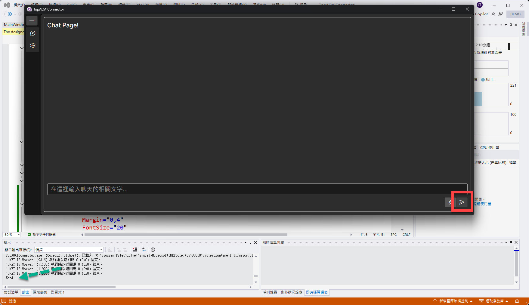
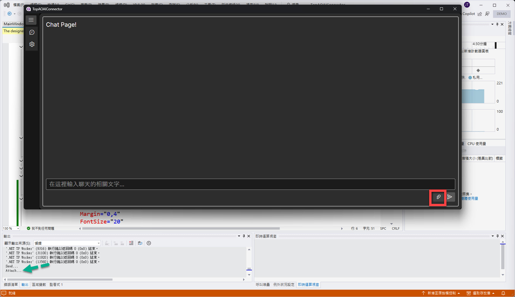
若點選 Send 按鈕,則會在 Visaul Studio 輸出窗格顯示 "Send...":
若點選 Attach 按鈕,則會在 Visaul Studio 輸出窗格顯示 "Attach...":
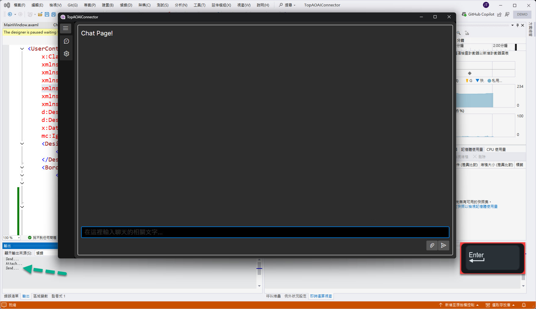
如果先點選一下所設計的 TexBox 讓視窗的 "焦點(Focus)" 進入到 TextBox 中,直接按鍵盤的 "Enter" 鍵,則會在 Visaul Studio 輸出窗格顯示 "Send...":
到這邊就完成最 "基本" 的 Chat 有關的 UI 設計,有沒有那麼像一開始所提的 Azure OpenAI Studio 使用 Playground 的 Chat 呢!?
哈哈,那就下回見~~~


 iThome鐵人賽
 看影片追技術