在 Flutter 開發中,表單輸入幾乎是每個 App 都會遇到的需求,但不同的輸入欄位如果用同一種元件,很容易造成操作不便或樣式混亂。今天目標是實作「新增行程頁」,這個頁面需要填寫多種資訊:單行文字、多行文字、下拉選單和日期選擇,下面將說明如何選擇合適的元件、統一樣式與驗證邏輯,同時分享一些封裝小技巧,讓程式碼更容易維護,也更方便重複使用~
所有元件都集中在同一個資料夾,方便管理與維護:
lib/
├─ components/
│  └─ text_fields/
│     ├─ custom_text_field.dart       # 單行文字輸入 + 多行輸入 factory
│     ├─ custom_dropdown_field.dart   # 下拉選單
│     └─ custom_datetime_field.dart   # 日期時間選擇
└─ views/
   └─ activity_editor_view.dart        # 行程編輯頁面
說明:
custom_text_field.dart:單行文字輸入元件,並透過 factory constructor 提供多行文字輸入(TextArea)custom_dropdown_field.dart:下拉選單元件custom_datetime_field.dart:日期時間選擇元件CustomTextField單行文字欄位常用於輸入行程名稱或地點。相比原生 TextField,TextFormField 支援 Form 驗證,更適合表單使用。
CustomTextField(
  controller: _titleController,
  labelText: '行程名稱',
  validator: (value) {
    if (value == null || value.isEmpty) return '請輸入行程名稱';
    return null;
  },
)
特性
備註或留言欄通常需要多行文字輸入,有兩種設計方式:
獨立 Widget (CustomTextArea)
使用 factory constructor (CustomTextField.textArea)
factory CustomTextField.textArea({
  required TextEditingController controller,
  String? hintText,
  String? labelText,
  String? Function(String?)? validator,
  bool enabled = true,
  FocusNode? focusNode,
  VoidCallback? onEditingComplete,
  ValueChanged<String>? onChanged,
}) {
  return CustomTextField(
    controller: controller,
    hintText: hintText,
    labelText: labelText,
    validator: validator,
    enabled: enabled,
    focusNode: focusNode,
    onEditingComplete: onEditingComplete,
    onChanged: onChanged,
    maxLines: 4,
    minLines: 4,
    keyboardType: TextInputType.multiline,
    textInputAction: TextInputAction.newline,
  );
}
使用方式:
CustomTextField.textArea(
  controller: _noteController,
  labelText: '備註',
)
建議
若多行輸入只是樣式或行數差異,使用 factory constructor 即可,無需額外 Widget。
CustomDropdownField當欄位有固定選項時,使用文字輸入容易錯誤,建議改用下拉選單,這樣使用者只需要「點選」,不用再打字,體驗順暢很多。
CustomDropdownField<String>(
  value: selectedOption,
  items: ['選項一', '選項二'],
  onChanged: (val) => setState(() => selectedOption = val!),
)
特性
將 DropdownButtonFormField 封裝成 CustomDropdownField,並加上:
enum ActivityType {
  sightseeing, restaurant, shopping, accommodation, freeTime, transport, other
}

extension ActivityTypeIcon on ActivityType {
  String get label {
    switch (this) {
      case ActivityType.sightseeing: return 'Sightseeing';
      case ActivityType.restaurant: return 'Restaurant';
      case ActivityType.shopping: return 'Shopping';
      case ActivityType.accommodation: return 'Accommodation';
      case ActivityType.freeTime: return 'Free Time';
      case ActivityType.transport: return 'Transport';
      default: return 'Other';
    }
  }
}
使用範例:
CustomDropdownField<ActivityType>(
    hintText: 'Type',
    value: _selectedActivityType,
    items: ActivityType.values,

    // 顯示文字,這裡使用 enum extension 提供的 label
    itemLabelBuilder: (item) => item.label,

    onChanged: (ActivityType? newVal) {
      setState(() { _selectedActivityType = newVal; });
    }
)
CustomDateTimeField手動輸入日期繁瑣且容易錯誤覺,尤其在行動裝置上,輸入日期是很繁瑣的操作,使用系統日期選擇器更直覺,這樣一來,使用者只需要滑動或點選日期,體驗比手動輸入好得多。
CustomDateTimeField(
  controller: _dateController,
  labelText: '行程日期',
  editingEnabled: true,
  onPicked: (picked) => print('使用者選擇: $picked'),
)
特性
將 TextFormField + showDatePicker 封裝成 CustomDateTimeField,提供:
若每個輸入欄位都自行設定 InputDecoration,維護成本會很高,容易導致邊框樣式、顏色不一致。建議透過 Theme 統一管理。
class AppInputDecoration {
  static InputDecorationTheme theme(AppColorExtension colors, TextTheme textTheme) {
    return InputDecorationTheme(
      enabledBorder: OutlineInputBorder(
        borderRadius: BorderRadius.circular(8),
        borderSide: BorderSide.none,
      ),
      filled: true,
      fillColor: colors.gray100,
    );
  }
}
透過 Theme 管理,可以一次調整全 App 的輸入框樣式,提高維護性。
| 多行文字 | 下拉選單 | 時間選擇 |
|---|---|---|
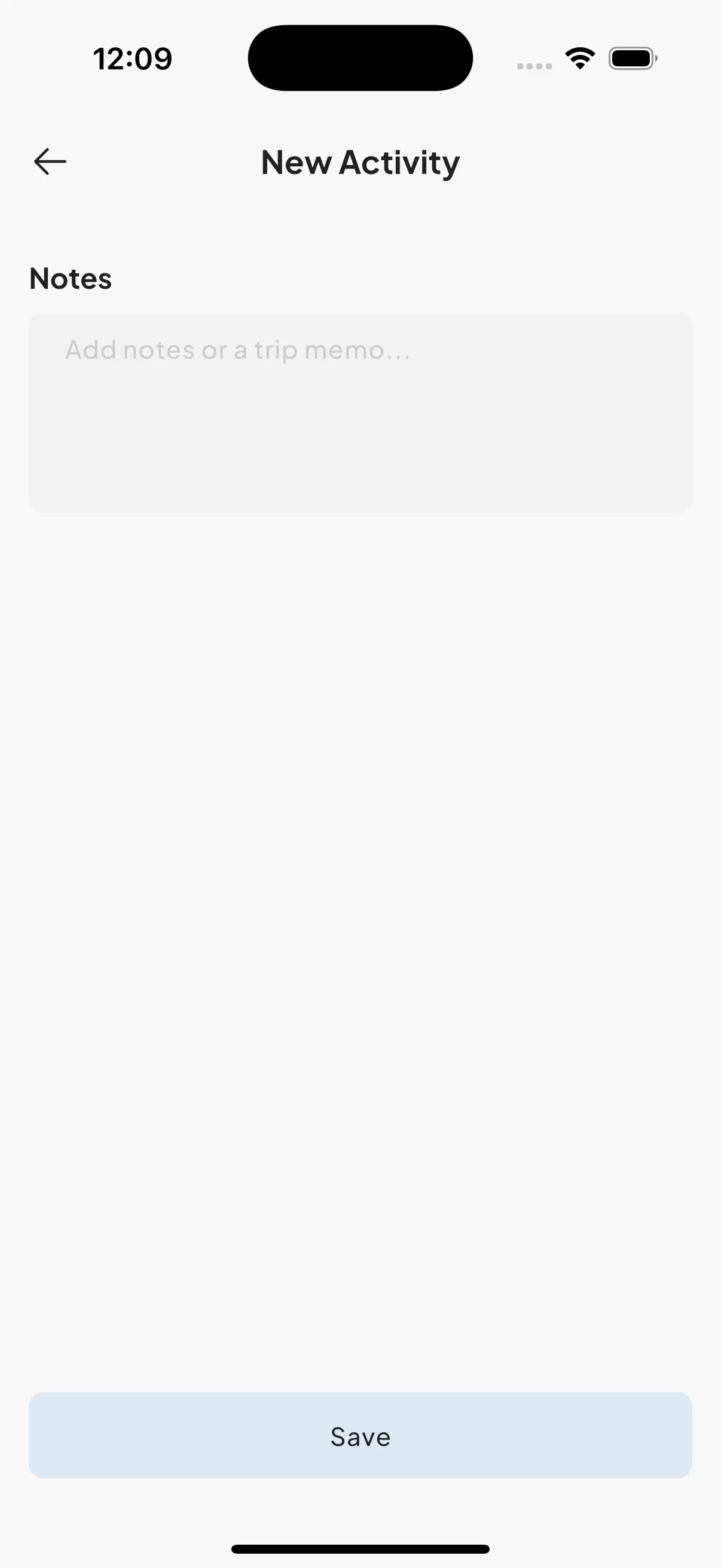 |
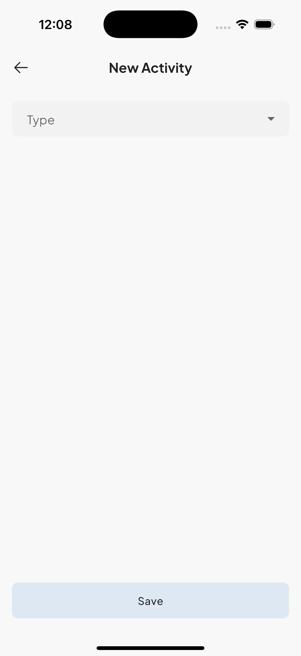 |
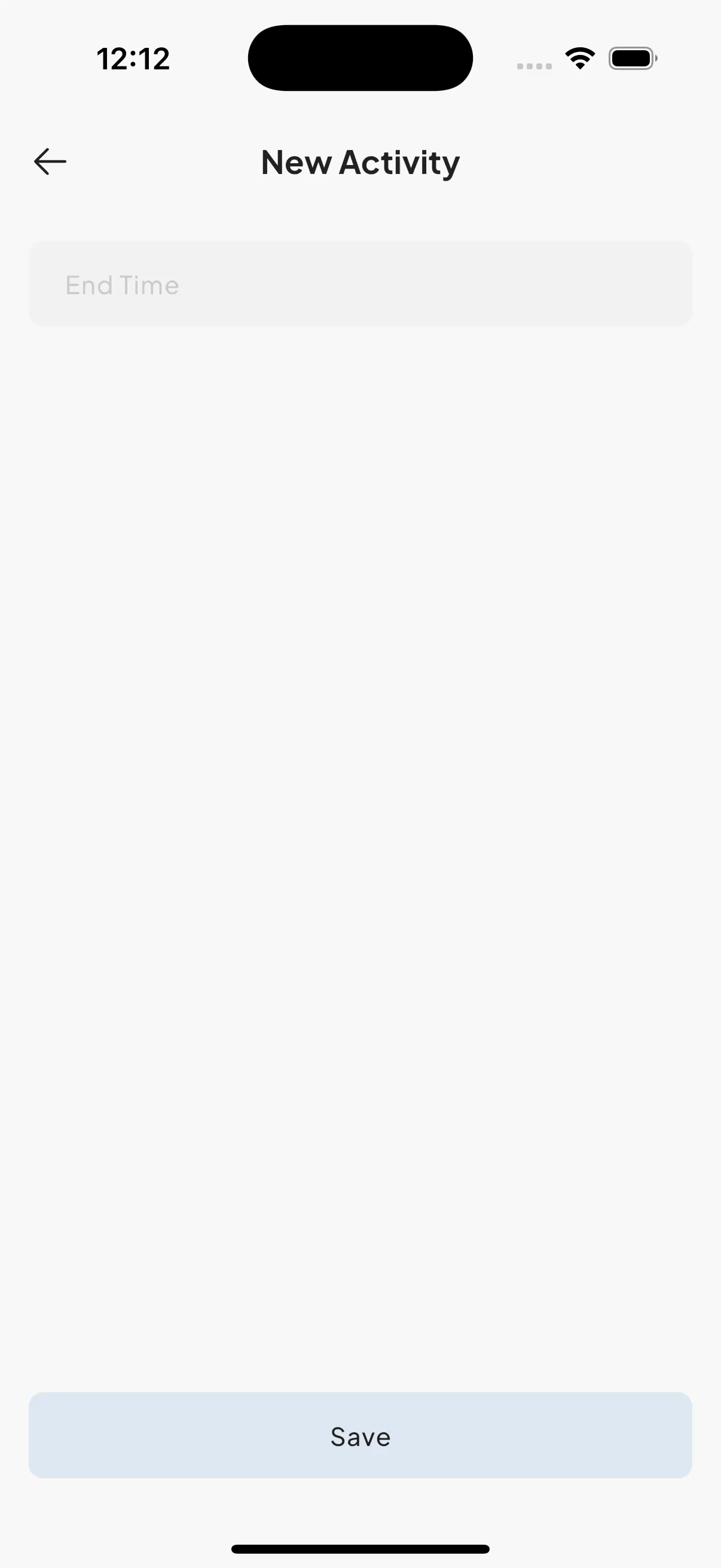 |
只要指令夠精準,例如:「幫我評估是否把 components/text_fields 底下檔案的 decoration 拉到 theme 共用」,AI 不但能準確完成,最後還會提醒我是否要跑 flutter analyze。看來它不只是修 bug 的工具,也能協助重構,幫助我提高效率。


 iThome鐵人賽
 看影片追技術