一、資料處理
資料讀取後,針對PM2.5濃度進行分級,定義為三個等級:
二、地圖製作
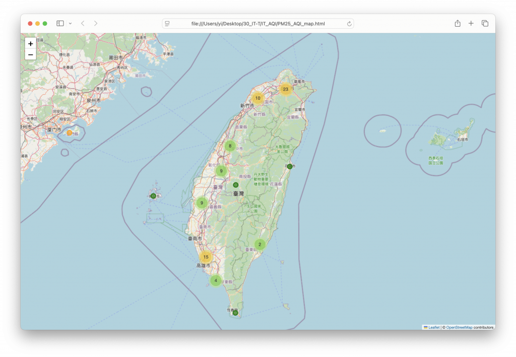
使用Folium(pip3 install Folium)建立互動式地圖,中心設定在台灣地理中心附近(經緯度23.5, 121),並以MarkerCluster聚合測站,避免測站過多時地圖過於擁擠。
每個測站以 圓形標記(CircleMarker)表示,顏色依PM2.5等級顯示:
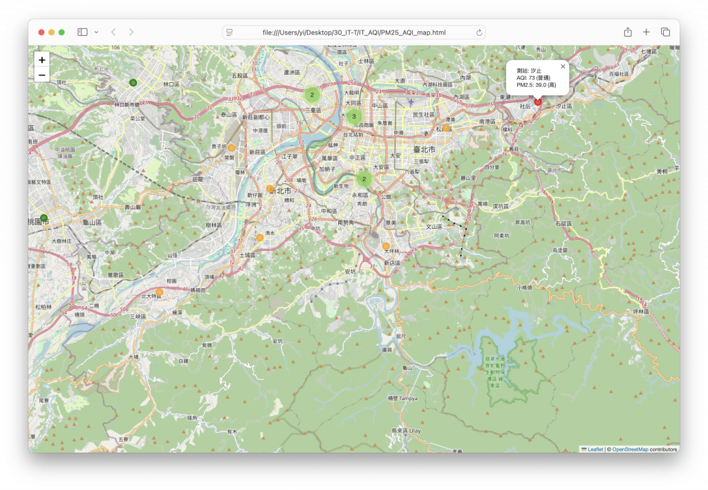
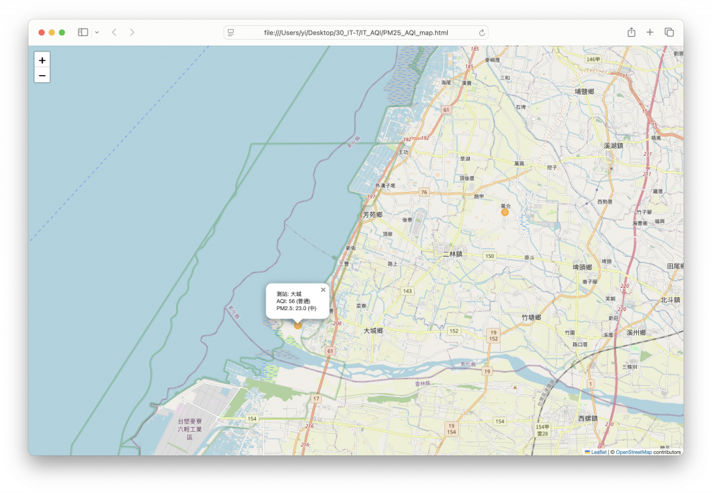
點擊測站標記可看到詳細資訊,包括:
import pandas as pd
import folium
from folium.plugins import MarkerCluster

# 讀取資料
df = pd.read_csv("IT_AQI/AQI.csv")


# PM2.5 高低分組(可以自己定義閾值)
def pm25_group(pm):
    if pd.isna(pm):
        return "無資料"
    elif pm <= 15:
        return "低"
    elif pm <= 35:
        return "中"
    else:
        return "高"


df["PM25_Level"] = df["pm2.5"].apply(pm25_group)


# AQI 等級函數
def aqi_category(aqi):
    if pd.isna(aqi):
        return "無資料"
    elif aqi <= 50:
        return "良好"
    elif aqi <= 100:
        return "普通"
    elif aqi <= 150:
        return "對敏感族群不健康"
    elif aqi <= 200:
        return "對所有族群不健康"
    elif aqi <= 300:
        return "非常不健康"
    else:
        return "危害"


df["AQI_Level"] = df["aqi"].apply(aqi_category)

# 建立地圖
m = folium.Map(location=[23.5, 121], zoom_start=7)

# MarkerCluster 方便大量測站顯示
marker_cluster = MarkerCluster().add_to(m)

# 顏色對應
color_dict = {"低": "green", "中": "orange", "高": "red", "無資料": "gray"}

for _, row in df.iterrows():
    if pd.notna(row["latitude"]) and pd.notna(row["longitude"]):
        popup_text = f"測站: {row['sitename']}<br>AQI: {row['aqi']} ({row['AQI_Level']})<br>PM2.5: {row['pm2.5']} ({row['PM25_Level']})"
        folium.CircleMarker(
            location=[row["latitude"], row["longitude"]],
            radius=6,
            color=color_dict.get(row["PM25_Level"], "blue"),
            fill=True,
            fill_color=color_dict.get(row["PM25_Level"], "blue"),
            fill_opacity=0.7,
            popup=folium.Popup(popup_text, max_width=300),
        ).add_to(marker_cluster)

# 儲存地圖
m.save("IT_AQI/PM25_AQI_map.html")
print("地圖已儲存為 PM25_AQI_map.html")
三、分析心得
互動式地圖直觀呈現污染熱區:紅色標記集中地區可立即辨識為PM2.5高污染區,提醒民眾減少戶外活動。
AQI與PM2.5分級結合:提供多維度資訊,不僅知道空氣品質好壞,也能掌握主要污染因子。
可作為政策與防護參考:環保單位可依此掌握污染熱點,制定改善策略;民眾可依地圖規劃日常行程與防護措施。


 iThome鐵人賽