今天想要分享的是會跟著滑鼠一起移動的小星星,先來看一下效果: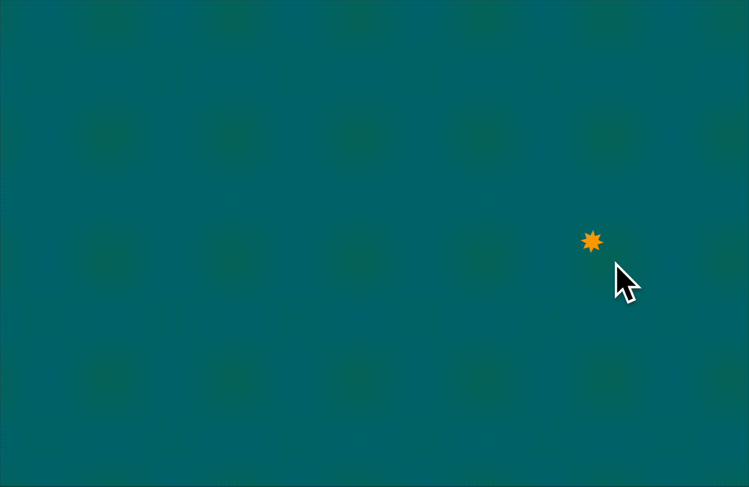
<body>
  <div class="star"></div>
  <div class="star"></div>
  <div class="star"></div>
  <div class="star"></div>
  <div class="star"></div>
</body>
body {
      margin: 0;
      height: 100vh;
      display: flex;
      justify-content: center;
      align-items: center;
      background: #007074;
      overflow: hidden;
}

.star {
  position: absolute;
  width: 15px;
  height: 15px;
  background: #FEA405;
  clip-path: polygon(
        //省略
  );
}
這裡唯一要注意的點是要有 position: absolute ,因為 .star 預設會是 position: static,它們會變成 Flexbox 的子項目,視覺上就會變成並排的一列星星,而不是重疊的樣子。
const stars = document.querySelectorAll(".star");

document.addEventListener("mousemove", (e) => {
    const centerX = window.innerWidth / 2;
    const centerY = window.innerHeight / 2;

    const offsetX = e.clientX - centerX;
    const offsetY = e.clientY - centerY;

    gsap.to(stars, {
      x: offsetX,
      y: offsetY,
      scale: 1 + e.clientY / window.innerHeight,
      rotation: e.clientX / 5,
      duration: 0.5,
      ease: "power2.out",
      stagger: 0.05
    });
});
(待補上)


 看影片追技術