接下來介紹共用元件(components)的開發,讓不同功能頁面重複使用。先從最簡單的跳窗開始介紹,後續幾天則會帶到進階與更複雜的元件,讓前端 UI 模組更完整,協助前端開發者快速組裝所需功能。
雖然前端可以直接使用 JavaScript alert() 完成跳窗訊息提示,但為了 UI/UX 一致性,仍需統一設計。這裡將從最基本的跳窗元件開始介紹,先聊聊需求:
DialogsAlert.vue,先加入 TypeScript 區塊,完成 props 宣告,並監控 props.dialog 的變化。<script setup lang="ts">
import { ref, watch, defineProps} from 'vue';
const props = defineProps({
dialog: Boolean, //彈跳視窗的開關
message: String, //彈跳視窗顯示的訊息
});
const showDialog = ref(false);
const showMessage = ref('');
watch(
() => props.dialog, // 監控props.dialog的數值
async (newValue) => {
showDialog.value = newValue; // 有發生改變時,將接收到的值回寫到 showDialog
showMessage.value = props.message ?? ''; // props.message 回寫 showMessage
}
);
//關閉對話框
const closeDialogAlert = () => {
showDialog.value = false;
};
</script>
DialogsAlert.vue 中加入 template 區塊,控制跳窗開關為 showDialog,顯示訊息為對應的變數。showMessage,完成後跳窗的components 就完成了。<template>
<div class="text-center mt-6 ">
<v-dialog v-model="showDialog" persistent width="500">
<template v-slot:default>
<v-card>
<v-toolbar color="primary" class=" text-center px-4">提示訊息</v-toolbar>
<v-card-item>
<div class="pa-12 text-center ">{{showMessage}}</div>
</v-card-item>
<v-card-actions class="justify-end">
<v-btn variant="flat" @click="closeDialogAlert">Close</v-btn>
</v-card-actions>
</v-card>
</template>
</v-dialog>
</div>
</template>
TypeScript 區塊先引用元件,並在 template 區塊中使用該元件。目前案例為跳窗,因此 template 的位置不影響功能。<script setup lang="ts">
import DialogsAlert from '@/components/shared/DialogsAlert.vue';
const showDiaAlert = ref(false);
const showDiaAlertMsg = ref('');
const OpenDialogAlert = () => {
showDiaAlert.value = true;
showDiaAlertMsg.value = "Hello components ! ";
};
</script>
<template>
<DialogsAlert :dialog="showDiaAlert" :message="showDiaAlertMsg" />
<v-btn variant="flat" color="primary" rounded="md" @click="OpenDialogAlert()">
<template v-slot:prepend>
<SvgSprite name="custom-send-outline" style="width: 20px; height: 20px" />
</template>
跳出視窗
</v-btn>
</temlate>
圖18-1:點選跳出視窗按鈕後,會顯示父層的傳遞的 message內容。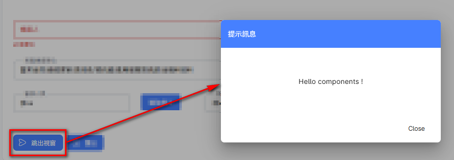
在 Vue 3 中,元件可透過 defineProps 承接不同元件間的 props,不限型別,可以是數字、字串、物件等皆可傳遞。當元件接收到 props 的數值時,搭配 watch 監測數值變化,使共用元件能隨數值更新內容。因此,需要透過 props 傳入 dialog 與 message 兩個參數:
dialog:控制跳窗的開關。message:顯示訊息內容。
圖18-2:若文字說明較難閱讀,下方附有圖示,期望能增加理解度。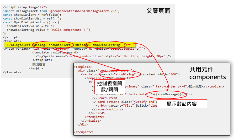
接下來加入一些變化,components 除了可以傳遞事件(Event)之外,也適用於刪除資料前的確認場景。父層頁面使用 components 時,可以將已完成的事件傳遞給 components,讓 components 可直接呼叫使用,實作如下:
DialogConfirmAlert.vue
<script setup lang="ts">
import { ref, watch, defineProps, defineEmits } from 'vue';
const props = defineProps({
    dialog: Boolean,
    message: String,
});
const emit = defineEmits(['close','confirm']); //定義元件可以向父元件發送的事件名稱。
const showDialog = ref(false);
const showMessage = ref('');

//監聽dialog 是否有變化同步showDialog的value
watch(
  () => props.dialog,
  (newDialog) => {
    showDialog.value = newDialog;
  }
);

//監聽message是否有變化同步showMessage 的value
watch(
  () => props.message,
  (newMessage) => {
    showMessage.value = newMessage ?? '';
  }
);

</script>
<template>
  <div class="text-center mt-6 ">
    <v-dialog v-model="showDialog" persistent width="500">
      <template v-slot:default>
        <v-card>
          <v-toolbar color="primary" class=" text-center px-4">提示訊息</v-toolbar>
          <v-card-item>
            <div class="pa-12 text-center ">{{showMessage}}</div>
          </v-card-item>
          <v-card-actions class="justify-end">
             <!-- 當使用者點擊按鈕時,會觸發 emit('close'),向父元件發送 close 事件與confirm  事件。 -->
            <v-btn variant="flat" @click="emit('close')">取消刪除作業</v-btn>
            <v-btn variant="flat" @click="emit('confirm')">確認刪除異動</v-btn>
          </v-card-actions>
        </v-card>
      </template>
    </v-dialog>
  </div>
</template>
<script setup lang="ts">
import DialogConfirmAlert from '@/components/shared/DialogConfirmAlert.vue';
const showDiaAlert = ref(false);
const showDiaAlertMsg = ref('');
const OpenDialogAlert = () => {
  showDiaAlert.value = true;
  showDiaAlertMsg.value = "Hello components ! ";
};
const deleteData = () => {

  showDiaAlertMsg.value = "OK,Now Delete Datas! ";
 //撰寫實際要執行的作業,EX : 呼叫API 進行資料刪除..
};
</script>
<template>
    <DialogConfirmAlert :dialog="showConfirmAlert" :message="showConfirmAlertMsg" @close="closeDialogConfirmAlert" @confirm="deleteData()"/>
<v-btn variant="flat" color="primary" rounded="md" @click="OpenDialogAlert()">
                <template v-slot:prepend>
                  <SvgSprite name="custom-send-outline" style="width: 20px; height: 20px" />
                </template>
                跳出視窗
              </v-btn>
</temlate>
圖18-3:跳窗可選擇要執行的 Method。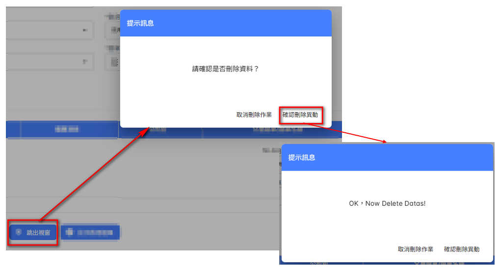
圖18-4:標示父層與元件間的事件傳遞關係。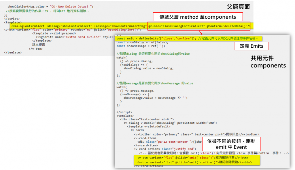


 iThome鐵人賽
 看影片追技術