在資料分析的世界裡,Pandas 不只能整理資料,還能直接畫圖!
其實 Pandas 背後是透過 Matplotlib 來完成繪圖,所以不需要很複雜的設定,就能快速視覺化資料
1. 準備資料
首先建立一個簡單的成績資料表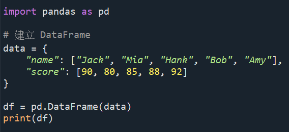
結果會輸出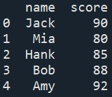
2. 長條圖(bar chart)
Pandas 內建繪圖功能非常方便,一行就能搞定,加上這行 :
結果就會輸出長條圖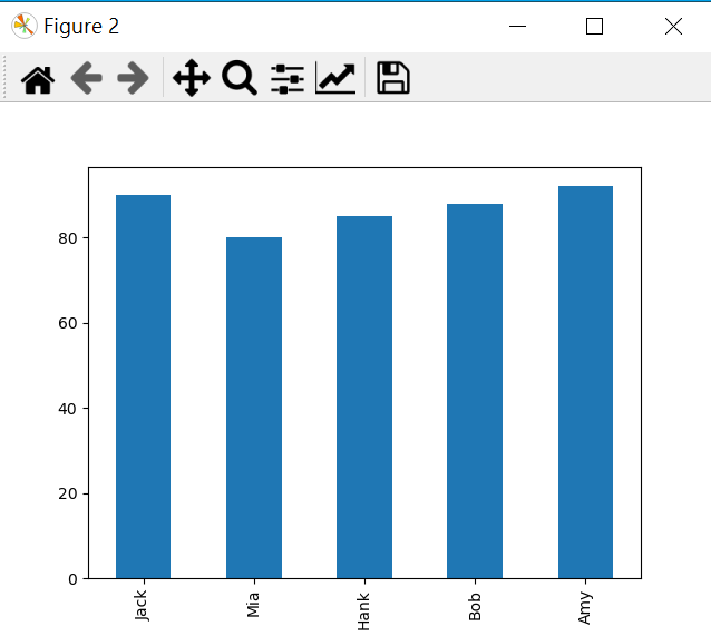
注意!
可能會遇到的問題1 : 如果在 Spyder(Anaconda 自帶的 IDE)裡執行後,發現沒有圖表出現的話,這種情況最常見的原因是「繪圖後端」設定的問題,那首先要做的就是 :
step1 到上方選單列「Tools(工具)」 → 「Preferences(偏好設定)」,點選完畢後會出現下方介面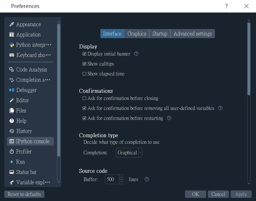
step2 左邊選 「IPython console」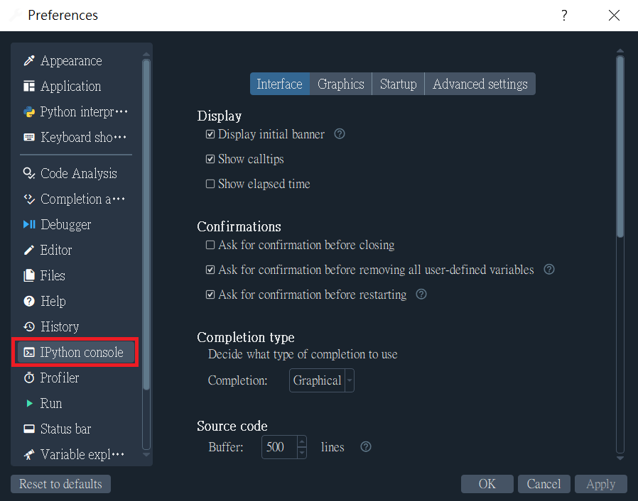
step3 點上方的 「Graphics」 分頁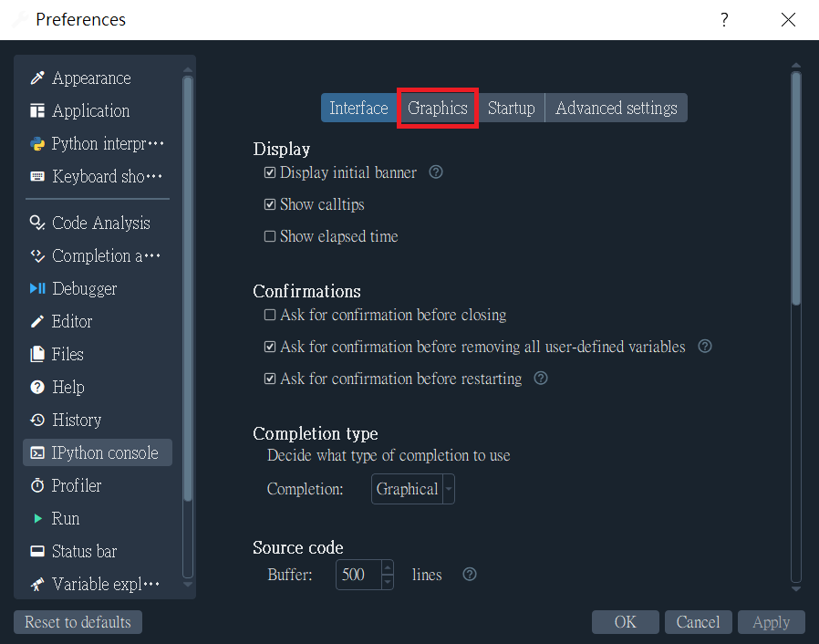
step4 將 Backend 改為:Automatic 或 Qt5,我自己的話是使用Qt5,不要選 Inline,因為這會讓圖顯示在 Console 裡,部分情況可能會沒反應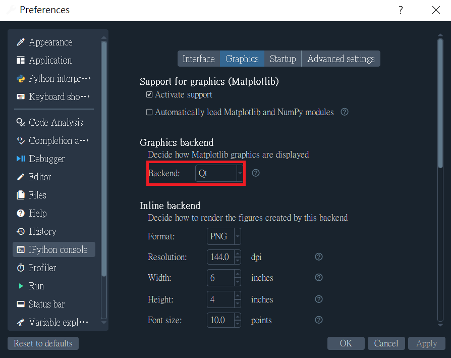
完成後選擇「Apply」再「OK」,然後重新執行程式,就能顯示圖表了!
可能會遇到的問題2 : 還有可能出現的一個問題是,中文字標籤影響了 Matplotlib 的自動字型渲染,如果今天是把字典 "name" 裡的名字設為中文而不是英文的話,那麼圖表中的名字就會顯示不出來 :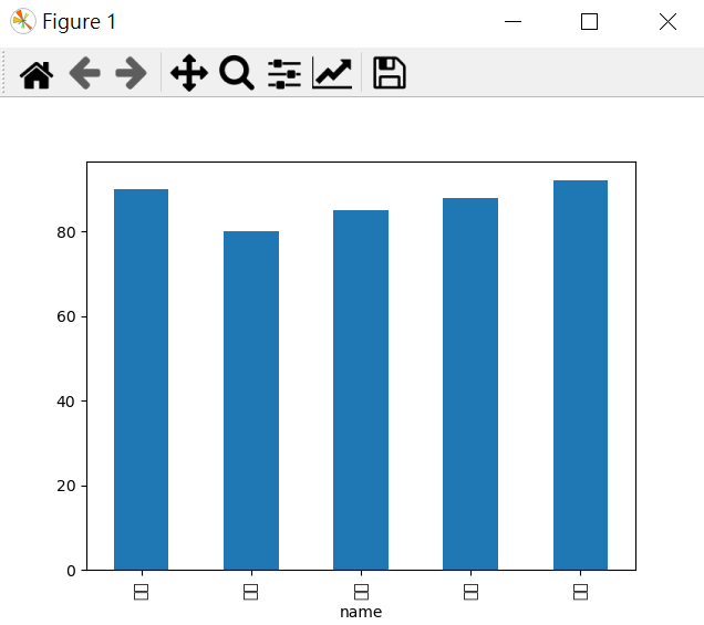
縱軸沒數字通常不是資料問題,而是Matplotlib 預設字型不支援中文,所以可能會影響刻度顯示,解決方法就是加上下方的這兩行程式碼 :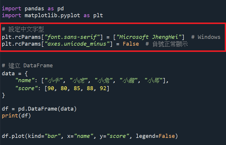
就會看到圖表中縱軸的資料有顯示了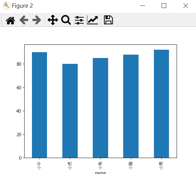
3. 折線圖(line chart)
如果想改成折線圖的話,只要加上這一行 :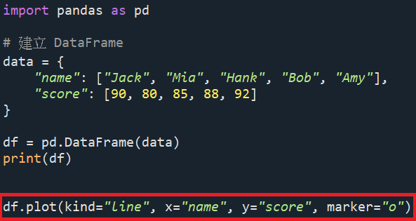
結果就會輸出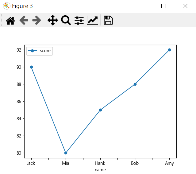
4. 圓餅圖(pie chart)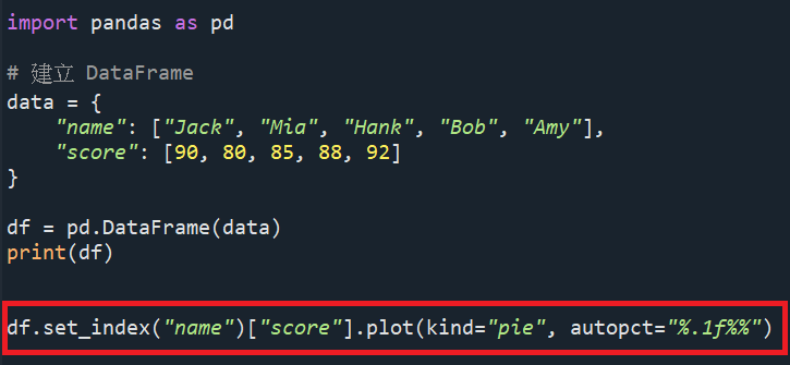
結果會輸出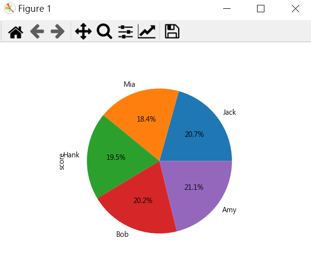
5. 補充:更多圖表類型
Pandas plot(kind="...") 常見圖表類型
line : 折線圖 ( 預設圖表,適合顯示趨勢 )
bar / barh : 長條 / 橫條圖 ( 顯示分類數值比較 )
pie : 圓餅圖 ( 顯示比例 )
hist : 直方圖 ( 顯示分佈情況 )
box : 盒狀圖 ( 顯示統計分佈(中位數等) )
scatter : 散佈圖 ( 顯示兩變數關係 )

