

昨天(Day 11)我們學會了混合圖表(Mixed Chart Types),範例中也初步用到了
tooltip.callbacks.label來客製化提示框內容。今天要把這個主題完整展開——深入介紹 Chart.js 的兩個互動性最強的內建外掛(plugin):圖例(Legend)與提示框(Tooltip)。學會這兩者的客製化技巧後,你就能打造出真正符合業務需求、資訊表達清楚的互動圖表。
在 Chart.js 的架構中,圖例(Legend)與提示框(Tooltip)都不是「圖表本體」的一部分,而是以**外掛(plugin)**的形式存在,分別對應到設定物件中的:
options: {
  plugins: {
    legend: { /* 圖例相關設定 */ },
    tooltip: { /* 提示框相關設定 */ }
  }
}
也就是說,這兩個功能的設定命名空間(namespace)都是 options.plugins.xxx,而不是像 scales、elements 那樣屬於圖表核心設定。這個觀念很重要,因為:
data.datasets 裡有 label,圖例跟提示框就會自動出現,不需要額外設定就能使用。display: false / enabled: false 把內建的關掉,改用其他方式呈現(本篇後段也會介紹「HTML 版」的做法)。今天的內容會分成兩大部分:先講圖例(Legend),再講提示框(Tooltip)。
options: {
  plugins: {
    legend: {
      display: true // 預設就是 true,設為 false 可以整個隱藏圖例
    }
  }
}
display: false 適合用在「圖表已經有清楚的標題或座標軸標籤,不需要額外圖例」,或是「你打算自己做一套圖例 UI」的情境。
position)圖例可以顯示在圖表的四個方位,或是疊加在圖表繪圖區域內:
options: {
  plugins: {
    legend: {
      position: 'bottom' // 'top'(預設)|'left'|'bottom'|'right'|'chartArea'
    }
  }
}
| 值 | 說明 |
|---|---|
'top' |
預設值,圖例顯示在圖表上方 |
'bottom' |
圖例顯示在圖表下方,適合圖例項目較多、需要橫向排列較多空間的情境 |
'left' / 'right' |
圖例顯示在左側或右側,適合圖例項目較少、圖表本身偏方形或需要保留頂部空間放標題的情境 |
'chartArea' |
圖例會疊加在繪圖區域內部(目前版本固定顯示在偏左置中的位置,沒有更細緻的座標可以調整) |
align)align 控制圖例在其所在區域內的對齊方式,預設是 'center':
options: {
  plugins: {
    legend: {
      position: 'top',
      align: 'end' // 'start'|'center'(預設)|'end'
    }
  }
}
例如 position: 'top' 搭配 align: 'end',圖例就會靠右對齊在圖表上方,常用來搭配「標題靠左、圖例靠右」的排版需求。
labels)圖例中每一個色塊 + 文字的組合,可以透過 plugins.legend.labels 進一步客製化:
options: {
  plugins: {
    legend: {
      labels: {
        boxWidth: 20,       // 色塊寬度
        boxHeight: 20,      // 色塊高度
        color: '#333',      // 文字顏色
        padding: 16,        // 每個圖例項目之間的間距
        usePointStyle: true, // 改用「資料點樣式」取代色塊(例如圓形、三角形)
        pointStyle: 'circle',
        font: {
          size: 14,
          family: "'Microsoft JhengHei', sans-serif"
        }
      }
    }
  }
}
usePointStyle: true:預設圖例是「色塊」呈現,開啟這個選項後會改成跟資料點(point)一樣的樣式(圓形、三角形、星形……),視覺上更活潑、也更能跟折線圖的資料點樣式呼應。font:可以指定圖例文字的字型、大小,中文專案常會在這裡指定慣用的中文字型。title)如果想幫整個圖例區塊加上一個說明性的標題(例如「地區別」),可以使用 plugins.legend.title:
options: {
  plugins: {
    legend: {
      title: {
        display: true,
        text: '各地區業績',
        font: { size: 14, weight: 'bold' }
      }
    }
  }
}
Chart.js 的圖例預設就是「可以互動」的:滑鼠點擊圖例上的任一項目,對應的 dataset 就會被切換顯示/隱藏。這是圖例外掛內建的行為,不需要額外設定。
Chart.js 官方文件說明,圖例的預設點擊處理函式(click handler)大致等同於:
function(e, legendItem, legend) {
  const index = legendItem.datasetIndex;
  const ci = legend.chart;
  if (ci.isDatasetVisible(index)) {
    ci.hide(index);
    legendItem.hidden = true;
  } else {
    ci.show(index);
    legendItem.hidden = false;
  }
}
也就是:判斷這個 dataset 目前是否顯示中,若是就呼叫 chart.hide(index) 隱藏,若否就呼叫 chart.show(index) 顯示,並同步更新圖例項目上的刪除線(strikethrough)樣式。
onClick如果內建行為不符合需求,可以透過 plugins.legend.onClick 完全覆寫點擊行為。常見情境是:點擊圖例時,不只切換單一 dataset,而是連動切換多組相關的資料。
options: {
  plugins: {
    legend: {
      onClick: (e, legendItem, legend) => {
        const index = legendItem.datasetIndex;
        const chart = legend.chart;

        // 假設 dataset 0 跟 1 是「本年」與「去年同期」,希望點擊時一起切換顯示
        if (index === 0 || index === 1) {
          [0, 1].forEach((i) => {
            const meta = chart.getDatasetMeta(i);
            meta.hidden = meta.hidden === null ? !chart.data.datasets[i].hidden : null;
          });
          chart.update();
        } else {
          // 其他 dataset 維持預設行為
          const ci = chart;
          if (ci.isDatasetVisible(index)) {
            ci.hide(index);
            legendItem.hidden = true;
          } else {
            ci.show(index);
            legendItem.hidden = false;
          }
        }
      }
    }
  }
}
onHover 與 onLeave除了點擊,圖例也支援滑鼠懸停(hover)事件,可以用來實作「滑鼠移到圖例項目上時,把對應的資料線加粗、其餘變淡」這類強調效果:
options: {
  plugins: {
    legend: {
      onHover: (e, legendItem, legend) => {
        e.native.target.style.cursor = 'pointer'; // 滑鼠移到圖例上時改變游標樣式
      },
      onLeave: (e, legendItem, legend) => {
        e.native.target.style.cursor = 'default';
      }
    }
  }
}
filter有時候某些 dataset 只是輔助用(例如平均線、目標線),並不希望它出現在圖例中被使用者切換,這時可以用 labels.filter 過濾:
options: {
  plugins: {
    legend: {
      labels: {
        filter: (legendItem, data) => {
          // 假設想隱藏 label 叫做「目標線」的圖例項目
          return legendItem.text !== '目標線';
        }
      }
    }
  }
}
sortlabels.sort 可以自訂圖例項目的顯示順序,而不需要真的調整 datasets 陣列的排列:
options: {
  plugins: {
    legend: {
      labels: {
        sort: (a, b) => a.text.localeCompare(b.text) // 依文字筆劃/字母順序排序
      }
    }
  }
}
options: {
  plugins: {
    tooltip: {
      enabled: true,       // 是否啟用內建的 on-canvas 提示框
      mode: 'index',       // 決定滑鼠移動時,哪些資料項目會出現在同一個提示框中
      intersect: false     // false 表示滑鼠不需要精準停在資料點上,靠近該 x 位置就會觸發
    }
  }
}
mode 常用值:'point'(只顯示最接近滑鼠位置的單一資料點)、'nearest'(顯示最接近的資料點)、'index'(顯示同一個 x 索引下,所有 dataset 的資料)、'dataset'(顯示整個 dataset 的資料)。intersect: false 是實務上非常常用的設定,尤其搭配 mode: 'index' 時,可以讓使用者只要把滑鼠移到某個月份的 x 座標範圍內,就能同時看到該月份所有 dataset 的數值,不需要精準對準資料點,操作上更直覺、更不容易「找不到提示框」。💡
mode與intersect其實是options.interaction(互動)設定的一部分,也可以直接寫在options.interaction.mode讓「hover 效果」跟「tooltip 顯示」共用同一套規則;若只想單獨調整 tooltip 的行為,則寫在plugins.tooltip.mode即可。
options: {
  plugins: {
    tooltip: {
      backgroundColor: 'rgba(0, 0, 0, 0.85)',
      titleColor: '#fff',
      titleFont: { size: 14, weight: 'bold' },
      bodyColor: '#fff',
      bodyFont: { size: 13 },
      padding: 12,
      cornerRadius: 6,
      displayColors: true,   // 是否顯示每個 dataset 對應的顏色小方塊
      borderColor: 'rgba(255, 255, 255, 0.2)',
      borderWidth: 1
    }
  }
}
這些設定大多是視覺樣式,跟 CSS 的概念很接近:背景色、文字顏色、字型、內距(padding)、圓角(cornerRadius)、邊框。displayColors: true 是很實用的預設值,讓提示框中每一行資料前面都帶有一個對應 dataset 顏色的小方塊,方便使用者快速對照。
callbacksplugins.tooltip.callbacks 是提示框客製化中最強大、也最常被使用的部分,它讓你可以完全掌控提示框中「標題」「內文每一行」「頁尾」要顯示什麼文字。
| Callback | 說明 |
|---|---|
title(tooltipItems) |
回傳提示框的標題文字(通常是 x 軸的標籤,例如「3月」) |
label(tooltipItem) |
回傳單一資料項目的內文文字,這是最常客製化的一個 |
beforeLabel(tooltipItem) / afterLabel(tooltipItem) |
在某一行內文的前面/後面插入額外文字 |
footer(tooltipItems) |
回傳提示框的頁尾文字,例如可以放「總計」 |
labelColor(tooltipItem) |
自訂該行資料前面色塊的顏色與邊框樣式 |
label callback:格式化數值延續昨天(Day 11)業績儀表板的例子,我們可以用 label callback 把數字格式化成「NT$ 千分位金額」或「百分比」:
options: {
  plugins: {
    tooltip: {
      callbacks: {
        label: (context) => {
          let label = context.dataset.label || '';
          if (label) {
            label += ':';
          }

          const value = context.parsed.y;
          if (value === null || value === undefined) {
            return label;
          }

          // 依照 dataset 的 yAxisID 判斷是金額還是百分比
          if (context.dataset.yAxisID === 'yAmount') {
            label += `NT$ ${value.toLocaleString()}`;
          } else {
            label += `${value}%`;
          }
          return label;
        }
      }
    }
  }
}
context 參數即是「tooltip item context」,其中常用的屬性有:
context.dataset:目前這行資料所屬的 dataset 設定物件(可以取得 label、yAxisID 等自訂欄位)。context.parsed:已經解析過的數值(例如折線圖、長條圖會是 { x, y })。context.raw:原始傳入 data 的值(在散佈圖、氣泡圖中常會是 {x, y, r} 物件)。context.label:對應到的 x 軸標籤文字。context.formattedValue:Chart.js 預設格式化後的字串。title callback:客製化標題options: {
plugins: {
tooltip: {
callbacks: {
title: (tooltipItems) => {
// tooltipItems 是陣列(同一個 x 索引下,所有 dataset 的資料項目)
return `${tooltipItems[0].label} 業績概況`;
}
}
}
}
}
footer callback:顯示加總或補充說明options: {
plugins: {
tooltip: {
callbacks: {
footer: (tooltipItems) => {
const total = tooltipItems.reduce((sum, item) => sum + item.parsed.y, 0);
return `合計:NT$ ${total.toLocaleString()}`;
}
}
}
}
}
footer 拿到的參數跟 title 一樣是整組 tooltip 項目的陣列,很適合用來計算「同一個 x 座標下,多組資料的加總、平均」等彙整資訊。
當一張圖表有多個 dataset(例如多條折線、長條 + 折線混合),並且希望使用者「滑鼠移到某個月份,就能一次看到所有資料的數值」,關鍵就是前面提過的 mode: 'index' 搭配 intersect: false:
options: {
  interaction: {
    mode: 'index',
    intersect: false
  },
  plugins: {
    tooltip: {
      mode: 'index',
      intersect: false
    }
  }
}
以下是一個「三組資料同時顯示在同一個提示框」的完整範例:某公司想比較「今年」「去年」「目標」三條業績折線,滑鼠移到任一個月份時,提示框要同時列出三者的數值,並在頁尾顯示與目標的差距。
HTML 版面內容如下:
<div style="width: 750px; margin: 40px auto;">
  <canvas id="legendTooltipChart"></canvas>
</div>
<script src="https://cdn.jsdelivr.net/npm/chart.js@4.5.1"></script>
JavaScript 程式碼內容如下:
const months = ['1月', '2月', '3月', '4月', '5月', '6月'];
const thisYear = [32, 35, 30, 41, 45, 48];
const lastYear = [28, 30, 27, 33, 38, 40];
const target = [30, 30, 30, 40, 40, 40];

new Chart(document.getElementById('legendTooltipChart'), {
  type: 'line',
  data: {
    labels: months,
    datasets: [
      {
        label: '今年業績(萬元)',
        data: thisYear,
        borderColor: 'rgb(54, 162, 235)',
        backgroundColor: 'rgb(54, 162, 235)',
        tension: 0.3
      },
      {
        label: '去年同期(萬元)',
        data: lastYear,
        borderColor: 'rgb(201, 203, 207)',
        backgroundColor: 'rgb(201, 203, 207)',
        borderDash: [6, 4], // 虛線,區隔「參考資料」與「主要資料」
        tension: 0.3
      },
      {
        label: '目標(萬元)',
        data: target,
        borderColor: 'rgb(255, 99, 132)',
        backgroundColor: 'rgb(255, 99, 132)',
        borderDash: [2, 2],
        pointRadius: 0, // 目標線不需要顯示資料點
        tension: 0
      }
    ]
  },
  options: {
    responsive: true,
    interaction: {
      mode: 'index',
      intersect: false
    },
    plugins: {
      title: {
        display: true,
        text: '業績比較:今年 vs. 去年 vs. 目標'
      },
      legend: {
        position: 'bottom',
        labels: {
          usePointStyle: true,
          padding: 20
        },
        onClick: (e, legendItem, legend) => {
          // 使用預設行為:切換該 dataset 的顯示/隱藏
          const index = legendItem.datasetIndex;
          const chart = legend.chart;
          if (chart.isDatasetVisible(index)) {
            chart.hide(index);
            legendItem.hidden = true;
          } else {
            chart.show(index);
            legendItem.hidden = false;
          }
        }
      },
      tooltip: {
        mode: 'index',
        intersect: false,
        callbacks: {
          label: (context) => {
            const label = context.dataset.label || '';
            const value = context.parsed.y;
            return `${label}:${value} 萬元`;
          },
          footer: (tooltipItems) => {
            // 找出「今年」與「目標」這兩筆資料,計算達成差距
            const current = tooltipItems.find((item) => item.dataset.label.includes('今年'));
            const goal = tooltipItems.find((item) => item.dataset.label.includes('目標'));
            if (!current || !goal) return '';
            const diff = current.parsed.y - goal.parsed.y;
            const sign = diff >= 0 ? '超越' : '落後';
            return `較目標${sign} ${Math.abs(diff)} 萬元`;
          }
        }
      }
    },
    scales: {
      y: {
        beginAtZero: true,
        title: { display: true, text: '金額(萬元)' }
      }
    }
  }
});
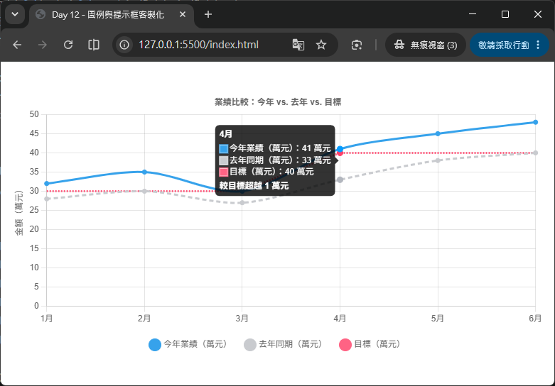
interaction.mode: 'index' + intersect: false:這組設定讓滑鼠移到任一個月份的 x 座標範圍時,「今年」「去年」「目標」三筆資料會同時出現在同一個提示框裡,不需要精準對準某個資料點。legend.onClick 維持預設行為,但明確寫出來:這裡示範了完整改寫預設點擊邏輯的寫法,實務上如果只是要沿用預設行為,其實不需要覆寫 onClick;但了解這段邏輯,是進一步客製化(例如前面 3.2 節「連動切換」)的基礎。tooltip.callbacks.footer 動態計算差距:透過 tooltipItems.find() 從陣列中找出「今年」與「目標」兩筆資料,計算差距並在頁尾顯示「超越/落後 N 萬元」,讓提示框不只是單純條列數字,還能提供有意義的分析結論。pointRadius: 0:目標線通常只是參考輔助線,不需要在每個月份上都顯示資料點圓圈,設為 0 可以讓畫面更簡潔。borderDash:用虛線樣式([6, 4]、[2, 2])區分「參考資料(去年)」與「輔助線(目標)」跟「主要資料(今年)」,是常見的視覺慣例。如果內建的 canvas 繪製的圖例/提示框無法滿足視覺設計需求(例如想要圖例做成卡片式排版、提示框想要有複雜的表格),Chart.js 允許你關閉內建繪製,改用 HTML + CSS 自行實作:
options: {
  plugins: {
    legend: {
      display: false // 關閉內建圖例,改用 HTML 自行渲染
    },
    htmlLegend: {
      containerID: 'legend-container' // 搭配自訂 plugin,把圖例畫到指定的 DOM 容器
    }
  }
}
做法上通常會撰寫一個自訂 Chart.js 外掛(plugin),在 afterUpdate 生命週期中讀取 chart.data.datasets,動態產生對應的 HTML 元素(例如 <ul><li> 清單),並綁定 click 事件呼叫 chart.setDatasetVisibility() 等 API 來實現跟內建圖例相同的互動效果。
external)options: {
plugins: {
tooltip: {
enabled: false, // 關閉內建的 on-canvas 提示框
external: (context) => {
// context.tooltip 內含目前提示框應該顯示的所有資料
// 可以在這裡動態建立/更新一個絕對定位的 <div>,取代預設的畫布繪製
}
}
}
}
HTML 版提示框最大的好處是:可以使用完整的 HTML/CSS 排版能力(例如放圖片、複雜表格、動畫效果),缺點是需要自行處理定位(跟隨滑鼠移動)、樣式、以及在圖表縮放或資料更新時同步更新內容,複雜度比內建版本高出許多。這個做法適合對提示框視覺呈現有特殊需求的進階場景,初學階段建議先熟悉內建的 callbacks 客製化即可應付大多數需求。
明天(Day 13)我們將學習動畫效果(Animations),包含 animation 設定中的 duration、easing 等參數、如何做出「逐步顯示資料」的漸進式動畫效果,以及使用 chart.update() 搭配資料異動,實作圖表資料動態更新時的流暢過場動畫。


 iThome鐵人賽
 看影片追技術