
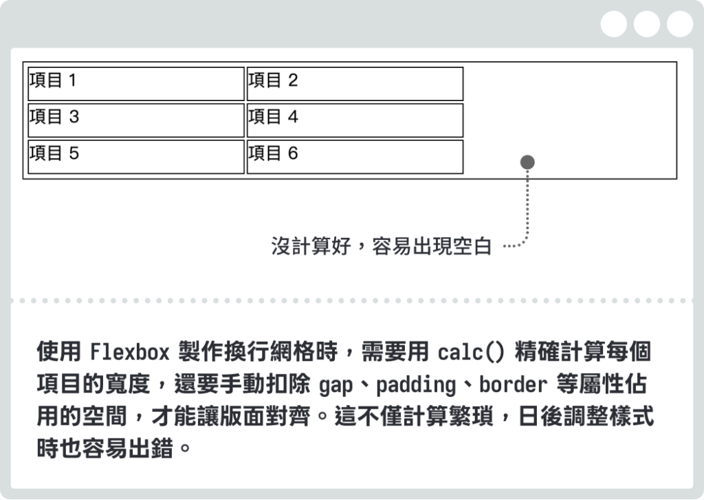
Flexbox 雖然是一個好用的排版工具,但只適合處理單一方向的排列。當需要同時控制水平和垂直方向的版面時,就會發現 Flexbox 並不怎麼適合 。如以下範例,使用 Flex 排版時,即使設定換行,右側仍容易出現空隙,若要精確對齊就需要額外計算。
<div class="container">
  <div class="item item-1">項目 1</div>
  <div class="item item-2">項目 2</div>
  ...
</div>
.container {
  width: 600px;
  height: 100px;
  border: 1px solid #000;
  padding: 4px;
  display: flex;
  flex-wrap: wrap;
  gap: 2px;
}

.item {
  border: 1px solid #000;
  /* 寬度設定為父元素的 1/3 */
  width: calc( 100% / 3 ) ;
}
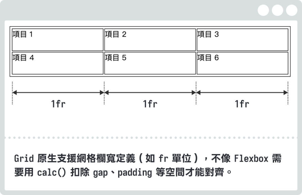
Grid 正是為了解決這種需要同時控制水平和垂直方向的排版需求,且項目的排列順序也可以不受 HTML 原始結構限制,可以自由指定在網格上的位置,讓我們能夠輕鬆建立複雜的網格版面。
使用 Grid 排版,只需在父元素上設定 display: grid。與 Flexbox 相同,Grid 也是套用在父容器上來控制子元素的排列方式。
.container {
  display: grid;
}
完成設定後,該元素就會變成 Grid 容器,裡面的子元素就會變成 Grid 項目,排列方式會按照 Grid 的規則進行。
.container {
  width: 600px;
  border: 1px solid #000;
  padding: 10px;
  display: grid;
  grid-template-columns: 1fr 1fr 1fr;/* 建立 3 欄 */
  gap: 2px;
}
.item {
  border: 1px solid #000;
}
Grid 提供了一個強大的二維排版系統,能夠精確控制元素在行和列上的位置和大小。根據 Grid 可以分成以下結構:
display: grid 的父元素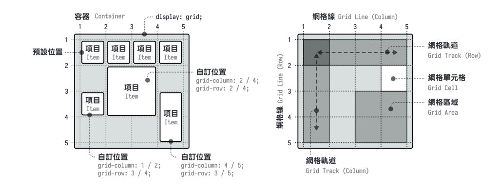
這些屬性用於定義網格的結構、大小和對齊方式,需設定在有設定 display: grid 的父元素上。
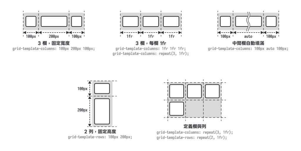
Grid-template-columns / Grid-template-rows 定義網格結構:grid-template-columns 和 grid-template-rows 屬性用來定義網格的欄數和列數,以及它們的尺寸。
.container {
  /* 定義欄位(直欄) */
  grid-template-columns: 100px 200px 100px; /* 3 欄,固定寬度 */
  grid-template-columns: 1fr 2fr 1fr;       /* 3 欄,比例分配 */
  grid-template-columns: repeat(3, 1fr);    /* 3 欄,每欄 1fr */
  grid-template-columns: 100px auto 100px;  /* 中間欄自動填滿 */

  /* 定義列數(橫列) */
  grid-template-rows: 100px 200px;          /* 2 列,固定高度 */
  grid-template-rows: repeat(3, 100px);     /* 3 列,每列 100px */
}
常用單位:
.container {
  /* px - 固定像素 */
  grid-template-columns: 200px 300px;

  /* % - 百分比 */
  grid-template-columns: 30% 70%;

  /* fr - 彈性單位,分配剩餘空間 */
  grid-template-columns: 1fr 2fr; /* 第二欄是第一欄的 2 倍寬 */

  /* auto - 根據內容自動調整 */
  grid-template-columns: auto 200px auto;

  /* minmax() - 設定最小和最大值 */
  grid-template-columns: minmax(100px, 1fr) 200px;

  /* repeat() - 重複模式 */
  grid-template-columns: repeat(4, 1fr); /* 4 欄均分 */
  grid-template-columns: repeat(3, 100px 200px); /* 6 欄交替 */
}
Gap 間距設定:gap 屬性用來設定網格項目之間的間距。
.container {
  gap: 20px;              /* 所有方向間距 20px */
  gap: 10px 20px;         /* 列間距 10px,欄間距 20px */
  row-gap: 10px;          /* 只設定列間距 */
  column-gap: 20px;       /* 只設定欄間距 */
}
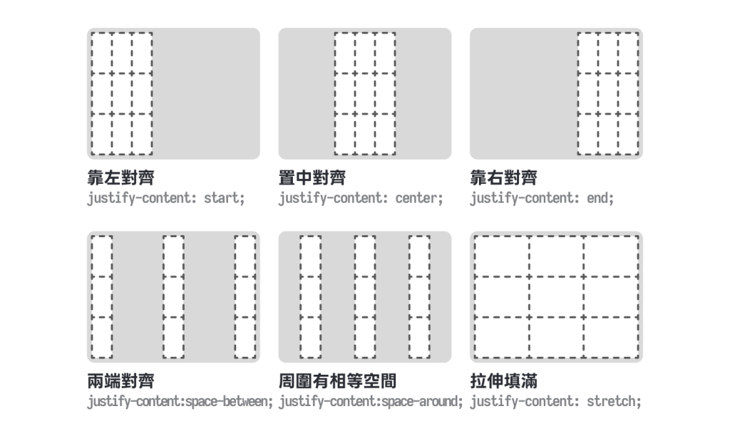
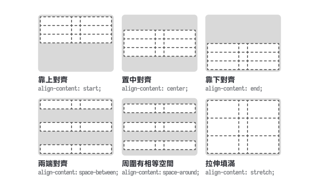
Justify-content / Align-content 網格對齊:這兩個屬性控制整個網格在容器內的對齊方式(當網格總大小小於容器時)。
.container {
  /* 水平對齊(欄方向) */
  justify-content: start;
  justify-content: center;
  justify-content: end;
  justify-content: space-between;
  justify-content: space-around;
  justify-content: stretch;
}
.container {
  /* 垂直對齊(列方向) */
  align-content: start;
  align-content: center;
  align-content: end;
  align-content: space-between;
  align-content: space-around;
  align-content: stretch;
}
補充:使用 place-content: center 可以直接表示 justify-content: center + align-content: center,因此只要在 Grid 容器上,直接設定 place-content: center,就可以快速達到元素水平垂直置中的效果喔!
<div class="grid-box">
  <div class="item">item</div>
</div>
.grid-box {
  display: grid;
  place-content: center;
}
這個方法比使用 flex 置中還要精簡喔!(display: flex + align-items: center + justify-content: center)
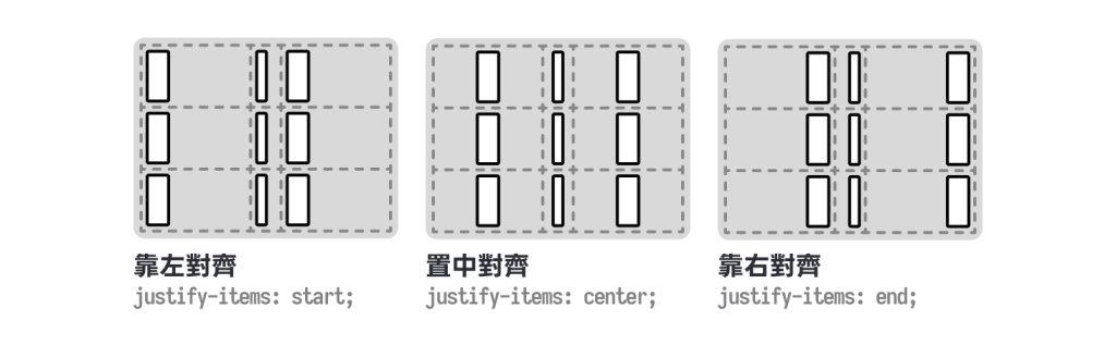
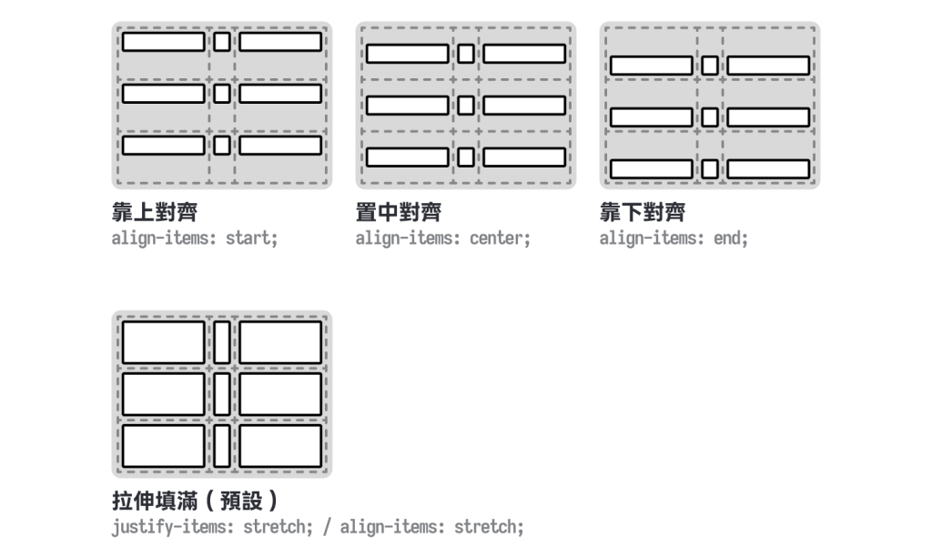
Justify-items / Align-items 項目對齊:這兩個屬性控制項目在網格單元格內的對齊方式。
.container {
  /* 水平對齊(欄方向)*/
  justify-items: start;
  justify-items: center;
  justify-items: end;
  justify-items: stretch;
}
.container {
  /* 垂直對齊(列方向)*/
  align-items: start;
  align-items: center;
  align-items: end;
  align-items: stretch;
}
Grid-auto-columns / Grid-auto-rows 自動生成網格:當項目被放置在未定義的網格軌道時,這些屬性定義自動生成的軌道大小。
.container {
  grid-template-columns: 100px 100px;
  grid-auto-columns: 50px;  /* 超出定義的欄會是 50px */
  grid-auto-rows: 80px;     /* 超出定義的列會是 80px */
}
Grid-auto-flow 自動放置:grid-auto-flow 屬性控制項目的自動放置方式。
.container {
  grid-auto-flow: row;       /* 按列排列(預設)*/
  grid-auto-flow: column;    /* 按欄排列 */
  grid-auto-flow: dense;     /* 盡量填滿空格 */
  grid-auto-flow: row dense; /* 按列排列且填滿空格 */
}




 iThome鐵人賽
 看影片追技術