
在昨天Day 13,我成功將結果輸出到CSV檔案上。然而,當這份報表呈現在決策者面前時,「表格雖然工整,但無法一眼看清風險比重與整體態勢。」 主管需要的是能「3 秒掌握局勢」的視覺化結論。
如果執行環境沒有安裝 Excel,又不想採購昂貴的商業 BI 工具(如 Power BI、Tableau),RPA 能否自動產出美觀且具備互動性的圖表?答案是:用前端 Web 技術來實現 今天我們將透過UiPath動態生成包含開源 Chart.js的單一HTML檔案,打造出零成本專利監控視覺化情報看板。
一、 核心設計:為何選擇「HTML + Chart.js」?
在企業 RPA 開發與維運實務中,以 HTML 作為視覺化輸出具有極大優勢,任何裝置只要有瀏覽器(Chrome、Edge)就能秒開。
動態互動體驗:滑鼠懸停於環形圖或長條圖時,會自動浮現精確筆數與佔比,專業度遠勝過靜態截圖。
二、 實作架構與流程
整體的自動化產出邏輯分為三個步驟:
三、 核心實作代碼
在 CSV 報表輸出步驟後,加入以下字串組裝邏輯:
' 組裝包含 KPI 卡片、環形圖與長條圖的 HTML 字串
htmlReportContent = String.Format("<!DOCTYPE html><html lang='zh-TW'><head><meta charset='UTF-8'>" &
"<title>全球專利監控情報儀表板</title>" &
"<script src='https://cdn.jsdelivr.net/npm/chart.js'></script>" &
"<style>" &
"  body {{ font-family: -apple-system, BlinkMacSystemFont, 'Segoe UI', Roboto, sans-serif; background: #f8fafc; padding: 24px; color: #1e293b; }}" &
"  .kpi-grid {{ display: grid; grid-template-columns: repeat(4, 1fr); gap: 16px; margin-bottom: 24px; }}" &
"  .kpi-card {{ background: white; padding: 20px; border-radius: 8px; box-shadow: 0 1px 3px rgba(0,0,0,0.08); border-left: 4px solid #94a3b8; }}" &
"  .kpi-card.high {{ border-left-color: #ef4444; }}" &
"  .kpi-card.review {{ border-left-color: #f97316; }}" &
"  .kpi-card.general {{ border-left-color: #3b82f6; }}" &
"  .chart-grid {{ display: grid; grid-template-columns: 1fr 1fr; gap: 20px; background: white; padding: 20px; border-radius: 8px; box-shadow: 0 1px 3px rgba(0,0,0,0.08); }}" &
"  .chart-box {{ height: 260px; }}" &
"</style></head><body>" &
"<h2>📊 全球專利自動化監控情報看板 (Web 免費版)</h2>" &
"<p style='color:#64748b;'>檢索完成時間:{0}</p>" &
"<div class='kpi-grid'>" &
"  <div class='kpi-card high'><div>VIP 競品監控</div><h1 style='margin:4px 0;color:#ef4444;'>{1} 件</h1></div>" &
"  <div class='kpi-card review'><div>海外優先權覆核</div><h1 style='margin:4px 0;color:#f97316;'>{2} 件</h1></div>" &
"  <div class='kpi-card general'><div>一般常規專利</div><h1 style='margin:4px 0;color:#3b82f6;'>{3} 件</h1></div>" &
"  <div class='kpi-card'><div>總監控案件</div><h1 style='margin:4px 0;'>{4} 件</h1></div>" &
"</div>" &
"<div class='chart-grid'>" &
"  <div class='chart-box'><canvas id='pieChart'></canvas></div>" &
"  <div class='chart-box'><canvas id='barChart'></canvas></div>" &
"</div>" &
"<script>" &
"  new Chart(document.getElementById('pieChart'), {{" &
"    type: 'doughnut'," &
"    data: {{ labels: ['VIP 競品', '優先權覆核', '一般專利'], datasets: [{{ data: [{1}, {2}, {3}], backgroundColor: ['#ef4444', '#f97316', '#3b82f6'] }}] }}," &
"    options: {{ responsive: true, maintainAspectRatio: false, plugins: {{ title: {{ display: true, text: '風險分流佔比' }} }} }}" &
"  }});" &
"  new Chart(document.getElementById('barChart'), {{" &
"    type: 'bar'," &
"    data: {{ labels: ['VIP 競品', '優先權覆核', '一般專利'], datasets: [{{ label: '案件數', data: [{1}, {2}, {3}], backgroundColor: ['#ef4444', '#f97316', '#3b82f6'] }}] }}," &
"    options: {{ responsive: true, maintainAspectRatio: false, plugins: {{ legend: {{ display: false }}, title: {{ display: true, text: '案件數量分佈' }} }}, scales: {{ y: {{ beginAtZero: true, ticks: {{ stepSize: 1 }} }} }} }}" &
"  }});" &
"</script></body></html>",
DateTime.Now.ToString("yyyy-MM-dd HH:mm:ss"),
listHighPriority.Count,
listReviewNeeded.Count,
listGeneral.Count,
(listHighPriority.Count + listReviewNeeded.Count + listGeneral.Count))
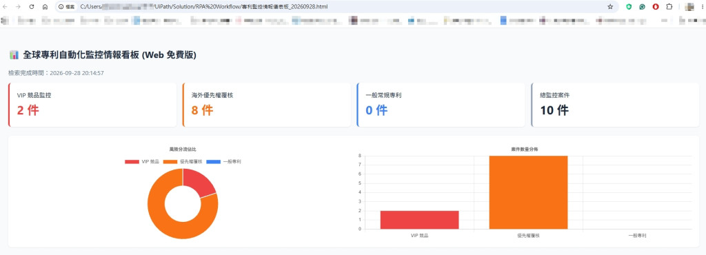
今日成果
可以很直覺看到專利資料被分為VIP競品監控2件與海外優先權覆核8件,減少之前需要人工去每筆資料做整理的部分。



 iThome鐵人賽
 看影片追技術