圖表通常可以比表格或者文字敘述作出更有感染力的詮釋,R語言另外一個令人讚賞的就是圖表的表現了,而套件ggplot2更是複習R語言的重點,接下來幾天,我們將進入R語言與機器學習見面會第4個主題:資料視覺化,來複習幾個常用圖表的使用方式。
ggplot2線圖函式
geom_line(mapping = NULL, data = NULL, stat = "identity", position = "identity",
  ...)
我們在資料夾MyR新增一支Day16.R

在Day16.R中輸入程式碼
#安裝並載入gcookbook
install.packages(c("ggplot2", "gcookbook"))
library(ggplot2)
library(gcookbook)
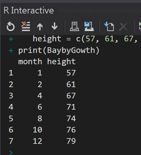
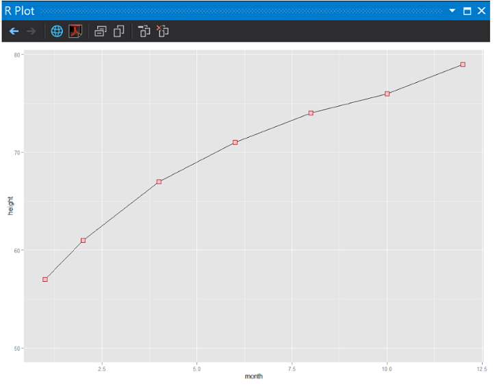
#製作簡單的資料(女生版1歲前身高曲線97分位)
BaybyGowth <- data.frame(
month = c(1, 2, 4, 6, 8, 10, 12),
height = c(57, 61, 67, 71, 74, 76, 79))
print(BaybyGowth)
#兒童生長曲線
#http://health99.hpa.gov.tw/doc/12024.pdf
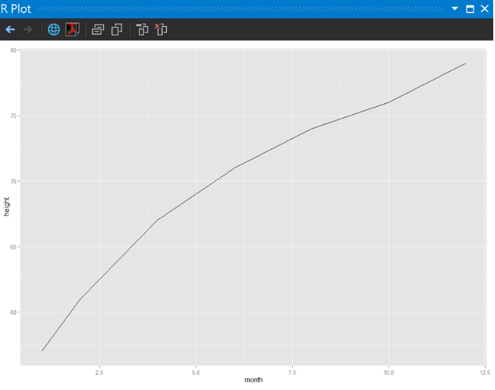
#先畫基本線圖
ggplot(BaybyGowth, aes(x = month, y = height)) + geom_line()
執行結果:
每個1~2月的身高
沒有點的線就是少了靈魂,來加座標點。
在Day16.R中輸入程式碼
ggplot(BaybyGowth, aes(x = month, y = height)) + geom_line() + geom_point()
執行結果:
多了黑色的座標點
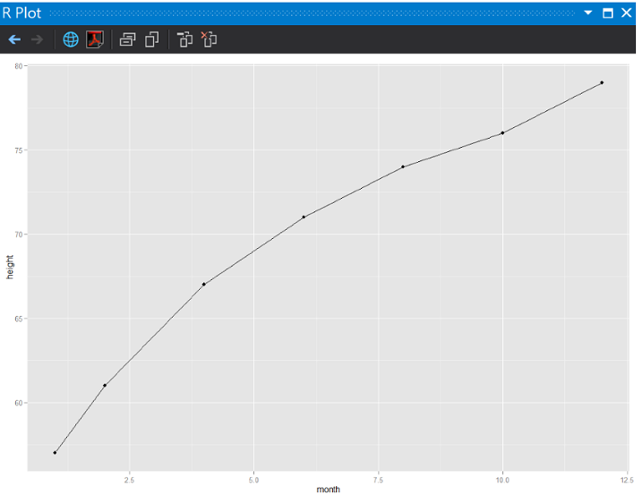
這個線圖發現1個問題:
第1次測量是57cm,但水平軸沒有標示明顯的間隔數字。
我們繼續編輯程式Day16.R
#(3)加上y軸的上下限
ggplot(BaybyGowth, aes(x = month, y = height)) + geom_line() + geom_point() + ylim(50, max(BaybyGowth$height))
執行結果:
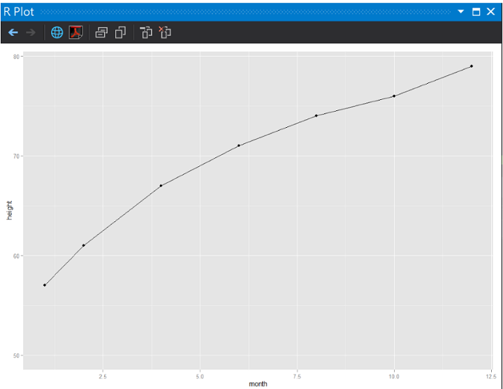
剛剛y軸顯示的問題解決了!
感覺不太有精神,把座標給他點顏色瞧瞧!
在Day16.R中輸入程式碼
#(4)座標加上顏色(darkred)並且用pink色填滿
ggplot(BaybyGowth, aes(x = month, y = height, group = 1)) + geom_line() +
geom_point(size = 4, shape = 22, colour = "darkred", fill = "pink") + ylim(50, max(BaybyGowth$height))
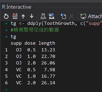
我們使用R內建的資料集ToothGrowth,他是一個實驗維生素C劑量和牙齒生長長度關係的數據紀錄,實驗時同時以兩種給藥方式(柳橙汁(OG)或維生素C(VC)),剛好可以畫出2條線。
(The Effect of Vitamin C on Tooth Growth in Guinea Pigs)
在Day16.R中輸入程式
#(5)多條折線圖
#載入plyr
library(plyr)
#總結牙齒成長紀錄(60筆彙總成6筆)
tg <- ddply(ToothGrowth, c("supp", "dose"), summarise, length = mean(len))
#檢視整理完成的數據
tg
在Day16.R中輸入程式
#(6)用給藥方式來畫線(colour)
ggplot(tg, aes(x = dose, y = length, colour = supp)) +
geom_line(linetype = "dashed",size=4) +
geom_point(shape = 22, size = 5, fill = "white")
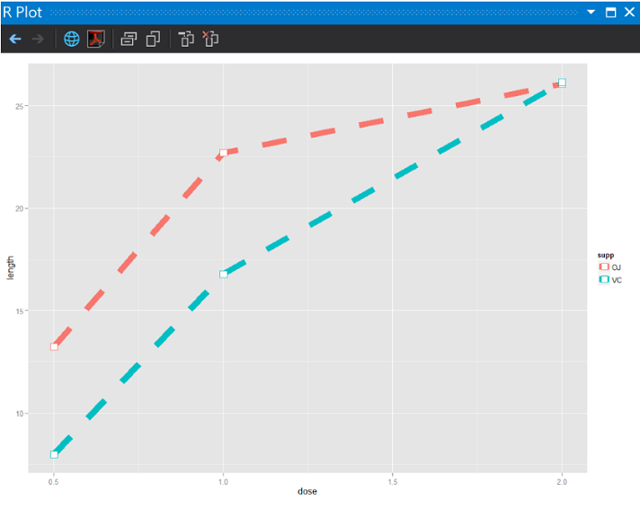
在劑量1.5單位以下,直接喝柳橙汁,牙齒長的比較長。
總結:天然ㄟ尚好!
線圖的進階:
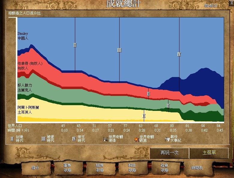
講山形圖這名詞也許有少部分成員沒聽過,但下面這圖,看16個夏天心有戚戚焉的同學,共同的回憶,經典中的經典:
1997:世紀帝國一 AOE
2000:世紀帝國二 AOC 征服者入侵
其中,遊戲結束後的結算:
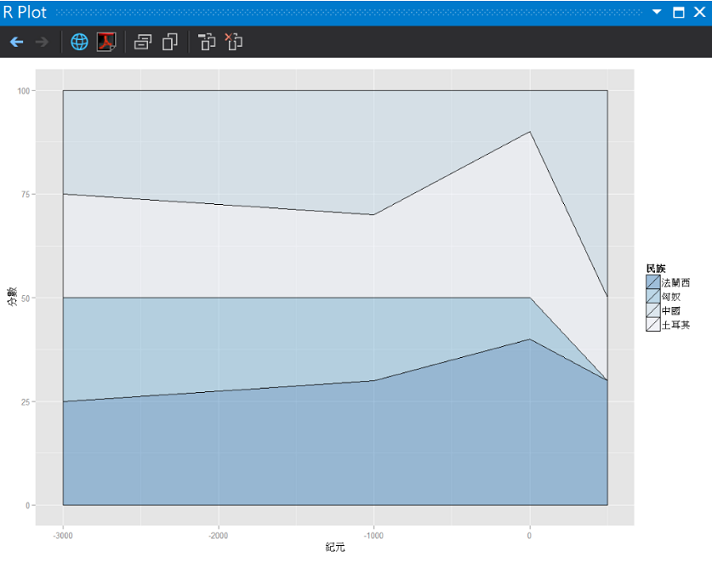
在Day16.R中輸入程式
#簡單的面積
#(7)製作簡單的世紀帝國資料
AoeStatistics <- data.frame(
   民族 = c("法蘭西", "匈奴", "土耳其", "中國", "法蘭西", "匈奴", "土耳其", "中國", "法蘭西", "匈奴", "土耳其", "中國", "法蘭西", "匈奴", "土耳其", "中國"),
   分數 = c(25, 25, 25, 25, 30, 20, 20, 30, 40, 10, 40, 10, 30, 0, 20, 50),
   紀元 = c(-3000, -3000, -3000, -3000, -1000, -1000, -1000, -1000, 0, 0, 0, 0, 500, 500, 500, 500))

ggplot(AoeStatistics, aes(x = 紀元, y = 分數, fill = 民族)) +
geom_area(colour = "black", size = .2, alpha = .4) +
scale_fill_brewer(palette = "Blues", breaks = rev(levels(AoeStatistics$民族)))
執行結果:
征服者世界奇觀:
2014-10 攝於Sevilla,Spain
看到世界奇觀很震撼。


 iThome鐵人賽