資料視覺化之後,也許我們會想把圖表呈現在文件或是網頁上作報告,除了貼圖的方式,還有兩個就是R Markdown和shiny,shiny可以把圖形做成互動的網頁,R Markdown則可以把圖片儲存成PDF、WORD或是靜態的HTML。
今天先簡單練習R Markdown。
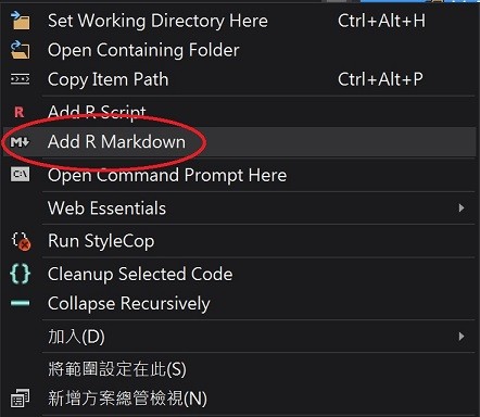
專案按下右鍵新增R Markdown,新增完畢後,專案資料夾會多一個markdown.rmd的程式。
打開markdown.rmd程式,原本就會內附使用範例,我們將他清除,然後輸入以下程式碼
---
title: "R語言之R Markdown見面會"
output: html_document
---

This is an R Markdown document. Markdown is a simple formatting syntax for authoring HTML, PDF, and Microsoft Word documents. For more details on using R Markdown see <http://rmarkdown.rstudio.com>.

When you click the **R Tools | Publish | Preview** button a document will be generated that includes both content as well as the output of any embedded R code chunks within the document. You can embed an R code chunk like this:
library(ggplot2)
AoeStatistics <- data.frame(
   民族 = c("法蘭西", "匈奴", "土耳其", "中國", "法蘭西", "匈奴", "土耳其", "中國", "法蘭西", "匈奴", "土耳其", "中國", "法蘭西", "匈奴", "土耳其", "中國"),
   分數 = c(25, 25, 25, 25, 30, 20, 20, 30, 40, 10, 40, 10, 30, 0, 20, 50),
   紀元 = c(-3000, -3000, -3000, -3000, -1000, -1000, -1000, -1000, 0, 0, 0, 0, 500, 500, 500, 500))
ggplot(AoeStatistics, aes(x = 紀元, y = 分數, fill = 民族)) +
geom_area(colour = "black", size = .2, alpha = .4) +
scale_fill_brewer(palette = "Blues", breaks = rev(levels(AoeStatistics$民族)))
注意到需要R引擎執行的部分,用{r, echo=FALSE}範圍包起來,裡頭使用的語法就是鐵人賽發文的Markdown的語法。
預覽看一下結果,R Tool > publish > preview HTML
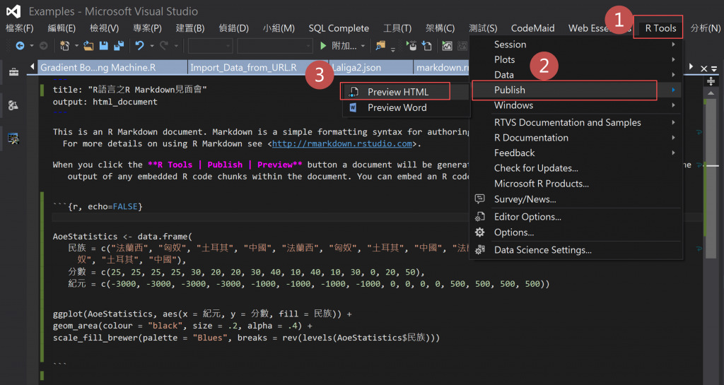
然後網頁就會自動開啟
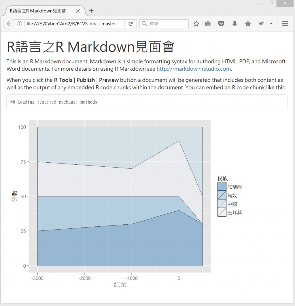
感覺比RTVS的R Plot更精美。
(自己在使用R plot時也發現圖表都有一點字太小或是圖片不更清楚的狀況)
好!補充完了,回到今天的主題Bar Graph
長條圖(bar graph)是一種以長條圖形高度或長度表示資料量的圖形,有一個特性是相鄰的長條有間距。
如果是簡單的幾項X值的統計數比較,像是台灣五個直轄市的新生兒比較,就很適合選擇長條圖。
長條圖有一個兄弟是直方圖(histogram) ,弟弟直方圖是以長條狀圖形高度代表資料量的圖形,相鄰的長條間無間距,主要是用面積表示數量。
ggplot2 長條圖函式:
geom_bar(mapping = NULL, data = NULL, stat = "bin", position = "stack", ...)
http://docs.ggplot2.org/0.9.3.1/geom_bar.html
我們在資料夾MyR新增一支Day17.R
在Day17.R中輸入程式碼
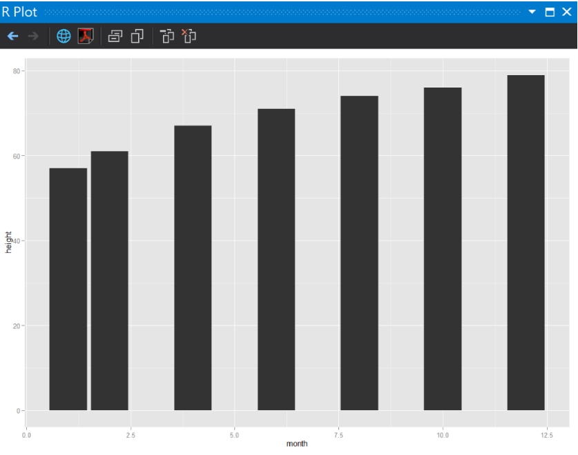
#製作簡單的資料(女生版1歲前身高曲線97分位)
BaybyGowth <- data.frame(
   month = c(1, 2, 4, 6, 8, 10, 12),
   height = c(57, 61, 67, 71, 74, 76, 79))
print(BaybyGowth)

#長條圖(1)
ggplot(BaybyGowth, aes(x = month, y = height)) + geom_bar(stat = "identity")
#將時間區轉換為factor
ggplot(BaybyGowth, aes(x = factor(month), y = height)) + geom_bar(stat = "identity")
執行結果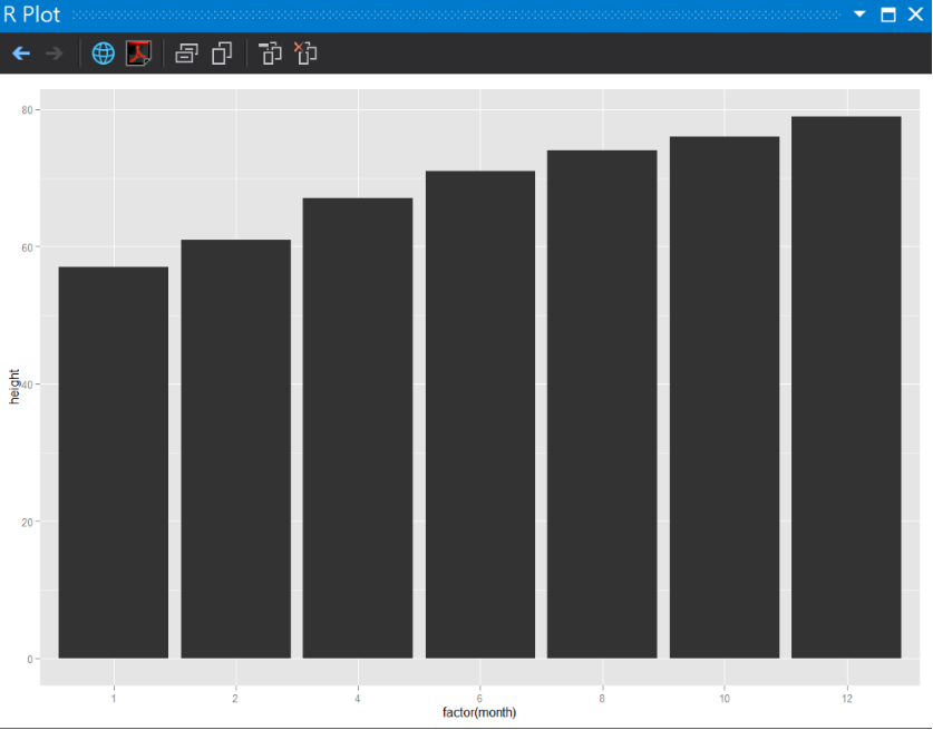
這邊我們使用R語言內建的資料集diamonds,她是一個鑽石價格統計,用鑽石的4C標準觀察價格變化。
ggpolt如果只輸入x條件時,ggplot會自動x的分類條件作小計count(*)。
4C:克拉(carat)、成色(color)、淨度(clarity)、切工(cut)
在Day17.R中輸入程式碼
#長條圖(3)筆數顯示
#顯示鑽石統計資料,各種切工的筆數
#只放x軸鑽石切工
ggplot(diamonds, aes(x = cut)) + geom_bar()
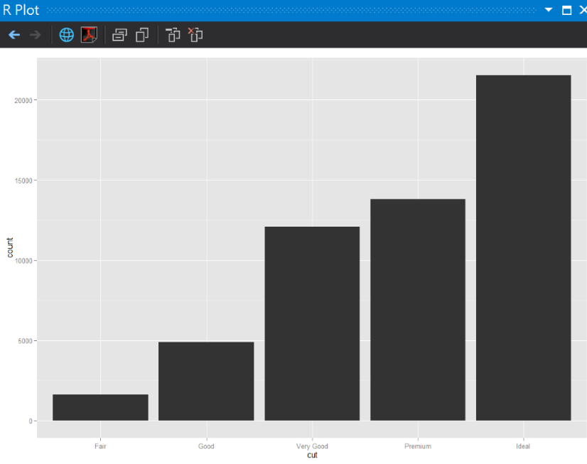
大部分鑽石的切割都是完美車工也!
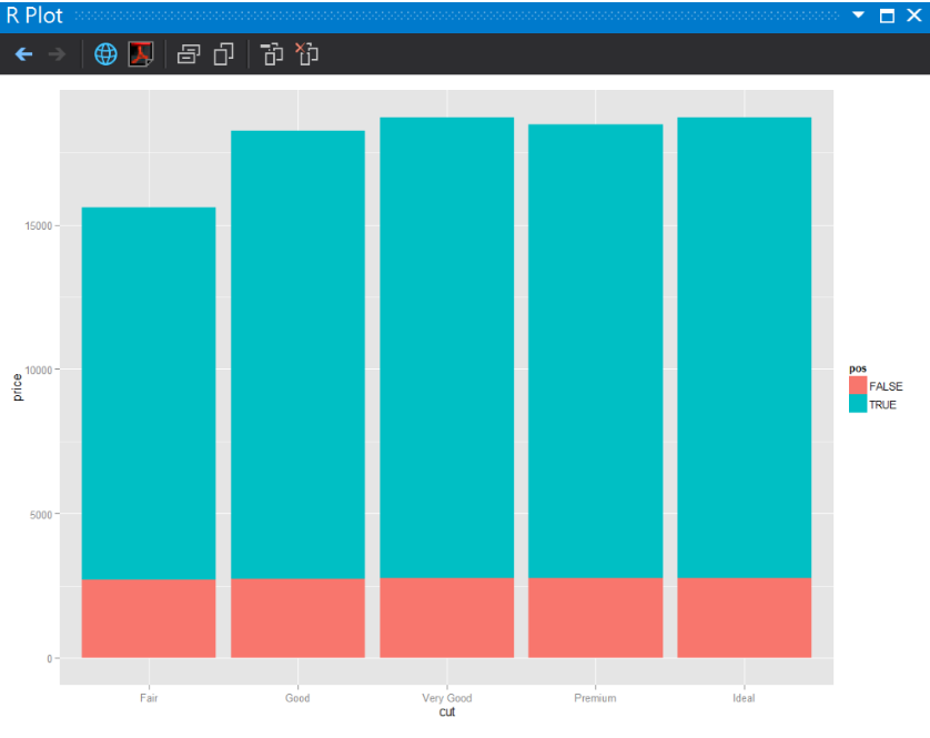
這個試著用鑽石的大小是否超過1克拉作為顏色區隔(fill)。
在Day17.R中輸入程式碼
#長條圖(4)推疊
#只篩選E Color的鑽石
df <- subset(diamonds, color == "E")
#觀察鑽石重量是否 >= 1克拉作為待會顏色的區隔
df$pos <- df$carat >= 1

#比較各種切工的價格差異,同時加上是否 >= 1克拉作為區隔
ggplot(df, aes(x = cut, y = price, fill = pos)) +
geom_bar(stat = "identity", position = "identity")
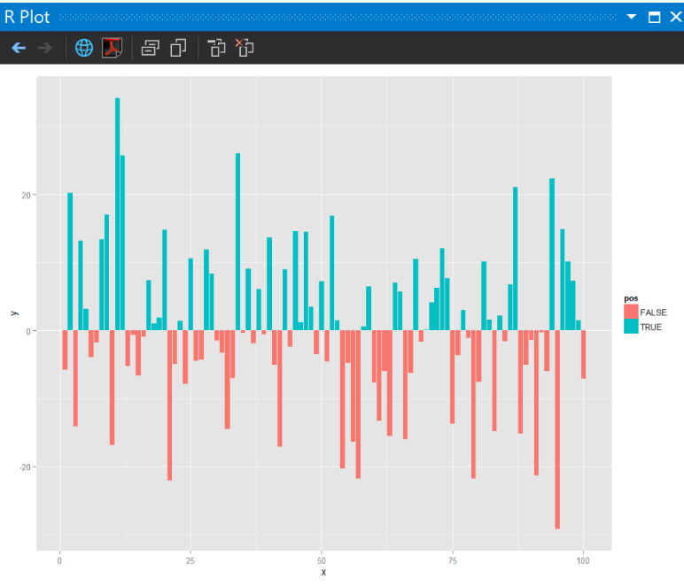
隨機建立一個100筆常態分佈隨機樣本
在Day17.R中輸入程式碼
#長條圖(5)區塊顯示
#The Normal Distribution 常態分佈
#建立一個100筆常態分佈隨機樣本函數
df<- data.frame(x = seq(1:100) , y = rnorm(100)*10)

#是否大於0
df$pos <- df$y >= 0
ggplot(df, aes(x = x, y = y, fill = pos)) +
geom_bar(stat = "identity", position = "identity")
執行結果
常態分佈:
我們初步認識了隨機分佈,明年要跑台北馬拉松,有機會再補複習蒙地卡羅方法。
Monte Carlo
2009攝於Monte Carlo,Monaco
http://docs.ggplot2.org/0.9.3.1/geom_bar.html
R Graphics cookbook